Otherland
Selected packaging
1 curated reference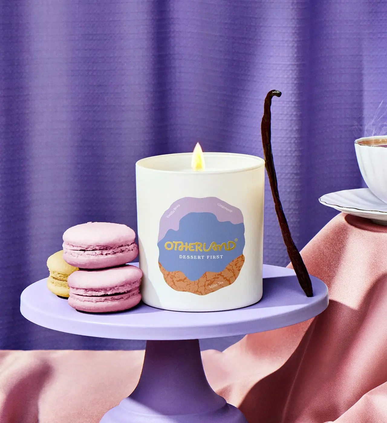
Candle · Jar
Dessert First Candle
Otherland’s Dessert First candle uses a pale vessel with a layered, irregular label in lavender, blue and warm orange. The selected campaign image coordinates its dessert cues—macarons and vanilla—with the scent notes listed by the brand.
Colours in this photograph
Sampled from the curated cover, including background and props. Screen colours, not print specifications.
A closer look
Read the full studyDesign observations from the selected packaging.
An irregular label turns the front into an illustration
Layered color fields create a soft-edged badge rather than a rigid rectangle. The label looks almost like a plated dessert, matching the gourmand theme without using literal food graphics on the package face.
Brand and scent name share the center
The yellow Otherland wordmark stands out against the blue field, with Dessert First set below it in smaller white letters. This keeps the maker visible while preserving the playful label shape.
More brands to explore
Continue discovering distinctive packaging.