Photography: Otherland official photography. Images belong to their respective owners.
Otherland

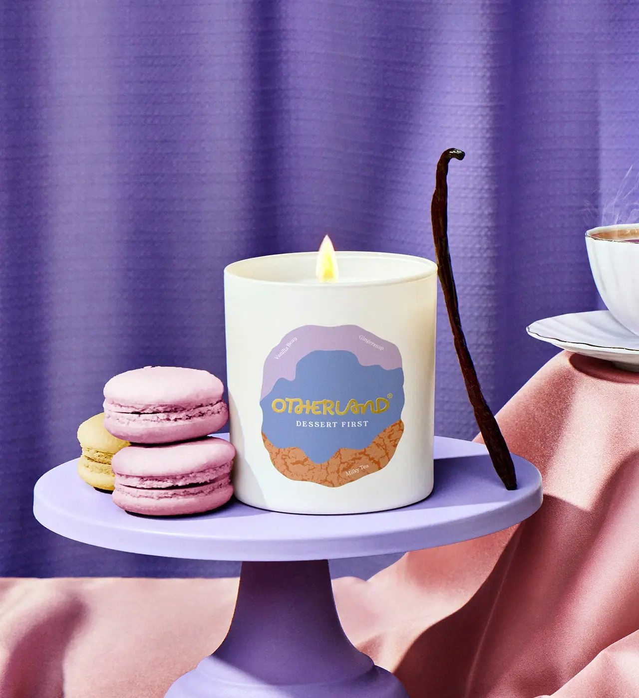
Cream candle with a layered lavender and biscuit-coloured badge
Dessert First uses a pale cylindrical vessel with one large irregular colour badge. Lavender forms its upper edge, a muted blue field carries the yellow Otherland wordmark and small white scent name, and an ochre lower section contains a mottled printed texture. Tiny scent-note words sit around the badge perimeter. The official image stages the lit candle on a lavender cake stand with macarons, vanilla and tea, translating the gourmand theme into an occasion without adding literal food pictures to the vessel.
- Candles & home scent
- Light pack
- Playful colour
- Retro illustrated
About this study
Selected Dessert First single-wick candle with layered colour badge and dessert-table scene; vessel material and unseen secondary packaging unverified.
Sources & evidence · Reviewed 2026-10-19Color Palette
Approximate colours interpreted from photography. These are screen references, not official brand colours or print specifications.
Pack body
Cream vessel
#EDEDE0
Approximate pale opaque-looking cylinder and visible rim. Vessel material is not established by the colour.
Label
Lavender upper field
#BAA7CA
Irregular top region of the badge, distinct from the deeper purple curtain in the scene.
Muted blue centre
#7D91BD
Main identity field behind the yellow producer and white scent name.
Biscuit ochre base
#CC955D
Lower badge area with a darker mottled texture. This is printed-looking artwork, not exposed cork or rough vessel material.
Ink
Yellow producer
#D5B94B
Warm flowing wordmark across the blue centre.
White scent copy
#F4F1E7
Small central scent name and perimeter note labels; subtly cream in the scene lighting.
Typography
Suggested visual alternatives, not confirmed brand typefaces. Any scale below is an illustrative estimate.
The yellow Otherland name is the largest text on the vessel and crosses the blue central region. DESSERT FIRST sits directly beneath it in small spaced white serif capitals. Vanilla Bean and Gingersnap appear near the upper left and right edges of the lavender area, while Milky Tea sits lower on the ochre field. These tiny labels turn scent notes into part of the illustration rather than a single conventional list. The producer remains the strongest text cue, with the fragrance title kept close enough to read as one central identity unit.
Fonts
Playful producer proposal
Quicksand
- Looks like
- Quicksand
- Type
- Rounded sans serif
- Weight
- Medium 500 / SemiBold 600
- Case
- Original mixed-case or uppercase lettering
- Tracking
- Neutral, optically adjusted
- Fallback
- sans-serif
A rounded starting point for a unique fictional name, not a match to the existing custom flowing mark. Develop original letter connections only after ensuring the word remains readable.
Scent and note alternative
Libre Baskerville
- Looks like
- Libre Baskerville
- Type
- Serif
- Weight
- Regular 400 / Bold 700
- Case
- Uppercase scent; title-case notes
- Tracking
- Open scent capitals, neutral note labels
- Fallback
- serif
Use a small serif to contrast with the expressive producer. Keep perimeter note words short and test their contrast on both lavender and ochre regions at the actual vessel scale.
Structure & Proportions
Visual proportions and finish previews are illustrative. Confirmed construction details and uncertainties are distinguished in the study notes.
Proportions
| Purpose | Value | Preview |
|---|---|---|
| Pale margin | The badge occupies much of the front but leaves generous cream space above, below and at both sides. | — |
| Central field | The blue middle region is the largest uninterrupted text surface, wide enough for producer and scent together. | — |
| Peripheral notes | Tiny scent words sit near the upper and lower edges, secondary to the central identity rather than competing with it. | — |
Shapes
| Element | Value | Preview |
|---|---|---|
| Vessel | Straight cylindrical candle container with open circular rim. | |
| Organic badge | Irregular rounded outline made from layered wavy colour regions. | |
| Central identity area | Broad uneven blue field holding producer and scent name. |
Finishes
Smooth pale vessel
Container wall and rim; substrate and coating unknown. · matte
Flat illustrated badge
Layered colour artwork; texture is printed-looking rather than confirmed relief. · matte
Formats and materials
| Formats | An uncovered straight-sided cylindrical candle vessel with one visible flame. The official page lists an 8 oz / 226 g candle and a height of 3.25 inches. These are source specifications, not measurements derived from the image. |
| Materials | The official product page specifies a coconut-and-soy wax blend and a cotton wick. It does not specify the vessel substrate, so the pale container is not labelled as glass or ceramic from appearance alone., Label stock, adhesive, print method and any vessel coating are unverified. The mottled ochre graphic should not be interpreted as cork, exposed fibres or a tactile material. |
| Closures | No lid or outer carton is shown. The candle is photographed lit with the rim open, which establishes its use state but not how it is sealed or protected for sale. |
| Decoration | Three uneven colour fields form a single organic badge: lavender above, muted blue through the middle and ochre below., The ochre lower section contains darker irregular crackle-like marks, while the other fields remain comparatively flat. Small note names follow the changing edge rather than a rigid rectangular grid. |
Front Panel
Schematic reading order. The diagram’s zone heights do not represent measured artwork proportions.
The label behaves like a small abstract illustration with a clear central text area. Uneven colour boundaries supply movement while the producer and scent stay together across the blue field. Scent notes occupy the margins, allowing the main panel to remain uncluttered. The pale vessel surrounding the badge acts as a frame, so the irregular outline reads clearly even against the colourful photographic scene.
| Zone | Content |
|---|---|
| Lavender upper edge | A wavy pale-purple region carries two small note labels near its left and right boundaries. |
| Blue identity centre | The yellow flowing producer spans the middle above a small white DESSERT FIRST line. Their contrasting type voices help distinguish maker from fragrance. |
| Textured ochre lower field | Darker crackle-like artwork adds visual texture around the small Milky Tea note. It does not establish a textured substrate. |
| Cream vessel margin | An unprinted-looking border surrounds the badge, separating its colourful silhouette from the cylinder’s edges. |
Range System
The exact official listing identifies the Dessert First note trio as Vanilla Bean, Milky Tea and Gingersnap. The selected vessel carries those words within its badge. This study does not infer a complete Otherland colour-to-scent system from one candle, nor assume that its irregular label layout applies to every collection or size.
- An original fragrance series can use an abstract colour composition to suggest mood while keeping note names readable within controlled areas. The artwork should support a scent story without pretending to depict formula ingredients literally.
- If the design moves to a different vessel size, preserve adequate cream margins and re-evaluate tiny note placement. A small peripheral word can disappear faster than the central brand when artwork is reduced.
Back of Pack & Shelf
The reverse, underside, carton and any lid are unseen. The official page supplies product specifications, but the image does not reveal their printed placement or candle-care panel design.
- Obtain a base view before documenting warnings, batch details or net-weight typography.
- Do not invent a lid or gift-box structure from the staged dessert setting.
- Keep the official wax and wick specifications separate from unknown vessel construction.
On shelf
The cream cylinder creates a quiet boundary around the layered badge, helping it remain distinct from purple scenery. At reduced size, the yellow producer and overall badge silhouette should survive before the tiny peripheral notes. This is an interpretation of the image rather than tested shelf recognition. A neutral front view would clarify the colour regions and show how much of the badge wraps around the cylindrical wall.
Imagery
A lavender cake stand holds the candle beside pink and yellow macarons. A long vanilla pod leans near the vessel, while a teacup and saucer appear at the right above draped pink fabric. A deeper purple curtain fills the background. The composition makes the candle feel part of a dessert table; the props correspond to the scent theme without demonstrating literal ingredient quantities. The lit wick and unobscured front keep the product readable within the colourful setting.
Guidelines
Editorial principles for an original design brief, not official brand guidelines.
Do
- Keep the tiny note labels secondary to the central name.
- Distinguish mottled artwork from actual material texture.
- Use cream margins to preserve the badge silhouette.
- Record wax and wick specifications without guessing vessel substrate.
Don't
- Do not call the pale vessel ceramic or glass without evidence.
- Do not treat macarons as a verified fragrance ingredient.
- Do not add a lid or carton absent from the selected image.
- Do not transfer curtain purple into the label palette.
Sources & evidence
- Dessert First — Otherlandproduct
How this study was built
edition · Sourced fact
Official page lists 8 oz / 226 g, 3.25-inch height, coconut/soy wax and cotton wick.Dessert First — Otherlandrange · Sourced fact
Vanilla Bean, Milky Tea and Gingersnap are the official note trio and appear on the selected badge.Dessert First — Otherlandstructure · Visual observation
Open pale cylinder is shown lit without lid or carton.typography · Visual observation
Yellow flowing producer contrasts with small white serif scent and peripheral note words.label · Visual observation
Layered irregular lavender, blue and ochre fields form a bounded badge with cream margins.palette · Visual observation
Label colours are distinct from darker purple curtain and pink scene fabric.imagery · Editorial interpretation
Cake stand, macarons, vanilla and tea translate gourmand theme into a dessert occasion.
What remains unverified
- Vessel substrate, label stock and print process unverified.
- No underside, reverse, lid or outer carton shown.
- Official size and height are source-listed, not image measurements.
- Fonts proposed; mottled texture treated as artwork.
Give your AI
packaging taste
Give your design or image tool a packaging study: palette, type, structure, front panel and principles for an original brief.
Export this styleFree with an email. PACK.md works in Claude, ChatGPT, Cursor and image tools.
More like this
Literie
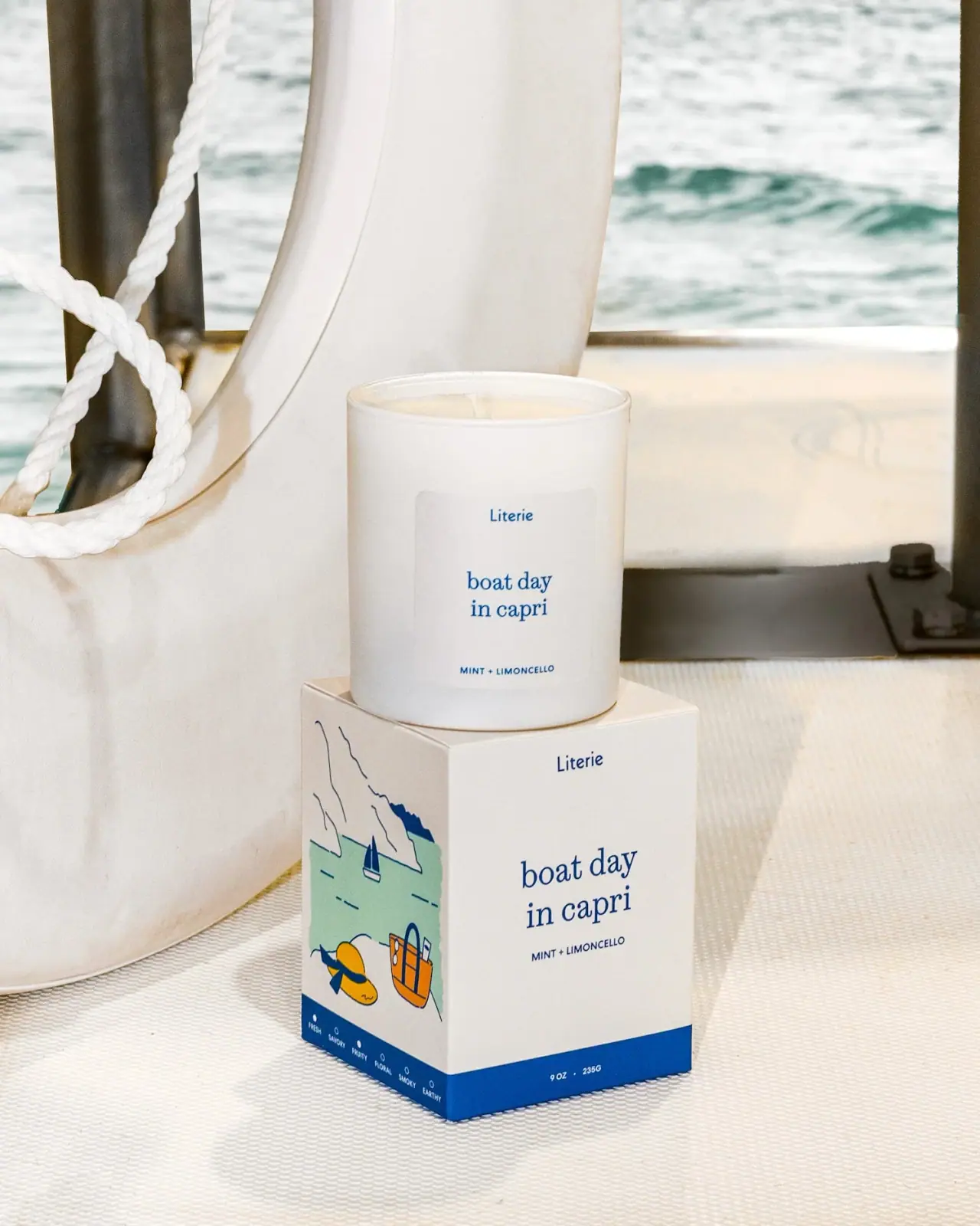
Quiet blue destination type with a playful coastal side panel
Milkjar
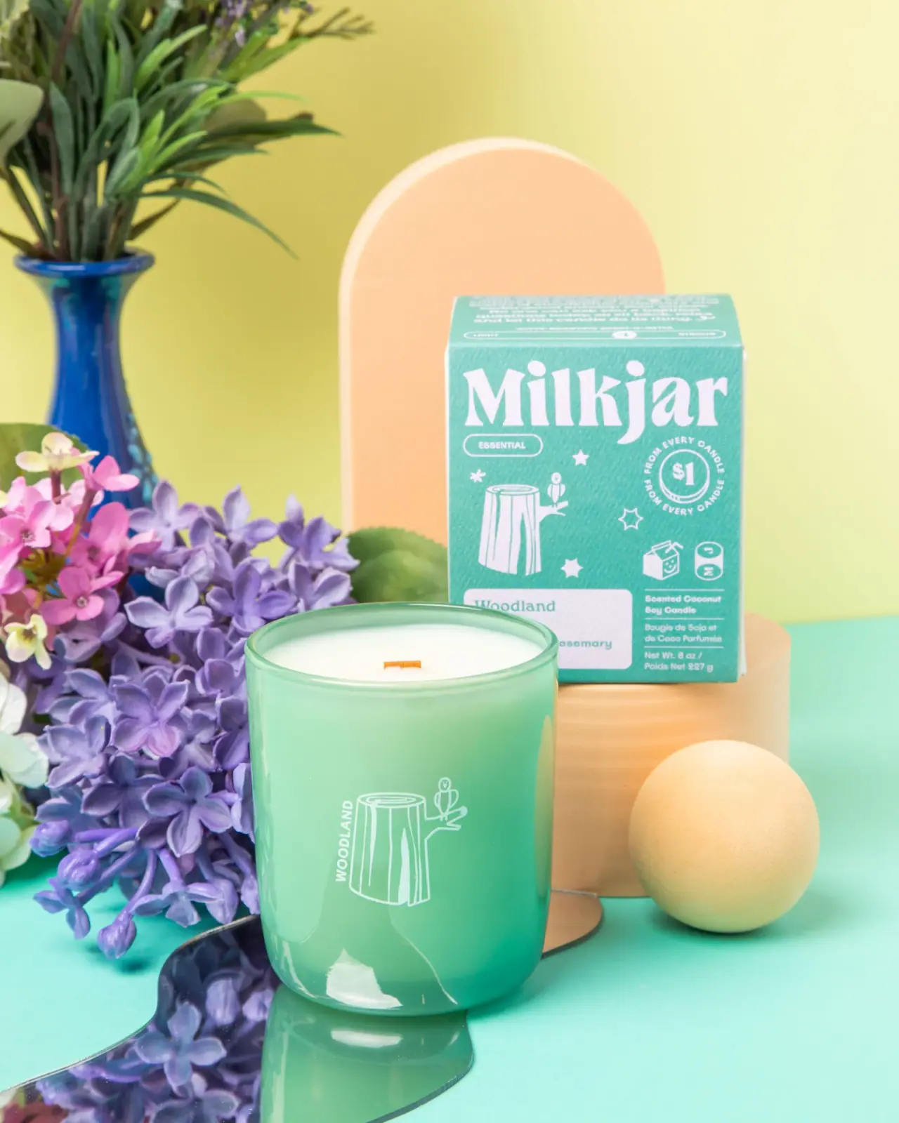
Green candle and carton share a white woodland illustration
Bathing Culture
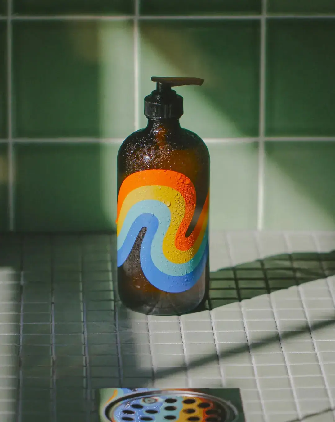
Flowing rainbow bands on dark refillable glass

Culture Pop
fruit-for-an-o wordmark on dewy cans
Diaspora Co.
marigold tins with a tiger crest
Flower Knows
Winged unicorn relief with pastel ribbons and reflective borders
Olipop
sunny soda fountain in flat colour
PoolBar London
Mint beach stripes with pink script and a lifebuoy badge