Vacation
Selected packaging
1 curated reference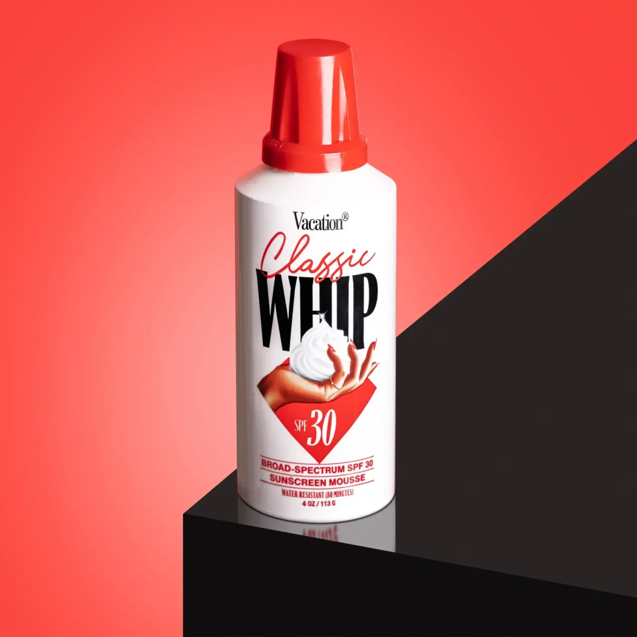
Suncare · Aerosol
Classic Whip SPF30
Vacation Classic Whip SPF 30 borrows the silhouette and visual language of an aerosol whipped-topping can for a sunscreen mousse. The selected image makes that playful reference unmistakable through its red cap, large “WHIP” lettering, and illustration, while the label also states that the product is for sun protection.
Colours in this photograph
Sampled from the curated cover, including background and props. Screen colours, not print specifications.
A closer look
Read the full studyDesign observations from the selected packaging.
A familiar shape with a sunscreen cue
The cylinder and whipped-cream styling evoke a topping can, while the SPF 30 marker and “sunscreen mousse” line identify its actual category.
Typography as a joke and hierarchy
“WHIP” is the largest word, partly overlaid by “Classic.” Vacation sits above it; SPF and product details anchor the lower portion.
More brands to explore
Continue discovering distinctive packaging.