Photography: Derek Drapeau — Vacation photography. Images belong to their respective owners.
Vacation

Retro whipped-can theatre with explicit sunscreen identification
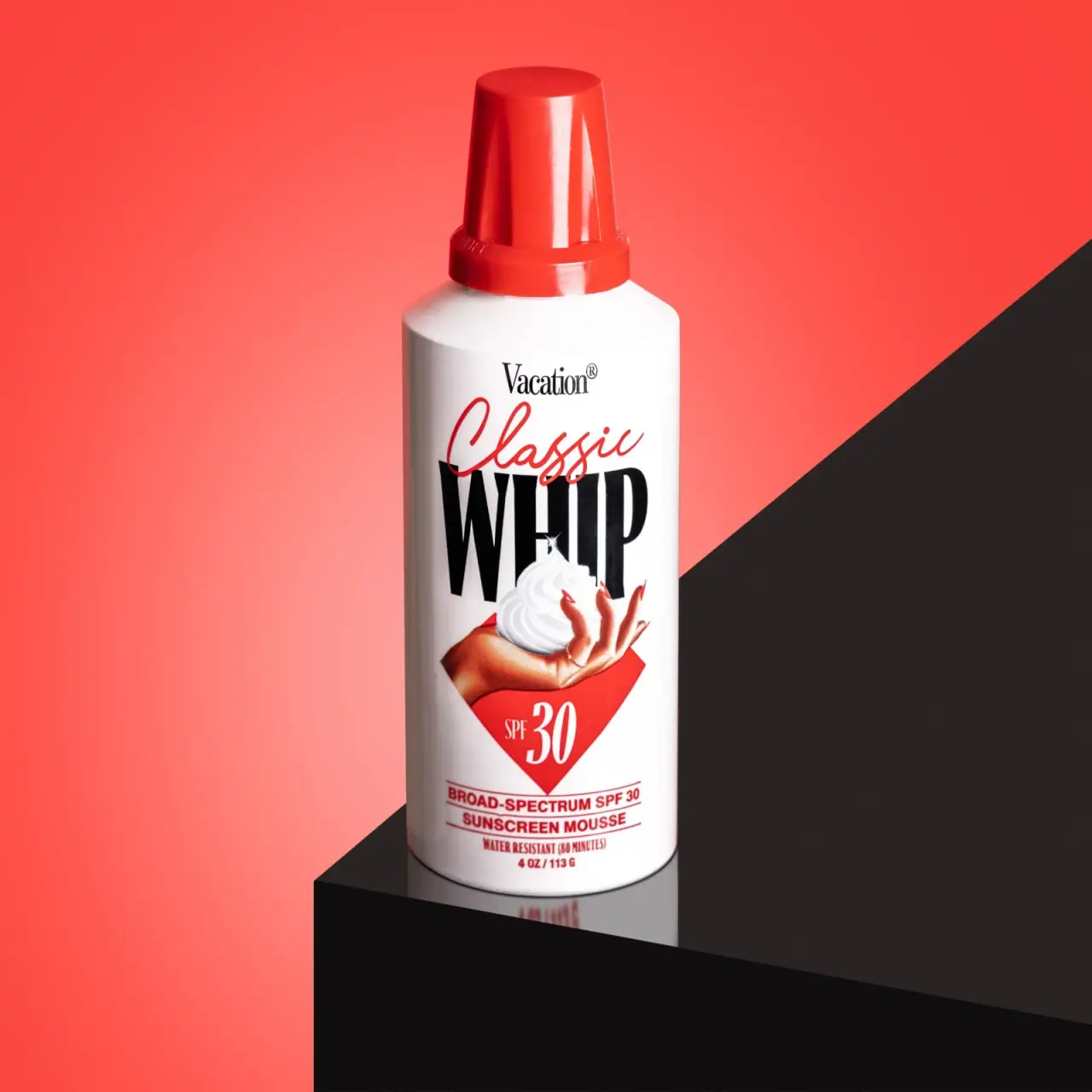
The selected Classic Whip SPF 30 package borrows the tall red cap and white cylindrical body of a whipped-topping can, then turns its front into a compact illustrated advertisement. A small serif producer name sits over red script and enormous black WHIP lettering. An illustrated hand holds a swirl of mousse above a red diamond carrying the SPF number. Strong sunscreen wording anchors the bottom. The design depends on contrast between playful texture associations and clear product identification; this is a sunscreen, not food. The photograph shows the 4 oz / 113 g SPF 30 edition.
- Suncare
- Light pack
- Retro illustrated
- Bold typographic
About this study
Selected red-cap Classic Whip SPF 30 4 oz / 113 g photograph, distinct from linked SPF 50 product.
Sources & evidence · Reviewed 2026-10-19Color Palette
Approximate colours interpreted from photography. These are screen references, not official brand colours or print specifications.
Pack body
Bright can white
#F8F6F1
Main cylinder and light mousse illustration; separates black display type from red accent zones.
Ink
Display black
#111111
Producer name and oversized WHIP title, creating strong contrast on the white body.
Accent
Classic red
#E62B27
Tall cap, script, SPF diamond and lower information rules. Approximate package color rather than the brighter coral background.
Illustrated warm skin
#C46D46
Shaded hand illustration, explicitly a pictorial color rather than another structural component.
Typography
Suggested visual alternatives, not confirmed brand typefaces. Any scale below is an illustrative estimate.
The largest word is WHIP, while Classic crosses its upper boundary in red script. Vacation appears above at a much smaller scale. The illustrated hand bridges title and SPF diamond; compact ruled sunscreen information then resolves the category at the foot. Different voices are held together by a centered composition and limited colors.
Fonts
Large format descriptor
Anton
- Looks like
- Tall compressed display capitals
- Type
- Condensed sans-serif
- Weight
- Regular 400
- Case
- Uppercase
- Tracking
- Tight but legible, with enough width for counters to remain open.
- Fallback
- Impact, sans-serif
A new short texture or format word with strong vertical presence. This is a practical display alternative, not an identification of WHIP’s original distinctive letterforms.
Expressive modifier
Allura
- Looks like
- Loose connected advertising script
- Type
- Script
- Weight
- Regular 400
- Case
- Title case
- Tracking
- Natural script connections; avoid mechanical letter spacing.
- Fallback
- cursive
A short original modifier crossing a display-heading boundary. Keep the swash from hiding the word beneath and avoid recreating the exact Classic signature.
Producer identity
Bodoni Moda
- Looks like
- Narrow editorial serif
- Type
- Serif
- Weight
- Medium 500
- Case
- Title case
- Tracking
- Compact but readable at small scale.
- Fallback
- Georgia, serif
An original producer line above the energetic title. For tiny practical text, use a plain supporting sans rather than shrinking decorative serif details beyond legibility.
Structure & Proportions
Visual proportions and finish previews are illustrative. Confirmed construction details and uncertainties are distinguished in the study notes.
Proportions
| Purpose | Value | Preview |
|---|---|---|
| Cap-to-body relationship | The narrow cap adds a conspicuous upper extension above sloped shoulders; its width is smaller than the main cylinder. No manufacturing dimensions are inferred. | — |
| Title dominance | WHIP is substantially taller than every other text block and spans nearly the usable front width. | — |
| Lower information reserve | The diamond and ruled category block occupy their own lower area, preventing the illustration from consuming all practical communication space. | — |
Shapes
| Element | Value | Preview |
|---|---|---|
| Tapering red cap | Long cover narrows toward a flat rounded top and widens into a lower band. | |
| SPF diamond | Red rotated-square field beneath the hand, with large white numerals. | |
| Illustrated mousse | White spiral peak sits in an illustrated palm; it is printed art, not exposed product on the closed can. |
Finishes
Glossy red cover
Tall cap exterior · gloss
Smooth white graphic field
Can body; coating process unverified · matte
Formats and materials
| Formats | Tall white aerosol-format cylinder with sloping shoulders and a long red cover over the dispensing assembly., Official listing and photographed front identify 4 oz / 113 g. This is mass; it must not be relabeled as 113 ml. |
| Materials | The component alloy, internal lining and red cap polymer are not established by the consulted product page. The can-like appearance is not a material specification., No carton, inner seal or separate accessory is shown. The glossy red cover and smooth white body are visible surfaces rather than verified coating processes. |
| Closures | The closed photograph shows a tall tapering red cap with a wider lower band. The official source identifies a tilt-valve actuator that produces shaped mousse. That confirms the dispensing format without exposing the actual valve or cap attachment in this view. |
| Decoration | Red script partly overlaps the giant black title., A shaded illustrated hand presents white mousse, connecting product texture to the lower SPF marker., Red rules organize compact category and performance wording near the base. |
Front Panel
Schematic reading order. The diagram’s zone heights do not represent measured artwork proportions.
Build a front-to-back reading sequence from producer to expressive title, texture illustration, SPF marker and functional category. Although the title and illustration overlap, the lower sunscreen block is distinctly separated by red rules and a regular baseline. The body curve remains visible at the sides.
| Zone | Content |
|---|---|
| Producer header | Small black serif Vacation name centered above the script. |
| Display title | Red Classic script across the upper portion of very large black WHIP lettering. |
| Texture illustration | A hand with red nails holds a white swirl; this provides a use and texture association within the printed front. |
| Protection marker | White SPF 30 inside a red diamond below the hand. |
| Functional footer | Broad-spectrum SPF 30, sunscreen mousse, water-resistant duration and 4 oz / 113 g appear near the base. These are photographed product statements, not independent testing results. |
Range System
The official page also points to an SPF 50 version, but the selected photograph is explicitly SPF 30. A broader family can retain a recognizable dispensing format while making protection level and category independently readable. No assumptions are made about identical construction or artwork across all Vacation products.
- Keep protection level visible as text and number rather than relying solely on cap color.
- For a new foam category, create a distinct illustration and title so the familiar can reference does not become a copy of this label.
- Treat a higher SPF version as its own product record; do not update photographed numerals to match a different current listing.
Back of Pack & Shelf
The rear panel and uncovered actuator are not shown. Actual drug-information layout, directions and pressure-container warnings cannot be reconstructed from the front photograph.
- For an original sunscreen brief, reserve clear space for verified product directions and required market-specific information.
- Keep the non-food intended use explicit when borrowing dessert-associated package forms.
- Validate component materials and supplier instructions before writing disposal or actuator specifications.
On shelf
The red cap and tall black word give fast visual recognition, with the illustration communicating a whipped texture at closer distance. The design deliberately borrows associations from another category, so the sunscreen descriptor and SPF marker carry a heavier clarification role than on a conventional lotion tube. The official source explicitly says the product is not food. This observation concerns communication hierarchy, not clinical effectiveness or measured shopper comprehension.
Imagery
Derek Drapeau’s photograph places the can on a black reflective plinth against a coral-red field divided by a strong diagonal. The scene repeats the package’s red and black contrast while the white body remains the brightest focal plane. The diagonal belongs to the set, not the printed label. The actual illustration on the can must remain distinguishable from a real hand or dispensed mousse in campaign images. A catalogue crop should retain the functional footer as well as the playful upper title.
Guidelines
Editorial principles for an original design brief, not official brand guidelines.
Do
- Keep sunscreen type and protection level legible beside any whipped-food visual metaphor.
- Separate the actual printed hand illustration from environmental props in descriptive content.
- Use a limited palette to coordinate multiple typographic voices.
- Retain the full functional footer when selecting catalogue crops.
Don't
- Do not label the product as edible or omit its cosmetic function in an original adaptation.
- Do not convert the 113 g mass into a volume claim.
- Do not infer a specific metal can or plastic cap composition from the photo.
- Do not replace the photographed SPF 30 with SPF 50 because the current page links to another version.
Sources & evidence
How this study was built
structure · Sourced fact
Official page identifies 4 oz / 113 g and tilt-valve format.Vacation — Classic Whip SPF 30palette · Visual observation
White, red and black package colors plus shaded hand; coral set excluded.typography · Visual observation
Small serif producer, red script and giant compressed black title.label · Visual observation
Hand illustration, SPF diamond and ruled functional footer visible.imagery · Visual observation
Diagonal coral/black scene and reflective plinth are external set elements.edition · Sourced fact
Official page identifies SPF 30 and separately links SPF 50.Vacation — Classic Whip SPF 30range · Sourced fact
Explicit non-food intended-use statement supports clarity discussion.Vacation — Classic Whip SPF 30
What remains unverified
- Exact can/cap materials and coatings unknown.
- Hidden reverse and actuator not reconstructed.
- Original font identities unverified.
- SPF and resistance statements are brand/product claims, not independent findings.
Give your AI
packaging taste
Give your design or image tool a packaging study: palette, type, structure, front panel and principles for an original brief.
Export this styleFree with an email. PACK.md works in Claude, ChatGPT, Cursor and image tools.
More like this
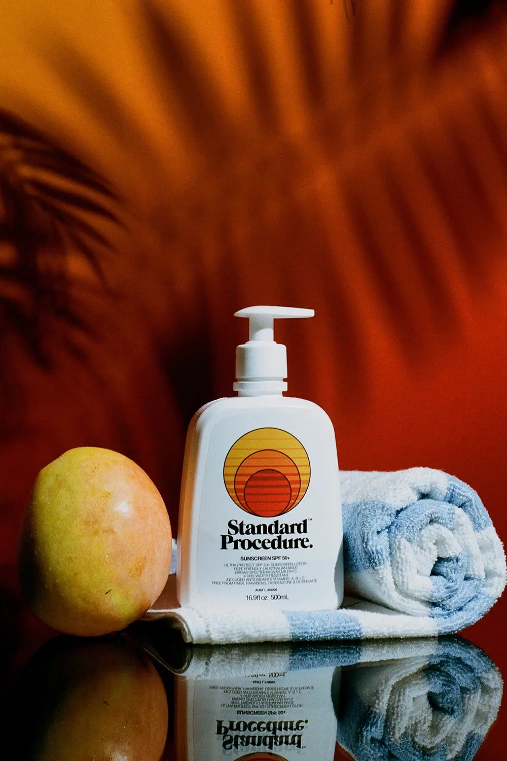
Standard Procedure
White family pump with striped sunset circles and heavy serif

Athletic Brewing
trailhead poster cans under a wheat-stalk monogram
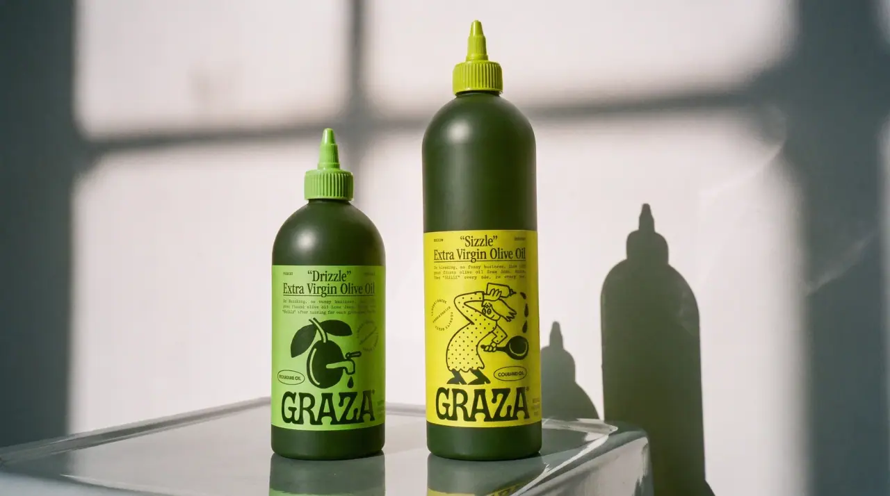
Graza
deli counter comic on bottle green
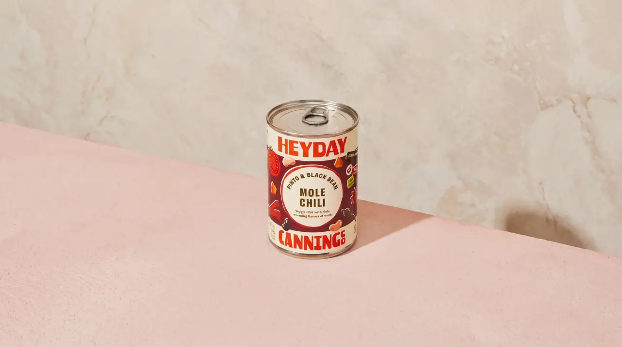
Heyday Canning Co.
saucy pantry tins with a cream band

Homesick
Bold black scent name with a small violet motif

ACURE
Iridescent spectacle with practical, tightly ordered type

AKT
Lilac stage directions with a quiet metallic detail

ARRAN
Festive golden linework on garnet with a grain-textured collar