About this packaging
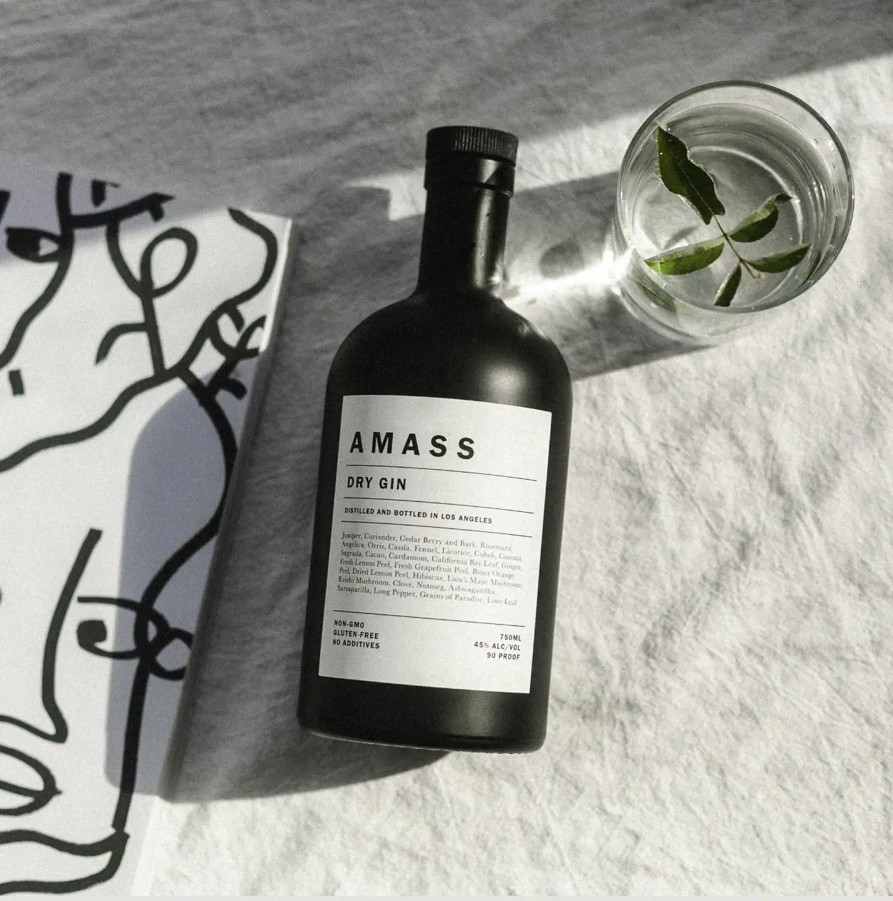
AMASS Dry Gin is presented in a dark bottle with a pale, information-rich main label organised by horizontal rules. The selected still life lets its botanical paragraph and measured typographic hierarchy carry the visual character.
AMASS identifies this as Dry Gin distilled and bottled in Los Angeles. The official product page lists a 750 mL size and 45% alcohol by volume; the selected image shows the bottle’s detailed botanical and product label.[1]
Pack construction & use
- Bottle and closure
- The selected image shows a dark, rounded-shoulder bottle with a dark cylindrical closure. The exact glass specification and closure material are not stated in the official source reviewed.Observed in the reference photograph
- Label information
- The label places AMASS and DRY GIN above a botanical list and separates sections with fine horizontal lines. Lower text includes volume and alcohol information.Observed in the reference photograph
What makes the design work
Editorial analysis of this packaging reference.
Contrast makes dense copy legible
A pale rectangular label stands out against the dark bottle, creating a high-contrast reading surface. Thin rules divide the small botanical and compliance copy into manageable blocks.
Spacing signals the category
Widely spaced AMASS capitals lead, with DRY GIN on its own line underneath. The restrained hierarchy gives the bottle a text-led character rather than relying on large decorative graphics.
The still life extends the botanical list
A glass and herb sprigs sit beside the bottle, while abstract black linework appears at the edge of the composition. These elements frame the gin without obscuring the label details.
Ideas for your next brief
- Use a high-contrast label to support small, information-rich copy on a dark bottle.
- Separate product name, botanical detail and required lower-panel information with consistent rules.
- Let ingredient props add atmosphere without covering label text.
Sources & further reading
Researched 19 October 2026