Photography: AMASS official photography. Images belong to their respective owners.
AMASS

A ruled botanical document on a dark rounded bottle
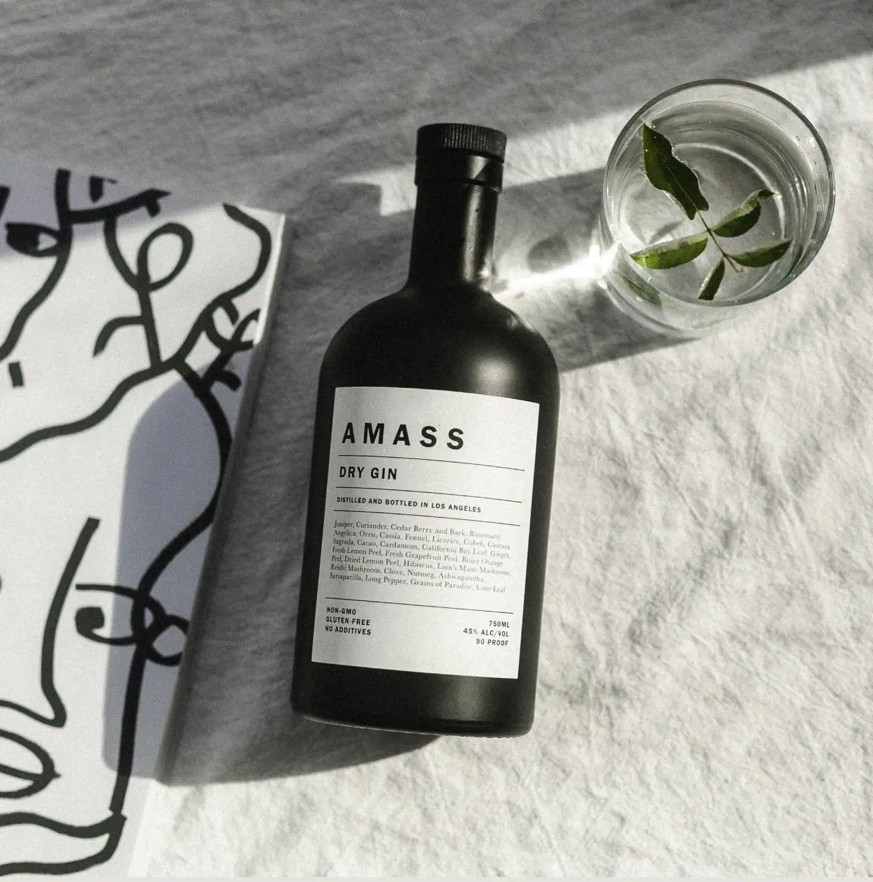
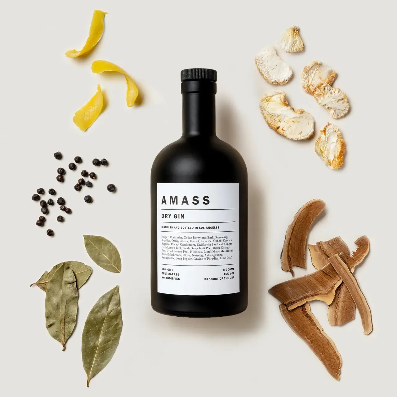
AMASS Dry Gin turns its main label into a small structured document. Spaced black capitals establish the brand, a separate line names the spirit, and fine horizontal rules divide origin information, a botanical paragraph and lower specifications. The pale rectangle sits on a dark rounded-shoulder bottle, giving dense text a clear reading surface. A serif voice in the botanical list softens the otherwise direct sans-serif headings. The selected photograph adds linen, a clear glass with a leaf and abstract linework on a separate prop; none of that illustration appears on the bottle label. This is an analysis of the pictured Dry Gin edition, not a complete AMASS identity manual.
- Wine & spirits
- Light pack
- Apothecary
- Luxe monochrome
About this study
The selected AMASS Dry Gin bottle with visible 750 ml and 45% alc/vol information in the official linen still life. Exact photographed artwork date is unknown. Historic material statements are identified as such; other products and unseen reverse information are not reconstructed.
Sources & evidence · Reviewed 2026-10-19Color Palette
Approximate colours interpreted from photography. These are screen references, not official brand colours or print specifications.
Pack body
Near-black vessel
#1D201A
Approximate dark bottle appearance under the scene's directional light. Highlights reveal curved volume rather than a second intentionally coloured surface.
Label
Warm paper white
#E5E4DA
Approximate pale rectangular label ground. It is distinct from the grey linen around the bottle and is not a verified paper shade.
Ink
Document black
#171A16
Approximate headings, rules and botanical lettering. One dark text colour creates hierarchy through typography and spacing rather than multiple coloured categories.
Typography
Suggested visual alternatives, not confirmed brand typefaces. Any scale below is an illustrative estimate.
The brand name leads in bold widely spaced sans-serif capitals. DRY GIN is smaller and more compact; the origin line becomes smaller again. A multi-line serif paragraph carries botanical detail, with a more literary texture than the short functional headings. At the bottom, small uppercase blocks split claims at left from volume and strength at right. The type changes voice according to information role, while shared alignment and rules keep the face coherent.
Fonts
Identity and heading alternative
Barlow Condensed
- Looks like
- Firm condensed grotesque capitals
- Type
- Condensed sans serif
- Weight
- Semibold to bold
- Case
- Uppercase
- Tracking
- Widely spaced for an original brand; tighter for category headings
- Fallback
- Arial Narrow, Arial, sans-serif
A short fictional brand followed by a distinct product-category line. Use spacing deliberately rather than stretching letterforms to fill the label.
Botanical-text alternative
Source Serif 4
- Looks like
- Readable small editorial serif
- Type
- Text serif
- Weight
- Regular
- Case
- Sentence case with proper ingredient names
- Tracking
- Normal
- Fallback
- Georgia, serif
A genuine, verified botanical description in a new design. Keep enough line spacing that the paragraph is usable at label size, rather than treating it as decorative grey texture.
Specification alternative
Roboto Condensed
- Looks like
- Narrow technical sans serif
- Type
- Condensed sans serif
- Weight
- Regular to medium
- Case
- Uppercase for short specifications
- Tracking
- Slightly open
- Fallback
- Arial Narrow, Arial, sans-serif
Origin and lower factual rows in a fictional system. The primary sans can also serve this role if the layout does not need another family.
Structure & Proportions
Visual proportions and finish previews are illustrative. Confirmed construction details and uncertainties are distinguished in the study notes.
Proportions
| Purpose | Value | Preview |
|---|---|---|
| Label to vessel | The rectangle covers much of the central straight-sided body but leaves a dark border and the rounded shoulders exposed. Its contrast is strong without wrapping every visible surface in white. | — |
| Information rhythm | Shallow heading rows sit above a deeper botanical paragraph. A separated footer gives small facts their own visual ending rather than letting them blend into the list. | — |
| Shape balance | The relatively broad body and rounded shoulders carry more visual mass than the narrow neck. These are qualitative relationships from the photographed angle, not measured bottle dimensions. | — |
Shapes
| Element | Value | Preview |
|---|---|---|
| Primary bottle | Broad straight body with softly rounded shoulders and a narrow upright neck. | |
| Main label | Pale vertical rectangle with straight edges, curving slightly around the bottle surface. | |
| Rule system | Fine horizontal lines divide the label into calm information bands without an enclosing ornamental border. |
Finishes
Dark low-glare finish
Bottle body and shoulders; consistent with the brand's historic matte-finish description, with exact batch specification unverified · matte
Paper-like label surface
Pale front rectangle; visible texture and lighting are insufficient to establish an uncoated paper grade · matte
Formats and materials
| Formats | Dark rounded-shoulder spirits bottle with a narrow neck and dark cylindrical closure |
| Materials | AMASS's dated 2020 bottle article describes bespoke glass with an organic-ink coating; this is historical brand information, not verification of the exact photographed production run., Pale rectangular label visible; fibre content, stock weight and adhesive are not established., Dark closure visible; material and internal sealing construction are unverified. |
| Closures | The dark cylindrical top has a ridged upper edge above a neck-covering section. The bottle is closed. The view does not establish whether an internal stopper, screw thread or separate seal sits beneath that exterior, so no opening mechanism is claimed. |
| Decoration | Black text and thin horizontal rules on a pale rectangle, No visible botanical illustration on the selected label, No verified embossing, foil or spot-gloss treatment |
Front Panel
Schematic reading order. The diagram’s zone heights do not represent measured artwork proportions.
The visible main label is organised like a compact botanical record. Most content aligns left, while the lower specification block aligns toward the right. Rules create discrete stages without turning every item into a separate badge. The lengthy ingredient-oriented paragraph is central to the composition rather than hidden as an afterthought. Its density is deliberate, but readability still depends on real print size and lighting.
| Zone | Content |
|---|---|
| Top identity | Spaced AMASS capitals with a fine rule beneath; the wordmark has room around it rather than filling the rectangle edge to edge. |
| Product row | DRY GIN on its own short line, followed by another horizontal division. |
| Origin row | A compact statement of distillation and bottling location, separated from the botanical paragraph below. |
| Botanical paragraph | Several lines of serif ingredient-oriented text. This study observes the paragraph's role without reproducing an assumed complete or current formula. |
| Lower facts | Small claims at left and visible 750 ml, alcohol and proof information at right. Their position is observed, while claim verification is outside this design review. |
Range System
In Good Co's primary case study describes a brand platform built with room for product and category expansion. This Dry Gin reference shows one way to accommodate that ambition: a stable information grammar can organise a different category name and description without relying on illustrations. This is an interpretation of the selected label, not proof that all AMASS products retain identical type, materials or dimensions.
- Observed Dry Gin: dark vessel, pale ruled rectangle, bold sans-serif identity and serif botanical paragraph.
- Original-design interpretation: retain an orderly sequence of brand, category, origin and verified description while adjusting the amount of space each needs.
- Do not extend historic bottle-finishing statements automatically to current products or unrelated categories.
Back of Pack & Shelf
The selected image shows an information-rich main face, not a documented reverse view. The opposite side is absent. Its density must not be used as evidence that all required information is present here or that the rear is blank.
- Obtain a readable reverse view before locating barcode, warnings and additional production details.
- For new artwork, separate observed hierarchy from jurisdiction-specific content requirements rather than copying the visible footer wholesale.
On shelf
Interpretation: the dark silhouette and pale rectangular face create a strong distant contrast, while the ruled structure rewards closer reading. The large brand is easier to recognise than the small botanical paragraph. This gives the bottle two scales of communication without needing saturated colours. An adaptation should check the paragraph under realistic bar lighting: a large, sharp promotional photograph can make tiny print seem more legible than it is on a physical bottle.
Imagery
The scene uses grey-white linen, a glass containing a leaf and a separate black-line graphic prop. Hard-edged sunlight creates shadows and a bright reflection on the dark shoulder. The contrast between soft fabric and the disciplined label makes the object feel domestic as well as professional. The agency case study explicitly discusses a bottle suited to designed interiors and bar settings. The leaf reinforces botanical context, but it does not identify every ingredient or become a printed label illustration.
Guidelines
Editorial principles for an original design brief, not official brand guidelines.
Do
- Make dense information readable through alignment, spacing and logical divisions.
- Give the product category its own clear row.
- Use a contrasting text voice only when its information role is distinct.
- Leave enough exposed vessel to retain the bottle's silhouette.
- Scope historic material statements to their source date and avoid assuming current equivalence.
Don't
- Do not call the visible main label the rear simply because it contains detailed text.
- Do not copy a botanical list from another edition or assume the recipe never changes.
- Do not identify a stopper mechanism from the exterior cap alone.
- Do not treat linen or line-art props as printed packaging elements.
- Do not present approximate fonts or colours as production specifications.
Sources & evidence
- Dry Gin — AMASS official product pageproduct
- AMASS — In Good Co primary agency case studydesigner
- How to Repurpose Your AMASS Bottles, 5 November 2020 — AMASS Stories archivebrand
How this study was built
structure · Sourced fact
The dated brand article describes bespoke glass and organic-ink coating. That historical statement is not assigned unqualified to every later bottle.How to Repurpose Your AMASS Bottles, 5 November 2020 — AMASS Stories archivelabel · Visual observation
The approved image shows a pale main label split by horizontal rules, with brand, category, origin, botanical paragraph and lower specification zones.Dry Gin — AMASS official product pagetypography · Visual observation
The central botanical paragraph has a serif character, distinct from the sans-serif headings; substitute families are recommendations only.Dry Gin — AMASS official product pageimagery · Sourced fact
The agency positions the package for designed domestic and hospitality interiors, providing context for the official still life's restrained setting.AMASS — In Good Co primary agency case studyrange · Editorial interpretation
The document-like structure suggests adaptability, but this single selected reference does not establish universal layout rules across AMASS.AMASS — In Good Co primary agency case studypalette · Visual observation
The dark bottle, pale label and dark ink form the packaging palette; grey linen and green leaf remain scene elements.Dry Gin — AMASS official product page
What remains unverified
- No exact artwork revision date or manufacturing specification for the photographed bottle was found.
- Label stock, actual fonts, print process and cap construction remain unverified.
- The botanical paragraph is analysed as information design, not transcribed as a complete current formula.
- The opposite face is not visible and the scene's light affects all approximate colours.
Give your AI
packaging taste
Give your design or image tool a packaging study: palette, type, structure, front panel and principles for an original brief.
Export this styleFree with an email. PACK.md works in Claude, ChatGPT, Cursor and image tools.
More like this
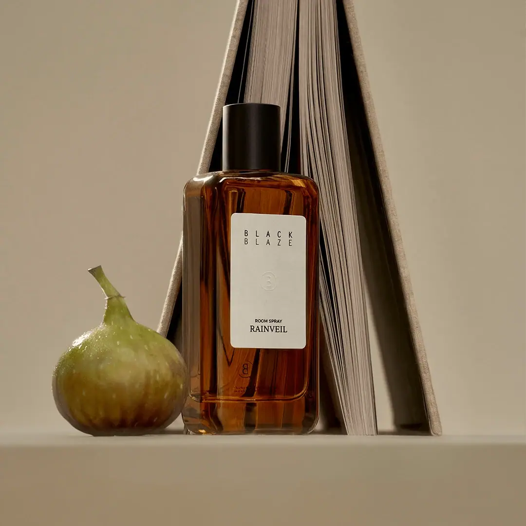
Black Blaze
Warm amber, quiet paper and a deliberate vertical rhythm
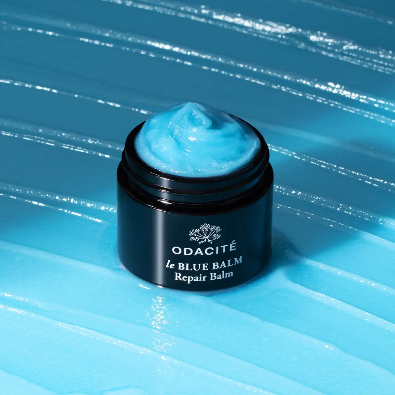
Odacité
Open dark balm jar with white type and blue contents
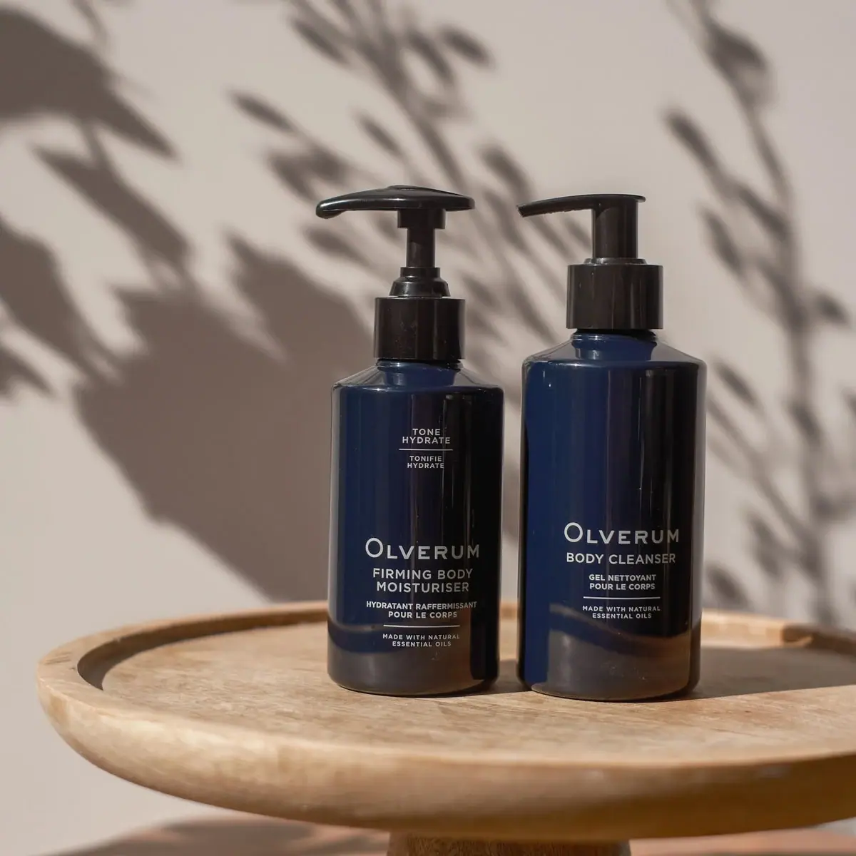
Olverum
Navy bodycare pair with pale centered copy and black pumps
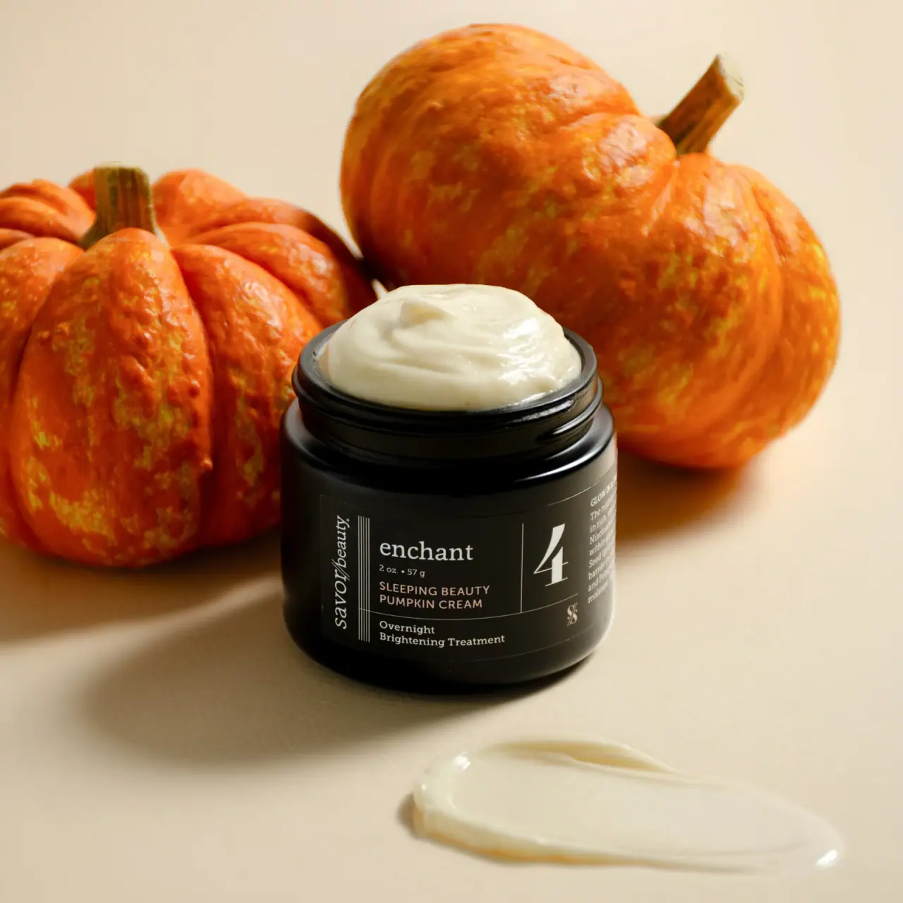
Savor Beauty
Black ruled jar label with vertical maker and routine numeral
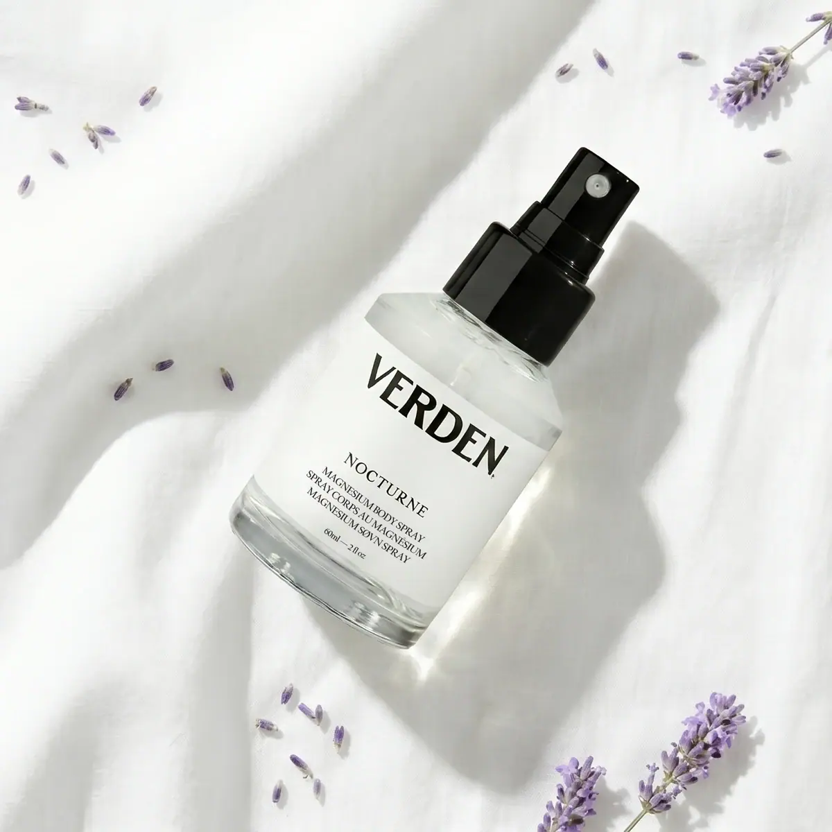
Verden
Bold serif identity on a quiet white spray label
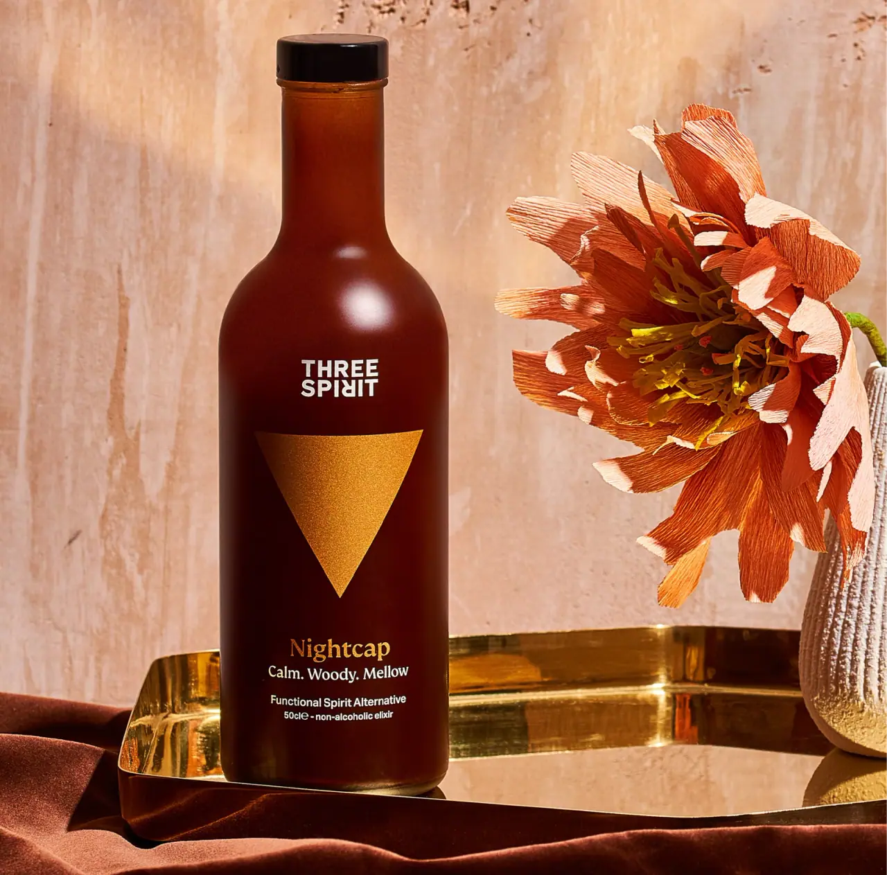
Three Spirit
a warm amber silhouette anchored by one gold triangle

Aerangis
a quiet numbered object, an intimate scent memory

Aesop
a botanical still life around a disciplined apothecary label