About this packaging
Avon’s Wonder fragrance is part of the Today Tomorrow Always collection, where scent naming carries the collection association.
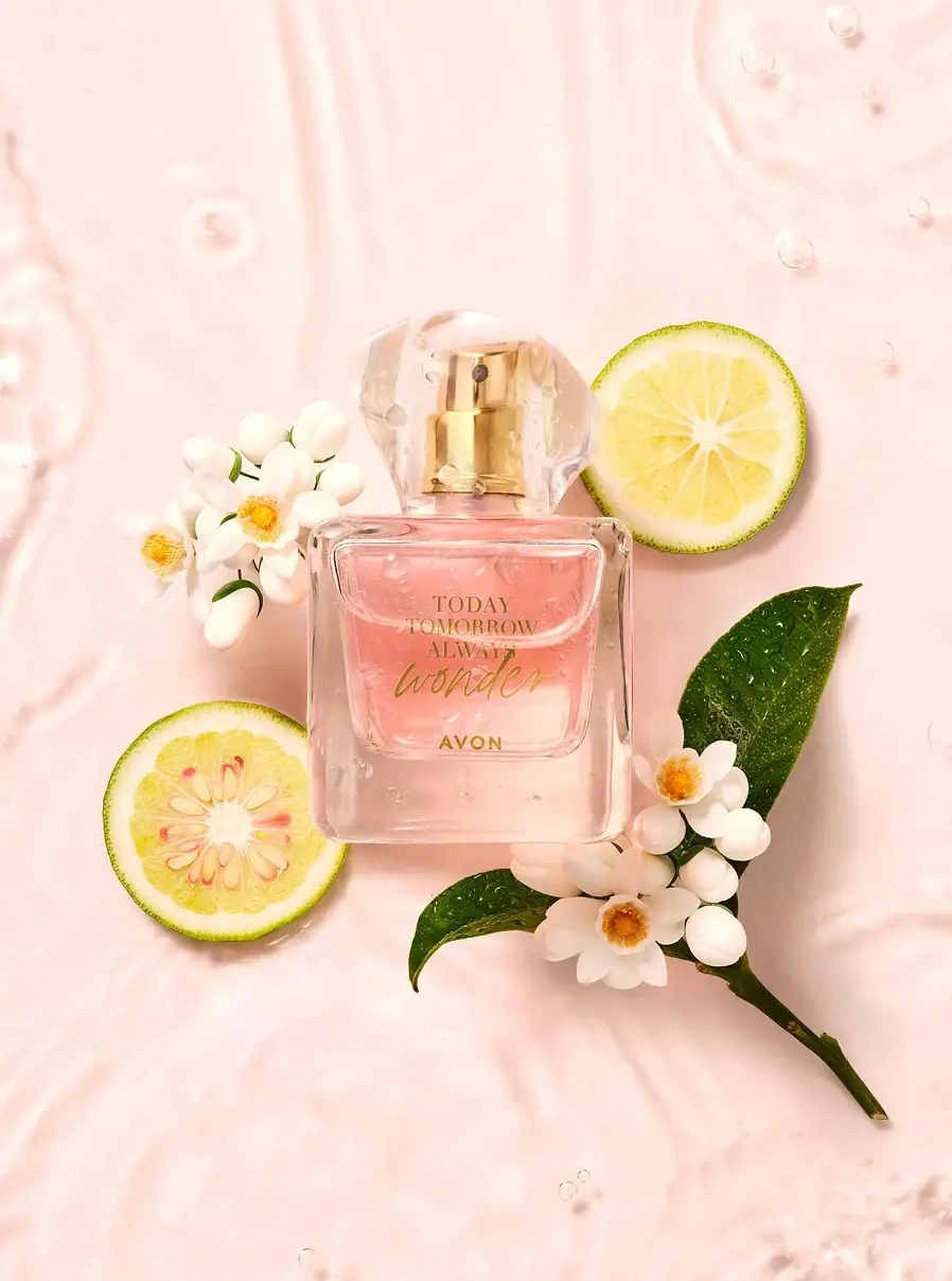
Avon’s official UK listing identifies Wonder Eau de Parfum within the Today Tomorrow Always fragrance line. The selected cover shows its clear flacon and gold front lettering.[1]
Pack construction & use
- Bottle and cap
- The selected cover shows a clear rectangular flacon with rounded corners and a transparent faceted cap. The golden-colored spray assembly can be seen through the cap; this is a visual description rather than a material specification.Observed in the reference photograph
- Front lettering
- Gold-toned TODAY TOMORROW ALWAYS and Wonder lettering appears on the face, with AVON below. Water droplets on the bottle belong to the still-life image.Observed in the reference photograph
What makes the design work
Editorial analysis of this packaging reference.
Gold typography against pale contents
Warm gold lettering harmonizes with the liquid and botanical styling while maintaining visible contrast on the front. Stacking the range name above Wonder leaves the variant name as the strongest read.
Cap facets add structure
The transparent cap uses angled faces that catch highlights and frame the gold actuator. The clear-on-clear arrangement keeps the cap visually light while outlining the closure.
Still-life details support, not replace
Flowers, citrus, leaves, and droplets build a soft fragrance mood around the bottle. The flacon itself still carries the brand and variant, so the campaign scene can be separated from package graphics.
Ideas for your next brief
- Use transparent cap geometry to add shape while keeping spray hardware visible.
- Keep campaign props outside the package identity so botanical cues do not become mistaken for printed artwork.
Sources & further reading
Researched 19 October 2026