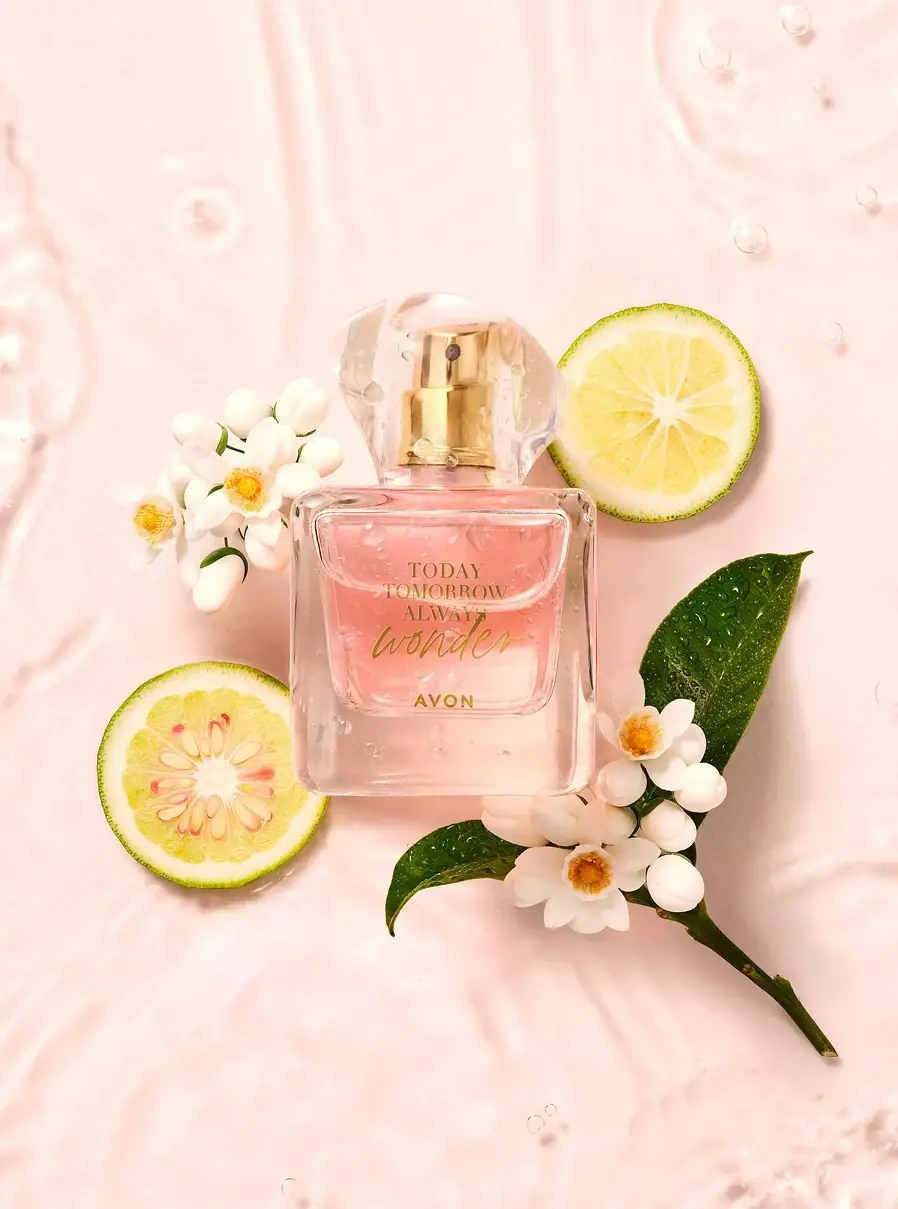
Photography: David Lineton — fragrance still-life photography. Images belong to their respective owners.
Avon

A clear flacon with a warm handwritten heart
The selected Today Tomorrow Always Wonder flacon combines a substantial transparent-looking rectangular body with a broad sculptural clear cap. Gold-tone spray hardware remains visible inside the cap and repeats the warm colour of the front lettering. The collection name is stacked in small serif capitals, while a flowing Wonder signature supplies a more expressive middle line and the compact Avon name anchors the bottom. David Lineton’s wet, pale-pink botanical still life emphasises softness and transparency, but the bottle’s own identity depends on its optical frame, cap shape and contrasting lettering styles.
- Perfume
- Light pack
- Luxe monochrome
About this study
The selected Today Tomorrow Always Wonder flacon in David Lineton’s botanical water still life. Official UK listing is product context; no universal Avon packaging specification is inferred.
Sources & evidence · Reviewed 2026-10-19Color Palette
Approximate colours interpreted from photography. These are screen references, not official brand colours or print specifications.
Pack body
Clear blush appearance
#F2C8BD
Approximate colour seen through the central bottle in this pink-lit scene. The contribution of fragrance, bottle wall and background is not isolated, so this is not a claim that the vessel itself is dyed pink.
Clear edge highlight
#F8E8DD
A near-neutral visual proxy for the bright clear cap and bottle edges. Transparency has no fixed HEX value; this swatch records their pale appearance in the selected setting, not an opaque production finish.
Accent
Warm gold tone
#BC9639
Approximate front-lettering and spray-hardware midtone. These elements look related in colour, but the photograph does not establish identical materials, a foil process or gold plating.
Typography
Suggested visual alternatives, not confirmed brand typefaces. Any scale below is an illustrative estimate.
Three serif uppercase words form a compact collection masthead. The flowing script variant underneath is wider and more expressive, creating a contrast in both rhythm and case. The small uppercase house name sits lower with a separate interval above it. The collection remains readable as a unit because its three lines share a central axis; the script can then act as the emotional accent without taking over the entire front.
Fonts
Collection masthead
Cormorant Garamond
- Looks like
- Cormorant Garamond
- Type
- Serif
- Weight
- Medium 500 / SemiBold 600
- Case
- Uppercase
- Tracking
- Neutral to slightly open
- Fallback
- serif
A proposed option for the three short stacked words. Keep the line spacing compact enough to read as one collection name, while checking the fine strokes at the final print size and against the actual liquid colour.
Expressive variant
Allura
- Looks like
- Allura
- Type
- Script
- Weight
- Regular 400
- Case
- Flowing lower-case or title-case word
- Tracking
- Natural joined spacing
- Fallback
- cursive
An alternative for a short original scent name with a handwritten rhythm. Do not reproduce the Wonder lettering or force joined script into artificial tracking. Limit the script to one clear expressive line.
House-name anchor
Montserrat
- Looks like
- Montserrat
- Type
- Sans serif
- Weight
- Medium 500 / SemiBold 600
- Case
- Uppercase
- Tracking
- Moderate
- Fallback
- sans-serif
Use for a concise fictional producer name below the collection and scent. The simpler letter shapes provide a stable final read after the serif stack and script; no exact Avon wordmark construction is implied.
Structure & Proportions
Visual proportions and finish previews are illustrative. Confirmed construction details and uncertainties are distinguished in the study notes.
Proportions
| Purpose | Value | Preview |
|---|---|---|
| Main body | A broad, nearly square front with softened corners and a pronounced clear lower margin around the inner liquid area. Physical dimensions are not measured from this scene. | — |
| Cap | Wide relative to the neck and visually substantial above the body. Its sculptural outline remains legible because it is not merely a small clear cylinder. | — |
| Front lettering | A centred compact group occupies the upper and middle liquid area, with the house name lower and clear margins around the whole composition. | — |
Shapes
| Element | Value | Preview |
|---|---|---|
| Flacon body | Rounded rectangular silhouette with straight central edges and softened corners. | |
| Clear cap | A broad sculptural form with curved transitions and angled faces; a simplified rounded preview cannot describe its full three-dimensional geometry. | |
| Inner visual area | A smaller rounded-looking cavity is visible within the outer body, creating a frame around the liquid and type. |
Finishes
Clear optical appearance
Bottle perimeter and cap, with material composition unverified. · transparent
Warm reflective accent
Visible spray hardware; gold-tone appearance does not establish solid metal or plating. · metallic
Smooth gloss
Outer bottle surfaces, independent of the added water droplets. · gloss
Formats and materials
| Formats | A closed perfume flacon with a broad rounded rectangular front, visible clear-looking perimeter and substantial lower base. The shoulder leads into a narrow spray neck beneath a wide transparent cap. |
| Materials | The selected view supports a transparent, reflective appearance, but neither the official product listing nor the inspected photographer page supplies a component-level bottle and cap material specification. Glass, polymer and metallic coating composition remain unverified. |
| Closures | The clear cap reveals a gold-coloured spray assembly with a dark nozzle opening. Its outer contour has broad angled or faceted surfaces and rounded transitions, giving it a sculptural shape. No snap fit, magnetic fastening, removable pump or refill system is established. |
| Decoration | The front relies on lettering rather than a large opaque label or printed botanical illustration. The lack of a visible label boundary does not identify the marking process. |
Front Panel
Schematic reading order. The diagram’s zone heights do not represent measured artwork proportions.
The front has no broad contrasting paper panel. Instead, the transparent-looking vessel and pale visible contents form a changing ground for a centred typographic stack. The choice of warm lettering creates tonal harmony, but it also makes legibility dependent on background and lighting.
| Zone | Content |
|---|---|
| Collection stack | Three short serif uppercase lines communicate the collection before the individual scent. Their shared width range and central alignment make a compact architectural block. |
| Script variant | A wider flowing word sits immediately below the collection. It changes the rhythm from formal stacked capitals to a personal-looking signature without adding an illustration. |
| House anchor | The small uppercase producer name is separated below. It remains a clear third information level rather than merging into the end of the script. |
| Optical frame | Clear-looking margins, especially the pronounced lower base, surround the information. Highlights and water droplets are strongest around these edges, leaving the middle comparatively readable. |
Range System
The official UK product page places Wonder in the Today Tomorrow Always collection and lists a 50 ml version. The selected image confirms the collection wording on the bottle. Other members of that collection were not visually audited, so this study does not claim a universal cap, tint or lettering system.
- The observed hierarchy separates collection, individual fragrance and producer. For an original family, this three-level naming structure can remain consistent even when the scent word changes.
- A new variant name should be tested in the script line for length and clarity. The photographed word is short; a much longer name may require a different line break or type treatment rather than simple shrinking.
Back of Pack & Shelf
The image presents the front and cap; reverse text, base marking and carton are not readable or shown.
- The official listing’s 50 ml size is product context, not proof of where quantity appears on this photographed bottle.
- Confirm regulatory text, ingredients and batch-marking locations from the actual artwork before designing a reverse.
- Do not infer an outer carton finish or refill instructions from a bare-flacon campaign image.
On shelf
The cap silhouette and clear lower frame may remain recognisable before the fine gold-tone lettering is readable. The serif-to-script change then gives the front a distinct visual rhythm at closer range. This is an interpretation of the selected presentation, not a shelf-performance result. A darker or busier background could reduce contrast through the transparent body, so a packaging review should include neutral packshots as well as the favourable pale campaign setting.
Imagery
The bottle lies in a pale pink watery setting with citrus slices, white blossoms and dark green leaves arranged diagonally around it. Ripples and droplets add movement while the front typography stays near the centre of the composition. The clear cap reveals the spray hardware rather than becoming a separate opaque colour block. David Lineton’s project page contains the Wonder images, supporting the photographic provenance. The props resonate with the official fragrance story, but they are not an ingredient declaration or printed package graphics; exact botanical species need not be inferred from the photograph.
Guidelines
Editorial principles for an original design brief, not official brand guidelines.
Do
- Keep collection, variant and producer as three readable levels with distinct typographic roles.
- Use the cap’s transparency to compose the visible hardware intentionally.
- Check lettering contrast against several realistic backgrounds and liquid fill levels.
- Document droplets and botanical props as photographic styling rather than physical packaging specifications.
Don't
- Do not reproduce the original three-line collection name, script signature or producer wordmark in a fictional concept.
- Do not identify glass, acrylic, gold plating or foil from appearance alone.
- Do not flatten the broad clear cap into a generic narrow cylinder when studying the selected silhouette.
- Do not treat the pink scene as proof of tinted bottle material or a fixed fragrance colour.
Sources & evidence
- Wonder Eau de Parfum — Avon UKproduct
- David Lineton — Avon fragrance still lifephotographer
How this study was built
edition · Sourced fact
Avon identifies Wonder as part of Today Tomorrow Always and lists a 50 ml version.Wonder Eau de Parfum — Avon UKimagery · Sourced fact
The photographer’s Avon project includes the matching Wonder botanical-water image.David Lineton — Avon fragrance still lifestructure · Visual observation
Rounded rectangular transparent-looking flacon and broad clear cap expose gold-tone spray hardware.typography · Visual observation
Serif collection stack, flowing script variant and small sans-serif producer form separate levels.palette · Visual observation
Warm gold-tone accents contrast with a pale blush optical ground; tint origin is not established.label · Visual observation
Sparse front lettering appears without a broad opaque label field.range · Editorial interpretation
The three-level naming system is transferable guidance, not a verified rule for all collection members.
What remains unverified
- Bottle and cap substrates, decoration method and hardware finish are not specified by the inspected sources.
- Pink appearance cannot be separated into liquid, material and reflected scene contributions.
- Cap fastening, reverse, base marking and outer carton are not inspected.
- Fonts, colour references and proportions are visual alternatives or qualitative estimates.
Give your AI
packaging taste
Give your design or image tool a packaging study: palette, type, structure, front panel and principles for an original brief.
Export this styleFree with an email. PACK.md works in Claude, ChatGPT, Cursor and image tools.
More like this

Aerangis
a quiet numbered object, an intimate scent memory

Akro
soft pink interrupted by an assertive black signature

Alexander McQueen
An oval flacon crowned with dense black relief

Arquiste
blush transparency, white lettering and a stepped gold cap
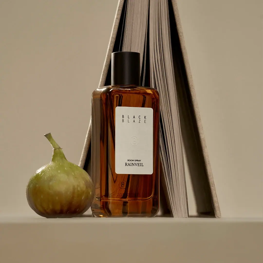
Black Blaze
Warm amber, quiet paper and a deliberate vertical rhythm
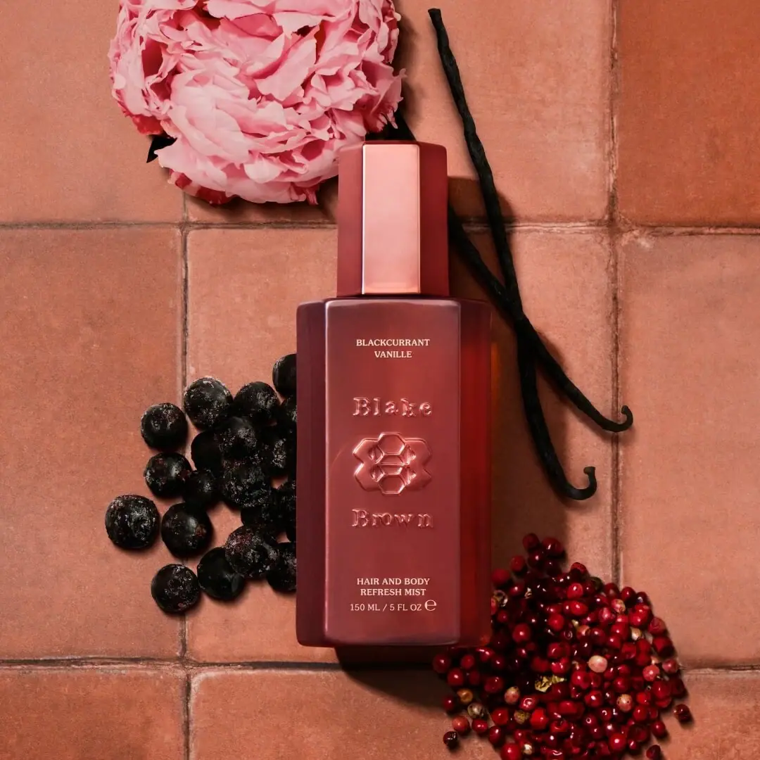
Blake Brown
sculptural rose-brown fragrance with a jewel-like centre
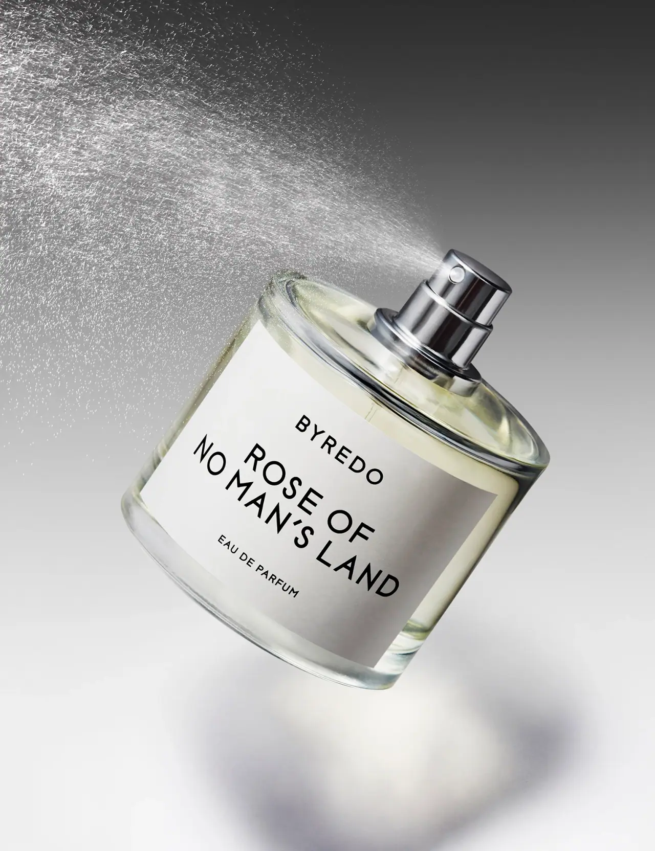
Byredo
Broad white fragrance label, clear round bottle, exposed silver atomizer

Chabaud
A framed perfume label beneath a clear architectural cap