About this packaging
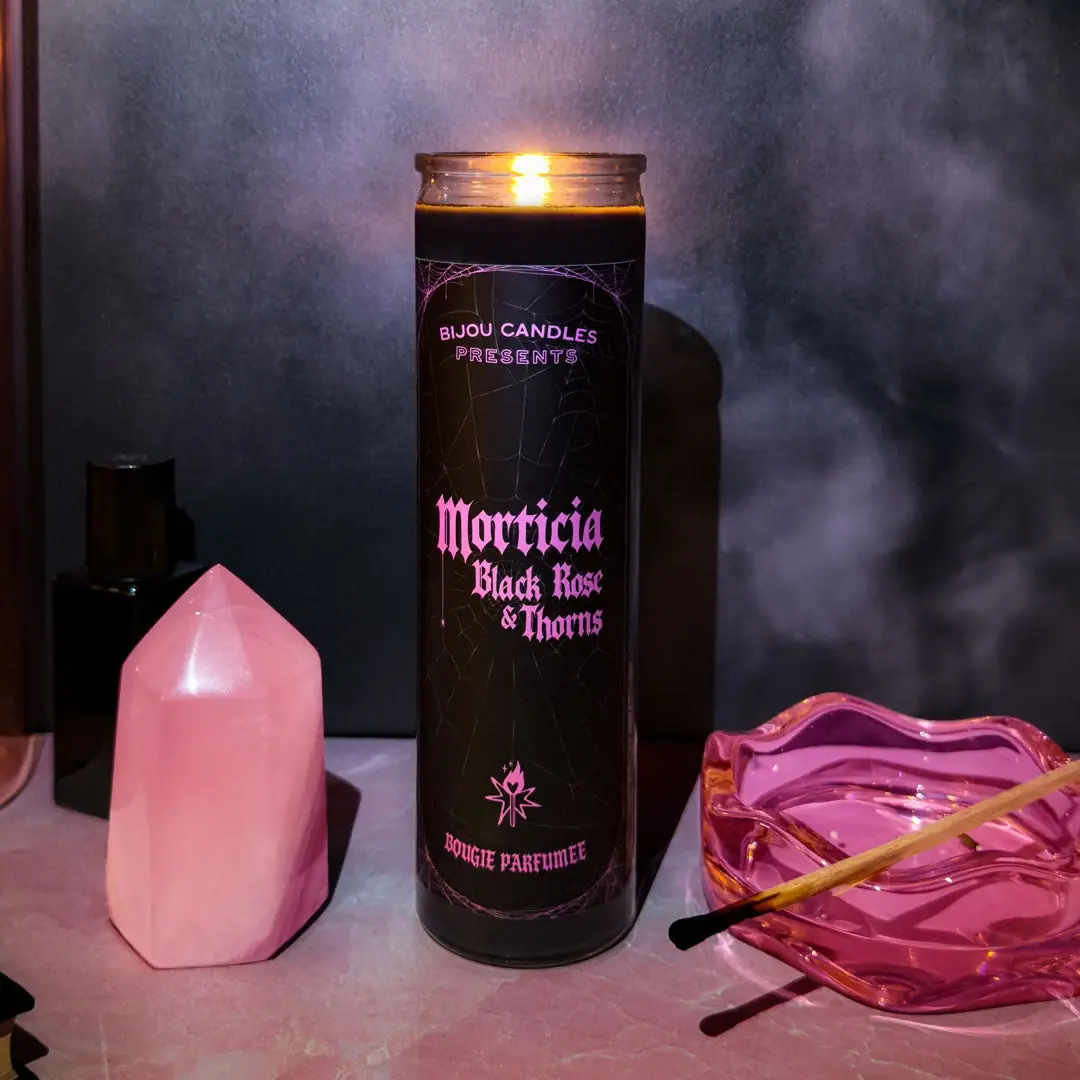
Bijou’s Morticia candle uses a long black label, vivid pink blackletter and a fine spiderweb frame to turn a fragrance name into a gothic title card.
Bijou Candles presents Morticia • Black Rose & Thorns as a tall candle inspired by Morticia Addams. The brand describes its candles as hand-poured soy candles.[1]
Pack construction & use
- Vessel and label
- The cover shows a tall cylindrical candle with a black wraparound label.Observed in the reference photograph
- Label illustration and type
- Bright pink blackletter dominates the title; fine spiderweb lines frame the label above and below.Observed in the reference photograph
What makes the design work
Editorial analysis of this packaging reference.
Type as character
Bright pink blackletter gives Morticia the strongest emphasis and helps the candle borrow the visual language of a gothic title card.
Web frame
Fine spiderweb lines sit at the top and bottom of the black label, adding theme while preserving an open central area for the name.
Tall label field
A long vertical label accommodates the stacked scent title and supporting lines without breaking the candle’s slim profile.
Ideas for your next brief
- Use a distinctive display face for the central name, then keep supporting text in simpler styles.
- Frame an elongated label at its edges to make room for a long title in the center.
Sources & further reading
Researched 19 October 2026