Photography: Bijou Candles official photography. Images belong to their respective owners.
Bijou Candles

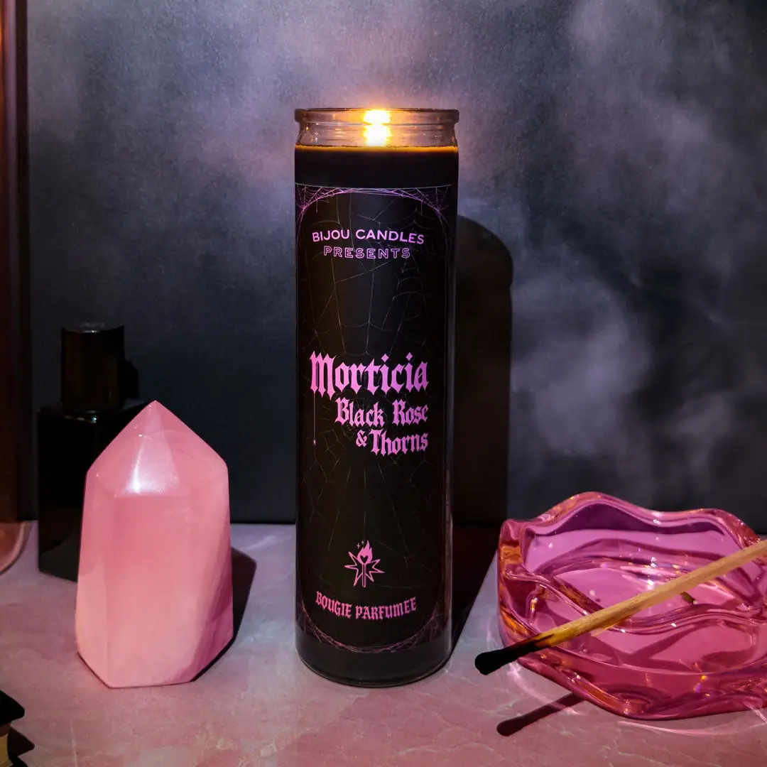
Pink blackletter and fine webs on a tall dark candle
Bijou's Morticia candle reads like a miniature gothic title card. A small maker-and-presents header opens the long black front field, followed by the large pink Morticia name and a closely stacked Black Rose & Thorns scent title. Fine spiderweb lines continue behind these words, becoming more noticeable around the upper and lower boundaries. A small flame-like emblem and French product wording close the composition. The selected image shows the candle lit, so its warm flame adds a temporary colour above an otherwise dark vessel. This study concerns this specific tall-format artwork, not an assumed template for every Bijou candle.
- Candles & home scent
- Dark pack
- Bold typographic
- Heritage label
About this study
The approved lit Morticia Black Rose & Thorns tall-candle photograph. Other Vamps artwork, previous editions, exact size and unseen retail closures are outside the visual scope.
Sources & evidence · Reviewed 2026-10-19Color Palette
Approximate colours interpreted from photography. These are screen references, not official brand colours or print specifications.
Label
Black title-card ground
#111014
Approximate deep front field, creating a continuous dark stage for the pink words and faint web drawing. The underlying wax is also dark, but exact vessel colouring is not established here.
Ink
Vivid orchid pink
#E375C8
Approximate title, header and lower emblem colour. It is visually bright against black; fluorescent ink, foil or light emission is not verified.
Subdued web grey
#51484F
Approximate low-contrast inner web lines. Their restraint lets the pink type lead while the theme remains present through the empty areas.
Typography
Suggested visual alternatives, not confirmed brand typefaces. Any scale below is an illustrative estimate.
The top line names Bijou Candles in relatively plain uppercase sans lettering, with an outlined PRESENTS beneath it. The central Morticia name switches to a much heavier blackletter voice. Black Rose and & Thorns continue that voice on smaller stacked lines, so the scent pairing shares the character of the name instead of becoming a neutral footnote. A small lower emblem precedes BOUGIE PARFUMÉE in condensed gothic-looking capitals. The strongest contrast is therefore between a restrained introductory header and the dramatic central title.
Fonts
Original gothic title alternative
Pirata One
- Looks like
- Heavy narrow blackletter
- Type
- Blackletter display
- Weight
- Regular
- Case
- Title case for a short fictional name
- Tracking
- Tight but optically adjusted
- Fallback
- Georgia, serif
A possible dramatic centrepiece for an original label. Test the scent line separately so narrow counters and sharp joins remain readable rather than copying Morticia's exact letter shapes.
Presenter-header alternative
Montserrat
- Looks like
- Plain compact uppercase sans serif
- Type
- Sans serif
- Weight
- Medium, Semibold
- Case
- Uppercase
- Tracking
- Gently open
- Fallback
- Arial, sans-serif
Keep the small maker introduction clear and secondary. A restrained sans voice gives the central blackletter room to perform without making every line equally ornate.
Structure & Proportions
Visual proportions and finish previews are illustrative. Confirmed construction details and uncertainties are distinguished in the study notes.
Proportions
| Purpose | Value | Preview |
|---|---|---|
| Tall format | The vessel's height is several times its width, creating enough vertical space for separated header, title and footer. This is a visual relationship, not a physical dimension. | — |
| Title placement | The main name sits around the middle of the dark field, with a generous patterned interval above it. The lower emblem is also separated from the scent lines by dark space. | — |
| Graphic coverage | The front artwork spans most of the visible wall height while leaving narrow rim and base areas exposed. Its full circumference and rear seam cannot be seen. | — |
Shapes
| Element | Value | Preview |
|---|---|---|
| Vessel | Slim straight cylinder with a slightly projecting circular rim and rounded lower edge. | |
| Front field | Tall rectangular artwork area following the curved wall, with rounded web arcs framing its ends. | |
| Web structure | Fine irregular radial and connecting lines, denser and brighter near the upper and lower boundaries. | |
| Lower emblem | Small angular flame-and-star-like graphic, treated as distinctive artwork rather than reconstructed geometry. |
Finishes
Quiet dark artwork ground
The long label-like front field; exact coating or stock is not confirmed · matte
Reflective exposed rim
Top and lower vessel edges; no frosted-glass specification is established from the consulted primary text · gloss
Formats and materials
| Formats | Tall narrow cylindrical candle vessel, shown open and lit, Long dark front artwork field following the curved wall |
| Materials | The transparent-looking rim and base suggest a glass vessel, but its exact material specification, treatment and supplier were not confirmed in the reviewed primary text., The official indexed product listing identifies black soy wax and a cotton wick; those product declarations do not establish the vessel's own colour or coating., The front has a label-like dark field, but label stock, adhesive and any direct-print process are unverified. |
| Closures | The selected candle is in use with an exposed flame and no visible lid, dust cover or carton. The clear-looking top rim projects slightly beyond the wall. This edge does not establish a screw closure or supplied accessory. No retail closure construction should be invented from the lit presentation. |
| Decoration | Pink blackletter name and scent pairing, Fine web drawing behind the type and brighter web arcs at the borders, Small upper presenter credit and lower flame-like emblem; no portrait or literal rose illustration is visible |
Front Panel
Schematic reading order. The diagram’s zone heights do not represent measured artwork proportions.
The layout borrows the sequence of a presentation card: maker introduction, central title, secondary scent lines, then a small closing emblem and product category. All sit on one vertical axis. Fine webs connect the otherwise separated zones but remain subdued behind the central name. The border is not a heavy solid box; it emerges from denser web lines near the ends. That choice preserves the tall slender feel while giving the composition a recognisable thematic enclosure.
| Zone | Content |
|---|---|
| Top introduction | BIJOU CANDLES above an outlined PRESENTS line, set apart from the main name by a large dark interval. |
| Central name | Morticia in the largest pink blackletter, giving the candle its character-led identity. |
| Scent pairing | Black Rose and & Thorns in smaller stacked blackletter lines directly beneath the name. |
| Lower signature | Small pink flame-like emblem above French scented-candle wording, separated from the title by another dark interval. |
| Background and edges | Low-contrast webs continue through the field, with brighter curved web sections near top and bottom. |
Range System
The official homepage and indexed Vamps set listing group Morticia with Elvira and Vampira. That verifies a named product family and a shared pop-culture framing, not identical artwork on every member. Only Morticia's cover was visually analysed here. The scent title and character inspiration remain distinct: the first helps describe fragrance, while the second supplies the narrative theme.
- Observed: the maker's presenter line sets up Morticia as a central title, with scent information directly attached below.
- Sourced family context: Morticia belongs to the Vamps grouping with two other named candles.
- Original-design interpretation: preserve a consistent information sequence while giving each fictional scent its own independent ornament and display lettering rhythm.
Back of Pack & Shelf
The reverse and underside are not visible, so no warning-label, wax-weight or barcode placement is documented. The French category line on the front is not the full product-information system. No outer retail package is shown.
- Inspect the base and rear before recording actual safety or care-copy placement.
- Do not infer full wrap coverage merely because the front field curves with the vessel.
- For a new candle, reserve a clear information area separate from the theatrical title treatment.
On shelf
Interpretation: blackletter supplies immediate character while the vivid pink prevents the dark package from becoming visually inert. The presenter header gives a reason for the central title to feel theatrical rather than purely decorative. At close range, the scent pairing is prominent enough to remain part of the main read. Fine web lines may disappear in small thumbnails or low light, so the design's recognition rests primarily on the name, pink contrast and tall form.
Imagery
The lit candle stands between a pink faceted stone and a pink glass dish carrying a used match. A dark bottle and reflective frame sit farther back. The props extend the label's pink into the scene while a violet-grey background sustains the gothic atmosphere. The flame creates a small warm highlight at the rim, distinct from the permanent printed palette. The stone's facets, glass dish ripples and background shadows should not be interpreted as physical features of the candle vessel.
Guidelines
Editorial principles for an original design brief, not official brand guidelines.
Do
- Give decorative type a clear hierarchy rather than equal weight everywhere.
- Separate a narrative name from a readable scent description.
- Keep background linework quieter than the title.
- Use the tall format to create pauses between information groups.
- Distinguish temporary flame colour from permanent package graphics.
Don't
- Do not assume bright pink means fluorescent or metallic ink.
- Do not describe the webs as confined only to the outer edges.
- Do not transfer customer-review vessel claims into verified specifications.
- Do not copy the character name, brand emblem or exact web composition for an original product.
Sources & evidence
- Bijou Candles official homepage — Morticia and Vamps contextbrand
- Morticia Black Rose & Thorns Tall Candle — indexed official listingproduct
- Vamps Tall Candle Set — indexed official family listingproduct
How this study was built
edition · Sourced fact
Official listings identify Morticia, its scent pairing and character inspiration; the selected cover shows the tall format.Bijou Candles official homepage — Morticia and Vamps context · Morticia Black Rose & Thorns Tall Candle — indexed official listingstructure · Sourced fact
Indexed product text identifies black soy wax and a cotton wick, but does not supply a verified vessel specification used here.Morticia Black Rose & Thorns Tall Candle — indexed official listingtypography · Visual observation
A plain uppercase presenter header contrasts with the larger central blackletter name and smaller blackletter scent lines.Morticia Black Rose & Thorns Tall Candle — indexed official listinglabel · Visual observation
Subdued webs run behind the text, with brighter arcs near the boundaries and a separate closing emblem below.Morticia Black Rose & Thorns Tall Candle — indexed official listingrange · Sourced fact
The Vamps listing groups Morticia with Elvira and Vampira without establishing identical label specifications.Vamps Tall Candle Set — indexed official family listingimagery · Editorial interpretation
Pink props reinforce the graphic accent, while the flame's warm glow is temporary rather than a printed colour.Morticia Black Rose & Thorns Tall Candle — indexed official listing
What remains unverified
- Direct product and set opens returned cache misses; their indexed official text was accessible and is explicitly distinguished from a full page open.
- Exact vessel material specification, label stock, print process and font identities remain unverified.
- The reverse, base markings and any lid or carton are absent.
- Warm flame and coloured props affect photographic colour; no fluorescence or special ink process is inferred.
Give your AI
packaging taste
Give your design or image tool a packaging study: palette, type, structure, front panel and principles for an original brief.
Export this styleFree with an email. PACK.md works in Claude, ChatGPT, Cursor and image tools.
More like this
La Belle Mèche
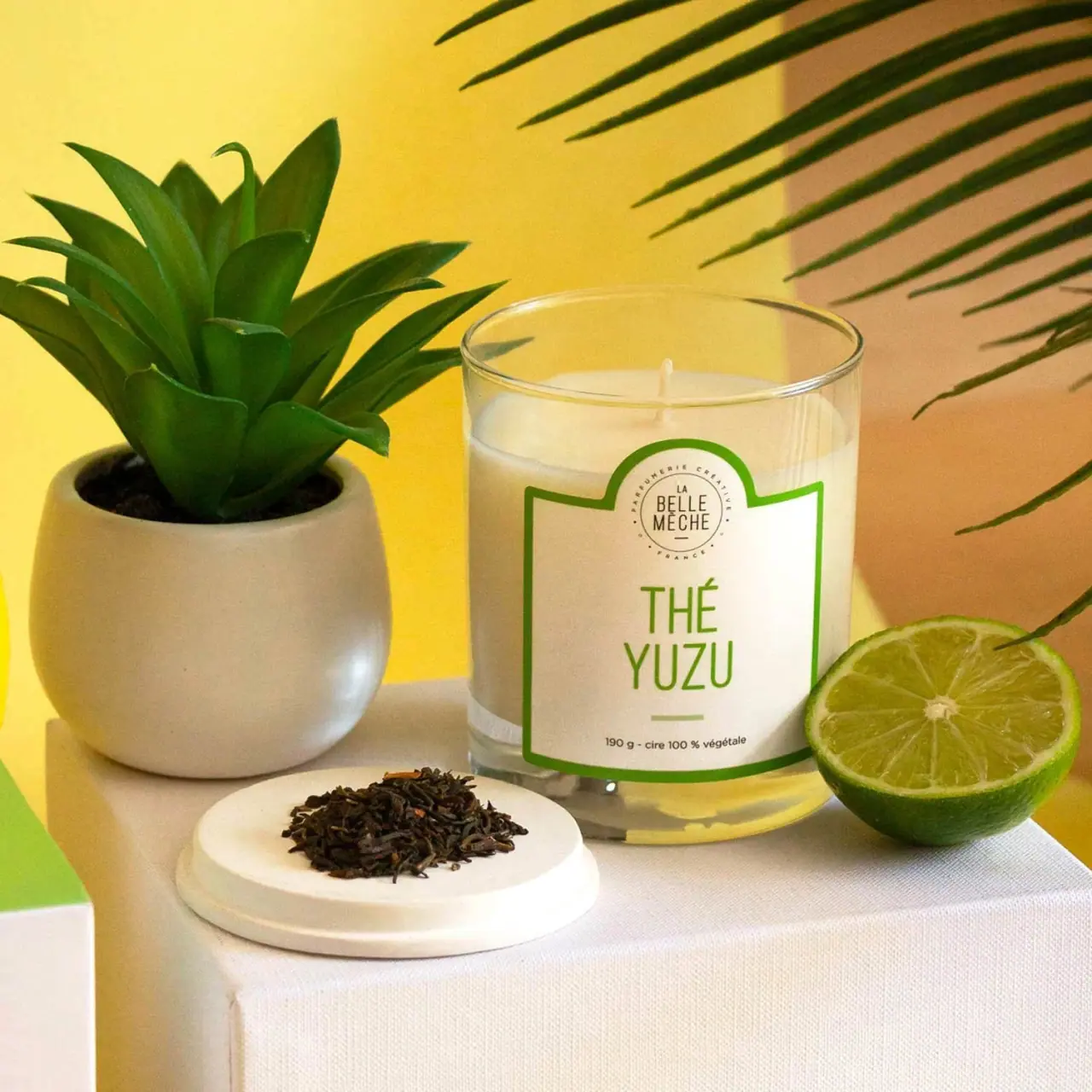
Green scent lettering inside an arched white candle label

Black Girl Sunscreen
Cream tube with gold crest and an isolated SPF numeral

COOLA
Turquoise cylinder, cropped rosettes, vertical brand and fragrance attribution

Coppertone
Blue fields, a yellow sun and a clear number

Dr. Bronner’s
A bright soap wrapper with a densely ordered voice
ICONIC London
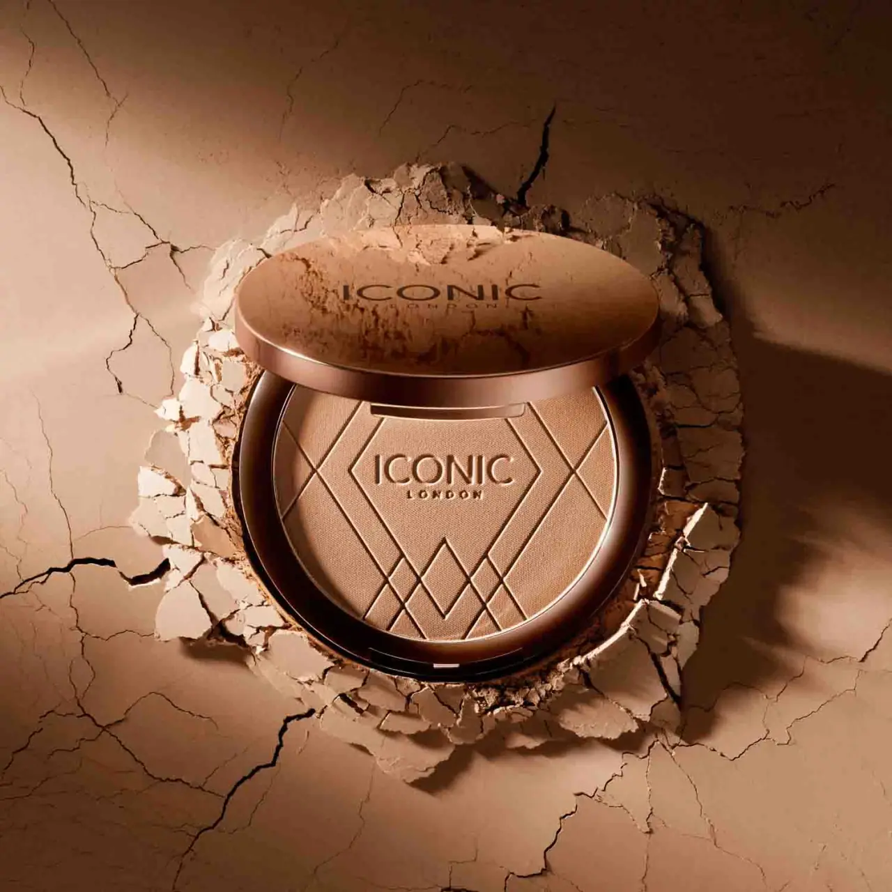
Geometric powder relief inside a warm reflective round compact

Kettle & Fire
farmhouse animal badges on black cartons
L:A Bruket
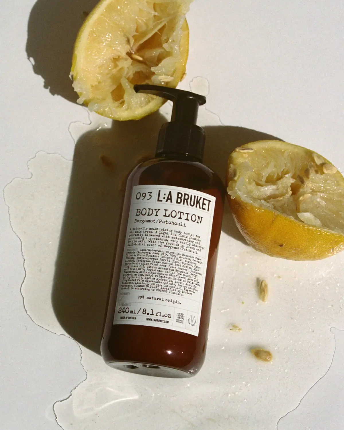
Amber pump bottle with a ruled typographic information label