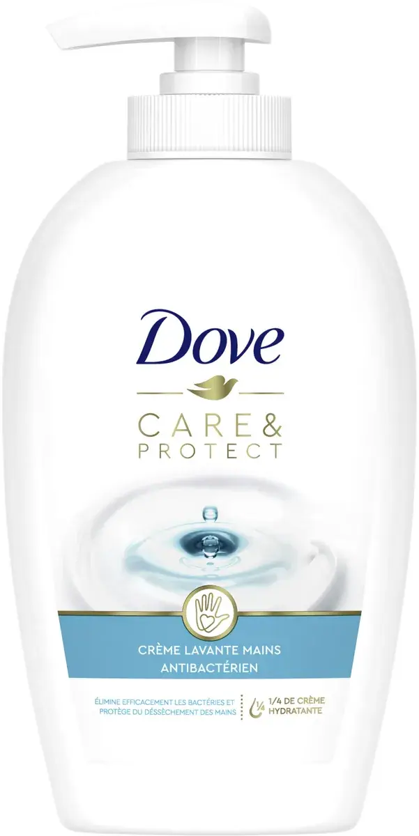
DOVE Care & Protect Crème Lavante Pompe Antibactérienne 250ml
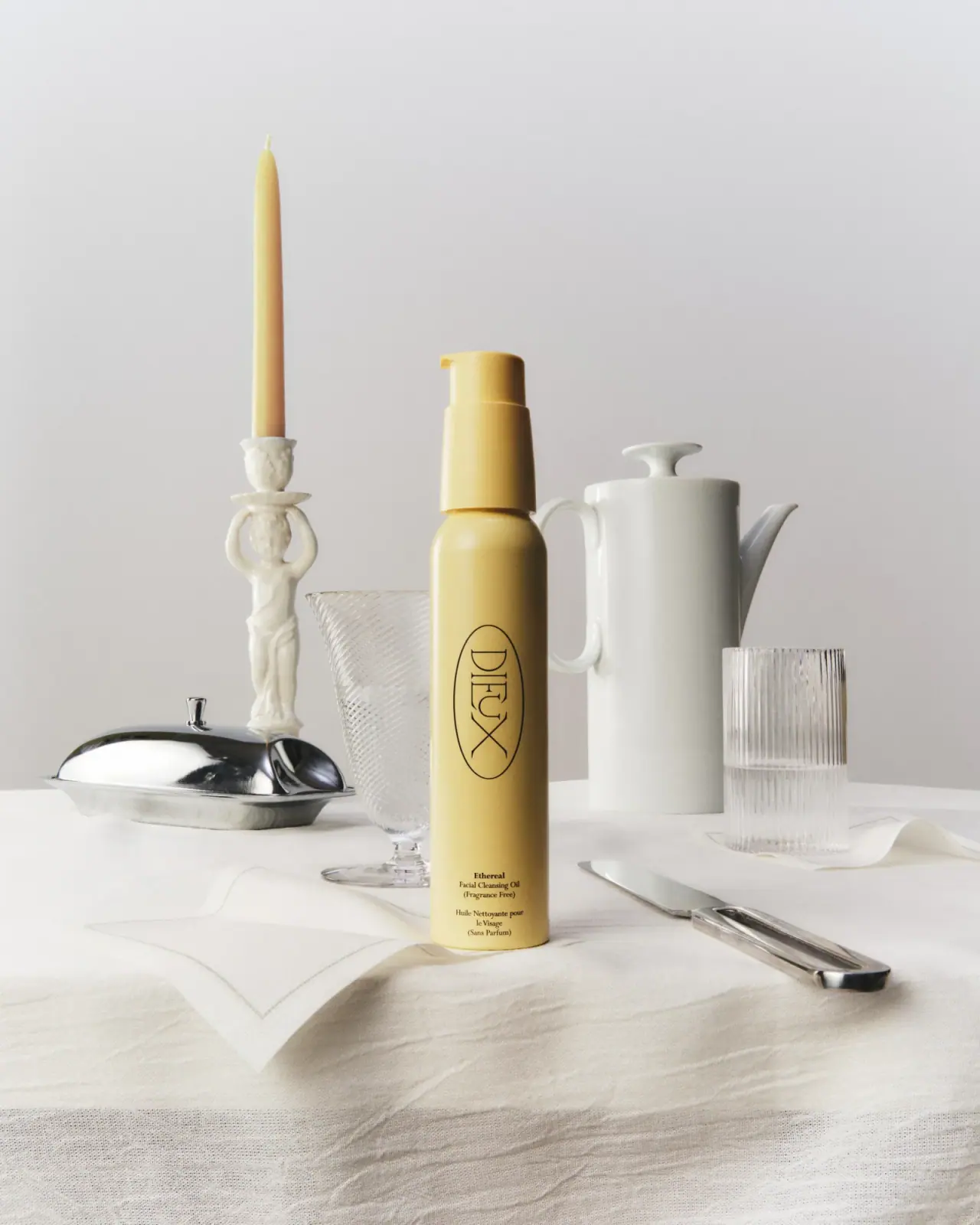
Photography: Open Beauty Facts · CC BY-SA. All imagery belongs to its respective owner.
What makes the design work
Dove brand studyVisual observations across the brand’s packaging. Individual formats and editions may vary.
Script and dove lockup
Navy calligraphic script at about 45% of front width with a small gold dove centred under it, in the upper third.
Lowercase product name
One or two words in a light humanist sans at about 4% of pack height, often mixing light and regular weights.
Cream ribbon
Grey-white rendered swirl of cream crossing the lower half, about a quarter of the front height.
Reading the label
Centred stack on white: script and dove, lowercase product name, cream ribbon, base band or callout.
- Top
- Navy script wordmark and gold dove
- Middle
- Lowercase product name, short benefit line, cream ribbon or ingredient render
- Bottom
- Navy band or gold callout ('moisturising cream'), volume, duration figure
Typography & hierarchy
Script wordmark first, centred in the upper third with the gold dove directly below. The product name follows in a large light lowercase sans, then a one-line benefit in small regular sans, then a small gold callout near the base. Duration and percentage figures (48h, 0%) are set large in thin navy beside small stacked labels.
Display
Custom calligraphic italic script; close to Kaufmann Bold or Courgette
Upright connected calligraphic script with thick-thin strokes
Title case · Regular, drawn heavier
Headline
Gill Sans Light, Dove Sans
Light humanist sans
Lowercase · Light, Regular
Numeral
Gill Sans Light numerals
Thin humanist sans figures
Figures with a symbol · Hairline, Light
Typeface suggestions based on visual similarity. These are not verified font identifications.
How the range holds together
One white base with navy and gold; variants are coded by cap colour, a thin colour band or the tint of the ingredient image, never by changing the body colour.
Shelf presence
On shelf the range reads as a white wall broken only by navy scripts and small cap colours, so the brand blocks by whiteness and the gold dove rather than by colour.
Related packaging
More curated references in skincare, matched by format and visual style.