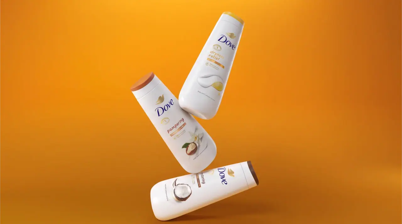
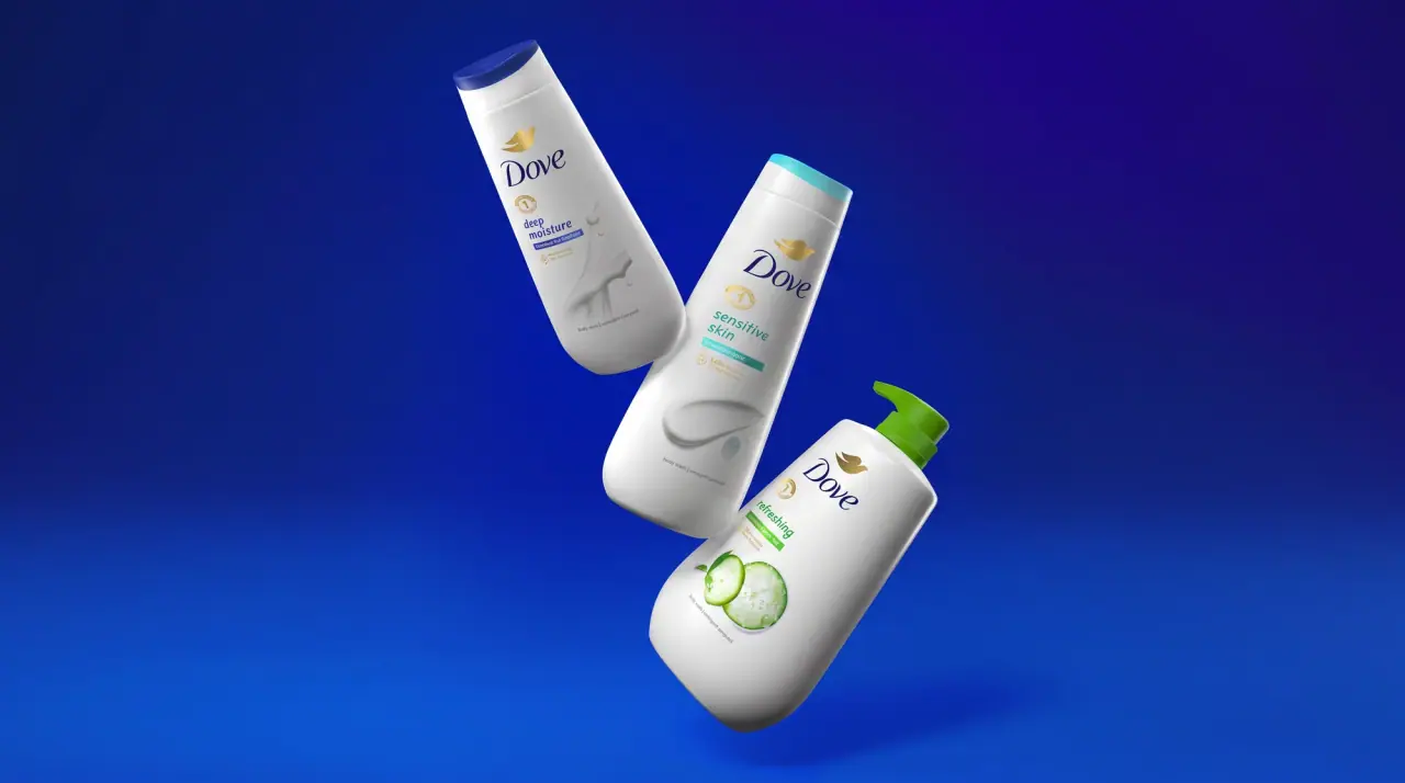
Images from the packaging case study by forceMAJEURE / Lonsdale
Dove

milk-white curves with a gold dove and navy script
Dove keeps almost every pack white (#f7f7f5) with soft, rounded, waisted shapes, and centres a navy (#1d2463) calligraphic script wordmark above a small gold (#c3a24f) dove symbol near the top of the front. The product name follows in a light lowercase humanist sans, sometimes split into two weights ('caring bath'), then a short benefit line, a gold drop-shaped 'moisturising cream' callout and large thin figures such as 48h or 0%. A soft grey-white ribbon of cream or an ingredient render sweeps across the lower front. Variants are coded by cap colour (navy, blush, lilac, aqua), a thin coloured band or the tint of the ingredient image, while the white body, navy script and gold dove never move.
- Body & bath
- Light pack
- Pastel soft-touch
- Colour-coded range
Color Palette
Approximate colours interpreted from photography. These are screen references, not official brand colours or print specifications.
Pack body
Cream White
#f7f7f5
White bodies of bars, bottles, jars, tubes, sticks and aerosols
Label
Band Navy
#1f2a6b
Solid band on bar cartons, body-cream jar lids, hand-cream tubes and the large dove on body love packs
Ink
Script Navy
#1d2463
Script wordmark, product names, benefit lines and figures like 48h
Accent
Dove Gold
#c3a24f
Small dove symbol under the wordmark and the 'moisturising cream' drop callout
Cream Swirl
#e6e6e3
Grey-white shading of the cream ribbon image across the lower front
Range coding
Original Blue
#2d3f9a
Domed cap on original deodorant sticks and roll-ons
Powder Blush
#f2c4c4
Cap and product-name tint on powder soft and invisible care deodorants
Lilac Cap
#b7a8d8
Cap and text band on the relaxing lavender body wash
Sensitive Aqua
#8fcfc9
Base and accent band on sensitive roll-ons and hypoallergenic washes
Reviving Red
#c8344a
Cap and product-name ink on the pomegranate body wash
Typography
Suggested visual alternatives, not confirmed brand typefaces. Any scale below is an illustrative estimate.
Script wordmark first, centred in the upper third with the gold dove directly below. The product name follows in a large light lowercase sans, then a one-line benefit in small regular sans, then a small gold callout near the base. Duration and percentage figures (48h, 0%) are set large in thin navy beside small stacked labels.
Type scale
Estimated cap size as a share of the panel · Front of the 250 ml body wash bottle, about 180 mm tall
wordmark
9% · Regular · Display
Swan
claim-figure
6% · Hairline · Numeral
0%
product-name
4% · Light · Headline
caring bath
variant
2.4% · Regular · Headline
shea butter with warm vanilla
band-copy
2% · Regular · Body
deep moisture for soft skin
callout
1.4% · Bold · Body
MOISTURISING CREAM
Fonts
Display
Courgette
- Looks like
- Custom calligraphic italic script; close to Kaufmann Bold or Courgette
- Type
- Upright connected calligraphic script with thick-thin strokes
- Weight
- Regular, drawn heavier
- Case
- Title case
- Tracking
- Normal
- Fallback
- Brush Script MT, Georgia Italic, serif
The wordmark only, always Script Navy and always paired with the small gold dove centred beneath it.
Headline
Lato
- Looks like
- Gill Sans Light, Dove Sans
- Type
- Light humanist sans
- Weight
- Light, Regular
- Case
- Lowercase
- Tracking
- Slightly open, about +1%
- Fallback
- Gill Sans, Helvetica Neue Light, sans-serif
Product names ('beauty cream bar', 'original', 'caring bath'), sometimes mixing light and regular weights in one name.
Numeral
Lato
- Looks like
- Gill Sans Light numerals
- Type
- Thin humanist sans figures
- Weight
- Hairline, Light
- Case
- Figures with a symbol
- Tracking
- Tight
- Fallback
- Helvetica Neue Thin, sans-serif
Large '0%' and '48h' figures on deodorants and '72hr' in the gold drop on creams.
Body
Nunito Sans
- Looks like
- Avenir, Frutiger
- Type
- Soft grotesque
- Weight
- Regular, Bold
- Case
- Sentence case and small caps for callouts
- Tracking
- Normal; callouts +6%
- Fallback
- Arial, sans-serif
Benefit lines, reversed text in navy bands, the 'MOISTURISING CREAM' callout and multilingual back copy.
Structure & Proportions
Proportions
| Purpose | Value | Preview |
|---|---|---|
| White body coverage | About 85% of the front is plain white | |
| Wordmark width | About 45% of front width, centred | |
| Wordmark position | Sits about 25% down from the top of the printed area | |
| Cream ribbon | About 25% of front height across the lower half | |
| Colours per pack | Three: white, navy, gold, plus one variant cap or band colour | — |
| Density | Airy; one short centred stack with large white margins | — |
Shapes
| Element | Value | Preview |
|---|---|---|
| Body wash bottle | Tall waisted bottle with a soft rounded shoulder | |
| Deodorant cap | Mushroom-dome cap | |
| Callout | Small gold teardrop holding 'moisturising cream' or the hours figure | |
| Cream jar | Wide round tub with a navy band lid | |
| Hand wash | Pump bottle with rounded shoulders |
Finishes
Gloss white plastic
Bottles, sticks and roll-ons · gloss
Satin soft print
Cream ribbon and ingredient renders · soft-touch
Metallic gold ink
Dove symbol and callout on premium lines · metallic
Matte board
Bar cartons · matte
Formats and materials
| Formats | Bar carton, Roll-on, Deodorant stick, Aerosol can, Shower gel bottle, Pump hand wash, Body cream jar, Squeeze tube |
| Materials | Paperboard, White PP and HDPE, Aluminium aerosol, PET bottle |
| Closures | Domed caps on sticks and roll-ons, flip caps on body washes, navy or white pumps, wide screw lids on jars |
| Decoration | Script wordmark with gold dove, Navy band, Cream ribbon rendering, Small gold drop callout, Ingredient renders on body washes |
Front Panel
Schematic reading order. The diagram’s zone heights do not represent measured artwork proportions.
Centred stack on white: script and dove, lowercase product name, cream ribbon, base band or callout.
| Zone | Content |
|---|---|
| Top | Navy script wordmark and gold dove |
| Middle | Lowercase product name, short benefit line, cream ribbon or ingredient render |
| Bottom | Navy band or gold callout ('moisturising cream'), volume, duration figure |
Range System
One white base with navy and gold; variants are coded by cap colour, a thin colour band or the tint of the ingredient image, never by changing the body colour.
- Original deodorant = white body + navy dome cap
- Powder soft = white stick + blush cap and pink name
- Relaxing body wash = white bottle + lilac cap + lavender and coconut render
- Sensitive roll-on = white body + aqua base
- Body love cream = white jar + navy band and large navy dove
Back of Pack & Shelf
The back stays white with the same navy ink: a short benefit paragraph, directions, then the INCI ingredient list in small capitals, followed by multilingual legal copy, PAO and recycling marks and the barcode.
- Benefit paragraph and directions in the body sans
- INCI ingredient list in small uppercase
- Multilingual copy blocks for the market cluster
- Period-after-opening jar icon and recycling marks
- Barcode, batch code and manufacturer address
On shelf
On shelf the range reads as a white wall broken only by navy scripts and small cap colours, so the brand blocks by whiteness and the gold dove rather than by colour.
Imagery
A soft white splash or ribbon of cream rendered in grey-white shading sweeping across the lower front; body washes add soft renders of the scent ingredient (shea nut, pomegranate, lavender, aloe). No people on pack.
Guidelines
Do
- Keep the pack body white (#f7f7f5) and the silhouette soft, waisted and rounded.
- Centre a navy (#1d2463) script wordmark in the upper third with a small gold (#c3a24f) bird beneath it.
- Set product names in light lowercase humanist sans at about 4% of pack height.
- Sweep a grey-white ribbon of cream across the lower front.
- Code variants with cap colour, a thin band or the ingredient render, not the body.
- Put a small gold drop beside a tracked-capitals 'moisturising cream' callout near the base.
- Set duration figures large in a hairline weight.
Don't
- Don't use saturated coloured bodies.
- Don't set the wordmark in capitals or a sans.
- Don't use hard angles or square shoulders on bottles.
- Don't fill the front with claim bursts or dense copy.
- Don't use more than one variant colour besides navy and gold on one pack.
- Don't put photography of people on pack.
Give your AI
packaging taste
Give your design or image tool a packaging study: palette, type, structure, front panel and principles for an original brief.
Export this styleFree with an email. PACK.md works in Claude, ChatGPT, Cursor and image tools.
More like this

Cocokind
sideways lowercase on spa-water pastels
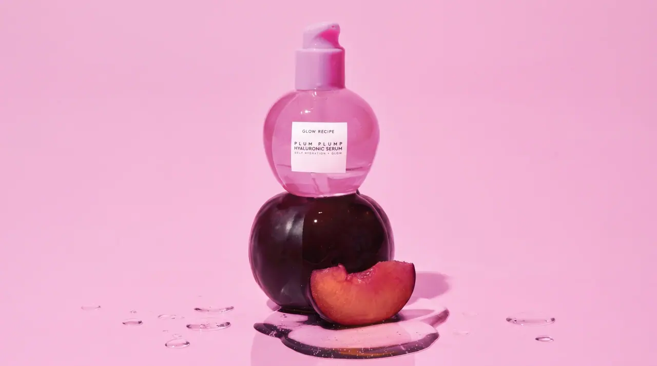
Glow Recipe
juicy fruit candy in tinted glass

Herbivore
pastel tinted vessels with a white tag

OSEA
sea-glass frosted bottles and a tidal wordmark

OUAI
sheer tinted bottles, small black capitals

Summer Fridays
sun-warmed tubes dressed in their own shade

AKT
Lilac stage directions with a quiet metallic detail

al.ive body
warm architectural calm, built as a paired vanity object