About this packaging
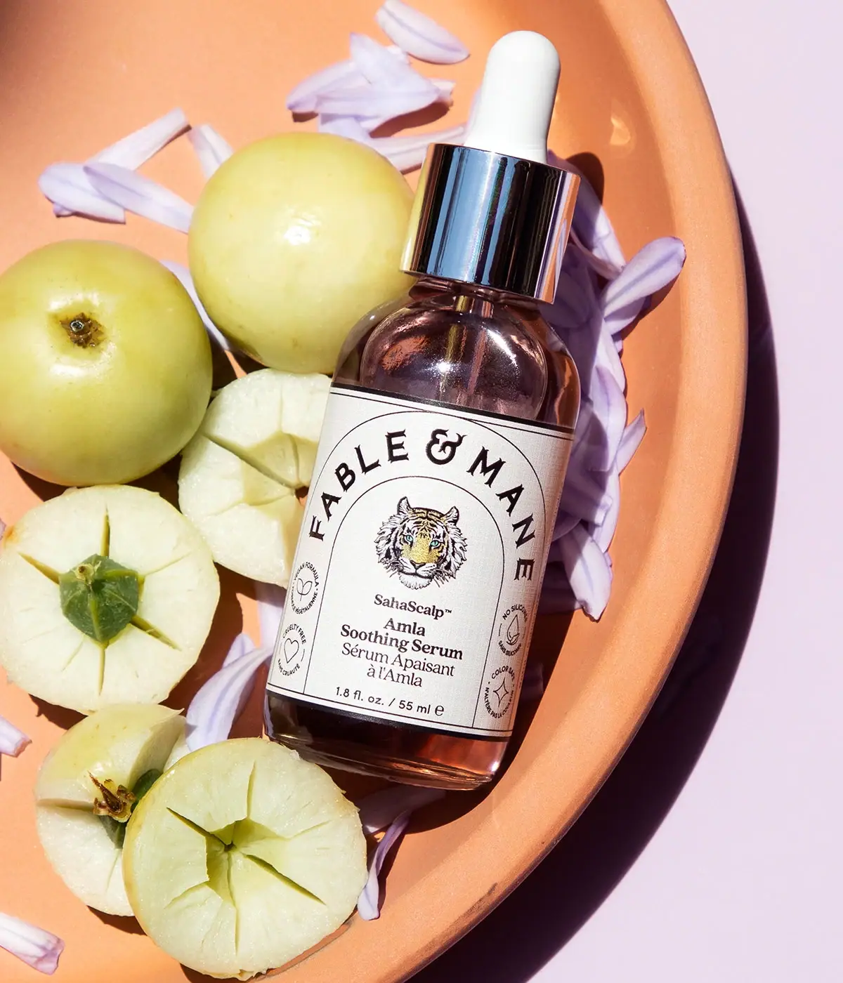
Fable & Mane’s SahaScalp Amla Soothing Serum uses a brown-tinted bottle, pipette-style closure and broad pale rectangular wrap label. An internal arched frame carries the curved maker name above a tiger portrait and bilingual product naming, with small circular emblems to either side. The selected image surrounds the bottle with amla and petals.
Fable & Mane’s official product page identifies SahaScalp as an Amla Soothing Serum in a 55 mL format. The page imagery shows the bottle and its full-front label; no bottle or dropper material specification was located.[1]
Pack construction & use
- Bottle and dropper
- The selected cover shows a brown-tinted rounded bottle with a pipette-style applicator and reflective collar. Since the source does not state its components, the image alone is not used to assert glass or metal construction.Observed in the reference photograph
- Front label
- An arched Fable & Mane name frames a central tiger illustration, with SahaScalp and Amla Soothing Serum beneath it. Small circular icons sit to either side of the main label.Observed in the reference photograph
What makes the design work
Editorial analysis of this packaging reference.
A framed label gives the bottle a focal point
The large arched wordmark and tiger image create a central emblem on the rounded front. The curved frame mirrors the bottle’s outline and keeps the key identity grouped.
Product name follows the illustration
SahaScalp sits below the tiger, followed by the Amla Soothing Serum name in smaller text. This hierarchy uses the center of the label for recognition and the lower area for the specific formula.
The setting repeats botanical cues
Amla pieces and pale flower petals on a warm orange plate echo the ingredient story and label illustration. The photograph’s overhead angle turns the bottle into part of an ingredient arrangement rather than a detached packshot.
Ideas for your next brief
- Build a distinctive central emblem around an illustration, then place product name and formula below it.
- Use small side icons as supporting information rather than competing headlines.
Sources & further reading
Researched 19 October 2026