About this packaging
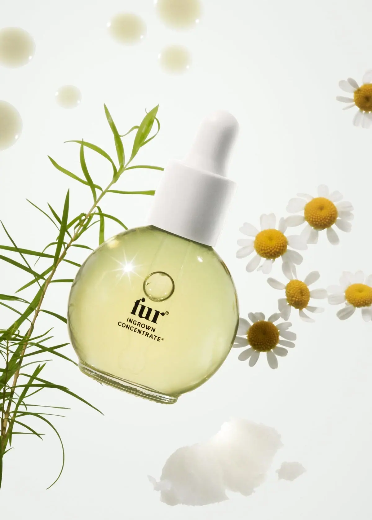
Fur Ingrown Concentrate pairs a rounded transparent bottle and pale yellow oil with compact black front lettering. The visible front has no solid black label panel. White flowers and green stems frame the product without covering its name.
Fur describes Ingrown Concentrate as a 14 ml spot treatment and says its box includes a cloth finger mitt. Its instructions distinguish the concentrate from Fur Oil: the concentrate is for specific bumps or irritation, while the mitt is used to exfoliate.[1]
Pack construction & use
What makes the design work
Editorial analysis of this packaging reference.
Distinctive rounded silhouette
The rounded body, short shoulder and broad base give this small treatment a recognizable outline.
Product naming stays concise
The Fur wordmark sits above the uppercase product name on the front, leaving most of the bottle visible.
Botanical image, clear pack
White flowers and green stems frame the bottle; the white closure repeats the light tones without obscuring the label.
Ideas for your next brief
- A compact, distinctive bottle silhouette can help a targeted treatment stand apart from a brand’s standard oil format.
- When selling a bottle and a use accessory together, make the accessory’s location inside the carton explicit in product information.
Sources & further reading
Researched 19 October 2026