Photography: Fur official photography. Images belong to their respective owners.
Fur

Pale oil and compact black type in a rounded dropper
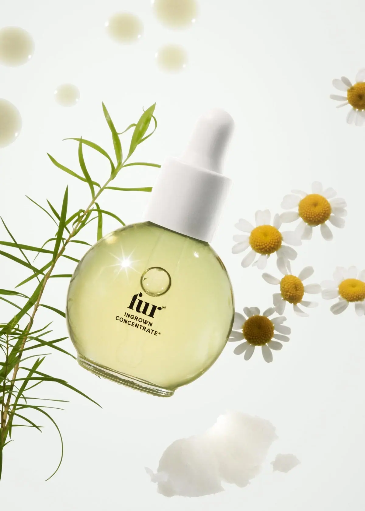
Ingrown Concentrate puts a small dark typographic stack on a broad, rounded clear bottle. Pale yellow oil supplies most of the visible colour; the white dropper assembly forms a quiet crown. A bold lowercase serif Fur wordmark leads two smaller uppercase lines naming the treatment. The sparse front leaves room for the liquid, pipette and bright reflections to remain visible. Botanical props belong to the photograph rather than the printed package. This study considers the selected concentrate bottle, with its 14 mL identity confirmed by the brand, and keeps the unseen carton and included finger mitt separate from the front design.
- Body & bath
- Light pack
- Apothecary
- Botanical
About this study
The approved Ingrown Concentrate botanical photograph and official product information. The included mitt and outer box are source-confirmed but not visually studied.
Sources & evidence · Reviewed 2026-10-19Color Palette
Approximate colours interpreted from photography. These are screen references, not official brand colours or print specifications.
Pack body
Pale oil yellow
#DEDEA0
Approximate apparent liquid colour through the clear body. Lighting and fill contribute to it; Fur's FAQ also notes batch variation, so this is not a fixed bottle-coating or universal formula colour.
Soft white closure
#F3F2EB
Approximate white dropper bulb and collar. Shadows separate their forms while keeping them within one quiet light family.
Ink
Dense black lettering
#15170F
Approximate dark front typography. Its compact footprint gives a strong focal point without masking the pale contents.
Typography
Suggested visual alternatives, not confirmed brand typefaces. Any scale below is an illustrative estimate.
The lowercase fur wordmark is the largest printed element, with pronounced serif contrast and a substantial visual weight. Directly below, INGROWN and CONCENTRATE form two small uppercase sans-serif lines. Their simpler construction contrasts with the more expressive maker lettering. The whole group is compact relative to the broad bottle face, making the difference between brand and product name clearer than a difference in colour would. Small registration marks accompany the names but do not establish additional information tiers.
Fonts
Original maker-name alternative
DM Serif Display
- Looks like
- Bold contrasting serif
- Type
- Display serif
- Weight
- Regular
- Case
- Lowercase for a new identity
- Tracking
- Close but individually checked
- Fallback
- Georgia, serif
Use the contrast between thick stems and fine details to make a short maker name distinctive. Develop an original word shape instead of attempting to recreate Fur's letterforms or terminal details.
Product-name alternative
DM Sans
- Looks like
- Plain compact sans serif
- Type
- Sans serif
- Weight
- Medium, Bold
- Case
- Uppercase
- Tracking
- Slightly open
- Fallback
- Arial, sans-serif
Keep the two-line product name subordinate to the maker while retaining enough stroke weight for small printing. Test actual-size proofs rather than judging readability only from an enlarged campaign photograph.
Structure & Proportions
Visual proportions and finish previews are illustrative. Confirmed construction details and uncertainties are distinguished in the study notes.
Proportions
| Purpose | Value | Preview |
|---|---|---|
| Broad rounded body | The front is almost disc-like, with a flatter lower edge that provides a resting base. Depth cannot be measured from this view. | — |
| Narrow crown | The dropper collar occupies only part of the bottle's width, preserving the contrast between broad fluid chamber and small dispensing neck. | — |
| Compact information island | The typography uses a small central area, leaving a generous clear-looking perimeter rather than filling the bottle face with claims. | — |
Shapes
| Element | Value | Preview |
|---|---|---|
| Body silhouette | Broad rounded face with an abbreviated flat base; not a perfect circular container. | |
| Dropper assembly | Rounded white bulb above a cylindrical collar and a visible internal pipette. | |
| Typographic stack | Short maker line over two progressively practical information lines. |
Finishes
Clear reflective body
Rounded vessel wall and base · transparent
Glossy highlight appearance
Bottle perimeter and bright front reflection · gloss
Formats and materials
| Formats | Rounded, flattened-looking treatment bottle with a short flat base, White dropper bulb and broad collar above a short neck, Brand-confirmed 14 mL / 0.5 oz product |
| Materials | The transparent rigid vessel appears glass-like, but the accessible official product text does not establish its exact material specification or supplier., The white bulb and collar are visually distinct components; their elastomer or polymer types are not verified., The pale oil and internal pipette are visible through the body. Their appearance does not confirm the pipette's material or calibrated dispensing volume. |
| Closures | A fitted white dropper assembly combines a softly rounded bulb with a straight-sided collar. The narrow internal pipette can be seen faintly through the filled bottle. This links the package's appearance to small-quantity application, but no dose per drop, thread specification or leak-resistance performance is established by the image. |
| Decoration | Short lowercase serif maker wordmark, Two small uppercase product-name lines, No large opaque coloured label field visible on the front |
Front Panel
Schematic reading order. The diagram’s zone heights do not represent measured artwork proportions.
The front reads as black lettering over a transparent field. There is no solid black rectangular label panel in the selected view, and the exact decoration method is unresolved. The maker name, product name and small marks form a single compact stack. Its central placement allows the surrounding pale liquid to act as visual space. A bubble-like circular feature above the wordmark is treated as a photographed optical detail rather than permanent brand artwork.
| Zone | Content |
|---|---|
| Upper clear body | Visible liquid, internal pipette and reflections; no additional confidently readable front copy. |
| Central maker line | The largest black serif fur wordmark establishes authorship. |
| Product descriptor | INGROWN CONCENTRATE appears directly below in two smaller uppercase lines. |
| Lower body and base | A largely clear-looking area ends in a thicker reflective lower edge; the photograph does not establish underside information. |
Range System
The official product text distinguishes this targeted concentrate from the brand's broader-use Fur Oil. That functional distinction supports clear naming, but it does not prove a universal packaging hierarchy or colour code. This study therefore treats the compact name and dropper format as features of the selected bottle. Any proposed family extension should preserve product recognition without relying solely on a liquid colour that may vary.
- The two-line name identifies the treatment while the maker wordmark stays dominant.
- A hypothetical companion product could keep the maker position but use a clearly different descriptor.
- Do not use the photograph's chamomile flowers as evidence of a printed botanical range code.
Back of Pack & Shelf
No reverse, underside or outer carton is shown in the approved image. The official page confirms that a cloth finger mitt is supplied inside the box, but its placement, artwork and carton construction were not inspected.
- Keep accessory-inclusion information separate from the visible bottle analysis.
- Do not reconstruct ingredient, warning or batch fields from the spare front.
- For a new design, plan practical information around the curved body and any outer pack after physical and regulatory requirements are established.
On shelf
As a visual interpretation, the rounded body is likely to be the first recognition cue, followed by the short black maker name. The compact text grouping supports a quiet appearance at close range, although the small product descriptor needs careful testing at real bottle size. The campaign's enlarged bottle cannot establish retail legibility, stability or ease of grip. A useful evaluation would compare the actual bottle against both white and darker surroundings and check whether the liquid colour changes the contrast of its small black lettering.
Imagery
The tilted bottle is surrounded by slender green stems, white flowers with yellow centres, pale droplets and a white texture swatch. The scene's lightness repeats the closure and liquid tones while giving the small bottle a generous setting. Fur's highlighted ingredient list includes chamomile and coconut oil, providing context for the imagery without proving the identity of every prop. A star-like reflection on the bottle adds polish, but is not printed artwork. The pale background and botanical greens should remain photographic colours in this study; transferring them indiscriminately into the package palette would overstate the printed system.
Guidelines
Editorial principles for an original design brief, not official brand guidelines.
Do
- Use a distinctive bottle outline to support sparse typography.
- Give maker and function different typographic roles.
- Test small product wording at physical size.
- Distinguish liquid appearance from a coating specification.
- State accessory inclusion clearly when the accessory is hidden inside a box.
Don't
- Do not describe the front as a solid black label.
- Do not treat the circular bubble-like detail as a permanent logo element.
- Do not copy the botanical scene as a packaging colour standard.
- Do not infer glass composition, drop volume or sustainability from appearance.
Sources & evidence
- Ingrown Concentrate — Furproduct
- Fur FAQsbrand
How this study was built
structure · Sourced fact
The product page identifies 14 mL / 0.5 oz and confirms a finger mitt inside the box.Ingrown Concentrate — Furlabel · Visual observation
Compact black lettering sits on a transparent field rather than a solid black panel.typography · Visual observation
A large lowercase serif maker name leads two smaller uppercase sans-serif product lines.palette · Sourced fact
The brand FAQ says batches can vary in colour, so the pictured pale yellow is not treated as a fixed universal shade.Fur FAQsimagery · Visual observation
Flowers, green stems, droplets and a white swatch surround the bottle without becoming printed decoration.range · Sourced fact
The official page distinguishes the concentrate's targeted role from Fur Oil's broader-use role.Ingrown Concentrate — Fur
What remains unverified
- Exact bottle, pipette and closure materials and decoration process remain unverified.
- The image does not show the reverse, underside, carton or finger mitt.
- Font alternatives are not confirmed original fonts; palette values are approximate.
- The official FAQ allows for batch colour variation, limiting any fixed liquid-colour claim.
Give your AI
packaging taste
Give your design or image tool a packaging study: palette, type, structure, front panel and principles for an original brief.
Export this styleFree with an email. PACK.md works in Claude, ChatGPT, Cursor and image tools.
More like this
Farmacy
Golden contents in a faceted jar beneath a wood-toned lid

Aesop
a botanical still life around a disciplined apothecary label

Benamôr
Ornamental lilac medallion suspended above golden botanical oil

Bomba Curls
tropical foliage gathered around a bold yellow nameplate
Bopo Women
a botanical figure on a coordinated blush-pink pair
Claus Porto
Golden geometric wrapping around a pale floral medallion
Desert Rose Australia
Apricot sunscreen tube with white type and ochre flower
Fable & Mane
Arched serif maker, tiger portrait and amber dropper bottle