About this packaging
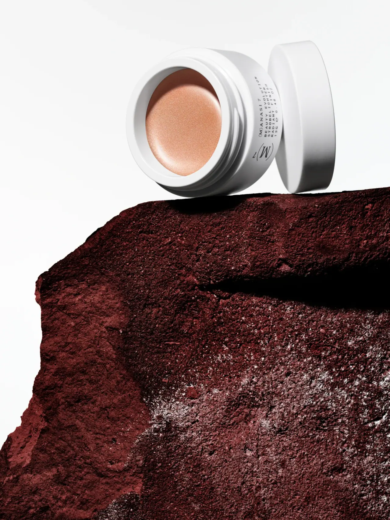
Manasi 7’s Strobelighter in Heliconia is shown as a compact white pot with the lid set aside to reveal a warm bronze-toned highlighter. The selected image uses a sharp white-to-rust contrast, treating the open product as both a cosmetic format and a close-up color study.
Manasi 7 describes Heliconia as the bronzy shade in its Strobelighter family, in contrast to Elysian’s champagne hue. The brand’s product listing identifies this product as Strobelighter — Heliconia; the cited product information does not identify the container materials.[1][2]
Pack construction & use
- Pot and lid
- The selected cover shows a low, wide white pot opened beside its separate round lid. The brand page confirms the product and Heliconia shade, but the packaging material and closure construction are not identified in the cited product information.Observed in the reference photograph
- Shade presentation
- The exposed product surface is a smooth, rounded pool of bronze-peach color; the pot side carries compact product and brand lettering. The warm shade is consistent with Manasi 7’s official description of Heliconia as the bronzy Strobelighter option.[2]
What makes the design work
Editorial analysis of this packaging reference.
An open pot makes the color the package’s centerpiece
The white rim frames the circular highlighter surface like a swatch, while the detached lid makes the product visibly accessible. This view prioritizes shade recognition over front-label reading, a sensible image choice for a makeup product whose color is the main selection cue.
Minimal side printing keeps the profile clean
The brand and product lettering follow the pot’s curved side in small, spaced type. The narrow line of copy preserves a quiet exterior and leaves the high-contrast white container to frame the brighter pan.
The dark ground intensifies the warm shade
The pot sits against a deep red-brown surface with large areas of white background. That split between light and dark gives the peach-bronze product a clear edge and makes the metallic-looking surface visible without additional swatch props.
Ideas for your next brief
- For color cosmetics, show the open product when the shade itself carries more selection value than the exterior label.
- Use a bright container rim to frame a warm pressed or cream surface and keep its hue distinct from the photo setting.
- Keep exterior copy compact on a low pot so the product surface remains the strongest visual cue.
Sources & further reading
Researched 19 October 2026