Photography: Studio Emil Larsson project photography. Images belong to their respective owners.
Manasi 7
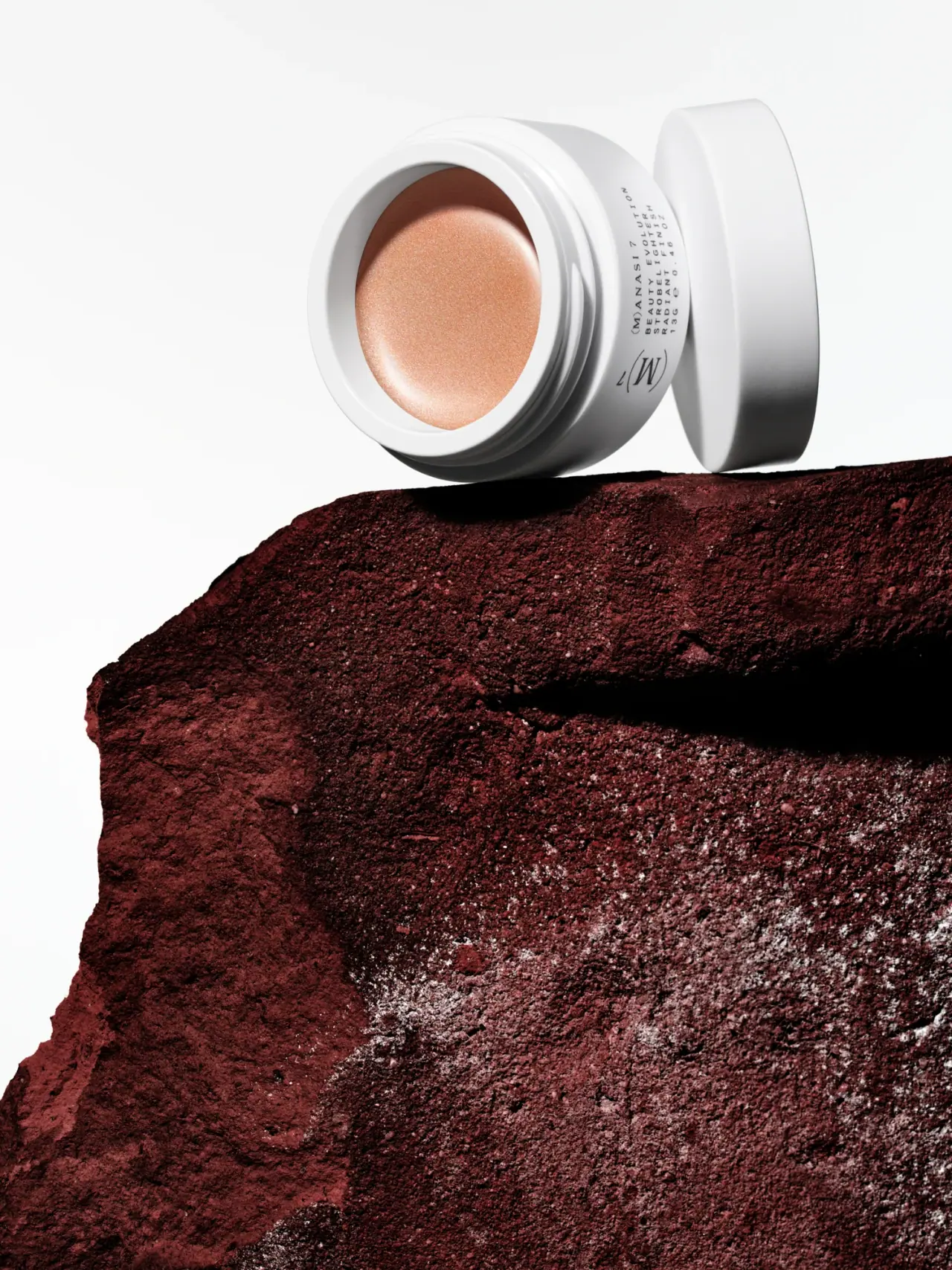
White threaded pot framing bronze cream with compact black sidework
The selected Heliconia Strobelighter image makes the open cosmetic surface the main color field. A low white pot with a broad rim frames a peach-bronze cream, while its matching lid stands separately behind it. Fine black side lettering and a larger parenthesized maker symbol remain secondary to the exposed shade. The visible neck threads establish a screw closure more clearly than a closed pack shot would. The rough dark-red support is photographic scenery, contrasting with the smooth container rather than becoming part of its material story.
- Make-up
- Light pack
- Clinical minimal
- Luxe monochrome
About this study
Selected open Heliconia Strobelighter pot with 13 g / 0.46 oz side marking. Accessible official shade article supports bronze cream identity; exact product and photographer URLs returned cache misses.
Sources & evidence · Reviewed 2026-10-19Color Palette
Approximate colours interpreted from photography. These are screen references, not official brand colours or print specifications.
Pack body
Clean white pot
#EEEEEB
Approximate vessel and lid tone with gray shadows around the threaded neck; the exterior itself is not bronze.
Ink
Fine black identity
#292A28
Small side text and larger maker symbol provide restrained contrast on the white body.
Accent
Exposed bronze-peach cream
#C18A6F
Visible cosmetic contents, included as a presentation accent rather than package ink or a metallic vessel finish.
Champagne cream highlight
#E2B6A0
Approximate bright shimmer on the curved product surface; lighting-dependent and not a separate shade specification.
Typography
Suggested visual alternatives, not confirmed brand typefaces. Any scale below is an illustrative estimate.
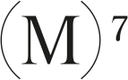
A comparatively large serif M enclosed by curved parentheses, with a small 7, forms the side's most expressive mark. Beside it, a compact block of widely spaced uppercase sans text identifies the maker, product and finish, with quantity below. The mark and text share the shallow band available on the low jar, so the system relies on compact grouping rather than a large front headline. In the selected tilted view, the side copy is deliberately less dominant than the circular exposed cream.
Fonts
Independent serif emblem
Cormorant Garamond
- Looks like
- Contrasting italic serif letterform
- Type
- Display serif
- Weight
- Regular, Medium
- Case
- Single capital or short monogram
- Tracking
- Custom optical spacing for an original symbol
- Fallback
- Georgia, serif
Use a new letter or monogram with a different enclosure. This is a direction for an independent emblem, not an instruction to reproduce the parenthesized M and numeral.
Compact side information
Montserrat
- Looks like
- Small spaced geometric sans
- Type
- Geometric sans-serif
- Weight
- Regular, Medium
- Case
- Uppercase
- Tracking
- Wide small-copy spacing
- Fallback
- Arial, sans-serif
Alternative for a short stacked maker/product/quantity block on a shallow circumference. Test curved-surface readability before applying generous tracking to every line.
Structure & Proportions
Visual proportions and finish previews are illustrative. Confirmed construction details and uncertainties are distinguished in the study notes.
Proportions
| Purpose | Value | Preview |
|---|---|---|
| Low wide pot | The broad opening is much wider than the shallow side band, prioritizing access to and visibility of the cosmetic surface. | — |
| Substantial white rim | A continuous pale boundary separates the bronze cream from both the threads and the dark photographic support. | — |
| Compact side identity | Emblem and small text occupy the narrow circumference without extending into the opening or covering the lid in this view. | — |
| Detached lid relation | The separate round cover is large enough to visually match the jar mouth, but its thickness and internal fit are not measured. | — |
Shapes
| Element | Value | Preview |
|---|---|---|
| Open pot | Low cylindrical white vessel with broad circular mouth. | |
| Threaded neck | Concentric raised threads around the opening, visible because the lid is removed. | |
| Detached lid | Round white cover viewed mostly edge-on behind the open pot. | |
| Side information block | Small stacked lines beside a larger curved-enclosure maker symbol. |
Finishes
Smooth white exterior
Pot and lid show broad soft reflections with darker thread shadows; manufacturing finish unverified. · gloss
Luminous cosmetic surface
Exposed Heliconia cream catches a bright curved highlight; this descriptor concerns contents, not the vessel. · pearlescent
Formats and materials
| Formats | Low white open screw-top cosmetic pot with detached matching lid; visible side quantity reads 13 g / 0.46 oz |
| Materials | The pot and lid appear opaque white and smoothly finished. The accessed official shade information does not identify their substrate, resin, recycled content or coating, so white appearance is not converted into a plastic or ceramic specification., The official brand article describes Strobelighter as a cream and Heliconia as a bronze-toned shade. Its shimmer belongs to the contents, not a metallic jar treatment. The dark-red rock-like support remains an external scene material. |
| Closures | The jar is open and its external neck threads are plainly visible around the broad mouth. The separate white lid is shown standing on its edge behind the pot, supporting a screw-top interpretation. The photo does not show the lid underside clearly enough to describe a liner, gasket or tamper seal. A broad white rim separates the cream surface from the threaded edge, creating a clean frame around the color. |
| Decoration | Larger parenthesized serif maker symbol with small numeral, Compact stacked sans information beside the symbol, Plain white rim and exterior, Product color revealed through the open top rather than a printed swatch |
Front Panel
Schematic reading order. The diagram’s zone heights do not represent measured artwork proportions.
The side band presents a compact signature rather than a conventional centered front label. A larger serif emblem sits beside a small block of spaced sans information, with product and finish terms on separate lines. The open top carries the shade visually, so the side system can remain quiet. The Heliconia name is not confidently readable in this particular side view; its identity comes from the approved image record and official shade context rather than a fabricated transcription.
| Zone | Content |
|---|---|
| Maker symbol | Large parenthesized serif M-like mark with a small 7 occupies one side of the visible band. |
| Maker and positioning | Compact uppercase maker and beauty-positioning wording begin the neighboring text block. |
| Product category | STROBELIGHTER and RADIANT FINISH appear in short spaced lines. |
| Quantity | 13 g / 0.46 oz is visible within the small side block. |
| Shade surface | The open mouth reveals the bronze-peach cream directly rather than using a printed color chip. |
Range System
The accessible brand article specifically contrasts Heliconia's bronze character with Elysian's champagne tone, supporting a limited shade-family comparison. It does not establish identical jar construction across every Manasi 7 product. The selected pot demonstrates how an uncolored exterior can frame a cosmetic shade, while the small side text carries product identity. A broader packaging comparison would require actual companion-pack images.
- Heliconia's exposed bronze tone is the key visual accent in this selected open-pot view.
- The official Elysian comparison concerns shade character, not a verified alternative package color.
- An original color family can retain a quiet rim while using open-product photography for accurate shade selection.
Back of Pack & Shelf
Only part of the circumference and opening are visible. The base, opposite side, lid top and lid interior are not sufficiently shown to document their full information or sealing construction.
- Inspect the underside for exact shade identification and batch information.
- Do not invent an inner liner or tamper seal.
- Keep cream texture separate from assumptions about pressed-powder pans or replaceable inserts.
On shelf
Interpretively, an open view is especially useful for a color cosmetic because the shade becomes more informative than the closed lid alone. The plain white rim supplies a consistent visual boundary, though its brightness may influence perceived warmth in the cream. The shallow side band limits text size and viewing angle. For an original design, pair an open shade photograph with a conventional closed-pack view so users can recognize both the product color and the object they will receive.
Imagery
The open pot is tilted on the edge of a rough rust-red rock-like slab against a large white background. Its detached lid stands behind, making the circular geometry clear while leaving the cream unobstructed. Hard directional light creates deep shadows under the rim and a bright curved shimmer across the cosmetic surface. The rugged support intensifies the smooth white packaging and warm contents, but it does not establish mineral ingredients, stone packaging or a literal geological source for the product.
Guidelines
Editorial principles for an original design brief, not official brand guidelines.
Do
- Show the open shade when color is a selection cue.
- Distinguish content shimmer from package finish.
- Use visible threads as construction evidence.
- Keep side information compact but readable.
- Qualify shade names that are not readable in the selected angle.
Don't
- Do not call the cream a pressed powder.
- Do not infer ceramic or plastic from white appearance.
- Do not claim the rock prop proves mineral ingredients.
- Do not invent a refill pan or seal.
- Do not copy the parenthesized maker emblem.
Sources & evidence
- Manasi7 — Delirio and Heliconiabrand
- Studio Emil Larsson — Manasi7 project (approved image provenance)photographer
How this study was built
edition · Sourced fact
Official brand article identifies Heliconia as bronze-toned Strobelighter and describes the family as cream, contrasting Elysian's champagne shade.Manasi7 — Delirio and Heliconiastructure · Visual observation
Open white low pot shows external screw threads and detached matching round lid.Studio Emil Larsson — Manasi7 project (approved image provenance)typography · Visual observation
Large serif parenthesized symbol sits beside compact spaced sans product and quantity lines.Studio Emil Larsson — Manasi7 project (approved image provenance)label · Visual observation
Side block includes Strobelighter, Radiant Finish and 13 g / 0.46 oz; shade name is not transcribed from this angle.Studio Emil Larsson — Manasi7 project (approved image provenance)palette · Visual observation
White exterior and black copy frame bronze-peach contents; shimmer belongs to the cream.Studio Emil Larsson — Manasi7 project (approved image provenance)imagery · Visual observation
Rust-red rough support and white background contrast with the smooth open pot without proving material or ingredient origins.Studio Emil Larsson — Manasi7 project (approved image provenance)range · Editorial interpretation
Open-shade presentation can support a color family; source shade comparison does not establish universal packaging construction.
What remains unverified
- Exact product URL and photographer project page returned cache misses; approved local image inspected.
- Pot/lid material, coating and liner construction unverified.
- Heliconia shade name not confidently readable in selected side view.
- Base, lid top, original fonts and measured dimensions unverified.
Give your AI
packaging taste
Give your design or image tool a packaging study: palette, type, structure, front panel and principles for an original brief.
Export this styleFree with an email. PACK.md works in Claude, ChatGPT, Cursor and image tools.
More like this

African Botanics
Technical black label with a low serif signature

bareMinerals
a restrained black compact framing the powder itself

BeautyPWR
Clear square shell, white cream cup, black serif identity

Corpus
sage gloss with whispered gold lettering

Costa Brazil
Pale matching vessels with small, deliberate bilingual labels

Crown Affair
Pale frosted-looking bottle, black pump and small looping emblem

HAKU
Pearly narrow tube with stacked serif identity and clear base

Haus Labs
mirror chrome hardware over frosted shade