About this packaging
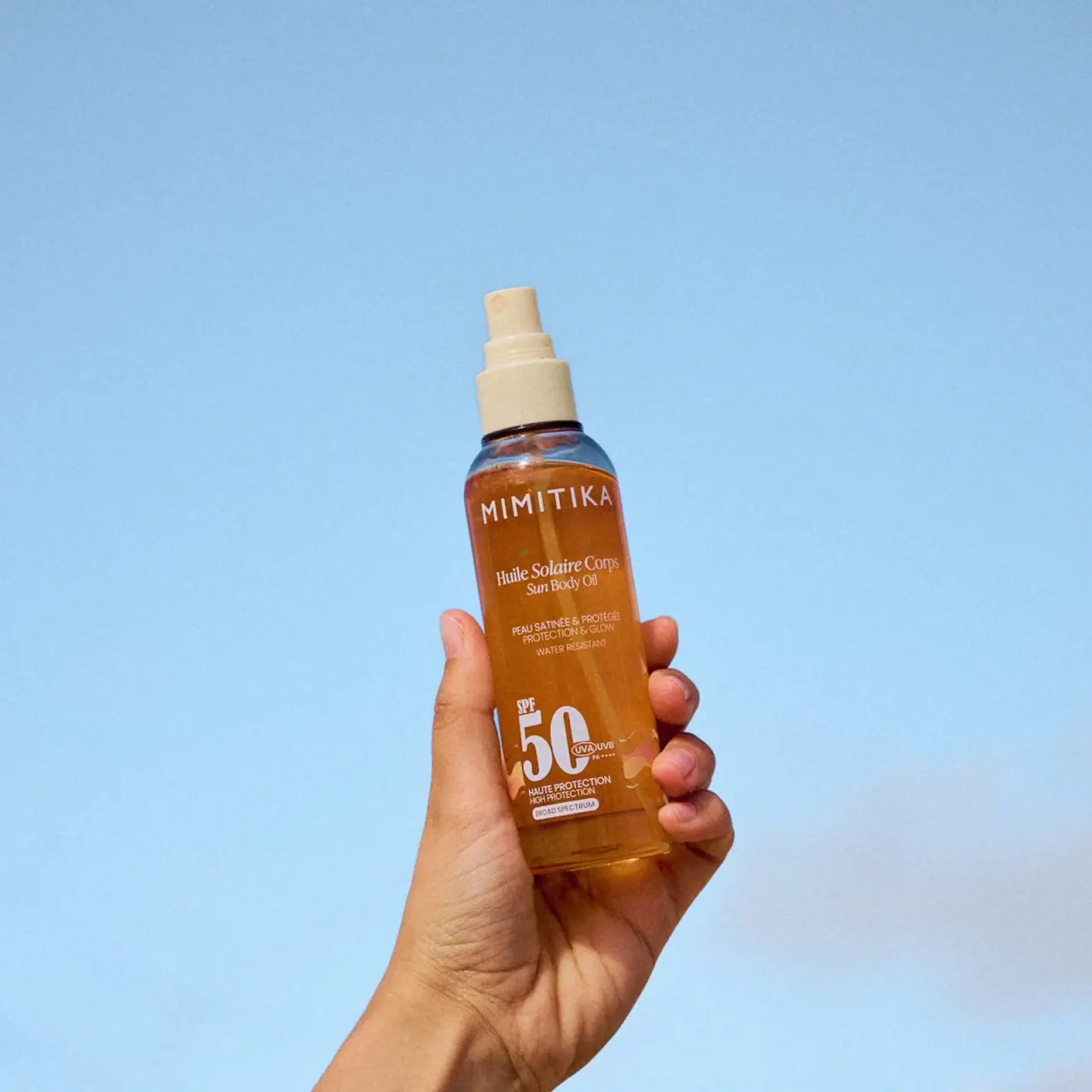
Mimitika Huile Solaire SPF50 is pictured in a hand-held amber-looking bottle with an exposed pale spray actuator and no visible protective overcap. The front combines bilingual serif product naming, a spaced producer line and a large lower 50 with adjacent protection markings.
Mimitika identifies this product as 150 ml SPF50 sun oil. The selected image shows its current photographed presentation, with a bilingual label.[1]
Pack construction & use
- Bottle and exposed sprayer
- The selected image shows a narrow rounded bottle with a pale spray actuator exposed above its stepped collar. No protective overcap is visible; the supplied cap configuration and component materials are unverified.Observed in the reference photograph
- Front information
- French and English product names appear above the large SPF50 mark, followed by compact protection descriptors.Observed in the reference photograph
What makes the design work
Editorial analysis of this packaging reference.
Protection hierarchy
SPF50 is much larger than the surrounding copy, so the principal rating remains the first readable detail in a hand-held view.
Bilingual naming above an offset numeric block
French and English product names share a compact centred serif unit. Lower on the bottle, the large 50 sits beside smaller protection marks rather than following a fully centred stack.
Use-context framing
The blue background and hand establish scale and use context in the campaign image; neither is a package feature. The amber-colored appearance remains the main visual identifier on the bottle.
Ideas for your next brief
- Give a key numeric descriptor enough scale to survive close cropping and hand-held product photography.
- Use one aligned information column to accommodate bilingual copy on a narrow cylindrical pack.
Sources & further reading
Researched 19 October 2026