Photography: Mimitika official photography. Images belong to their respective owners.
Mimitika

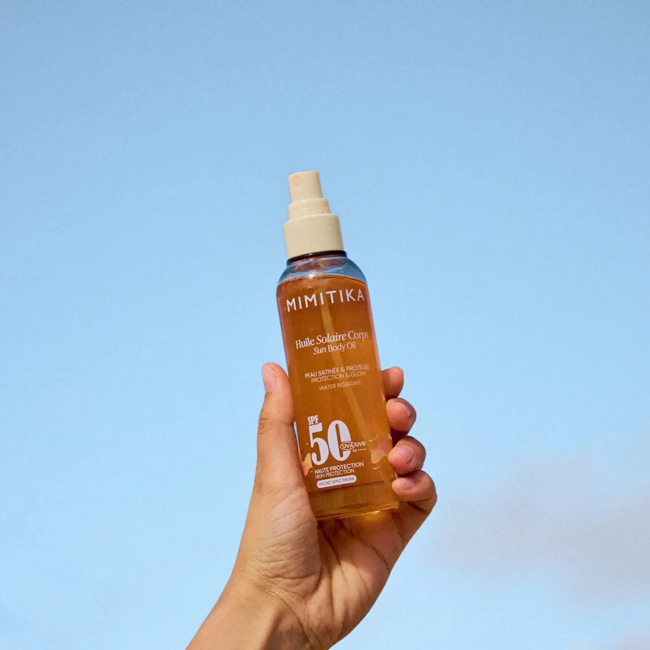
Amber sun oil, white lettering and an exposed cream spray
The selected Mimitika sun-oil bottle combines a transparent amber appearance with white typography and a pale cream spray assembly. Its producer name sits high on the rounded body, while a smaller serif French/English product name occupies the middle. A large white 50 anchors the lower portion beside compact protection markings and small warm abstract shapes. The photograph shows the actuator exposed, with no protective overcap visible. A hand and a broad blue background provide use context, but neither belongs to the packaging palette.
- Suncare
- Light pack
- Bold typographic
About this study
Selected 150 mL SPF50 sun-oil image with exposed cream sprayer and hand-held blue-background composition. No overcap visible.
Sources & evidence · Reviewed 2026-10-19Color Palette
Approximate colours interpreted from photography. These are screen references, not official brand colours or print specifications.
Pack body
Amber oil appearance
#AB6623
Approximate amber-brown appearance through the transparent body. The photograph does not isolate bottle tint from liquid colour and lighting.
Cream spray assembly
#D9C69D
Approximate actuator and collar colour. Their material composition and mechanism internals are not specified in the accessed source.
Ink
White information
#F4ECDD
Approximate producer, product name, numeric identifier and supporting copy. White maintains contrast against the warm contents without an opaque main label field.
Accent
Soft peach motif
#DBA17B
Approximate small abstract wave-like shapes around the lower numeric block. These printed accents are distinct from the hand and background.
Typography
Suggested visual alternatives, not confirmed brand typefaces. Any scale below is an illustrative estimate.
The spaced uppercase producer line occupies the upper body, directly below the shoulder. The French product name and smaller English equivalent use a serif voice in the middle, contrasting with the producer’s sans-serif forms. Small uppercase benefit lines follow with generous separation. The lower 50 is much larger and more condensed than surrounding copy, with SPF above and compact protection markers beside it. The design is therefore not one continuous centred stack: upper text is broadly axial, while the lower numeric block creates an offset composition with adjacent symbols.
Fonts
Producer and supporting copy alternative
Manrope
- Looks like
- Manrope
- Type
- Geometric sans serif
- Weight
- Regular 400 / Medium 500
- Case
- Uppercase producer and small labels
- Tracking
- Open for producer, neutral for small copy
- Fallback
- sans-serif
A proposed clear sans-serif voice for an original producer name and support. Maintain sufficient spacing without forcing the name around the bottle’s outer curvature.
Product name and numeric alternative
Bodoni Moda
- Looks like
- Bodoni Moda
- Type
- High-contrast serif
- Weight
- Regular 400 / Bold 700
- Case
- Title case product naming; numerals for key identifier
- Tracking
- Natural optical spacing
- Fallback
- serif
Use a serif companion for the bilingual product name and a strong numeric role. The observed 50 has a narrow high-contrast appearance; this is a direction for original work, not an exact font attribution or permission to invent a protection claim.
Structure & Proportions
Visual proportions and finish previews are illustrative. Confirmed construction details and uncertainties are distinguished in the study notes.
Proportions
| Purpose | Value | Preview |
|---|---|---|
| Bottle silhouette | A tall narrow straight-sided body has rounded shoulders and a compact neck. The hand gives context but is not used as a measurement scale. | — |
| Exposed sprayer | The actuator and stepped collar create a pale vertical extension above the amber body. The absence of an overcap in the image makes the delivery format legible. | — |
| Information spacing | Large gaps separate producer, product name, support and lower number, allowing multiple type voices to coexist on the narrow face. | — |
Shapes
| Element | Value | Preview |
|---|---|---|
| Bottle | Tall cylindrical-looking body with rounded shoulders. | |
| Spray actuator | Small pale nozzle above a stepped collar, exposed in the photo. | |
| Lower number block | Large narrow numerals with small adjacent protection markings. | |
| Warm abstract accents | Small irregular wave-like motifs near the lower label area. |
Finishes
Transparent body appearance
Bottle shoulder, side and lower edge; substrate unverified. · transparent
Opaque cream sprayer
Actuator and collar; material unverified. · matte
Formats and materials
| Formats | A narrow rounded bottle with an exposed spray actuator and a visible dip tube through the warm contents. The official page identifies 150 mL sun oil. |
| Materials | Bottle resin or glass composition, recycled content and spray component materials are not specified on the inspected product page. Transparency and amber colour alone do not identify the substrate., The front includes a transparent-looking information area with white and peach graphics. Exact label film, adhesive or direct-print method is not established. |
| Closures | A pale stepped collar supports a small spray actuator with a visible nozzle opening. No protective overcap appears in the selected photograph. The neck attachment, locking arrangement and supplied cap configuration cannot be determined from this open-use view. |
| Decoration | A spaced producer, bilingual serif product naming, small benefit lines and oversized lower number form the main graphic system. Small peach shapes add movement near the base without competing with the numeric identifier. |
Front Panel
Schematic reading order. The diagram’s zone heights do not represent measured artwork proportions.
The upper identity and bilingual product naming sit near the central axis. The lower number shifts the emphasis leftward, with small marks beside it and brief protection lines beneath. Warm abstract accents flank this area. The hand partly covers the side edges but leaves the principal white text visible. The transparent-looking field lets the liquid serve as the graphic background.
| Zone | Content |
|---|---|
| Producer | Spaced uppercase Mimitika sits just below the shoulder and spans much of the visible width. |
| Bilingual product name | French sun-body-oil wording sits above a smaller English equivalent in a serif style. The two lines form one compact product unit. |
| Supporting claims | Small centred lines occupy the middle-lower area. Their wording is documented as package information, not independently validated performance. |
| Protection identifier | A very large 50 sits with smaller SPF and adjacent UVA/UVB/PA markings. The number is the main visual anchor in the lower region. |
| Bottom details and motifs | Short protection lines and a small broad-spectrum panel sit beneath the number, with peach abstract shapes around the sides. The precise lower edge is partly affected by the hand and reflections. |
Range System
The exact official listing confirms Huile Solaire SPF50 at 150 mL. The selected picture demonstrates a warm transparent oil format with a pale sprayer; other Mimitika products are not visually audited. No assumption is made that amber colour, peach shapes or this type pairing extend across every protection level or format.
- An original extension can retain distinct producer, format and key-number roles while adapting the layout to a different bottle width. Any real protection number and symbols must come from the approved product specification.
- The liquid’s warm appearance can be an appealing part of an oil presentation, but it should not replace explicit product identification. A milk or cream format may require a different background contrast strategy.
Back of Pack & Shelf
Reverse directions, ingredients, quantity line and base markings are not readable. The official page provides usage information, but its printed position on the selected bottle is unknown.
- Obtain a reverse image before mapping full directions and warnings.
- Do not treat an absent photographed overcap as proof that no cap is supplied.
- Do not infer refillability, locking function or exact spray dose from the visible actuator.
On shelf
The producer line and large lower number should survive a smaller catalogue view better than the tiny supporting text. The serif product name adds a softer tone between two stronger recognition anchors. This is visual interpretation, not tested shelf performance. A complementary uncropped front and rear view would improve the technical record, because the selected lifestyle image deliberately prioritises handling and colour over complete label documentation.
Imagery
A hand holds the uncovered bottle against a spacious blue background. Warm amber contents and skin contrast with the cool field, while the pale spray head separates clearly from both. The hand introduces scale and handling context but partly obscures the bottle’s side. No spray plume is shown and no application action is demonstrated. The large white number remains readable despite the casual tilt, which illustrates the value of a strong numeric hierarchy in use-oriented photography. Blue is entirely a scene colour here.
Guidelines
Editorial principles for an original design brief, not official brand guidelines.
Do
- Document the exposed actuator and absence of a visible overcap accurately.
- Distinguish upper centred text from the offset lower numeric composition.
- Keep printed peach accents separate from the blue scene and hand.
- Use source-approved identifiers when adapting a sun-care hierarchy.
Don't
- Do not claim a protective cap is visible in this selected image.
- Do not identify bottle material from transparency or amber colour.
- Do not infer a spray plume, dose or application performance from a held bottle.
- Do not generalise the oil’s colours to the entire Mimitika range.
Sources & evidence
How this study was built
edition · Sourced fact
Official page identifies SPF50 sun oil at 150 mL.Huile Solaire SPF50 — Mimitikastructure · Visual observation
Exposed pale actuator and stepped collar are visible without an overcap.typography · Visual observation
Sans-serif producer contrasts with serif bilingual product naming and large lower numerals.label · Visual observation
Upper text is centred while lower number has adjacent compact marks and warm motifs.palette · Visual observation
Amber appearance, white type, cream sprayer and peach motifs belong to package.imagery · Visual observation
Hand and blue background provide context and partly obscure side edges.range · Editorial interpretation
Strong numeric hierarchy is transferable, but other range formats are not audited.
What remains unverified
- Bottle and sprayer materials, decoration method and closure internals unspecified.
- No visible overcap does not establish supplied-cap configuration.
- Reverse and quantity placement unseen; 150 mL comes from official listing.
- Fonts and colours are alternatives or estimates; protection claims not independently assessed.
Give your AI
packaging taste
Give your design or image tool a packaging study: palette, type, structure, front panel and principles for an original brief.
Export this styleFree with an email. PACK.md works in Claude, ChatGPT, Cursor and image tools.
More like this

ACURE
Iridescent spectacle with practical, tightly ordered type

AKT
Lilac stage directions with a quiet metallic detail

AussieZinc
Sun-yellow numerals on a tall, information-rich white cylinder

Bask
sunny yellow with a playful turquoise signature

Beame
Orange bubble lettering, pink mascot, clear product badge

BioSeivas
Vertical serif identity on a mauve treatment band
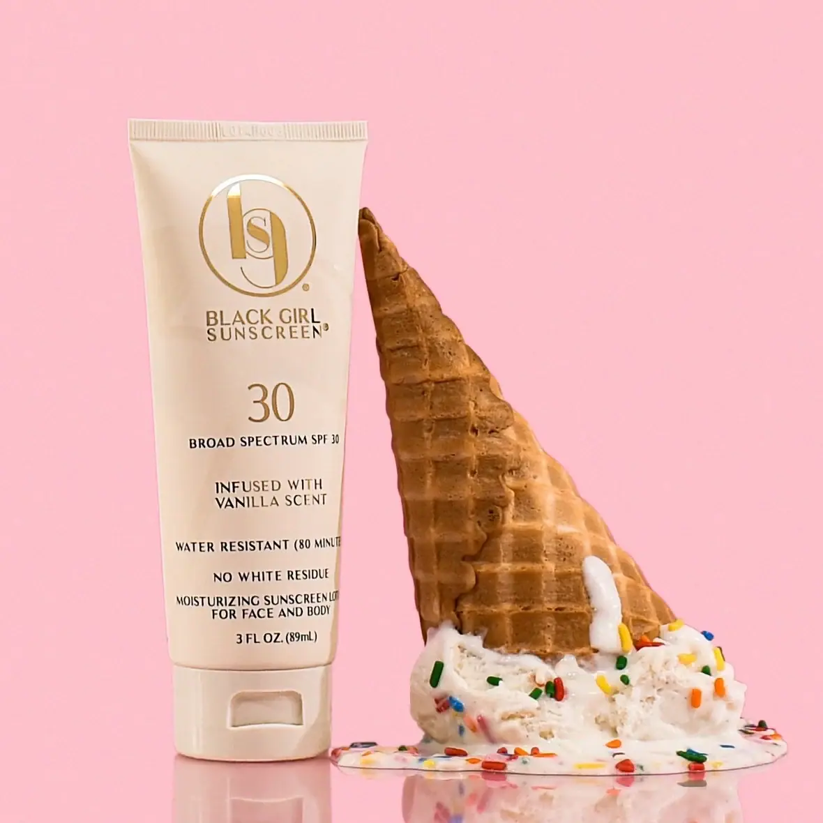
Black Girl Sunscreen
Cream tube with gold crest and an isolated SPF numeral

Bomba Curls
tropical foliage gathered around a bold yellow nameplate