About this packaging
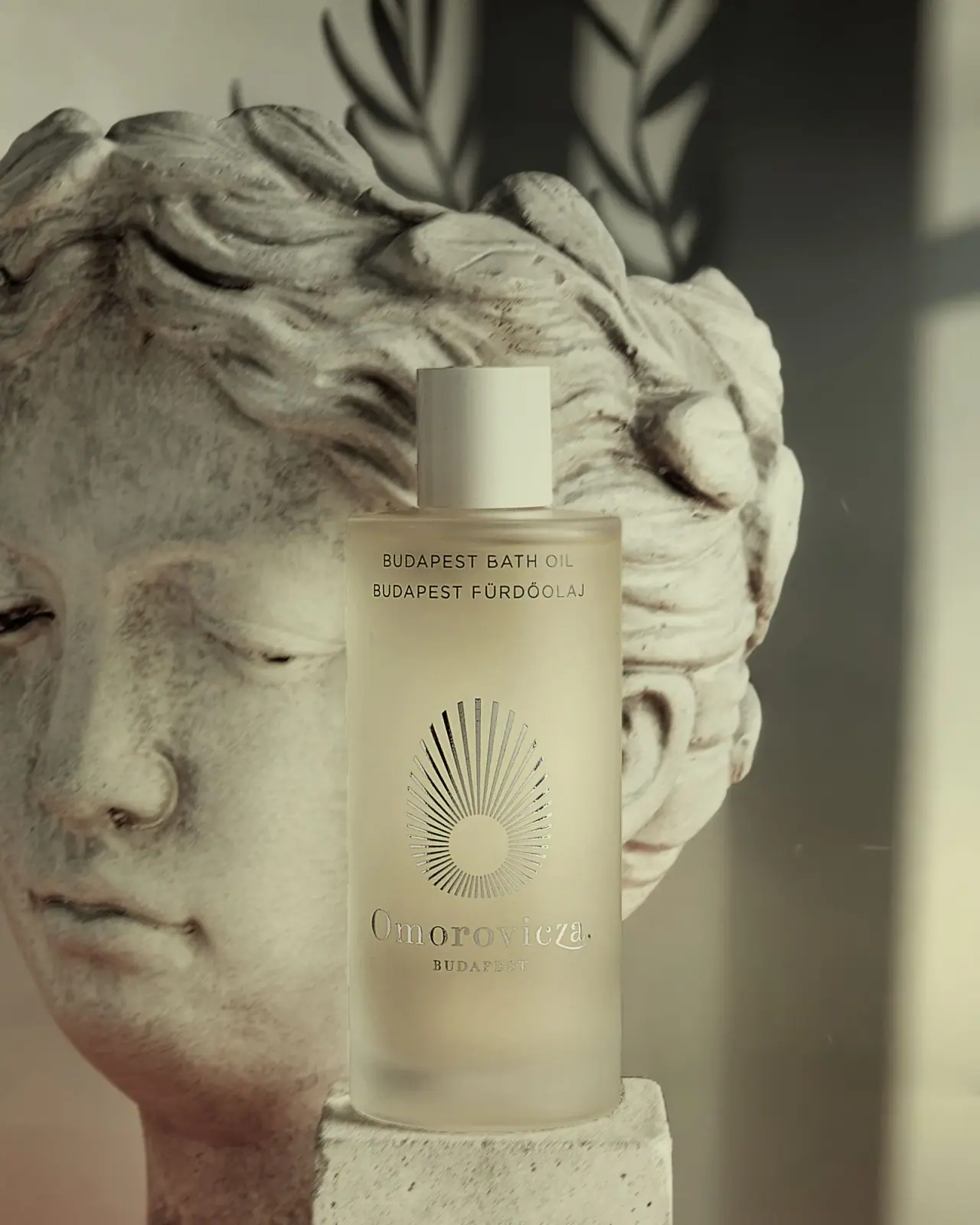
The Budapest Bath Oil cover preserves Omorovicza’s earlier quiet label system: a frosted-looking cylinder, pale cap and radiating sun emblem. The brand later announced a 2025 packaging redesign and says its new glass containers are 100% recyclable, but that current guidance should not be assigned to this earlier pictured pack without matching edition confirmation.
Omorovicza’s current listing identifies Budapest Bath Oil. The selected cover shows its earlier radiating sun emblem and label layout.[1]
Edition note. The local cover shows the earlier Omorovicza label. The brand’s 2025 material and recycling statements describe its redesigned packaging, not necessarily this photographed version.
Pack construction & use
- Earlier bottle edition
- The selected photograph shows a tall frosted-looking cylindrical bottle with a pale cylindrical cap. Material is not confirmed for this particular earlier edition by the current product listing.Observed in the reference photograph
- Brand’s 2025 packaging update
- Omorovicza says its new glass containers are 100% recyclable, its lids contain 50% post-consumer recycled plastic and its boxes use recycled paper stock or non-paper card. The brand’s stated recyclability depends on local collection systems, and these specifications apply to its new packaging program rather than the pictured earlier edition by default.[2]
What makes the design work
Editorial analysis of this packaging reference.
An elongated radial emblem anchors the front
Unequal-length rays surround a small circular centre, producing an elongated, drop-like outer outline. The emblem separates the fine bilingual product names from the lower serif producer signature without adding a filled badge.
Bilingual naming makes provenance part of the label
BUDAPEST BATH OIL is followed by its Hungarian counterpart on the same upper panel. This paired naming acknowledges the place reference through the product face rather than relying only on brand storytelling elsewhere.
Open spacing lets the brand mark breathe
Generous blank space separates the small product text, emblem and reflective-looking Omorovicza lettering. The vertical rhythm gives each information tier its own role on a narrow cylindrical surface.
Ideas for your next brief
- Build a tall label around three distinct vertical zones: product name, emblem and brand signature.
- Use bilingual naming to make a product’s geographic reference visible in the pack hierarchy.
Sources & further reading
Researched 19 October 2026