Photography: Franco Guidi photography. Images belong to their respective owners.
Omorovicza

Frosted bath-oil cylinder with a reflective radiating emblem
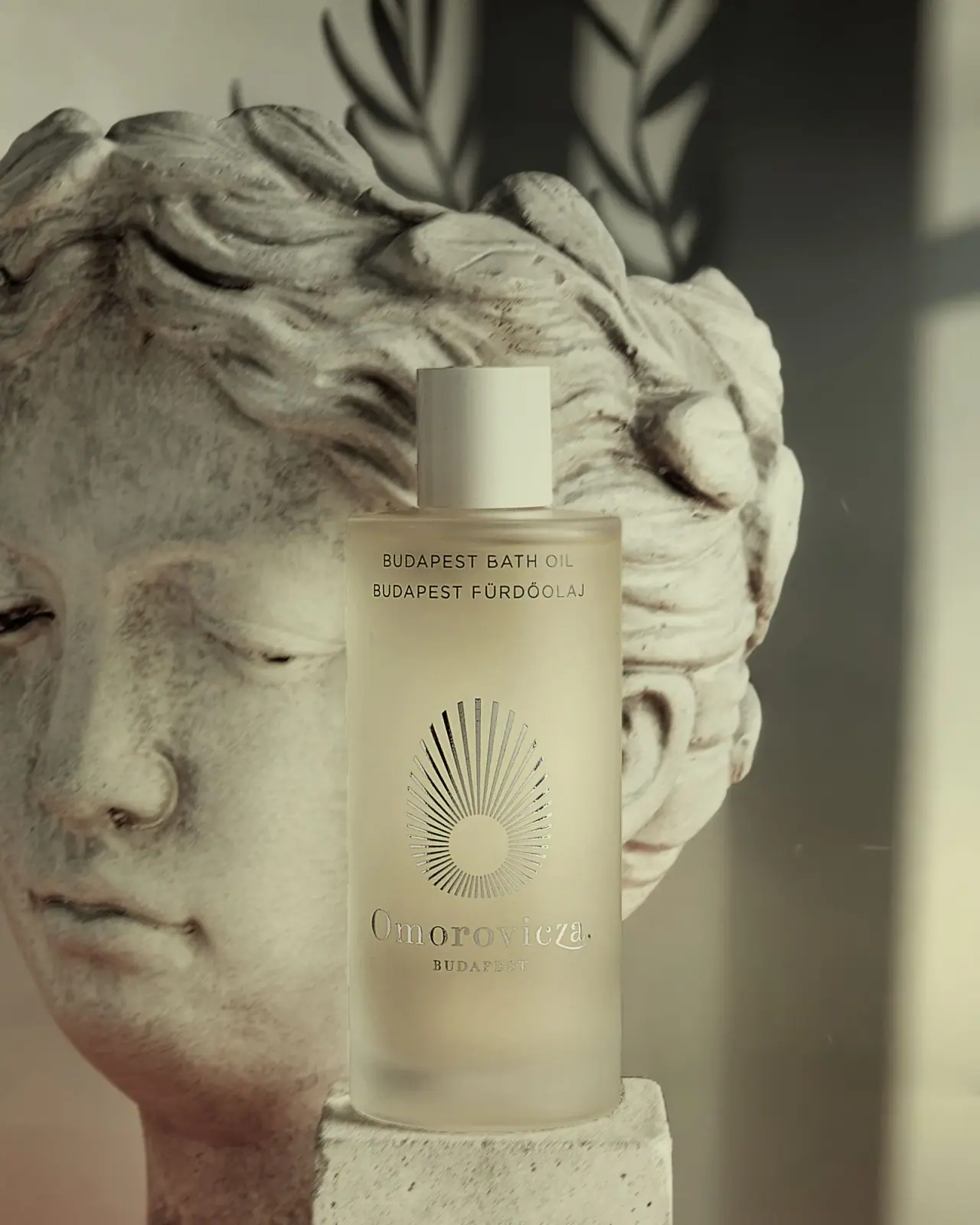
The selected earlier Budapest Bath Oil bottle uses three widely separated front zones: small bilingual naming near the shoulder, a large radiating emblem in the middle and reflective serif producer lettering below. A pale cylindrical cap continues the quiet vertical silhouette. Warm light and the stone sculpture behind the bottle give its frosted-looking wall a cream tint. The brand announced a new packaging system for 2025, so current material claims are kept separate from this earlier photographed treatment.
- Body & bath
- Light pack
- Luxe monochrome
- Heritage label
About this study
Earlier Budapest Bath Oil cylinder with radiating emblem; later 2025 packaging programme used only for edition distinction.
Sources & evidence · Reviewed 2026-10-19Color Palette
Approximate colours interpreted from photography. These are screen references, not official brand colours or print specifications.
Pack body
Warm frosted cream
#C9C5A8
Approximate body appearance under warm, olive-toned scene lighting. This is not a verified coloured substrate or a precise liquid shade.
Pale cap
#D6D6BE
Opaque-looking cylindrical cap, slightly lighter than the body in this photograph.
Ink
Dark product naming
#272923
Small bilingual uppercase text near the shoulder. Parts brighten with reflection, so the physical decoration process is not inferred.
Accent
Reflective silver-grey
#AEB1A7
Emblem and producer lettering alternate between light and dark reflections. This records metallic-looking appearance rather than confirmed foil or metal content.
Typography
Suggested visual alternatives, not confirmed brand typefaces. Any scale below is an illustrative estimate.
BUDAPEST BATH OIL and BUDAPEST FÜRDŐOLAJ form two short centred lines high on the body. A large area of blank surface separates them from the radiating emblem. Below that emblem, Omorovicza spans much of the front in a fine serif, with a smaller tracked BUDAPEST line underneath. The producer is low on the bottle rather than above the category, and the emblem supplies the strongest central shape. This creates a slow vertical sequence instead of one compact label block.
Fonts
Product-name alternative
Inter
- Looks like
- Inter
- Type
- Sans serif
- Weight
- Regular 400 / Medium 500
- Case
- Uppercase
- Tracking
- Moderately open
- Fallback
- sans-serif
Use a restrained sans serif for two parallel language lines. Preserve Hungarian accents and test their spacing at small size rather than removing diacritics to simplify the layout.
Producer alternative
Cormorant Garamond
- Looks like
- Cormorant Garamond
- Type
- Serif
- Weight
- Regular 400 / Medium 500
- Case
- Mixed-case producer; small uppercase location
- Tracking
- Open for location, neutral for producer
- Fallback
- serif
A proposed fine serif voice for an original lower signature. Its delicate strokes need material and lighting tests if a reflective treatment is used; the existing custom mark is not attributed to this font.
Structure & Proportions
Visual proportions and finish previews are illustrative. Confirmed construction details and uncertainties are distinguished in the study notes.
Proportions
| Purpose | Value | Preview |
|---|---|---|
| Tall body and narrow cap | The long cylindrical body provides space for widely separated information zones; the cap is substantially narrower and remains a simple top accent. | — |
| Emblem spacing | A large blank interval separates the two product lines from the central radiating symbol. | — |
| Lower signature | The serif producer spans most of the available front width below the emblem, with a much smaller location line beneath it. | — |
Shapes
| Element | Value | Preview |
|---|---|---|
| Bottle body | Tall cylinder with a softly rounded shoulder and base. | |
| Cap | Narrow tall cylinder with a flat-looking top. | |
| Radiating emblem | Unequal rays around a circular centre form an elongated drop-like outer outline. |
Finishes
Frosted-looking wall
Bottle body; substrate and frosting process unverified for this earlier edition. · frosted
Reflective identity appearance
Radial emblem and lower producer lettering; process unknown. · metallic
Muted pale cap
Smooth opaque-looking closure. · matte
Formats and materials
| Formats | A tall cylindrical bath-oil bottle with a narrow cylindrical cap and gently rounded shoulder. The current official product page lists 100 ml; no capacity line is legible on the photographed front. |
| Materials | This earlier specimen has a frosted-looking body and pale opaque-looking cap, but the accessed current product listing does not establish its exact body or closure material., The brand’s 2025 redesign announcement gives new glass-container and recycled-plastic-lid specifications. Those statements belong to that programme and are not automatically assigned to this earlier bottle. No label stock, coating or decorative metal is verified here. |
| Closures | The closed pale cap is narrower than the body and meets a short neck at the shoulder. No outlet, reducer, thread, liner or tamper seal is visible. A bath-oil format alone does not establish the dispensing hardware. |
| Decoration | The central motif consists of rays around a small circular opening, with longer rays above creating an elongated, drop-like outer contour. It is not simply a uniformly circular sun., The front has no visible bordered label panel. Fine bilingual naming, emblem and producer sit directly against the frosted-looking field, although the method of application remains unknown. |
Front Panel
Schematic reading order. The diagram’s zone heights do not represent measured artwork proportions.
The front is organised as a sequence of open vertical zones rather than a bounded rectangular label. Fine product information sits near the shoulder, the large radial symbol occupies the middle, and the producer signature sits below. The clear spaces between these elements are as important as their size. The layout relies on the tall body to separate practical naming from identity without introducing dividers or extra colours.
| Zone | Content |
|---|---|
| Bilingual product naming | Two uppercase lines pair the English product name with Hungarian wording. Both use the same restrained scale and remain separate from the producer below. |
| Open middle interval | An unprinted-looking area gives the small product text room before the emblem begins. It prevents the tall front from reading as one dense stack. |
| Radiating identity | The central circle and uneven-length rays create an elongated emblem. Its changing reflections make it a visual focal point without a solid filled badge. |
| Producer and place | A fine serif Omorovicza signature sits above small tracked BUDAPEST. Reflective highlights change contrast across the word, so a neutral image is useful for transcription. |
Range System
The study is limited to the earlier Budapest Bath Oil presentation visible in the approved photograph. The official 2025 announcement describes updated identity and collection colours, but those later rules are not projected backwards onto this specimen. The current bath-oil listing confirms the product identity and 100 ml listing; the front image itself does not document a complete historic range.
- An original bilingual range can keep product names at the shoulder and identity lower down, provided each bottle offers enough vertical space. Short formats would require a fresh layout rather than simply compressing the gaps.
- When documenting a redesign, compare dated front images and component specifications separately. Similar frosted appearances can conceal material changes, and a later recycled-content statement should not be used as a historical assumption.
Back of Pack & Shelf
The reverse, base and open neck are unseen. No ingredients, quantity, batch or instruction layout can be reconstructed from this front view. Online usage text describes the product but not its printed reverse.
- Obtain a dated reverse image for the same earlier label treatment.
- Verify the outlet before describing pouring control or a removable reducer.
- Keep new-packaging recycling claims separate until the pictured edition is matched to the relevant specification.
On shelf
The central radial symbol and broad lower signature should be recognised before the fine bilingual product text at reduced image size. Their reflective appearance can also weaken contrast when they catch a light background, making an alternate lighting view useful. This is a visual interpretation rather than tested shelf performance. The catalogue should preserve the earlier-edition identity and pair the atmospheric sculpture image with a neutral front view for accurate material and colour comparison.
Imagery
The bottle stands on a pale block in front of a large classical stone head, with plant shadows falling across the background. Warm directional light unifies the frosted wall, pale cap and sculpture, while the reflective emblem catches sharper highlights. The sculpture is a scene prop, not evidence of a stone component or a specific historical provenance for the container. The photographer’s still-life portfolio was accessible and provides the original image context; the actual local cover was inspected for the label details.
Guidelines
Editorial principles for an original design brief, not official brand guidelines.
Do
- Preserve diacritics in the Hungarian product line.
- Treat the 2025 redesign as a separate edition context.
- Describe the emblem’s elongated outline accurately.
- Check reflective lettering in neutral and directional light.
Don't
- Do not assign current recycled-plastic lid content to this earlier cap.
- Do not infer glass or a frosting process from the photograph.
- Do not treat the stone sculpture as a bottle material.
- Do not invent quantity placement or an unseen pour reducer.
Sources & evidence
- Budapest Bath Oil — Omoroviczaproduct
- A New Look for Omoroviczabrand
- Still-life photography — Franco Guidiphotographer
How this study was built
edition · Sourced fact
Brand announces gradual 2025 redesign with updated identity and packaging specifications, kept separate from earlier image.A New Look for Omoroviczastructure · Sourced fact
Current official bath-oil listing gives 100 ml; selected front has no readable quantity.Budapest Bath Oil — Omoroviczaimagery · Sourced fact
Photographer still-life portfolio supports approved image context.Still-life photography — Franco Guiditypography · Visual observation
Two small bilingual uppercase lines contrast with lower reflective serif signature.label · Visual observation
Unequal rays around circular centre make an elongated emblem, separated from naming by open space.palette · Visual observation
Warm frosted body, pale cap and silver-grey reflections are affected by sculpture-scene lighting.range · Editorial interpretation
One earlier bath-oil front does not establish all historic or redesigned collection rules.
What remains unverified
- Earlier bottle and cap materials unverified; 2025 programme not applied retrospectively.
- Reflective finish process and original fonts unverified.
- Current 100 ml listing is not a legible front quantity observation.
- Reverse, base, neck outlet and exact photograph date unverified.
- Warm scene affects apparent colours.
Give your AI
packaging taste
Give your design or image tool a packaging study: palette, type, structure, front panel and principles for an original brief.
Export this styleFree with an email. PACK.md works in Claude, ChatGPT, Cursor and image tools.
More like this
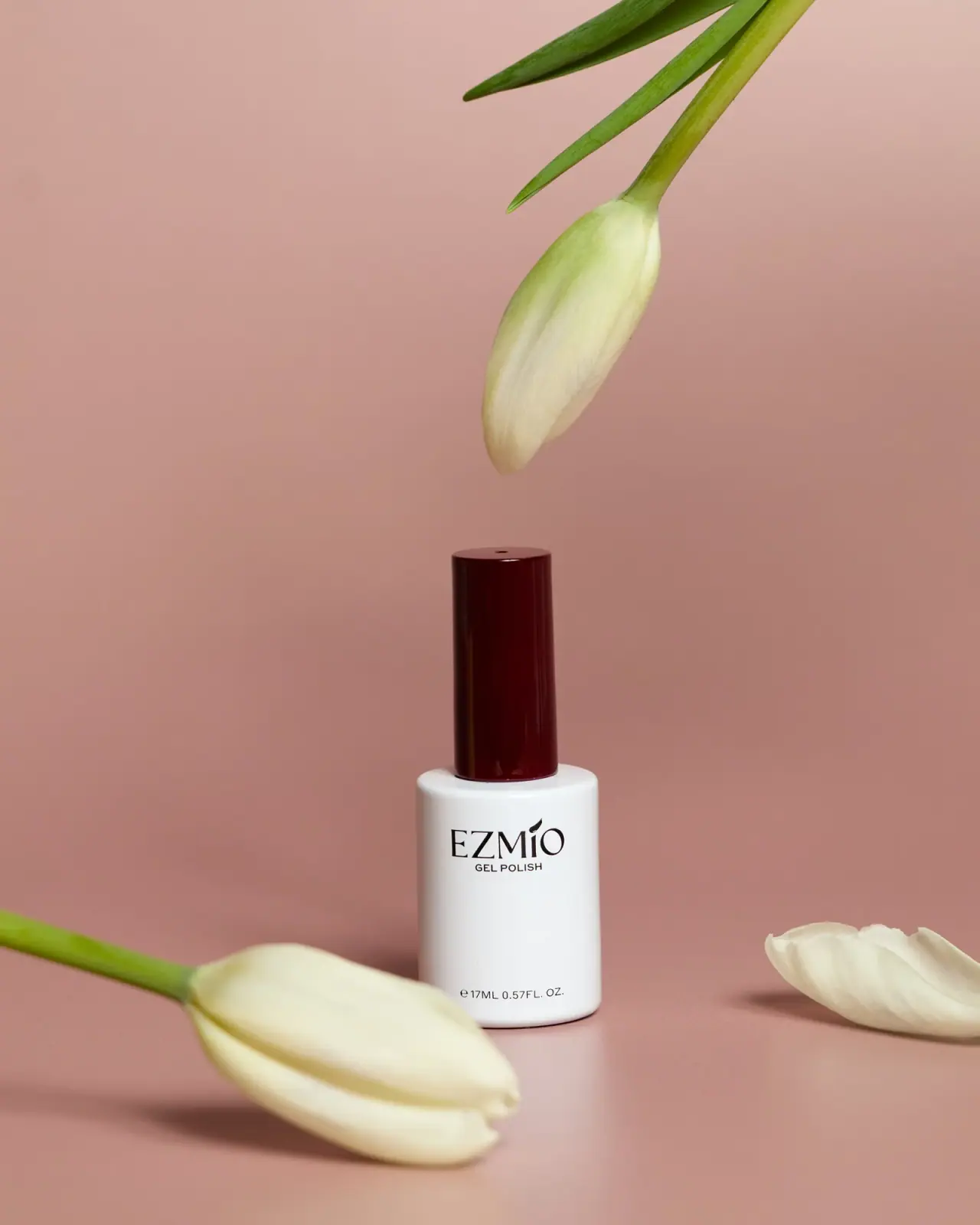
Ezmio Beauty
White polish bottle, tall burgundy cap, spare serif identity
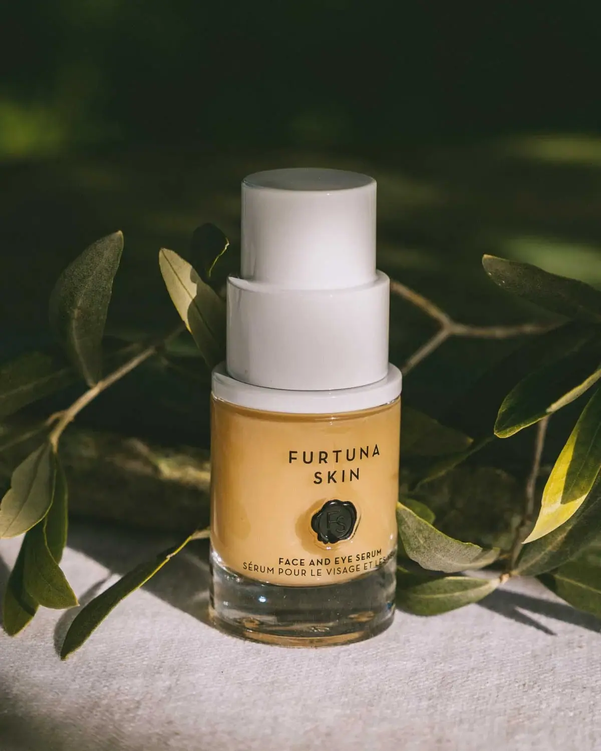
Furtuna Skin
A tiered white top above a warm sealed identity
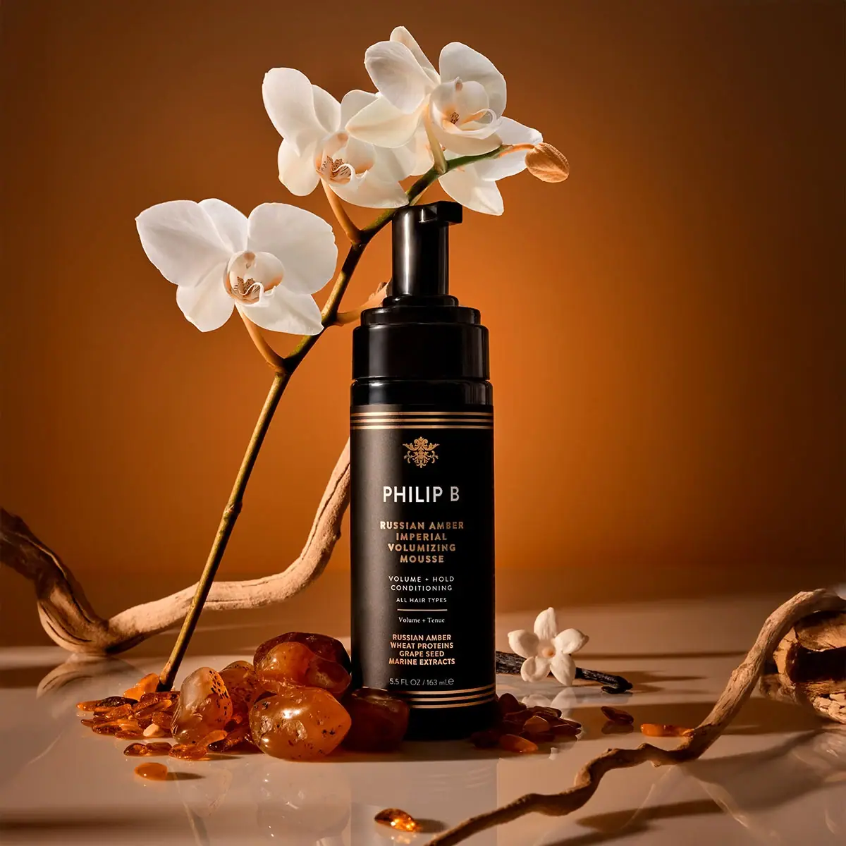
Philip B
gold rules and a crest on a black foamer
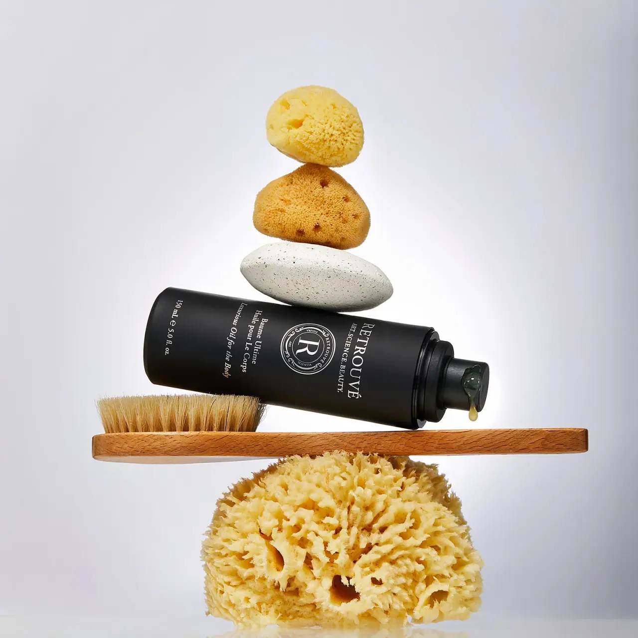
Retrouvé
White serif seal on a black airless body-oil cylinder

Aerangis
a quiet numbered object, an intimate scent memory

Alexander McQueen
An oval flacon crowned with dense black relief

Arquiste
blush transparency, white lettering and a stepped gold cap

Chabaud
A framed perfume label beneath a clear architectural cap