About this packaging
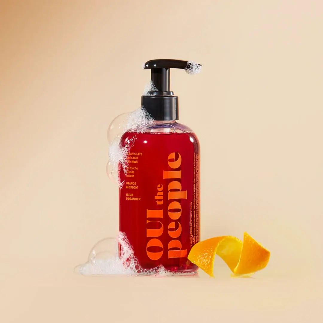
OUI the People’s Clean Slate Lactic Acid Body Wash appears in a clear rounded bottle filled with red liquid, topped by a black pump. Oversized orange serif lettering runs vertically down the front, with smaller pale product and Orange Blossom text beside it.
OUI the People identifies Clean Slate as a lactic acid body wash scented with Orange Blossom.[1]
Pack construction & use
- Bottle and pump
- The selected image shows a clear, rounded bottle filled with red liquid and topped with a black pump; the body and closure materials are not verified.Observed in the reference photograph
- Scent labeling
- The Orange Blossom scent name appears in smaller yellow lettering beside the oversized orange serif wordmark. The brand describes the wash as having its signature Orange Blossom scent.[1]
What makes the design work
Editorial analysis of this packaging reference.
Vertical serif lettering makes the label distinctive
The oversized orange name runs along the bottle’s height, giving the front a strong typographic gesture and using the full vertical plane. Its serif forms contrast with the straightforward smaller copy.
Saturated fields do the variant work
Red body color and orange lettering create a bold pairing, while pale product wording supplies a quieter third level. The color system lets the scent variant feel specific without extra illustration.
The pump punctuates the color block
The black pump provides a crisp dark endpoint above the red bottle. Its contrast separates the functional closure from the broad printed surface and reinforces a strong vertical axis.
Ideas for your next brief
- Set a large product or brand name vertically when the pack face is tall and broad enough to support it.
- Use a quieter secondary color for small scent and product information against a saturated body.
- Keep component-material descriptions separate from color and finish observations.
Sources & further reading
Researched 19 October 2026