Photography: OUI the People official photography. Images belong to their respective owners.
OUI the People

Rotated orange serifs over red wash with black pump
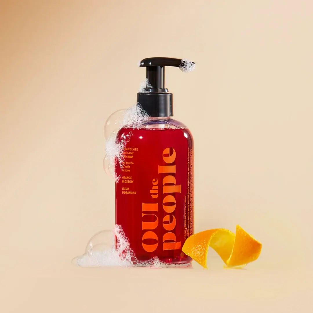
Clean Slate Orange Blossom uses visible red wash as the main colour field behind oversized orange serif lettering. The OUI the People maker is rotated along the bottle's height, while a small upright block at the upper left supplies the product role and scent in English and French. A black pump adds a dark functional top to the rounded transparent bottle. Foam and orange peel provide context in the selected official photograph. The current product page identifies a 250 mL body wash, but the selected front does not provide a clearly readable quantity or a verified bottle material.
- Body & bath
- Light pack
- Bold typographic
- Playful colour
About this study
Selected red-filled Clean Slate Orange Blossom pump photograph. Current 250 mL listing supplies context; material, hidden text and exact photographed capacity marking remain unverified.
Sources & evidence · Reviewed 2026-10-19Color Palette
Approximate colours interpreted from photography. These are screen references, not official brand colours or print specifications.
Pack body
Black dispensing top
#1C1917
Pump, stem and collar form a dark upper endpoint above the transparent shoulder.
Ink
Bright orange maker
#F77E13
Large rotated serif lettering. Its warm contrast against red is more tonal than black-on-white, making size important to readability.
Warm yellow-orange small copy
#F5AD42
Approximate lighter appearance of the small product and scent text; exact number of print inks is unverified.
Accent
Visible deep red wash
#B60916
Approximate colour of the contents seen through the clear-looking bottle. Lighting, fill and wall transmission influence it; no pigment or formula-colour origin is established.
Typography
Suggested visual alternatives, not confirmed brand typefaces. Any scale below is an illustrative estimate.
The maker occupies two parallel lines rotated along the long axis of the bottle: OUI the on one line and people on the other. Large high-contrast serif forms make the name a graphic structure rather than a conventional header. The small connector the changes scale within the maker, preserving its phrase rhythm. In contrast, CLEAN SLATE, the lactic-acid body-wash description and the scent information remain upright in a narrow block at the upper left. This creates two reading orientations with different purposes: expressive brand recognition and practical identification. Fine side copy is also visible near the right edge but is not fully transcribed.
Fonts
Original expressive maker alternative
DM Serif Display
- Looks like
- High-contrast editorial serif
- Type
- Display serif
- Weight
- Regular
- Case
- Mixed uppercase and lowercase
- Tracking
- Close with optical spacing
- Fallback
- Georgia, serif
Explore a distinctive original name with strong thick-thin strokes. Use the bottle's height deliberately, but change line arrangement and lettering rather than copying the two-line OUI the People identity.
Product and scent alternative
Barlow Condensed
- Looks like
- Compact narrow sans serif
- Type
- Condensed sans serif
- Weight
- Regular, Medium
- Case
- Uppercase role and scent with mixed-case details
- Tracking
- Normal
- Fallback
- Arial Narrow, sans-serif
Keep practical wording upright and readable next to a rotated maker. Allow translations separate lines and verify contrast before choosing a similarly warm small-copy colour.
Structure & Proportions
Visual proportions and finish previews are illustrative. Confirmed construction details and uncertainties are distinguished in the study notes.
Proportions
| Purpose | Value | Preview |
|---|---|---|
| Height used for identity | Rotating the maker lets its large letters use most of the body height while keeping the bottle narrow and upright. | — |
| Practical information pocket | The small role and scent block sits above and to the left of the dominant maker rather than sharing its orientation or scale. | — |
| Visible clear margins | Clear headspace and a thin lower edge reveal the vessel around the red field, helping distinguish contents from an entirely opaque red container. | — |
| Functional top | The pump assembly forms a compact black upper zone above the much longer coloured body, with a lateral spout breaking the vertical symmetry. | — |
Shapes
| Element | Value | Preview |
|---|---|---|
| Bottle | Tall straight-sided body with rounded shoulder and softened base. | |
| Pump | Raised dispensing head, central stem and smooth collar with a side-projecting spout. | |
| Rotated maker block | Two long parallel typographic lines occupying the central and rightward body area. | |
| Upright facts | Small narrow rectangular text column near the upper-left front. |
Finishes
Clear glossy vessel appearance
Body, shoulder and lower edge; substrate unspecified · transparent
Glossy black pump
Upper dispensing assembly · gloss
Formats and materials
| Formats | Tall transparent-looking bottle with rounded shoulders, Raised black pump and cylindrical collar, Visible red contents with a clear headspace near the shoulder, Current official listing identifies 250 mL; selected quantity not readable |
| Materials | The body is clear-looking but glass or a particular plastic has not been verified., The opaque black pump contains multiple visible components, without a sourced polymer or metal specification., No visible opaque paper rectangle surrounds the lettering; direct decoration or a transparent label are both possibilities, so the application method is left unspecified. |
| Closures | The black dispensing head projects to the right above an extended central stem and smooth cylindrical collar. Foam sits on part of the spout and shoulder, partially obscuring the assembly. The visible raised position establishes how the product was staged, not a verified lock direction, pump output or transport state. No refill compatibility, tamper feature, internal spring or dip-tube construction is confirmed. The dark top remains visually separate from the saturated lower body even where the clear shoulder catches warm reflections. |
| Decoration | Large longitudinal two-line serif maker, Small upright bilingual product and scent block, Very fine side information near the turning edge, No printed orange-fruit illustration or enclosing decorative border |
Front Panel
Schematic reading order. The diagram’s zone heights do not represent measured artwork proportions.
The selected front behaves like typography placed over a visible colour field rather than an opaque paper label. Large orange maker letters run upward along the body. The smaller upright text begins near the upper left with CLEAN SLATE and the body-wash role, followed by French wording and the Orange Blossom scent in both languages. The maker's broad serifs create large orange shapes, while the small sans-serif lines act as factual annotations. Foam obscures parts of the left margin, and some fine side text turns around the bottle. Those areas are not reconstructed from the current website.
| Zone | Content |
|---|---|
| Upper-left product facts | CLEAN SLATE and lactic-acid body-wash wording with French product text beneath. |
| Upper-left scent facts | Orange Blossom and Fleur d'Oranger in a small upright block. |
| Dominant maker | Large orange OUI the / people lettering rotated along the bottle height. |
| Right turning edge | A narrow strip of fine copy is visible but not fully readable from this photograph. |
Range System
The current official source identifies Clean Slate as a 250 mL lactic-acid body wash with Orange Blossom scent. That establishes this product's role and scent, but not a complete colour code for the brand's other washes, oils or fragrances. The selected red-and-orange pairing can be analysed as a specific visual identity without declaring that red always means this scent across the range. The upright scent block is especially useful because it supplies an explicit name rather than relying solely on colour. Other editions or related products should be compared directly before transferring the bottle format, maker orientation or ink palette.
- Clean Slate is the product name, while Orange Blossom identifies the scent; the image gives each a distinct small text position.
- The large maker remains the dominant visual gesture rather than the scent name.
- An original range can preserve a fixed upright identification pocket while allowing a larger expressive graphic to vary, provided practical reading remains reliable.
Back of Pack & Shelf
The reverse and underside are not visible, and only a narrow side text strip can be seen around the right edge.
- No complete ingredient declaration, barcode, batch code or quantity mark is transcribed from the selected pack.
- The current online formula and directions are not treated as exact photographed rear artwork.
- No recycling code, material composition or refill instruction is established from this front view.
On shelf
The red contents and orange serif forms should produce a strong colour impression before the small factual block is read. This is visual interpretation rather than tested retail performance. The rotated maker takes advantage of height, but a person may turn the bottle to read it naturally. The upright role and scent information therefore have a practical job beyond decoration. Testing should include reduced fill levels and different backgrounds, because transparent packaging changes as the contents recede and the red field no longer sits behind every letter.
Imagery
The official image places the bottle on a warm pale background with foam climbing its left side and gathering at the base. A curled orange peel sits to the right, echoing the maker's orange colour and the named scent without becoming a printed graphic. Large bubbles make the clear shoulder more visible but also conceal some of the small copy. The composition leaves the rotated maker mostly unobstructed. Foam demonstrates the intended cleansing context visually, not a measured lather quantity, efficacy result or formulation test. The photograph's orange peel should not be treated as a complete ingredient declaration.
Guidelines
Editorial principles for an original design brief, not official brand guidelines.
Do
- Use bottle height deliberately for a rotated identity.
- Keep product role and scent readable in an upright block.
- Test transparent packs at several fill levels.
- Preserve English and French information as separate readable lines.
- Distinguish visible contents colour from verified vessel material.
Don't
- Do not infer a glass bottle from transparency alone.
- Do not assume that orange props are a full ingredient statement.
- Do not let a large maker make the functional text unreadably small.
- Do not invent the fine side copy hidden by curvature or foam.
- Do not treat the photographed lather as a performance measurement.
Sources & evidence
How this study was built
edition · Sourced fact
Official page identifies Clean Slate lactic-acid body wash, Orange Blossom scent and 250 mL current size.Clean Slate Lactic Acid Body Wash — OUI the Peopletypography · Visual observation
Large orange serif maker is rotated in two parallel lines while small role and scent text remain upright.Clean Slate Lactic Acid Body Wash — OUI the Peoplelabel · Visual observation
English and French product and scent wording occupy the upper-left information block.Clean Slate Lactic Acid Body Wash — OUI the Peoplestructure · Visual observation
Clear shoulder headspace and lower edge surround visible red contents below a raised black pump.Clean Slate Lactic Acid Body Wash — OUI the Peopleimagery · Visual observation
Foam and curled orange peel belong to the scene and partially obscure the left margin.Clean Slate Lactic Acid Body Wash — OUI the Peoplepalette · Editorial interpretation
Because contents supply the red background, the lettering should be evaluated at changing fill levels rather than only in the full-bottle photograph.Clean Slate Lactic Acid Body Wash — OUI the People
What remains unverified
- Bottle and pump materials, decoration method and exact fonts unknown.
- Foam and curvature obscure parts of the small text.
- No reverse, underside or readable selected quantity mark.
- No complete range colour system or performance evidence inferred from the photograph.
Give your AI
packaging taste
Give your design or image tool a packaging study: palette, type, structure, front panel and principles for an original brief.
Export this styleFree with an email. PACK.md works in Claude, ChatGPT, Cursor and image tools.
More like this

ACURE
Iridescent spectacle with practical, tightly ordered type

Bask
sunny yellow with a playful turquoise signature

Beame
Orange bubble lettering, pink mascot, clear product badge

Bread Beauty Supply
bubblegum pumps and a fat black wordmark

Cut By Fred
Orange gel, cropped geometry and bold bilingual utility

Dune Suncare
Coral bottle with striped vertical identity and small left-aligned copy

e.l.f. Cosmetics
Pink tube, black cap, oversized thin lowercase signature
Ethique
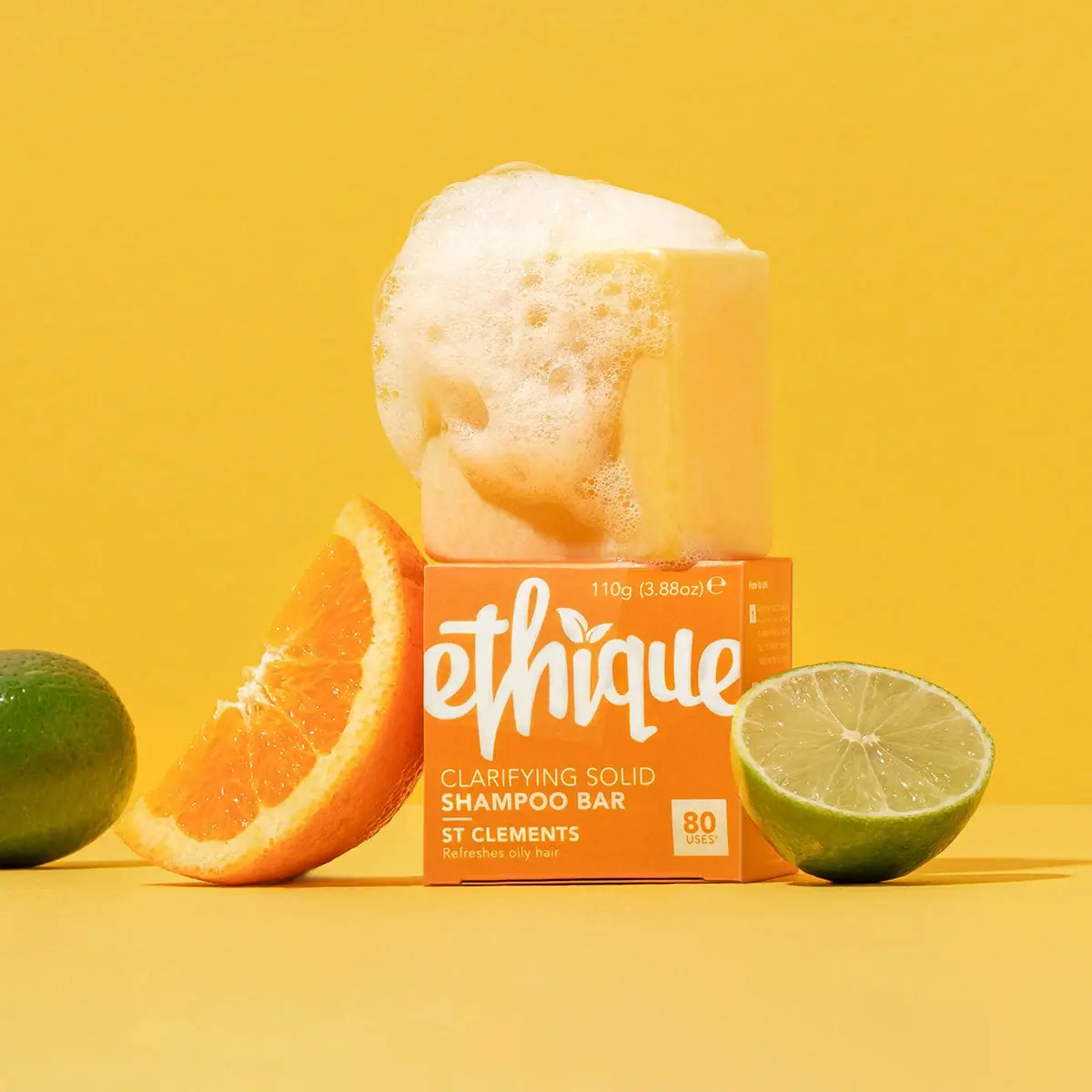
Orange carton, oversized white script and a lathered square bar