About this packaging
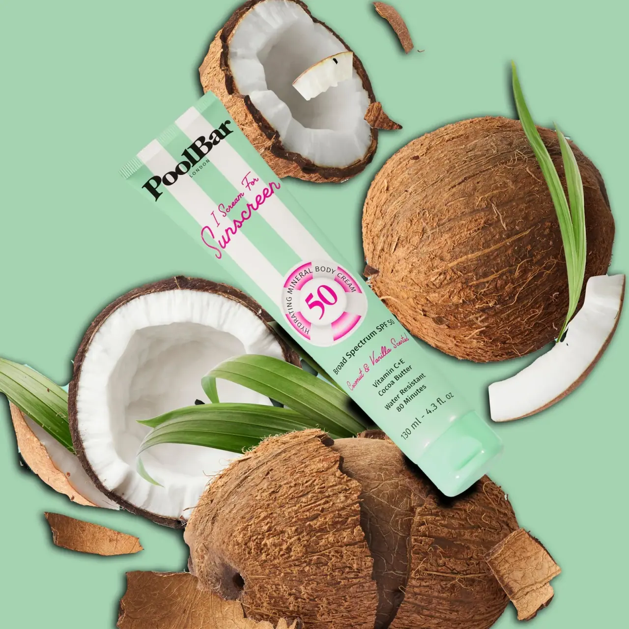
PoolBar London presents its body sunscreen in a beach-inspired visual language that makes the product name and SPF level central.
PoolBar London’s official listing identifies a Mineral SPF 50 Body Sunscreen in 130 ml. The selected package names Coconut & Vanilla and uses the I Scream For Sunscreen line; the product page does not state tube material or recyclability.[1]
Pack construction & use
- Product format and size
- PoolBar’s official page identifies a 130 ml Mineral SPF 50 Body Sunscreen.[1]
- Tube graphics
- The mint-green squeeze tube has broad alternating mint and white vertical stripes. A bold black PoolBar wordmark sits above a bright pink cursive product line. The pink 50 sits inside a white-and-pink lifebuoy motif in the center of the front.Observed in the reference photograph
What makes the design work
Editorial analysis of this packaging reference.
Numeric focus
The SPF50 numerals sit in a lifebuoy-style ring, giving the key product identifier a central visual position.
Contrasting voice
A compact black wordmark and bright pink script create distinct brand and variant voices without competing for the same role.
Pattern interruption
Broad stripes form a recognizable background, interrupted by the central circular badge to establish a focal point.
Ideas for your next brief
- Frame a primary numeric attribute so it is immediately legible on a crowded shelf.
- Break a repeating stripe with one clear central badge to create a focal point.
Sources & further reading
Researched 19 October 2026