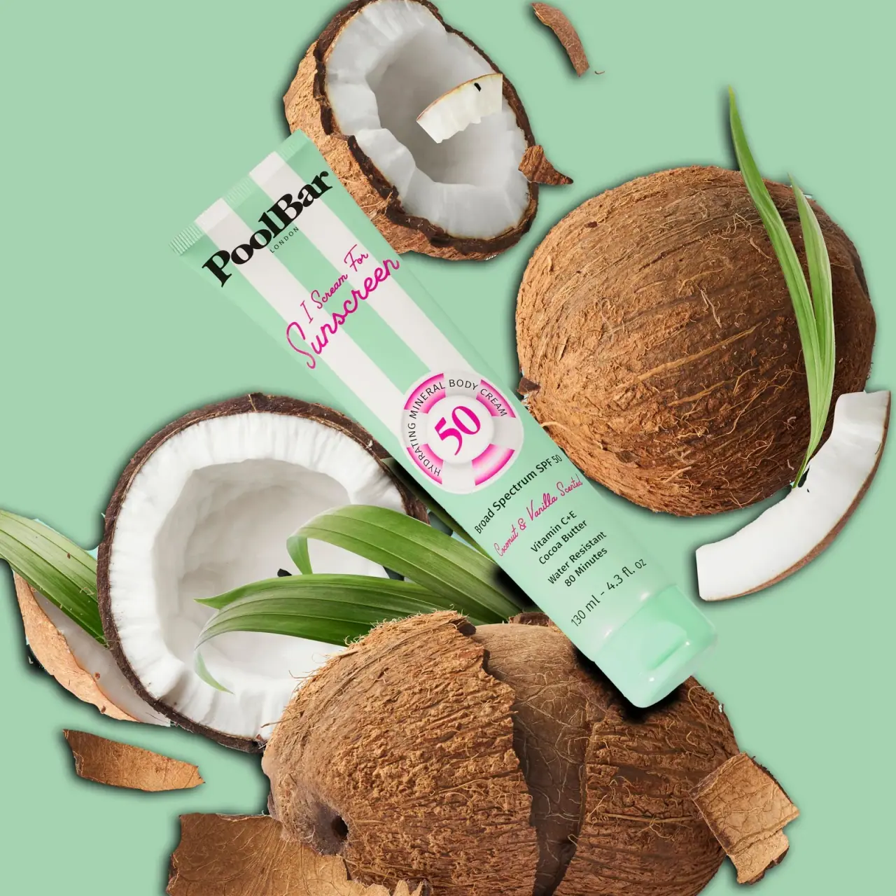
Photography: RANCH Studio — PoolBar London photography. Images belong to their respective owners.
PoolBar London

Mint beach stripes with pink script and a lifebuoy badge
The selected Coconut & Vanilla sunscreen tube uses mint and white beach stripes above a quieter mint lower panel. A heavy black serif producer name, bright pink script and a large illustrated lifebuoy create three distinct reading levels. The ring frames the protection number while short functional lines sit beneath it. The official product page identifies a 130 ml mineral body sunscreen; the image supports this particular front design, not the packaging specification of every PoolBar product.
- Suncare
- Light pack
- Retro illustrated
- Playful colour
About this study
Selected 130 ml Coconut & Vanilla front photographed by Ranch Creative; tube construction and reverse unseen.
Sources & evidence · Reviewed 2026-10-19Color Palette
Approximate colours interpreted from photography. These are screen references, not official brand colours or print specifications.
Pack body
Poolside mint
#B7D8C8
Approximate tube ground and matching fitted cap. The photographic backdrop is close in colour but is not an additional printed surface.
Ink
Beach-stripe white
#F3F4E9
Alternating upper stripes and the pale lifebuoy illustration. Lighting and shading change the apparent white across the ring.
Sunscreen pink
#D76891
Script title, large protection number and sections of the illustrated ring. This energetic accent interrupts the restrained mint field.
Producer black
#242723
Heavy serif identity and compact functional lines. It supplies the strongest text contrast against both mint and white.
Typography
Suggested visual alternatives, not confirmed brand typefaces. Any scale below is an illustrative estimate.
PoolBar appears first as a heavy mixed-case serif, with a small tracked LONDON beneath it. The pink I Scream For Sunscreen script introduces a much looser rhythm across the striped upper body. A large pink 50 occupies the centre of the lifebuoy illustration, surrounded by a curved functional descriptor. Below the ring, a short black protection line anchors smaller scent and ingredient-supporting copy. The hierarchy alternates expressive display lettering with compact factual information rather than asking one typeface to perform every task.
Fonts
Producer alternative
DM Serif Display
- Looks like
- DM Serif Display
- Type
- Display serif
- Weight
- Regular 400
- Case
- Mixed case
- Tracking
- Close to neutral
- Fallback
- serif
Use a strong serif silhouette for an original producer name. The goal is a compact and recognisable top anchor, not imitation of the existing PoolBar lettering.
Expressive title alternative
Pacifico
- Looks like
- Pacifico
- Type
- Script
- Weight
- Regular 400
- Case
- Title case
- Tracking
- Natural joined lettering
- Fallback
- cursive
A possible playful script for a short original product title. Test it over stripes and keep it away from dense functional text; the photographed lettering is not attributed to this font.
Functional copy alternative
Inter
- Looks like
- Inter
- Type
- Sans serif
- Weight
- Regular 400 / Medium 500 / SemiBold 600
- Case
- Mixed case with compact uppercase descriptors
- Tracking
- Neutral, slightly open for very short capitals
- Fallback
- sans-serif
Reserve a clear sans serif for verified product category, quantity and practical information. Curved lines need separate legibility testing because perspective already compresses text on a tube.
Structure & Proportions
Visual proportions and finish previews are illustrative. Confirmed construction details and uncertainties are distinguished in the study notes.
Proportions
| Purpose | Value | Preview |
|---|---|---|
| Upper striped field | The striped area occupies the upper portion of the long body and stops around the central badge, leaving a calmer lower area. | — |
| Central protection badge | The ring is large enough to interrupt several stripes and establish a separate numeric focal point. | — |
| Lower copy stack | Short horizontal lines fit beneath the badge with a small quantity line close to the cap end. | — |
Shapes
| Element | Value | Preview |
|---|---|---|
| Tube silhouette | Elongated flexible-looking body with a straight sealed end and rounded shoulder near the fitted cap. | |
| Striped field | Broad alternating vertical bands in the upper region only. | |
| Lifebuoy illustration | Circular shaded ring framing the large protection number. | |
| Fitted cap | Short colour-matched cap with a visible seam; dispensing details unseen. |
Finishes
Smooth softly reflective body
Mint tube surface; coating and substrate unknown. · matte
Smooth cap highlight
Closed mint cap; exact material and finish process unknown. · gloss
Formats and materials
| Formats | A long squeeze-tube format with a sealed ridged upper end and a fitted mint cap at the opposite end. The official listing and photographed front identify 130 ml. |
| Materials | Neither the accessed product page nor the photograph establishes the tube laminate, resin, barrier structure or cap polymer. A smooth flexible-looking tube is not enough to assign a recyclable material specification., The front art appears continuous with the tube surface, but the image does not establish whether it uses direct printing, a sleeve or another decoration process. |
| Closures | A mint fitted cap has a visible boundary and recessed-looking feature. The closed photograph does not show the outlet, open lid or internal seal, so the exact dispensing mechanism is not treated as confirmed. |
| Decoration | Alternating vertical mint and white stripes occupy the upper body; the lower information area returns to plain mint., Pink script crosses the stripes while the central ring creates a bounded area for the largest number. Black copy remains distinct from these decorative elements. |
Front Panel
Schematic reading order. The diagram’s zone heights do not represent measured artwork proportions.
The composition moves from producer to expressive product title, then to a large ring-framed number and a compact lower information stack. Stripes provide the beach association, but their limited vertical coverage prevents every line from competing with the pattern. The central badge bridges the busy and quiet portions of the face. The front is visually rich while retaining a recognisable order.
| Zone | Content |
|---|---|
| Producer at sealed end | The heavy black mixed-case name and small LONDON line establish the maker above the pink script. The crimped edge remains structurally separate from the identity. |
| Striped title field | Pink script is laid over alternating white and mint bands. Its angled, flowing strokes contrast with the rigid vertical pattern. |
| Ring and number | A shaded pink-and-white lifebuoy frames 50, with a curved black body-cream descriptor around the ring. It is illustration, not a structural component. |
| Plain mint information | Below the badge sit the broad-spectrum protection line, Coconut & Vanilla scent lettering, smaller supporting copy and 130 ml quantity. Their exact approved wording should be verified independently before reuse. |
Range System
This study covers the selected Coconut & Vanilla I Scream For Sunscreen SPF50 front. The official page identifies that scent and mineral body-cream format. No other photographed variant is used to establish a complete colour-coding system, and the mint is therefore described as this specimen’s colour rather than a universal category code.
- An original range could keep the producer, ring position and lower information zone stable while changing one clearly controlled scent accent. That is a design proposal, not a claim about an existing PoolBar system.
- Any protection or performance number must remain independently verified for each product. A decorative ring can organise information, but should never make a fictional claim look like an established specification.
Back of Pack & Shelf
Only the front and a limited side curve are visible. The official page contains directions and product information, but web text does not establish the typography or arrangement of an unseen printed reverse.
- Obtain a reverse image before documenting directions, ingredient order or regulatory panel structure.
- Verify the dispensing outlet and closure opening before specifying functional details.
- Keep recycling and material instructions unassigned until component-level evidence is available.
On shelf
The high-contrast producer, pink script and large ring-framed number should remain the most recognisable features when the image is reduced. This is a visual assessment rather than a tested consumer response. The small curved descriptor and lower supporting lines become less readable first, making the distinction between expressive title and functional category useful. In a catalogue, the diagonal hero should be paired with a neutral front view for exact copy review.
Imagery
The tube lies diagonally among whole and opened coconuts, green leaves and a pale mint ground. Coconut flesh and fibrous shells connect directly to the named scent, while the matching background makes the pink script and black producer especially clear. Brown shell and dark green leaves belong to the scene, not the package palette. The angle exposes the crimp and fitted cap but compresses small text; a straight-on isolated product view would complement this atmospheric image.
Guidelines
Editorial principles for an original design brief, not official brand guidelines.
Do
- Keep the stripe pattern away from the smallest information lines.
- Distinguish illustrated depth from actual raised packaging structure.
- Use black functional copy to balance the expressive pink script.
- Photograph the front straight-on as well as in the coconut scene.
Don't
- Do not infer tube or cap material from a smooth mint surface.
- Do not include coconut brown in the printed palette.
- Do not assume the whole brand follows this one scent colour.
- Do not reuse protection claims or numbers without product verification.
Sources & evidence
- Mineral SPF50 Body Cream — PoolBar Londonproduct
- PoolBar London photography — Ranch Creativephotographer
How this study was built
edition · Sourced fact
Official page identifies 130 ml mineral SPF50 body cream, Coconut & Vanilla and I Scream For Sunscreen naming.Mineral SPF50 Body Cream — PoolBar Londonimagery · Sourced fact
Ranch Creative primary project page supports photographer context for the selected image.PoolBar London photography — Ranch Creativestructure · Visual observation
Long tube has sealed crimp and matching fitted cap; opening is unseen.palette · Visual observation
Mint, white, pink and black occur on pack; coconut brown and foliage green belong to scene.typography · Visual observation
Heavy serif producer, pink script and compact factual copy form separate reading levels.label · Visual observation
Upper stripes stop around the circular illustrated badge above plain mint lower information.shelf · Editorial interpretation
Producer, script and ring are expected to survive image reduction better than small curved copy.
What remains unverified
- Tube and cap materials, print process and exact closure mechanism unverified.
- Reverse panel and other range variants not inspected.
- Font alternatives are proposals; colours are photographic approximations.
- Lifebuoy depth is illustration, not a confirmed raised component.
Give your AI
packaging taste
Give your design or image tool a packaging study: palette, type, structure, front panel and principles for an original brief.
Export this styleFree with an email. PACK.md works in Claude, ChatGPT, Cursor and image tools.
More like this
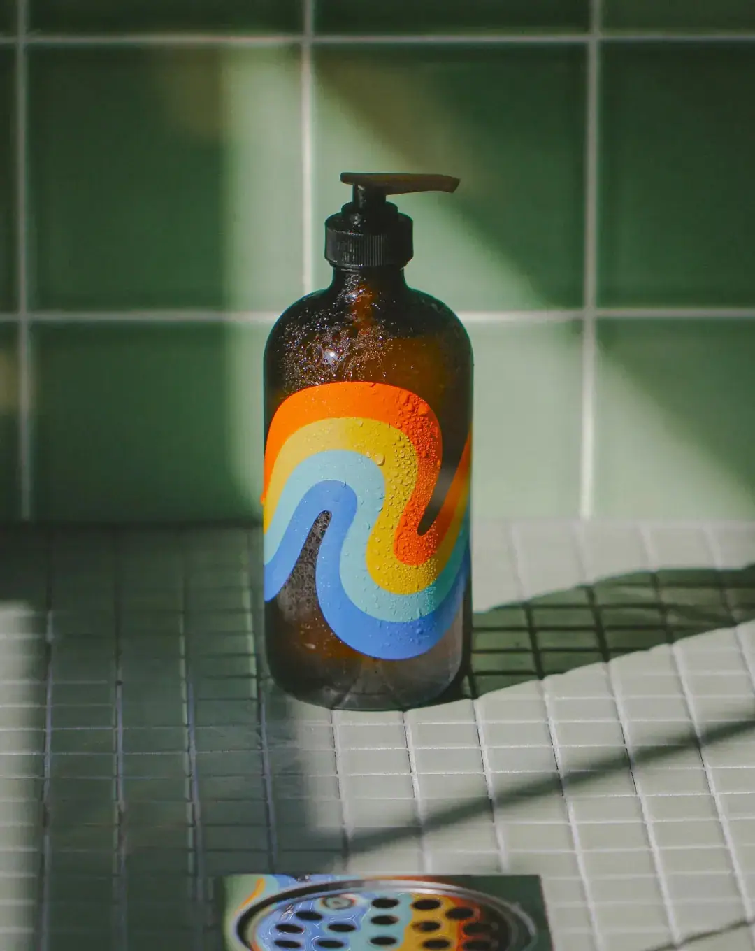
Bathing Culture
Flowing rainbow bands on dark refillable glass
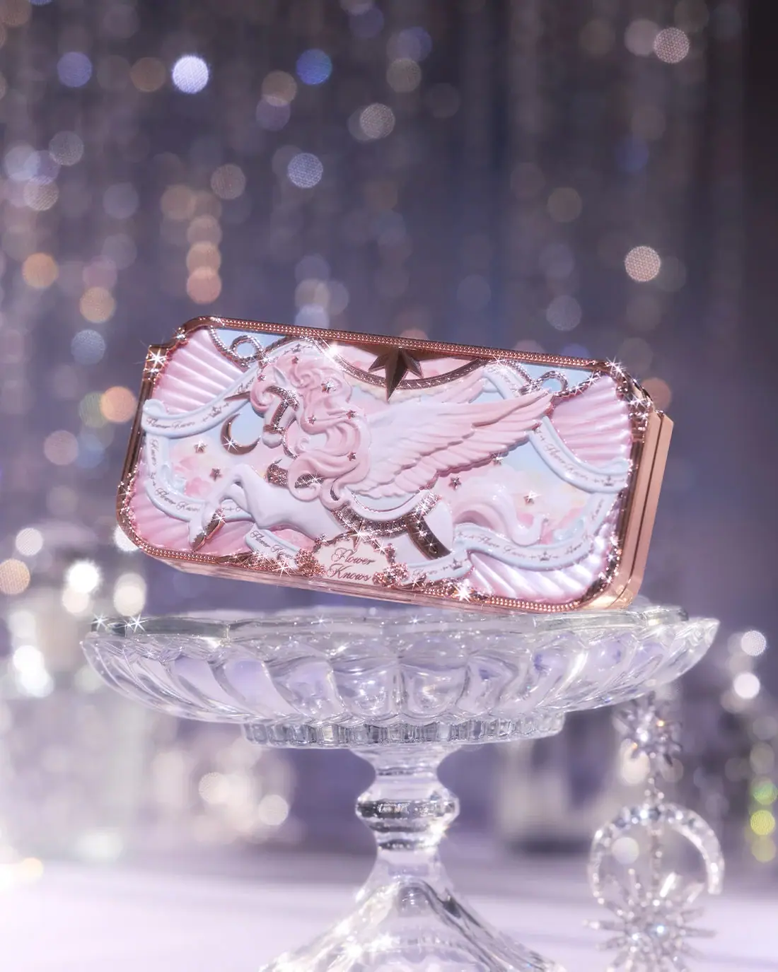
Flower Knows
Winged unicorn relief with pastel ribbons and reflective borders
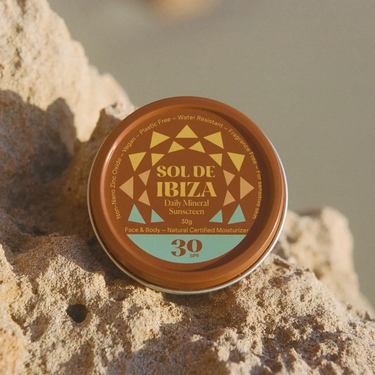
Sol de Ibiza
Terracotta sunscreen tin with triangular rays and turquoise SPF

Culture Pop
fruit-for-an-o wordmark on dewy cans
Diaspora Co.
marigold tins with a tiger crest
Literie
Quiet blue destination type with a playful coastal side panel
Milkjar
Green candle and carton share a white woodland illustration
Olipop
sunny soda fountain in flat colour