About this packaging
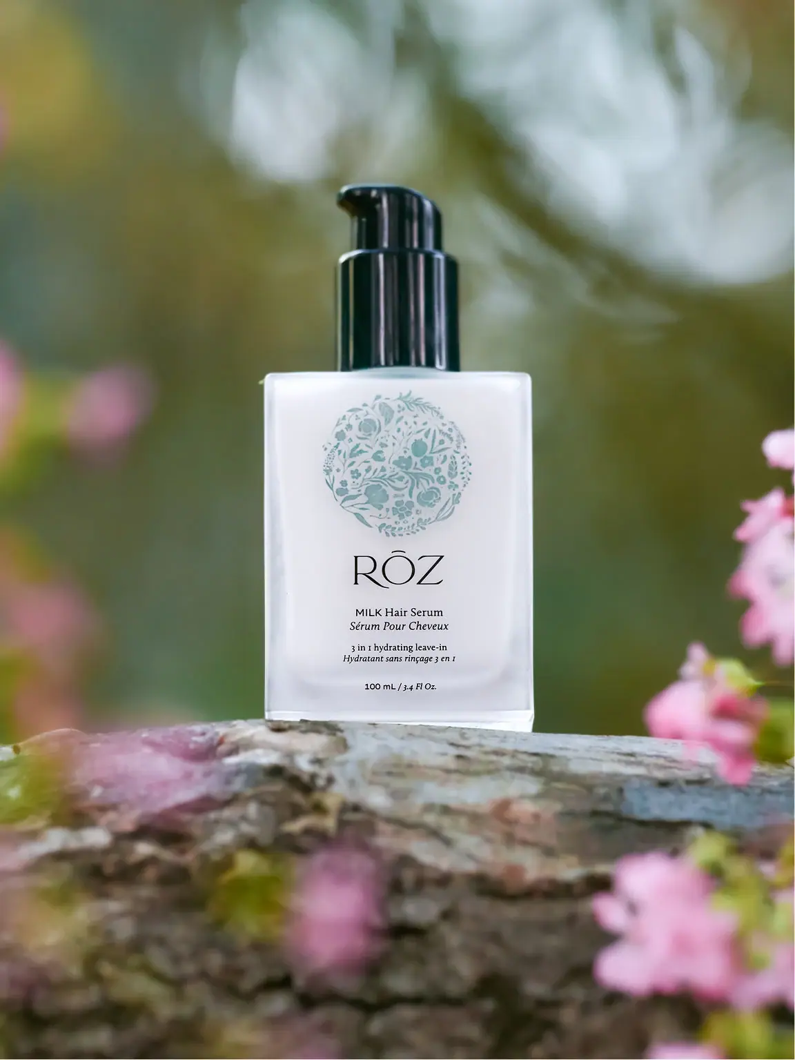
RŌZ Milk Hair Serum is shown in a broad white-looking rectangular pump bottle marked 100 mL. A filled pale-green botanical medallion sits above the fine large maker name, followed by much smaller bilingual product and function lines. The glossy black pump adds a contrasting upper volume.
RŌZ describes Milk as a leave-in conditioner and styling serum for damp or dry hair and lists the full size as 100 mL / 3.4 fl oz.[1]
Pack construction & use
- Bottle
- The selected image shows a square-shouldered white bottle with a tall black pump and a 100 mL / 3.4 fl oz marking near the base.Observed in the reference photograph
- Front artwork
- A filled pale-green botanical medallion occupies the upper front. The RŌZ name sits below it, followed by small MILK Hair Serum wording, italic French counterpart, bilingual function lines and quantity.Observed in the reference photograph
What makes the design work
Editorial analysis of this packaging reference.
Botanical detail occupies its own area
The near-circular motif is filled with leaves, stems and floral forms. It sits above the typography rather than forming an open wreath around the name, keeping illustration and information in separate vertical zones.
Maker leads the typographic hierarchy
The fine RŌZ wordmark is substantially larger than the compact product line beneath it. Upright and italic bilingual pairs then identify product and function in progressively smaller groups.
Bottle geometry suits a pump
The upright rectangular body offers a broad front for the wreath and a stable base, while the tall pump gives the bottle a clear dispensing direction. The silhouette is practical for a dressing table without looking like a salon canister.
Ideas for your next brief
- Give detailed botanical artwork a defined area separate from the product information, so each retains a clear role.
- Keep the main function visible in secondary copy when a short evocative product name needs explanation.
Sources & further reading
Researched 19 October 2026