Photography: RŌZ official photography. Images belong to their respective owners.
RŌZ

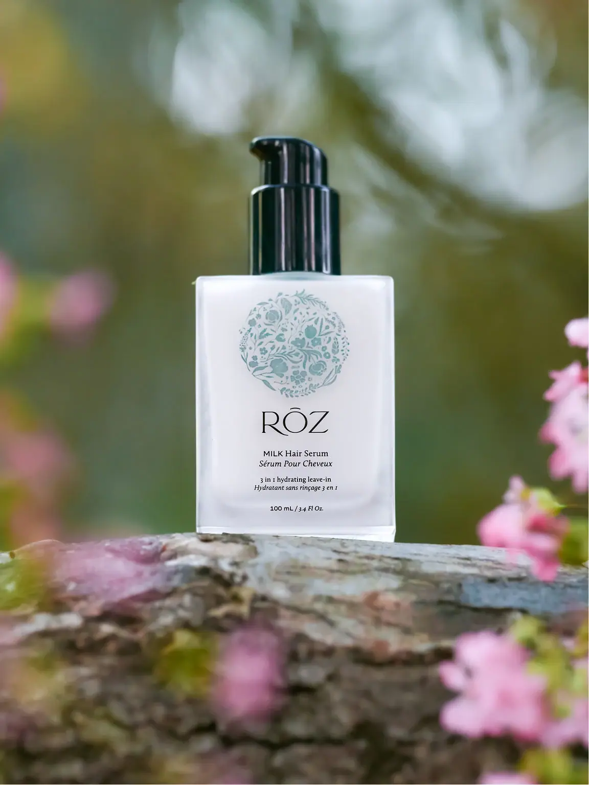
pale botanical medallion above fine lettering and a black pump
Milk Hair Serum combines a broad white-looking rectangular face with a tall glossy black pump. A filled pale-green botanical medallion occupies the upper front, followed by the fine, spacious RŌZ name and much smaller bilingual product and function lines. The illustration sits above the typography rather than enclosing it as a wreath. The selected 100 mL bottle is photographed on a branch among softly blurred pink flowers, connecting the small botanical artwork to a larger garden setting while keeping the central reading surface quiet.
- Hair
- Light pack
- Botanical
- Clinical minimal
About this study
Milk Hair Serum 100 mL in the approved garden photograph. This covers the visible full-size front and does not establish construction for travel sizes or other RŌZ products.
Sources & evidence · Reviewed 2026-10-19Color Palette
Approximate colours interpreted from photography. These are screen references, not official brand colours or print specifications.
Pack body
Cool white face
#EAECEE
Approximate broad bottle-face appearance. The photo does not resolve how much comes from contents, vessel treatment or an applied field.
Ink
Pale botanical green
#8FABA7
Approximate filled medallion artwork colour, distinct from the darker blurred garden behind the bottle.
Near-black type
#151A18
Approximate maker and supporting lettering, visually echoed by the glossy pump.
Accent
Clear edge highlight
#D5E1DF
Approximate perimeter and base highlight, included as an optical appearance rather than a verified material tint.
Typography
Suggested visual alternatives, not confirmed brand typefaces. Any scale below is an illustrative estimate.
The RŌZ maker name is the largest text element, with fine capital strokes, a broad circular O and a short horizontal mark above it. Beneath it, MILK Hair Serum is a much smaller mixed-style line; the French counterpart appears in italic serif lettering. A further bilingual function pair sits lower, followed by quantity near the base. The lettering is therefore not contained inside the botanical circle, and MILK is not a separate oversized headline. The hierarchy depends on a large quiet maker name above a compact sequence of informative lines.
Fonts
Fine maker alternative
Raleway
- Looks like
- Raleway for light, spacious uppercase lettering
- Type
- Geometric sans serif
- Weight
- Light 300
- Case
- Uppercase
- Tracking
- Open optical spacing
- Fallback
- Arial, sans-serif
Explore a short original maker name with a broad quiet silhouette. Raleway is only a stylistic direction: do not add the source's accent or reshape letters to mimic RŌZ. Fine strokes need a physical print proof, especially on a reflective face.
Bilingual information alternative
Libre Baskerville
- Looks like
- Libre Baskerville for upright and italic supporting lines
- Type
- Text serif
- Weight
- Regular 400
- Case
- Mixed case
- Tracking
- Normal, with meaning-led line breaks
- Fallback
- Georgia, serif
Use upright and italic forms to distinguish two language lines while keeping them visibly paired. Preserve enough size and weight for small functional information. The photographed text does not establish exact point sizes or a universal language-style rule for the brand.
Structure & Proportions
Visual proportions and finish previews are illustrative. Confirmed construction details and uncertainties are distinguished in the study notes.
Proportions
| Purpose | Value | Preview |
|---|---|---|
| Illustration above identity | The botanical medallion occupies a substantial upper area, with the maker name clearly below its lower boundary. It is a separate graphic block rather than a frame around text. | — |
| Large maker, small product | The maker spans much more width and height than the product line. A viewer can recognise the house before reading the specific function. | — |
| Tall dark upper assembly | The pump adds a narrow black vertical volume above the broad pale body, producing a strong silhouette contrast without another printed colour. | — |
Shapes
| Element | Value | Preview |
|---|---|---|
| Bottle | Upright rectangle with broad shoulders and softly rounded perimeter edges. | |
| Botanical medallion | Near-circular filled arrangement of small organic motifs with a slightly irregular edge. | |
| Pump | Tall cylindrical collar beneath a narrower actuator and short spout. |
Finishes
Glossy dark dispenser
Black pump and collar with visible vertical highlights; coating unknown. · gloss
Clear-looking perimeter
Bottle edges and lower base; substrate and wall construction unverified. · transparent
Formats and materials
| Formats | Selected 100 mL rectangular hair-serum vessel with square-looking shoulders, broad flat front, clear-looking lower perimeter and exposed black pump. |
| Materials | The current recycling page lists glass bottles among several collection categories, but does not provide a complete component declaration for this photographed Milk edition., Bottle treatment, pump resin, internal metal parts, graphic application and any label layer remain unverified. Transparent-looking edges alone do not establish exact construction. |
| Closures | A tall black cylindrical collar supports a narrower pump actuator with a short projecting outlet. Strong vertical highlights give the assembly a glossy appearance, contrasting with the pale face below. No protective overcap is visible. The picture shows the dispensing direction but not the full stroke, output, attachment or internal mechanism, and does not establish whether a cap was supplied separately. |
| Decoration | Filled botanical medallion composed of small leaves, stems and floral forms., Large fine maker name below the illustration., Small bilingual product and function groups., Separate quantity line at the lower edge of the reading area. |
Front Panel
Schematic reading order. The diagram’s zone heights do not represent measured artwork proportions.
The front uses a centred vertical sequence: botanical medallion, maker, product pair, function pair and quantity. Each step occupies its own area, with the largest change in scale occurring between the maker and the small descriptive copy. The illustration is densely filled internally but separated from the typography by open white space. No distinct label edge is visible, so this is a map of front artwork rather than a claim about a specific paper label. The broad pale face gives the dark supporting copy a stable background.
| Zone | Content |
|---|---|
| Botanical image | Filled pale-green circular motif near the shoulders. |
| Maker identity | Large fine RŌZ lettering below the motif. |
| Product pair | MILK Hair Serum with its smaller italic French counterpart. |
| Function pair | Small bilingual leave-in description, separate from the product name. |
| Quantity | Visible 100 mL / 3.4 Fl Oz. line near the base. |
Range System
The official page identifies a 100 mL full size and offers a travel-size alternative. This establishes options but not identical bottle materials or scaled artwork. The study concerns the pictured full-size Milk front and does not generalise its botanical colour or component construction to other RŌZ products. For a new range, the medallion could act as a stable illustration area, but specific product names would still need clear differentiation below it.
- Selected reference: 100 mL Milk Hair Serum with pale-green medallion and black pump.
- Source context: a travel-size choice exists, but its detailed construction is not compared here.
- Original-design exercise: retain a defined illustration area while varying product information without relying solely on subtle illustration colour changes.
Back of Pack & Shelf
The reverse, underside and removed pump are unseen. The front contains bilingual descriptive lines but does not reveal the complete instructions or ingredient layout. General recycling categories on the brand's website do not establish how every component of this edition separates or which local collection route accepts it.
- Inspect the reverse before drawing a complete bilingual information map.
- Document pump removal and component identification before describing end-of-life handling.
- For new artwork, test fine type and pale illustration detail on the chosen physical surface.
On shelf
Interpretation: the white rectangular field and black pump can make the object easy to isolate visually, while the pale botanical motif rewards closer inspection. The fine maker lettering remains larger than the product wording, so product identification may require a nearer view than house recognition. An independent design using a similar hierarchy should test the small bilingual lines at actual size and ensure that different products remain distinguishable when the illustration is viewed as a small coloured shape.
Imagery
The bottle stands on a textured branch, with pink blossoms in the foreground and a blurred green garden behind. A narrow focus plane keeps the botanical medallion and label readable while the flowers become soft colour patches. The image echoes the printed plant forms through its environment without literally matching each motif to an ingredient. The pink and olive scene colours are not added to the packaging palette. The branch is a photographic support, not a supplied tray or part of the vessel.
Guidelines
Editorial principles for an original design brief, not official brand guidelines.
Do
- Separate a detailed illustration area from the information hierarchy.
- Pair related language lines closely while keeping product and function groups distinct.
- Use structural contrast, such as a dark pump, as part of the overall silhouette.
- Check whether a pale emblem remains recognisable at thumbnail size.
Don't
- Do not call the filled medallion an open wreath enclosing the maker name.
- Do not exaggerate MILK into a headline larger than the maker.
- Do not infer exact bottle treatment or pump composition from appearance.
- Do not transfer general recycling or refill language to this edition without component evidence.
Sources & evidence
- RŌZ — Milk Hair Serum, official product and imageryproduct
- RŌZ Recycles — general packaging collection contextbrand
How this study was built
context · Sourced fact
Official product page identifies Milk as a leave-in conditioner/styling serum and lists 100 mL full size.RŌZ — Milk Hair Serum, official product and imagerystructure · Sourced fact
Brand recycling page lists general glass, aluminium and component categories, without a full Milk-specific construction declaration.RŌZ Recycles — general packaging collection contextlabel · Visual observation
Filled botanical medallion sits above the maker rather than surrounding it as an open wreath.RŌZ — Milk Hair Serum, official product and imagerytypography · Visual observation
Fine maker name is substantially larger than the small bilingual product and function lines.RŌZ — Milk Hair Serum, official product and imagerystructure · Visual observation
Tall glossy black pump contrasts with a broad pale rectangular front and clear-looking base edge.RŌZ — Milk Hair Serum, official product and imageryshelf · Editorial interpretation
Small product wording and pale emblem need separate reading and recognition tests at actual display size.
What remains unverified
- General recycling page does not supply an exact component bill for the photographed Milk edition.
- Bottle treatment, pump composition and graphic application process are unverified.
- Original fonts, physical dimensions and hidden reverse are unidentified.
- Colours are approximate; garden flowers and branch are scenery rather than packaging components.
Give your AI
packaging taste
Give your design or image tool a packaging study: palette, type, structure, front panel and principles for an original brief.
Export this styleFree with an email. PACK.md works in Claude, ChatGPT, Cursor and image tools.
More like this
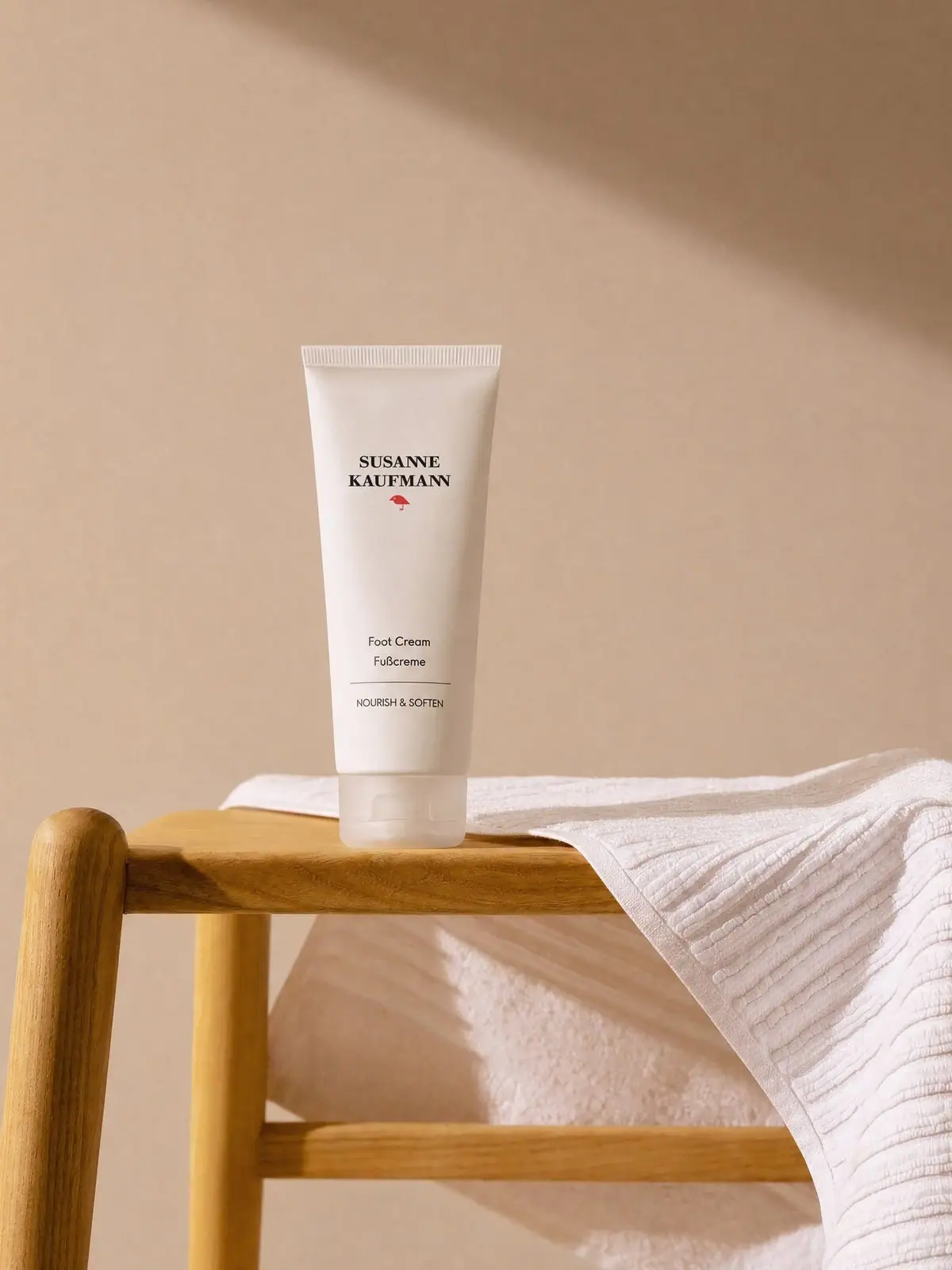
Susanne Kaufmann
airy white tube with a small red signature
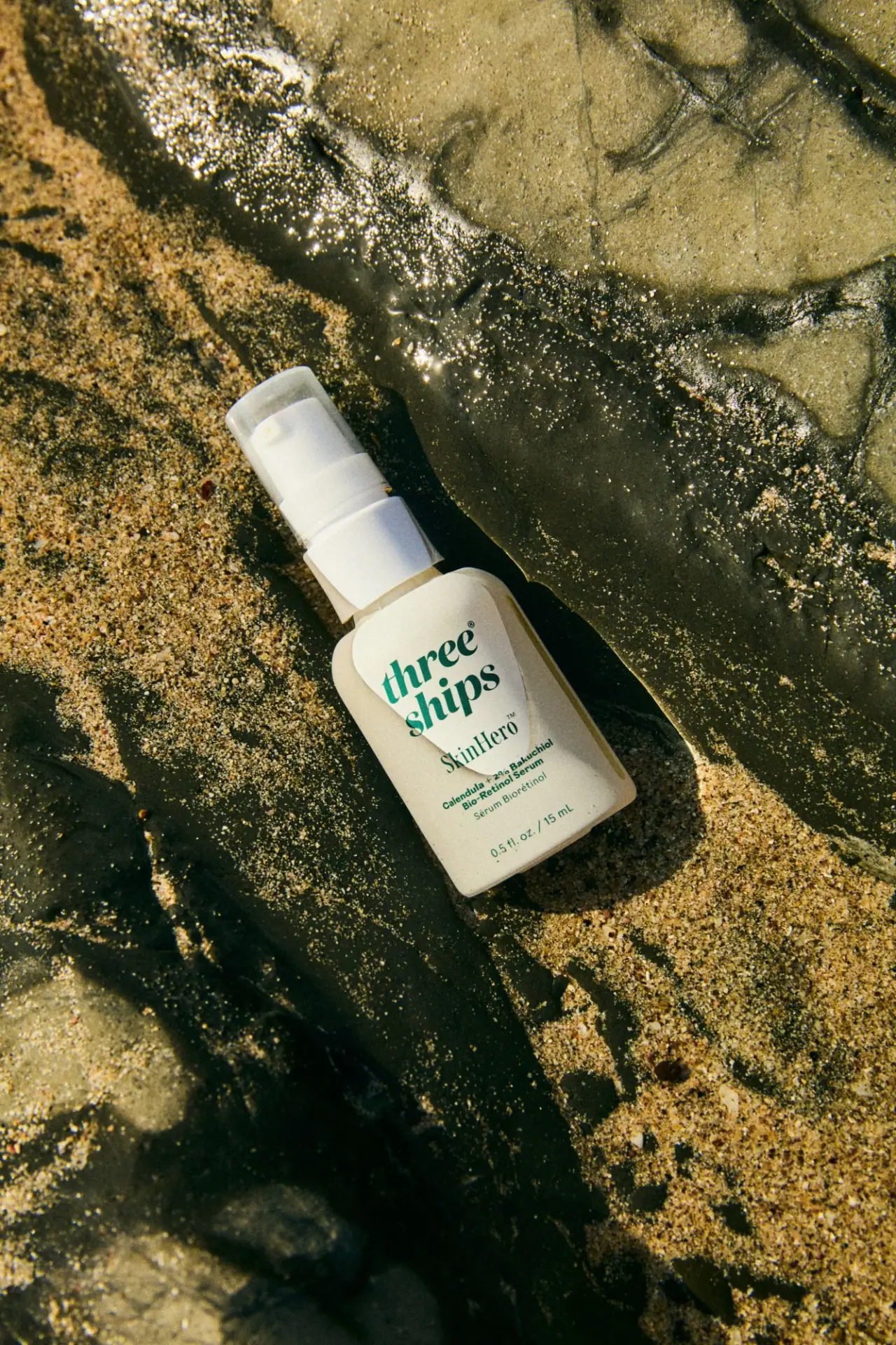
Three Ships
green stacked serif identity on a pale miniature pump bottle
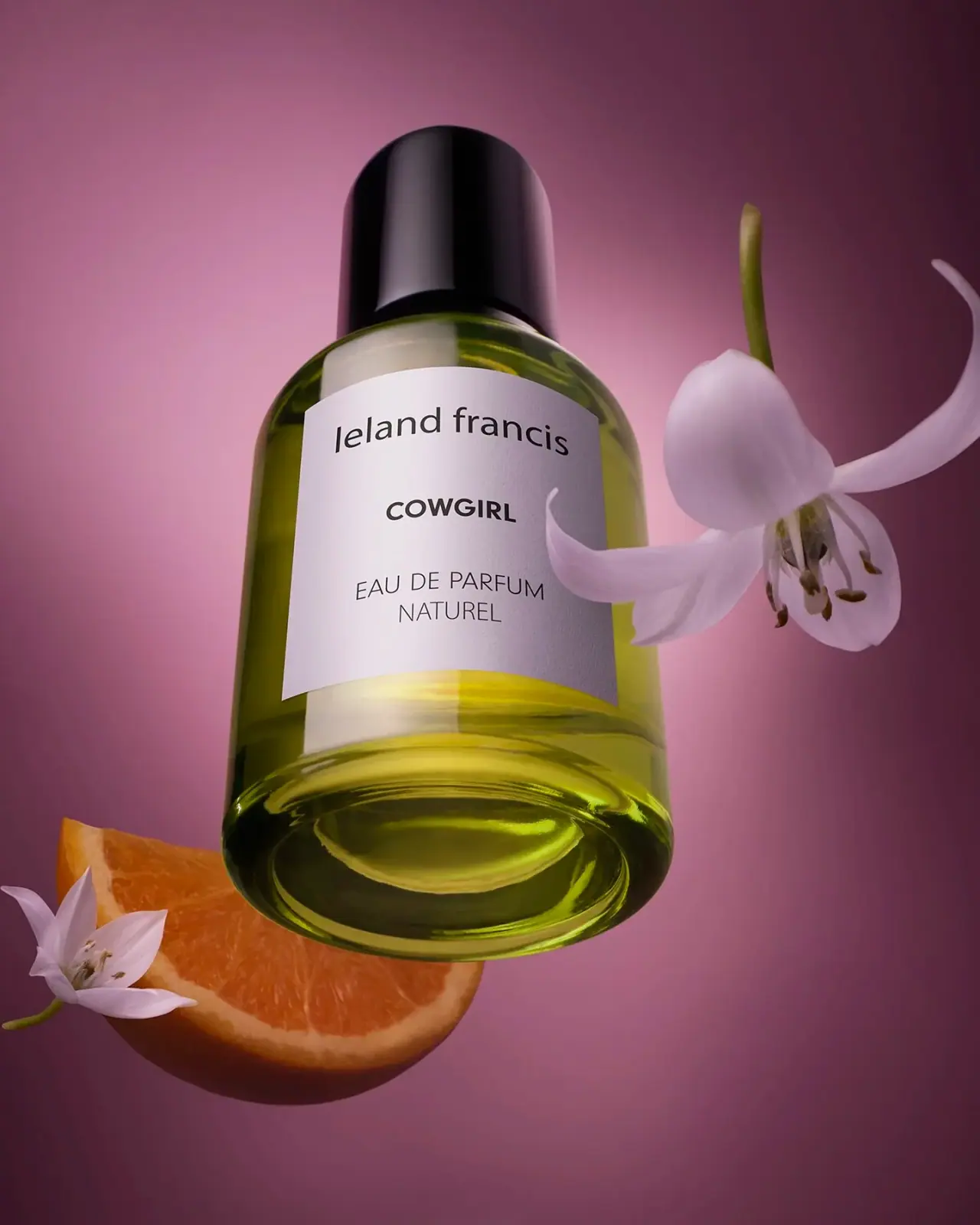
Leland Francis
quiet cream label against luminous botanical perfume

African Botanics
Technical black label with a low serif signature

AussieZinc
Sun-yellow numerals on a tall, information-rich white cylinder

bareMinerals
a restrained black compact framing the powder itself

BeautyPWR
Clear square shell, white cream cup, black serif identity

Benamôr
Ornamental lilac medallion suspended above golden botanical oil