About this packaging
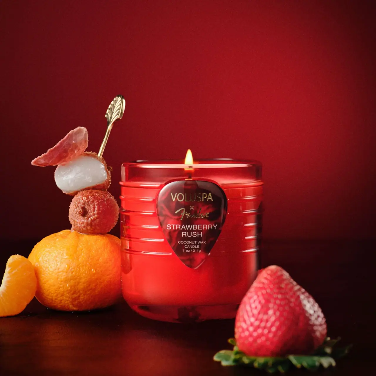
Voluspa Strawberry Rush is part of the brand’s Fender collaboration and is shown in a red vessel with horizontal guitar-inspired ridges and a guitar-pick-shaped front label. The photograph foregrounds the vessel’s graphics and collaboration identity.
Voluspa presents Strawberry Rush as a Fender collaboration.[1]
Pack construction & use
- Vessel
- Voluspa describes the Strawberry Rush vessel as glass with a six-string embossing and guitar-pick motif.[1]
- Front label
- The selected cover shows the Voluspa and Fender names with Strawberry Rush on a shaped label.Observed in the reference photograph
- Vessel surface
- The image shows a ridged red vessel with a guitar-pick motif.Observed in the reference photograph
What makes the design work
Editorial analysis of this packaging reference.
Motif integrated into form
Guitar references are carried through the vessel’s horizontal ridges and pick-shaped label rather than relying only on a collaboration logo.
Front label hierarchy
The collaboration marks sit above the scent name, which is followed by candle type and size. The pick silhouette frames this information as one compact panel.
Color as edition signal
The red vessel and pale lettering produce a strong single-color block that differentiates this collaboration in a product lineup.
Ideas for your next brief
- Translate a partner’s recognizable object into both the vessel surface and the label shape for a cohesive collaboration.
- Keep brand, scent, candle type and size inside one shaped front panel to avoid scattering key information.
Sources & further reading
Researched 19 October 2026