Photography: Voluspa official photography. Images belong to their respective owners.
Voluspa

red guitar-string glass with a dark pick-shaped identity
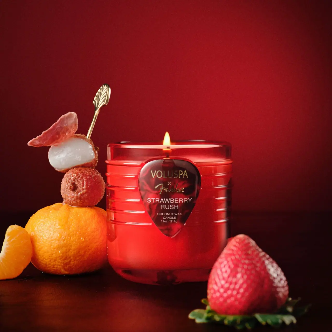
Strawberry Rush translates the Voluspa x Fender collaboration into a red candle vessel with horizontal raised lines and a dark guitar-pick-shaped front panel. The partner marks sit above a compact scent name, candle descriptor and weight. The glass is shown lit, making the red body luminous while the darker pick remains a reading surface. Guitar references are carried by both form and graphics rather than by the collaboration names alone.
- Candles & home scent
- Dark pack
- Playful colour
- Heritage label
About this study
Selected lit Strawberry Rush 11 oz Voluspa x Fender candle. Box, lid and other collaboration sizes are outside the visual scope.
Sources & evidence · Reviewed 2026-10-19Color Palette
Approximate colours interpreted from photography. These are screen references, not official brand colours or print specifications.
Pack body
Luminous red vessel
#C82F27
Approximate red glass appearance in the lit campaign image; colour process and unlit appearance are not established.
Label
Dark marbled pick
#4A171D
Approximate dark red patterned front panel, visually separate from the brighter vessel.
Ink
Pale scent information
#F2DAD0
Approximate scent, candle type and weight lettering.
Accent
Gold-looking partner marks
#C6AF6F
Approximate collaboration lettering; not verified foil or metallic substrate.
Typography
Suggested visual alternatives, not confirmed brand typefaces. Any scale below is an illustrative estimate.
VOLUSPA appears in a restrained uppercase sans-serif near the top of the pick. A small multiplication-style collaboration symbol separates it from the flowing Fender script. STRAWBERRY RUSH follows in two centred uppercase lines, with smaller COCONUT WAX CANDLE and 11 oz / 311 g wording below. The script partner mark is the most characterful voice, while the plain scent lettering carries practical identification. The narrowing pick shape requires progressively shorter lower lines rather than a uniform-width text block.
Fonts
Scent and information alternative
Inter
- Looks like
- Inter as an independent visual alternative
- Type
- Sans serif
- Weight
- Regular 400 / Medium 500
- Case
- Uppercase
- Tracking
- Natural to slightly open
- Fallback
- Arial, sans-serif
Use clear sans-serif scent naming and scale down carefully for the descriptor and weight. Test the lower lines inside the narrowing panel so their margins do not become cramped. Keep decorative partner marks separate from essential information.
Expressive partner alternative
Caveat
- Looks like
- Caveat as an independent visual alternative
- Type
- Handwritten
- Weight
- SemiBold 600
- Case
- Mixed case
- Tracking
- Natural handwriting rhythm
- Fallback
- Arial, sans-serif
A newly drawn or independently typeset expressive partner name can contrast with a restrained maker. Do not imitate the Fender script or treat this suggested handwriting family as an identification of that logo.
Structure & Proportions
Visual proportions and finish previews are illustrative. Confirmed construction details and uncertainties are distinguished in the study notes.
Proportions
| Purpose | Value | Preview |
|---|---|---|
| Source-listed vessel dimensions | The official listing gives 99 mm diameter and 100 mm height; these are source specifications, not measurements taken from the photograph. | — |
| Narrowing reading field | The pick is broad around the partner marks and tapers below the weight line. | — |
| Relief behind identity | Horizontal ridges extend around the sides while the dark front panel interrupts their visual continuity. | — |
Shapes
| Element | Value | Preview |
|---|---|---|
| Vessel | Broad cylindrical glass with rounded lower corners and open circular rim. | |
| Front motif | Guitar-pick-like panel with rounded upper shoulders and a downward point. | |
| String relief | Repeated horizontal raised lines wrapping around the glass. |
Finishes
Embossed glass
Six-string-inspired horizontal relief, explicitly described by the brand. · emboss
Glossy red vessel
Lit glass body and rim; coating or colour-in-glass process unverified. · gloss
Gold-looking marks
Upper partner names on the dark pick; no foil process confirmed. · metallic
Formats and materials
| Formats | Selected open single-wick candle in a red rounded cylindrical vessel, visibly labelled 11 oz / 311 g. Official dimensions are listed as approximately 99 mm diameter by 100 mm height. |
| Materials | The official page identifies glass with six-string embossing, a coconut wax blend and one natural wick., The front pick panel’s substrate, attachment, red-colour process and gold-looking decoration are unverified. The source describes guitar-case-inspired outer packaging, but that box is absent from the selected cover. |
| Closures | The candle is photographed open with one flame visible above the rim. No lid, dust cover or outer carton appears, so their fit and construction cannot be analysed from this image. The broad rim and rounded lower corners define a nearly equal-height-and-width object according to the source dimensions, while perspective and nearby fruit influence its apparent proportions. The raised horizontal lines are confirmed as glass embossing; the pick shape is a front motif whose material and removability are not specified. |
| Decoration | Six-string-inspired horizontal glass relief, confirmed by the brand., Large downward-pointing guitar-pick motif at the front., Centred collaboration marks and scent information within the pick. |
Front Panel
Schematic reading order. The diagram’s zone heights do not represent measured artwork proportions.
The pick serves as one central reading panel. Maker, collaboration symbol and partner logo occupy the upper region; the scent name becomes a separate two-line group below. The candle descriptor and weight fit into the narrower lower area. The panel has a dark red marbled-looking pattern that remains visible around the text. It is not simply a flat black label, and its outline is more important than a conventional rectangular grid. The surrounding red relief continues the musical idea without adding more text to the curved sides.
| Zone | Content |
|---|---|
| Collaboration | VOLUSPA, small joining symbol and Fender script. |
| Scent | STRAWBERRY / RUSH in two pale uppercase lines. |
| Product and weight | COCONUT WAX / CANDLE and 11 oz / 311 g. |
| Vessel relief | Horizontal string-like ridges extending beyond the pick panel. |
Range System
The current official page presents a boxed candle and links smaller and other fragrance options, but this study analyses only the selected 11 oz Strawberry Rush vessel. It does not infer identical dimensions or panel construction across the collaboration. The red colour and scent name distinguish this reference locally; a full range-coding system would require direct comparison of the other approved packages. The box’s guitar-case inspiration is sourced context, not a visually reviewed construction here.
- Selected lit Strawberry Rush 11 oz / 311 g red vessel.
- Other sizes and collaboration scents are outside this single-reference analysis.
Back of Pack & Shelf
The underside, rear, unlit interior and outer box are not visible. Candle care text, warning labels and batch information cannot be placed on a packaging diagram from this view. The front wax wording is not a complete blend formula, and the visible flame does not establish burn performance.
- Inspect the underside for product and care information.
- Review the actual box before describing texture or stitched construction.
- Verify the pick panel’s material and attachment separately from the glass relief.
On shelf
Interpretation: the red block, raised horizontal lines and pick silhouette create recognition before the smaller words are read. The collaboration logos compete less because they occupy a dedicated upper group, but the lower weight and descriptor may become difficult at distance. A new collaboration package should test whether both partners remain legible and whether the shared physical motif still works without a lit candle or matching background.
Imagery
A strawberry, citrus fruit and lychee-like fruit surround the glowing red vessel, while a decorative spoon rises at the side. They amplify the fragrance’s fruit direction without being contents or package accessories. The deep red background makes the vessel feel part of one warm colour field, and the flame adds a bright focal point above the collaboration panel. These props should not be mistaken for a supplied gift set. A neutral unlit view would show how much of the apparent red brightness comes from the staged illumination.
Guidelines
Editorial principles for an original design brief, not official brand guidelines.
Do
- Translate collaboration meaning into a physical motif as well as names.
- Preserve readable information within a narrowing panel.
- Distinguish confirmed glass relief from unverified label processes.
- Compare lit and unlit appearance before selecting colours.
Don't
- Do not call the pick a removable guitar accessory without evidence.
- Do not infer foil from gold-looking lettering.
- Do not treat fruit props as supplied components.
- Do not reproduce Fender script or the exact collaboration panel.
Sources & evidence
How this study was built
structure · Sourced fact
Brand confirms glass embossed with six strings, coconut wax blend and one wick.Voluspa — Strawberry Rush Boxed Candleproportions · Sourced fact
Official dimensions are 99 mm diameter by 100 mm height, with 11 oz / 311 g fill.Voluspa — Strawberry Rush Boxed Candlelabel · Visual observation
Partner marks, scent, candle type and weight share a dark pick-shaped panel.Voluspa — Strawberry Rush Boxed Candlepalette · Visual observation
Lit red glass contrasts with a dark marbled-looking front motif.Voluspa — Strawberry Rush Boxed Candleimagery · Visual observation
Fruit and spoon belong to the scene rather than the packaging.Voluspa — Strawberry Rush Boxed Candleshelf · Editorial interpretation
The shared shape motif should be tested in unlit retail conditions.
What remains unverified
- Pick panel substrate, attachment and red-colour process unverified.
- Original supporting fonts and metallic decoration method unknown.
- Outer box, underside and unlit interior not analysed.
Give your AI
packaging taste
Give your design or image tool a packaging study: palette, type, structure, front panel and principles for an original brief.
Export this styleFree with an email. PACK.md works in Claude, ChatGPT, Cursor and image tools.
More like this
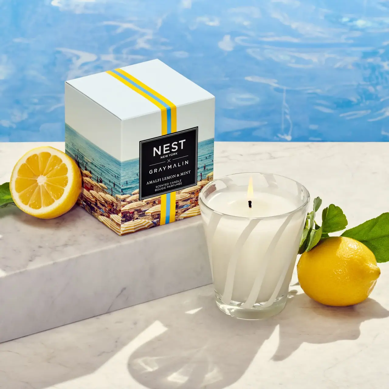
NEST New York
Striped glass candle beside a photographic collaboration carton
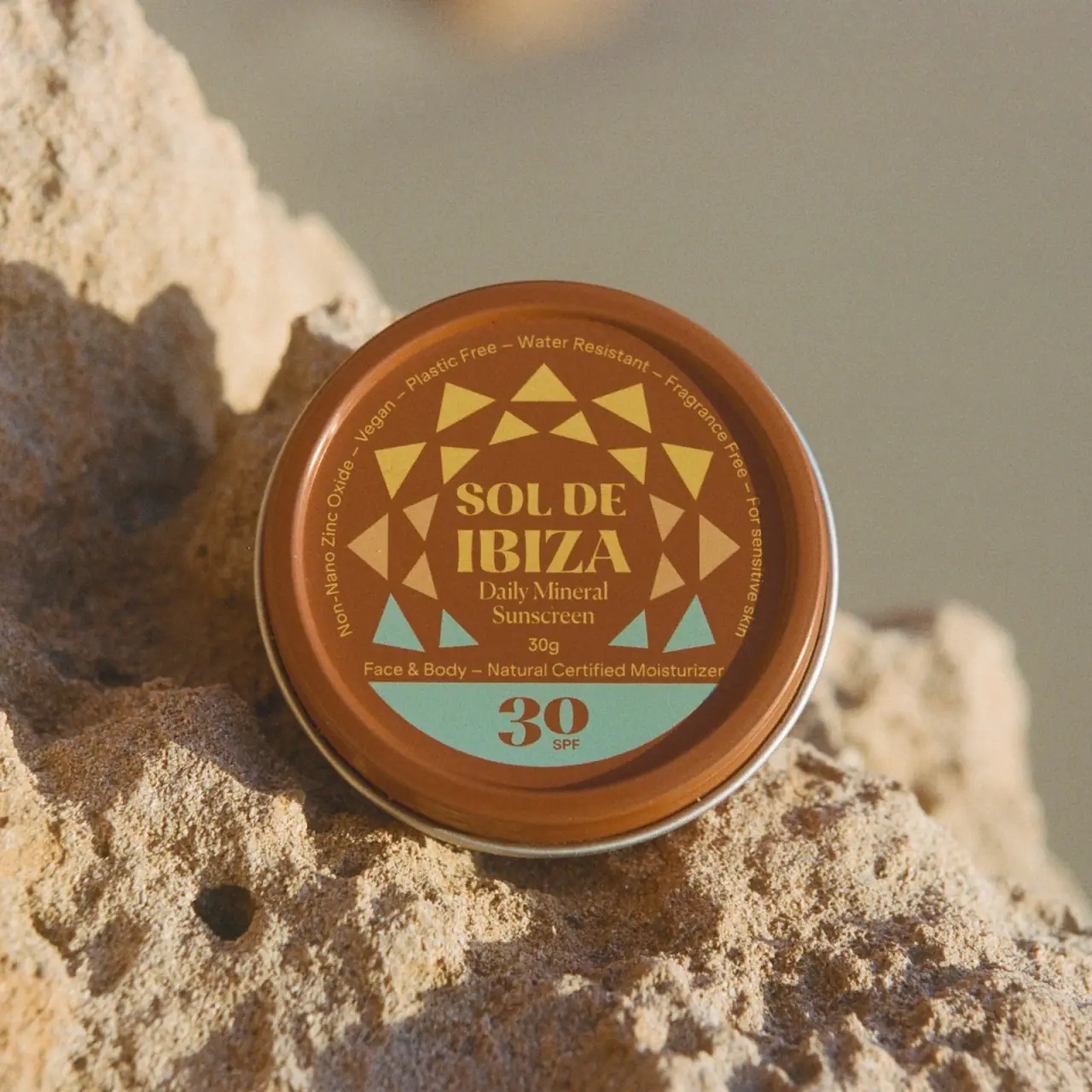
Sol de Ibiza
Terracotta sunscreen tin with triangular rays and turquoise SPF

Aerangis
a quiet numbered object, an intimate scent memory

Alexander McQueen
An oval flacon crowned with dense black relief
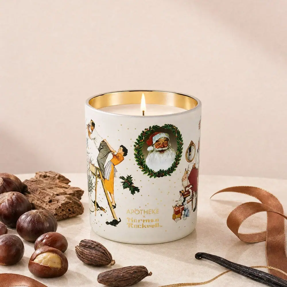
Apotheke
White holiday vignettes with a warm golden interior

Arquiste
blush transparency, white lettering and a stepped gold cap
Atelier des Ors
Golden constellation framing a compact name on amber transparency
Bijou Candles
Pink blackletter and fine webs on a tall dark candle