Farmacy
Selected packaging
1 curated reference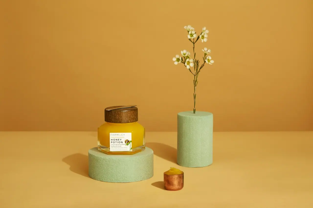
Skincare · Jar
Honey Potion Renewing Antioxidant Hydration Mask — Earlier Packaging
The selected earlier Honey Potion mask reference presents a faceted clear jar, broad wood-toned cap, and compact white label. The transparent, low-profile silhouette lets the warm-colored contents contribute as much to the pack’s identity as its printed name.
The cover depicts the earlier Honey Potion package, while Farmacy’s current listing and Italy recycling guide describe Honey Potion Plus; the Plus component specifications do not establish the earlier jar’s materials.
Colours in this photograph
Sampled from the curated cover, including background and props. Screen colours, not print specifications.
A closer look
Read the full studyDesign observations from the selected packaging.
Facets shape the silhouette
The angular wall catches light across multiple planes, giving the short jar a sculptural outline instead of a standard cylinder. The broad cap balances that low, wide body and makes the form easy to recognize in a product lineup.
A compact label preserves visibility
The small white label stays distinct against the amber-colored contents while leaving most of the jar exposed. That proportion makes the product color part of the pack’s immediate visual signature without sacrificing a clear front-facing product name.
More brands to explore
Continue discovering distinctive packaging.