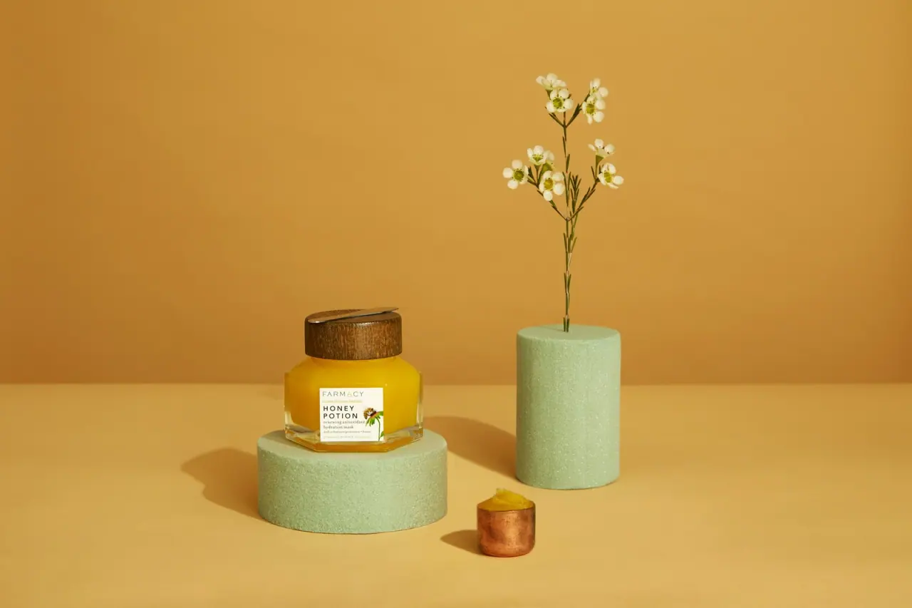
Photography: Jurada — Farmacy campaign photography. Images belong to their respective owners.
Farmacy

Golden contents in a faceted jar beneath a wood-toned lid
The earlier Honey Potion package shown in Jurada's campaign combines a low faceted transparent jar, saturated golden contents and a broad wood-toned lid. A small white label leaves most of the product visible, while a slender spatula rests across the lid. Fine spaced brand lettering, a stronger two-line product name and a botanical vignette give the small front panel a precise informational role. The orange-gold set amplifies the jar's warmth, with pale green display cylinders supplying contrast. Current Honey Potion Plus sources provide useful edition context, but their component specifications are not treated as proof of this earlier package's construction.
- Skincare
- Light pack
- Apothecary
- Botanical
About this study
Earlier Honey Potion jar in Jurada's Solo_HoneyPotion campaign image. Honey Potion Plus is consulted only to define edition boundaries; its specifications are not transferred to the photographed package.
Sources & evidence · Reviewed 2026-10-19Color Palette
Approximate colours interpreted from photography. These are screen references, not official brand colours or print specifications.
Pack body
Visible golden product
#DDAA14
Approximate saturated yellow contents seen through the clear wall. This is a product appearance cue rather than an opaque printed jar colour or calibrated formula specification.
Wood-toned brown
#79501D
Approximate dark lid appearance with visible grain-like variation. The exact earlier cap material and wood species are unverified.
Label
Warm white panel
#F3F0D8
Approximate compact front label field. It provides a light reading area against the golden contents without covering the full jar wall.
Ink
Dark label lettering
#303023
Approximate brand, product name and descriptive text, establishing fine contrast within the small panel.
Accent
Botanical green
#4D6B2C
Approximate small plant-detail colour within the label vignette. This belongs to the artwork, unlike the much larger pale green display props.
Typography
Suggested visual alternatives, not confirmed brand typefaces. Any scale below is an illustrative estimate.
FARMACY appears as a fine, widely spaced uppercase line at the top of the white label. HONEY POTION follows in stronger capitals over two lines, giving the specific product a more concentrated dark presence. Smaller descriptive wording underneath changes to a more text-like serif appearance. A botanical vignette occupies the right side, leaving the name aligned to the left. The label's hierarchy depends on weight, spacing and line grouping rather than a large logo filling the jar.
Fonts
Original spaced identity alternative
Montserrat
- Looks like
- Light geometric sans capitals
- Type
- Sans serif
- Weight
- Light, Medium
- Case
- Uppercase
- Tracking
- Open for a short maker name
- Fallback
- Arial, sans-serif
Create a restrained independent maker line and a stronger two-line product title. Adjust letter spacing to the available label width instead of imitating the Farmacy wordmark.
Descriptive-copy alternative
Source Serif 4
- Looks like
- Small editorial serif
- Type
- Text serif
- Weight
- Regular
- Case
- Sentence case for concise product information
- Tracking
- Normal
- Fallback
- Georgia, serif
Provide a quieter supporting voice below the capitalised name. Keep the botanical drawing away from essential words rather than forcing text into an irregular shape.
Structure & Proportions
Visual proportions and finish previews are illustrative. Confirmed construction details and uncertainties are distinguished in the study notes.
Proportions
| Purpose | Value | Preview |
|---|---|---|
| Low-wide silhouette | The jar reads as a broad low volume rather than a tall cylinder. Its angled shoulders narrow into the circular lid, giving the upper profile a distinct stepped transition. | — |
| Label coverage | The white panel occupies only a small central portion of the visible wall. Large transparent areas remain on either side and above, keeping the contents central to recognition. | — |
| Lid presence | The dark cap forms a substantial horizontal band above the bright contents. Its visual weight balances the thick-looking clear base below. | — |
| Accessory scale | The spatula spans much of the lid's width while remaining thin enough not to obscure the grain-like surface. The selected view does not provide a measured length. | — |
Shapes
| Element | Value | Preview |
|---|---|---|
| Jar outline | Multi-sided low vessel with planar walls, angled shoulder transitions and a clear-looking lower edge. | |
| Lid | Broad short cylinder with a flat upper face and wood-grain-looking side wall. | |
| Front label | Small upright rectangle placed on a front-facing facet. | |
| Spatula | Long narrow reflective implement with a flattened rounded end, resting across the lid. |
Finishes
Faceted transparency
Jar walls and base, with varied reflections across the planes; exact glass specification is not asserted · transparent
Grain-like cap appearance
Brown lid side and upper face; preview does not establish an uncoated wood specification · matte
Reflective accessory
Slim spatula on the lid; exact alloy and retention system are unverified for this edition · metallic
Quiet white information panel
Small front label, without a confirmed embossing or foil effect · matte
Formats and materials
| Formats | Low faceted jar with transparent walls and angled shoulders, Broad circular lid with wood-grain appearance, Slender spatula displayed across the lid |
| Materials | The earlier vessel is transparent and rigid-looking; its precise material specification is not established by the current Plus recycling guide., The cap shows wood-like grain, but appearance alone does not verify its complete construction, inner components or species., The spatula looks reflective and metallic, while the white front label appears opaque. Exact materials and attachment methods for this photographed edition remain unverified. |
| Closures | The jar is closed by a broad round lid. A slim spatula lies across its upper face, making an application accessory part of the package portrait. The current Plus page describes magnetic attachment, but the photograph itself cannot verify how this earlier spatula is retained. The thread, inner disc, seal and cap underside are not visible. No current component specification is substituted for those unseen historical details. |
| Decoration | Compact label with spaced maker name and stronger product title, Small botanical illustration on the label's right side, Visible formula colour and faceted geometry supply more overall decoration than printed pattern |
Front Panel
Schematic reading order. The diagram’s zone heights do not represent measured artwork proportions.
The label uses a compact left-led text block with a botanical accent to the right. A fine maker line starts the panel, the two-line product name creates the strongest internal emphasis, and smaller descriptive copy finishes below. The design leaves the surrounding jar clear instead of stretching the white field around the entire body. Placing the label on one front-facing plane gives the reader a relatively stable surface despite the changing angles elsewhere in the vessel.
| Zone | Content |
|---|---|
| Upper maker line | Fine spaced FARMACY capitals, visually quieter than the product title beneath. |
| Main product title | HONEY POTION in a compact two-line uppercase block. |
| Lower description | Small descriptive wording identifying the earlier hydration-mask edition; tiny lines are not fully reconstructed from the image. |
| Right vignette | Small botanical artwork adding a natural-reference cue without becoming an all-over pattern. |
| Surrounding clear wall | Golden contents remain visible around the label and through the angled facets. |
Range System
The photographed label reads Honey Potion, whereas Farmacy's consulted current listing names Honey Potion Plus and describes an upgraded formula. Its Italy guide likewise labels the component list as Plus. These sources establish why the editions must remain separate. They do not prove that the earlier jar shares the current fill amount, material codes, magnetic system or carton. Range guidance is therefore a visual principle derived from the selected object, not a retroactive technical specification.
- Observed earlier design: transparent facets, golden contents, a compact white label and a dark grain-like lid.
- Sourced comparison boundary: current Plus documentation describes a magnetic spatula and named components for that later product, not the exact historical object shown.
- Original-design interpretation: combine visible product colour with a small readable information panel, then verify each new vessel and accessory independently.
Back of Pack & Shelf
The rear, underside, lid interior and any original carton are not visible. No ingredient list, batch marking or disposal instruction can be located on the earlier package from this cover. Current Plus recycling information is not evidence of what was printed on the historical jar.
- Locate exact-edition rear and base images before describing technical information placement.
- Verify the earlier accessory and closure directly before claiming magnetic attachment.
- Keep current recycling instructions attached to the product edition they actually name.
On shelf
Interpretation: the broad faceted silhouette and bright visible contents can provide recognition at a distance, while the small label works at closer range. The wood-toned cap adds a contrasting dark horizontal mass above the colour. A transparent jar changes with lighting and product level, so a new system should remain identifiable when partially used or viewed against a different background. The compact label is efficient only if the name and function remain readable at actual size.
Imagery
Jurada's portfolio identifies this exact Honey Potion campaign image and its creative-production role. The jar sits on a short pale green porous cylinder, while a taller matching cylinder supports a delicate flowering stem. A small copper-coloured cup in front contains a golden dollop. The orange-gold background and tabletop dominate the scene, echoing the visible formula. Neither the green cylinders nor the small cup is established as part of the sold package. Their varied heights and textures turn the low jar into a focal object without obscuring the label.
Guidelines
Editorial principles for an original design brief, not official brand guidelines.
Do
- Make product visibility a deliberate part of the design.
- Place small copy on a readable front-facing plane.
- Keep historical and current packaging specifications separate.
- Use an accessory's actual presence without inventing its mechanism.
- Distinguish display props from package components.
Don't
- Do not assign the Plus edition's material codes to the earlier jar.
- Do not call the whole setting green when only the display props are green.
- Do not infer a wood species or alloy from photographed texture.
- Do not turn a current product capacity into a historical package measurement.
Sources & evidence
- Honey Potion Plus — current official product listingproduct
- Italy recycling guide — Honey Potion Plus component entrybrand
- Farmacy campaign — Jurada primary production portfoliophotographer
How this study was built
edition · Sourced fact
The current official listing explicitly names Honey Potion Plus and an upgraded formula, distinct from the pictured Honey Potion label.Honey Potion Plus — current official product listing · Farmacy campaign — Jurada primary production portfoliostructure · Sourced fact
The Italy guide's material list is titled Honey Potion Plus and is not applied to the earlier image.Italy recycling guide — Honey Potion Plus component entryimagery · Sourced fact
Jurada's portfolio links the exact Solo_HoneyPotion image and identifies its campaign production role.Farmacy campaign — Jurada primary production portfoliostructure · Visual observation
The cover shows clear facets, golden contents, a dark grain-like lid and a slim spatula resting on top.Farmacy campaign — Jurada primary production portfoliotypography · Visual observation
Fine spaced maker capitals, a stronger two-line name and small descriptive copy organise the compact white panel.Farmacy campaign — Jurada primary production portfoliopalette · Visual observation
Orange-gold scenery surrounds pale green display props; neither the props nor small cup is a package component.Farmacy campaign — Jurada primary production portfoliorange · Editorial interpretation
The visual principle of a small label over visible contents can be studied without borrowing later technical claims.Honey Potion Plus — current official product listing · Italy recycling guide — Honey Potion Plus component entry · Farmacy campaign — Jurada primary production portfolio
What remains unverified
- No exact historical construction specification or photo production date was verified.
- Earlier cap material, jar composition, spatula alloy and retention mechanism remain uncertain.
- Current Plus fill amount and component codes cannot establish the earlier jar's specifications.
- The reverse, underside and original carton are unseen; exact typefaces and calibrated colours are unknown.
Give your AI
packaging taste
Give your design or image tool a packaging study: palette, type, structure, front panel and principles for an original brief.
Export this styleFree with an email. PACK.md works in Claude, ChatGPT, Cursor and image tools.
More like this
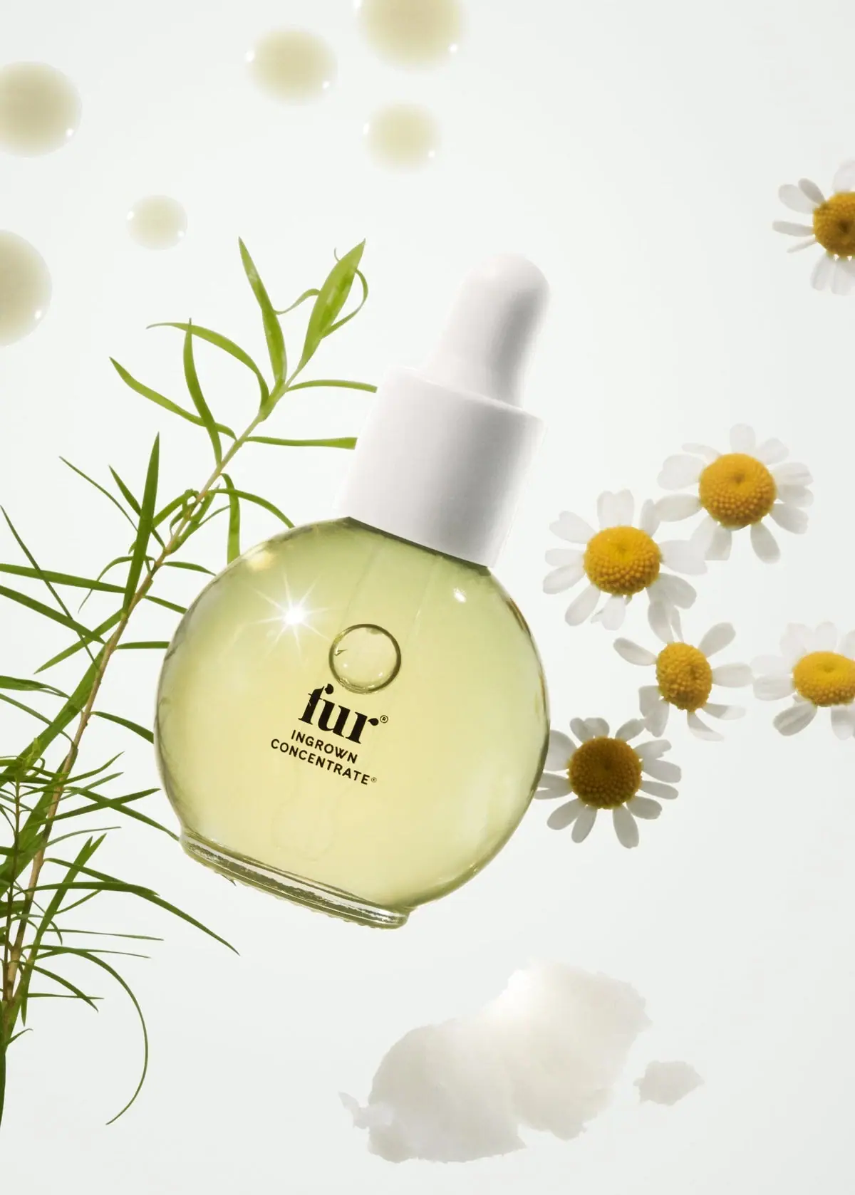
Fur
Pale oil and compact black type in a rounded dropper

Aesop
a botanical still life around a disciplined apothecary label

Benamôr
Ornamental lilac medallion suspended above golden botanical oil

Bomba Curls
tropical foliage gathered around a bold yellow nameplate
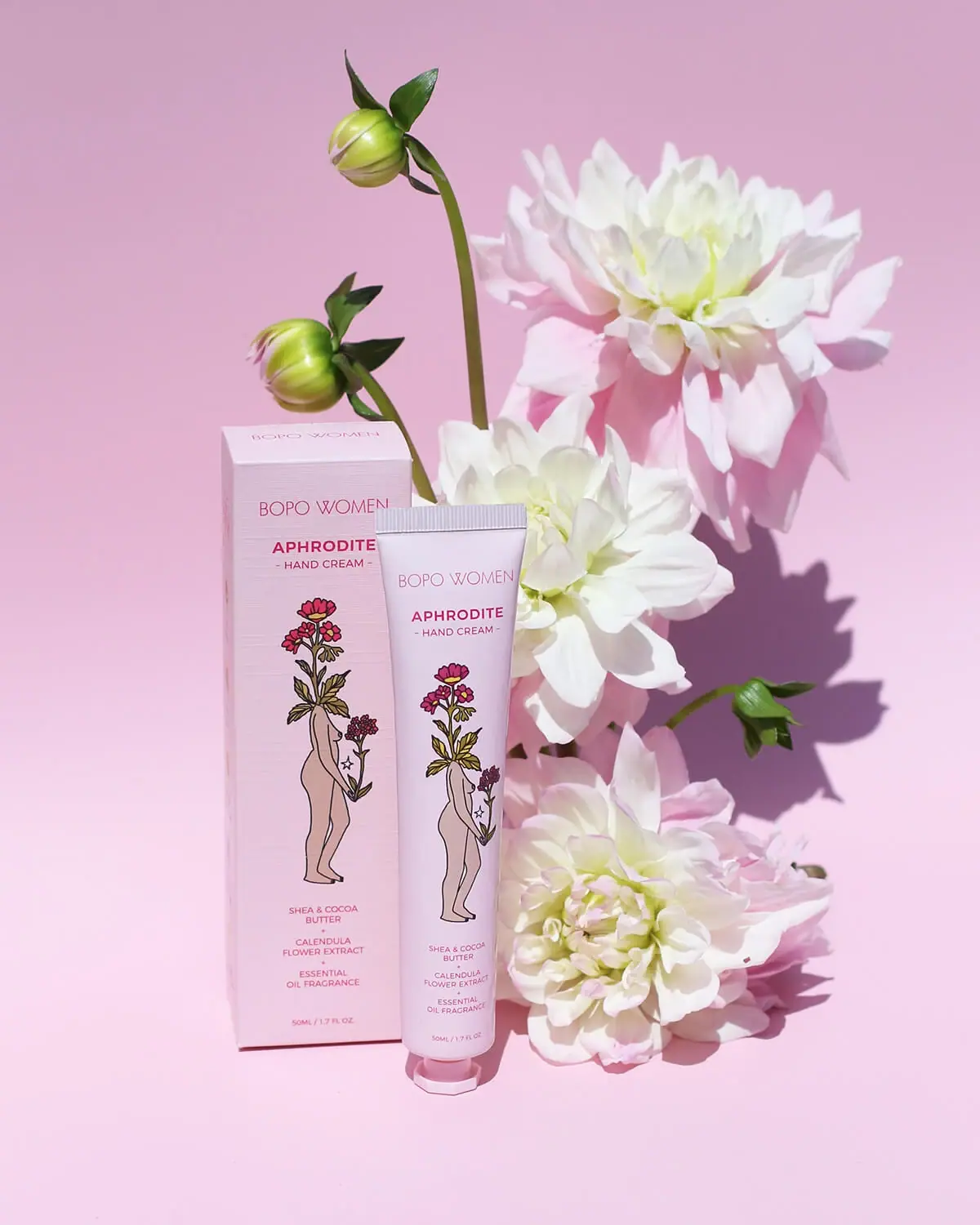
Bopo Women
a botanical figure on a coordinated blush-pink pair
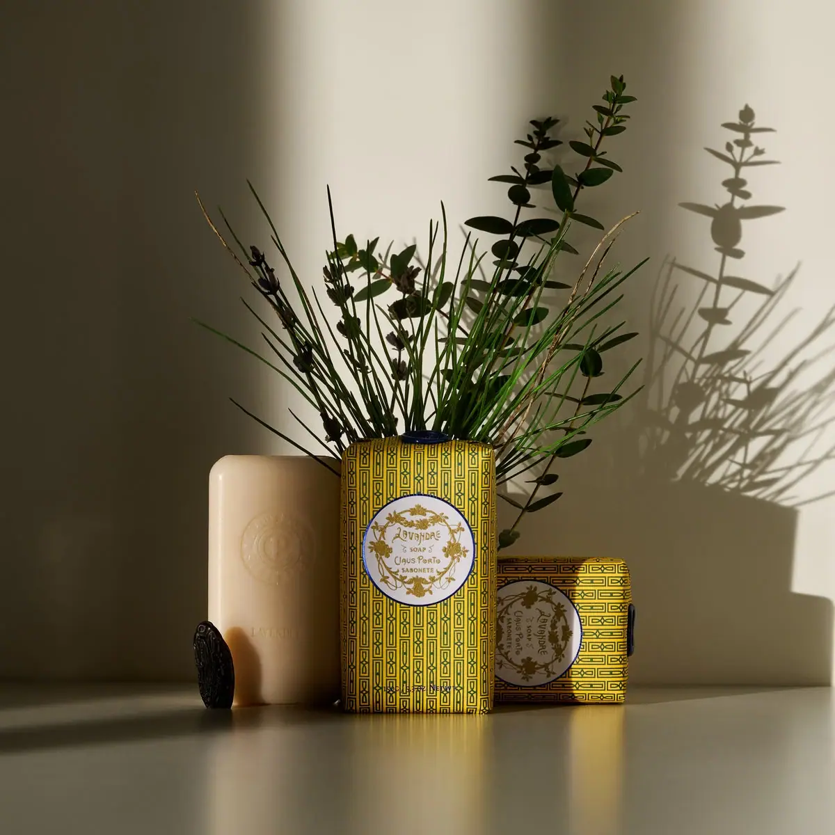
Claus Porto
Golden geometric wrapping around a pale floral medallion
Desert Rose Australia
Apricot sunscreen tube with white type and ochre flower
Fable & Mane
Arched serif maker, tiger portrait and amber dropper bottle