About this packaging
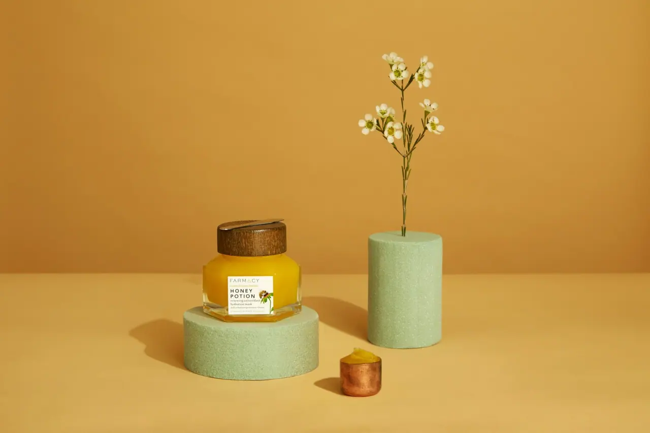
The selected earlier Honey Potion mask reference presents a faceted clear jar, broad wood-toned cap, and compact white label. The transparent, low-profile silhouette lets the warm-colored contents contribute as much to the pack’s identity as its printed name.
Farmacy’s current Honey Potion Plus is a 50 g mask with a magnetic spatula that attaches to the lid. Its Italy recycling guide lists component materials for the Plus package.[1][2]
Edition note. The cover depicts the earlier Honey Potion package, while Farmacy’s current listing and Italy recycling guide describe Honey Potion Plus; the Plus component specifications do not establish the earlier jar’s materials.
Pack construction & use
- Earlier jar form
- The selected cover shows a low, multi-faceted clear jar with a broad brown cap and golden product visible inside.Observed in the reference photograph
- Current Honey Potion Plus configuration
- For Honey Potion Plus, Farmacy’s Italy guide lists a GL70 glass jar; LDPE 4 disc and label; plastic 7 inner cap; wood (FOR 50) outer cap; steel spatula; and PAP 21 carton. These details describe the Plus configuration, not the earlier jar pictured.[2]
What makes the design work
Editorial analysis of this packaging reference.
Facets shape the silhouette
The angular wall catches light across multiple planes, giving the short jar a sculptural outline instead of a standard cylinder. The broad cap balances that low, wide body and makes the form easy to recognize in a product lineup.
A compact label preserves visibility
The small white label stays distinct against the amber-colored contents while leaving most of the jar exposed. That proportion makes the product color part of the pack’s immediate visual signature without sacrificing a clear front-facing product name.
Golden contents echo the scene
The golden product and dark wood-toned lid give the jar a warm appearance. The orange-gold backdrop reinforces that palette, while pale green display cylinders provide contrast as separate photographic props.[3]
Ideas for your next brief
- Use faceted transparent walls to add shape and light variation while keeping the product visible.
- Keep a compact, high-contrast label when a product’s color and container form already provide strong recognition.
Sources & further reading
- 1.Honey Potion Plus — Farmacy Beauty
- 2.How To Recycle Farmacy Beauty Products in Italy — Farmacy Beauty
- 3.Farmacy campaign — Jurada primary production portfolio
Researched 19 October 2026