Go-To
Selected packaging
1 curated reference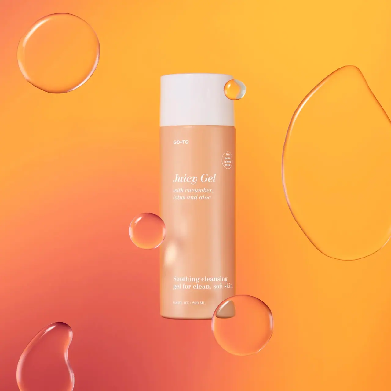
Skincare · Bottle
Juicy Gel Cleanser
Go-To Juicy Gel is photographed in a peach cylindrical bottle with a broad white cap. White italic serif product lettering and smaller upright serif copy share a loose left-aligned column, while an oval bottle-specific PCR statement sits separately near the upper right. Floating translucent forms belong to the campaign scene.
Colours in this photograph
Sampled from the curated cover, including background and props. Screen colours, not print specifications.
A closer look
Read the full studyDesign observations from the selected packaging.
Contrasting type voices
The small informal Go-To maker mark sits above a larger italic serif Juicy Gel title. A matching italic ingredient block follows; the lower cleanser descriptor switches to upright serif lettering. The main blocks share a left edge rather than centered alignment.
A quiet peach reading field
White lettering and a broad white cap sit against a peach body. A large open interval separates the upper product block from the lower cleanser descriptor. Fine white type has modest tonal contrast in this warm photograph, so readability should be judged at the intended viewing size.
More brands to explore
Continue discovering distinctive packaging.