About this packaging
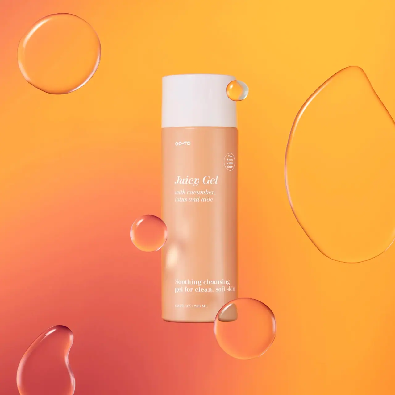
Go-To Juicy Gel is photographed in a peach cylindrical bottle with a broad white cap. White italic serif product lettering and smaller upright serif copy share a loose left-aligned column, while an oval bottle-specific PCR statement sits separately near the upper right. Floating translucent forms belong to the campaign scene.
Go-To describes Juicy Gel as a gentle gel cleanser. Its selected package states that the bottle is 100% PCR.[1]
Pack construction & use
- Container
- Go-To lists 200 ml / 6.8 fl oz; the selected cover states “This bottle is 100% PCR.”[1]
- Closure
- A broad white cap tops the cylindrical bottle.Observed in the reference photograph
- Label copy
- The front names Juicy Gel and identifies cucumber, lotus and aloe, followed by its cleanser description.Observed in the reference photograph
What makes the design work
Editorial analysis of this packaging reference.
Contrasting type voices
The small informal Go-To maker mark sits above a larger italic serif Juicy Gel title. A matching italic ingredient block follows; the lower cleanser descriptor switches to upright serif lettering. The main blocks share a left edge rather than centered alignment.
A quiet peach reading field
White lettering and a broad white cap sit against a peach body. A large open interval separates the upper product block from the lower cleanser descriptor. Fine white type has modest tonal contrast in this warm photograph, so readability should be judged at the intended viewing size.
Ingredient cue as image language
Floating translucent forms add movement around the straight-on pack without covering the PCR statement or product name.
Ideas for your next brief
- Put the familiar product name first, then use a short descriptor to resolve category and function.
- Make recycled-content claims visible on the package and tie them to a clearly identified component.
Sources & further reading
Researched 19 October 2026