Photography: Georgina Egan — product photography. Images belong to their respective owners.
Go-To

Peach cylinder, white cap and airy italic serif copy
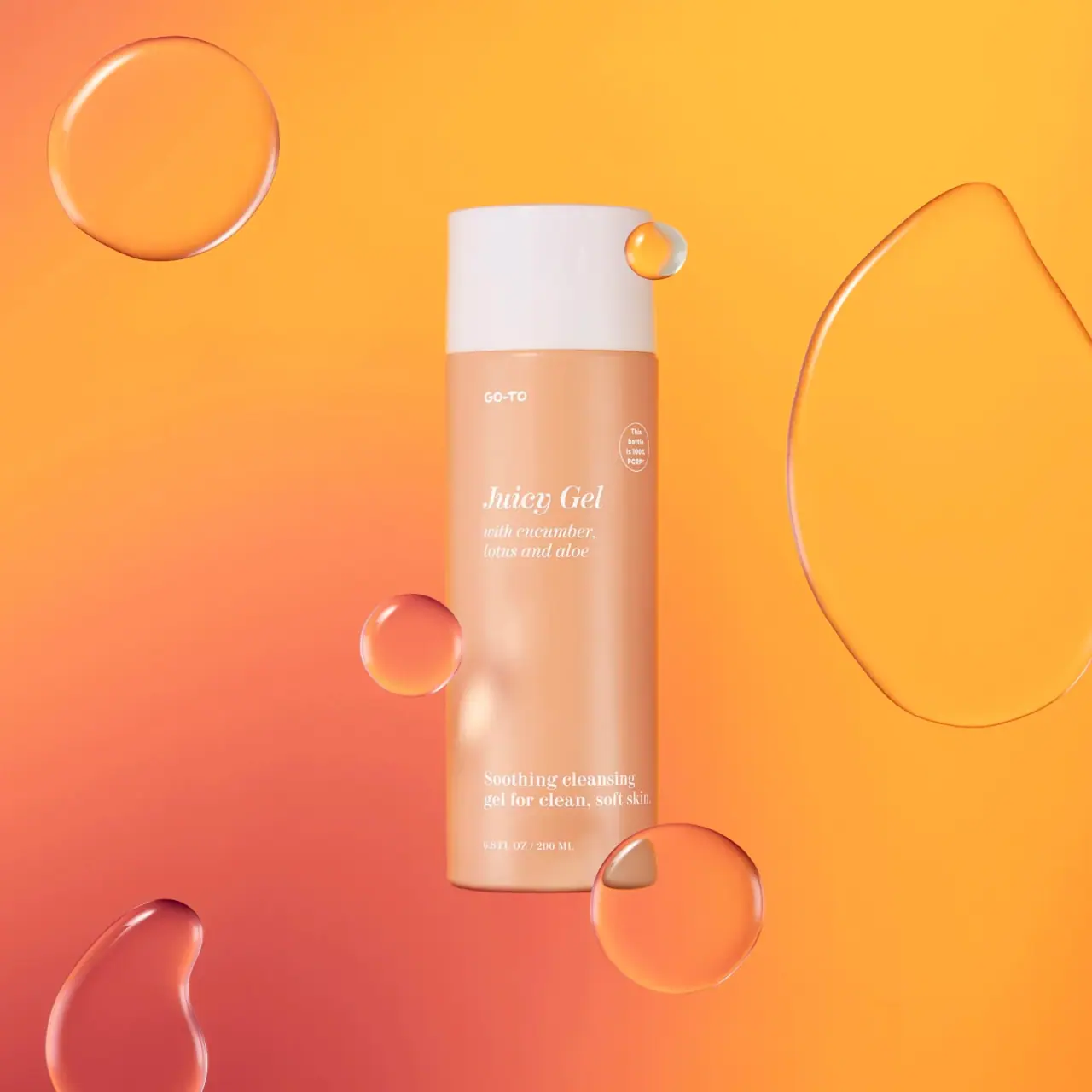
Juicy Gel presents a quiet peach cylinder interrupted by a broad white cap and sparse white lettering. The small informal maker mark, italic serif product title and upright serif cleanser descriptor have distinct voices. Their main blocks follow a loose left-aligned column with a long empty interval through the body. An oval recycled-content statement sits separately near the upper right. The selected photograph surrounds this restrained object with translucent gel-like forms and an intense orange-to-coral setting; that vivid scene is not a printed packaging pattern.
- Skincare
- Light pack
- Pastel soft-touch
- Bold typographic
About this study
Selected peach Juicy Gel 200 mL bottle photographed by Georgina Egan, including its bottle-specific PCR badge. Current product-page materials are context, not proof of identical historical construction.
Sources & evidence · Reviewed 2026-10-19Color Palette
Approximate colours interpreted from photography. These are screen references, not official brand colours or print specifications.
Pack body
Warm peach body
#DFA888
Approximate softly colored cylindrical field. Its warmth varies with the surrounding orange and coral lighting; this is not a manufacturer color standard.
Ink
Soft white lettering
#F5EEE8
Product text, ingredient wording, quantity and thin oval badge. Fine white lines can lose contrast over the body's brightest reflections.
Accent
Pale white cap
#EDE6E6
Broad solid upper component, visibly cooler and lighter than the peach body. It supplies a major light shape without an added graphic border.
Typography
Suggested visual alternatives, not confirmed brand typefaces. Any scale below is an illustrative estimate.
The maker mark is small and irregular, placed near the upper left of the front. Juicy Gel is substantially larger and set in an italic serif voice, followed by a smaller italic ingredient block. Low on the bottle, the cleanser descriptor uses upright serif lettering, with a still smaller quantity line beneath. The title is not a connected handwritten script. This distinction matters: its elegance comes from serif contrast and inclination, while the maker supplies the more casual gesture. The oval claim is a separate compact sans-like voice.
Fonts
Product, ingredient and category text
Libre Caslon Display
- Looks like
- Contrasting serif with expressive italic
- Type
- Display serif
- Weight
- Regular
- Case
- Title and sentence case
- Tracking
- Natural optical spacing
- Fallback
- Georgia, serif
Proposed upright serif alternative for an independent title and lower descriptor. Where a true designed italic is needed, use the companion alternative below rather than synthesizing this family into a claimed exact source match.
Italic product and ingredient hierarchy
Lora
- Looks like
- Readable editorial serif italic
- Type
- Contemporary serif
- Weight
- Regular, Medium
- Case
- Title and sentence case
- Tracking
- Natural spacing
- Fallback
- Georgia, serif
Use its designed italic for an original product name and smaller ingredient phrase, and upright text for supporting information. Preserve sufficient stroke weight against a pale body; the original logo and small badge do not need to be imitated.
Structure & Proportions
Visual proportions and finish previews are illustrative. Confirmed construction details and uncertainties are distinguished in the study notes.
Proportions
| Purpose | Value | Preview |
|---|---|---|
| Continuous cylinder | Cap and body have closely related widths, so a single straight outline dominates rather than a narrow neck and flared shoulder. | — |
| Cap mass | The white cap is tall enough to register as a substantial visual block, yet the peach body remains the majority of the object's height. | — |
| Vertical breathing room | A long unprinted interval divides the upper name-and-ingredient group from the lower function-and-volume group. No numeric spacing grid is inferred. | — |
| Off-axis claim | The small oval sits to the upper right of the title region, outside the main left-aligned text column and below the maker mark. | — |
Shapes
| Element | Value | Preview |
|---|---|---|
| Body silhouette | Slender cylindrical body with subtly rounded base edge. | |
| Closed cap | Broad white cylindrical cover with a single horizontal boundary against peach. | |
| PCR badge | Small thin upright oval enclosing several compact lines. | |
| Text fields | Upper and lower left-aligned groups separated by an open vertical interval. |
Finishes
Softly luminous peach
Broad body reflections in the selected scene; appearance does not verify soft-touch coating or frosted resin. · matte
Smooth pale cover
White cap shows gentle diffuse highlights; exact gloss specification unknown. · matte
Formats and materials
| Formats | Tall cylindrical 200 mL / 6.8 fl oz cleanser bottle with a broad closed white cap in the selected photograph |
| Materials | The photographed oval statement attributes 100% PCR to the bottle only. This is an observed brand claim, not an independent material audit, and does not automatically include cap or internal components., The current official product page describes a polypropylene bottle and lid plus a mixed virgin-material pump. Those current specifications are recorded as context, not silently assigned to the older photographed edition. |
| Closures | The closed cap approximately continues the bottle's width, keeping the overall outline a simple cylinder with one horizontal seam. No nozzle or dispensing aperture is visible. A pump is discussed on the current product page, but the photograph does not reveal the mechanism beneath its white cover. The cap's fit, internal attachment and dispensing dose remain unverified. |
| Decoration | Small informal maker mark near upper left, Italic serif title and ingredient block, Bottle-specific oval PCR statement at upper right, Separated upright serif category text and small quantity near the base |
Front Panel
Schematic reading order. The diagram’s zone heights do not represent measured artwork proportions.
The front is organized by vertical distance and type voice rather than frames. A small maker mark begins the left column high on the body. The product title and ingredient phrase sit lower, with the compact claim offset right. A large quiet area then opens before the cleanser descriptor and quantity. There is no visible separate white paper panel. Whether the text is directly printed, transferred or carried on a transparent label is not established by this image.
| Zone | Content |
|---|---|
| Maker | Small GO-TO lettering near the upper-left front introduces an informal voice without dominating the product title. |
| Title and ingredients | Italic Juicy Gel naming followed by a smaller two-line ingredient phrase creates a gentle slope and a shared left edge. |
| Material statement | The upper-right oval refers specifically to the bottle and PCR content. Its compact size and isolated placement keep it secondary to the title. |
| Product function | The lower upright serif block explicitly identifies cleansing gel and provides the practical category read after the more evocative name. |
| Net contents | A small imperial/metric line sits near the bottom of the same column, separated from the larger descriptor. |
Range System
Only the selected Juicy Gel edition is analyzed. Peach is prominent in the brand's current presentation, but one pack does not establish a complete category or ingredient color code. The source page's current material description and the photograph's PCR statement should coexist as edition-specific evidence until the brand confirms their relationship.
- An original family could keep a common pale shell while distinguishing product names through explicit wording and controlled serif hierarchy.
- Preserve a separate category descriptor when an evocative name alone does not explain what the product does.
- Treat component claims as changeable factual content with their own verification, not as permanent decorative emblems copied across a range.
Back of Pack & Shelf
No reverse, underside, open cap or carton is inspected. Online materials and ingredient information do not show the physical rear's typography or panel allocation.
- Request an edition-matched rear image before locating full directions and ingredients.
- Verify which components a recycled-content statement covers.
- Keep any proposed future reverse sufficiently contrasting for practical reading.
On shelf
Interpretively, the wide white cap and peach body can make a calm two-part silhouette among busier packs. The generous spacing invites a slower reading of product and function, but fine white serif strokes have only modest tonal contrast in parts of this warm-lit image. Evaluate an original design at actual size and against body highlights, especially for the ingredient phrase and volume. A saturated campaign background should not be relied upon to solve on-pack text legibility.
Imagery
Georgina Egan's selected still-life image floats translucent rounded and elongated gel-like forms around the upright bottle. Their edges catch highlights and refract the orange-yellow and coral background, adding motion around a static cylindrical object. Some overlap the bottle edge without obscuring the key words. The image does not establish whether these forms were physically staged or composited. Their translucency is a photographic texture cue, not proof that the body itself is transparent or that every drop is the actual formula.
Guidelines
Editorial principles for an original design brief, not official brand guidelines.
Do
- Distinguish italic serif from connected script.
- Keep title and category both explicit.
- Use empty vertical space deliberately.
- Tie component statements to their exact photographed edition.
- Check fine type against the brightest body highlights.
Don't
- Do not describe the main text as centered.
- Do not infer soft-touch chemistry from a pastel appearance.
- Do not apply the bottle's PCR claim to its cap or pump.
- Do not mistake floating gel scenery for printed motifs.
- Do not assume current material details prove historical construction.
Sources & evidence
- Go-To Skincare — Juicy Gelproduct
- Georgina Egan — Still Life Photographyphotographer
How this study was built
edition · Sourced fact
Current product page confirms cleanser identity and 200 mL / 6.8 fl oz; its materials section is kept distinct from the photographed claim.Go-To Skincare — Juicy Gelstructure · Visual observation
Selected image shows a peach cylinder and broad closed white cap, not an exposed dispensing top.Georgina Egan — Still Life Photographytypography · Visual observation
Product title is italic serif; lower descriptor is upright serif, and main blocks share a left edge.Georgina Egan — Still Life Photographylabel · Visual observation
An independent oval attributes PCR content to the bottle; a long empty interval separates upper and lower copy.Georgina Egan — Still Life Photographypalette · Visual observation
Peach and white belong to the pack; orange-yellow and coral dominance mainly belongs to the scene.Georgina Egan — Still Life Photographyimagery · Visual observation
Translucent floating forms add movement without establishing manufacturing or ingredient facts.Georgina Egan — Still Life Photographyrange · Editorial interpretation
Type posture and spacing can organize an original pale family; no universal Go-To specification asserted.
What remains unverified
- Original typefaces, exact dimensions and decoration process unverified.
- Current material description does not restate the pictured PCR claim.
- Closed cap conceals dispensing mechanism; reverse and carton not inspected.
- Soft-touch tag describes a visual association, not a verified coating.
- Floating forms' production method and formula identity unknown.
Give your AI
packaging taste
Give your design or image tool a packaging study: palette, type, structure, front panel and principles for an original brief.
Export this styleFree with an email. PACK.md works in Claude, ChatGPT, Cursor and image tools.
More like this

Bread Beauty Supply
bubblegum pumps and a fat black wordmark
Dae
Warm translucent mist with tonal lettering and bilingual rhythm

Fenty Beauty
faceted caps and wide-spaced lilac capitals
Function of Beauty
Lavender bottle with longitudinal white serif lettering

Kosas
lavender chrome and candy-pink acrylic
LAWLESS
Pink diffused gloss vial with a reflective rose-toned cap
Odyskin
Mint tube with rotated serif lettering and circular protection badge
Overose
Lavender glossy cylinder with a spare black-and-white scent label