LORAC
Selected packaging
1 curated reference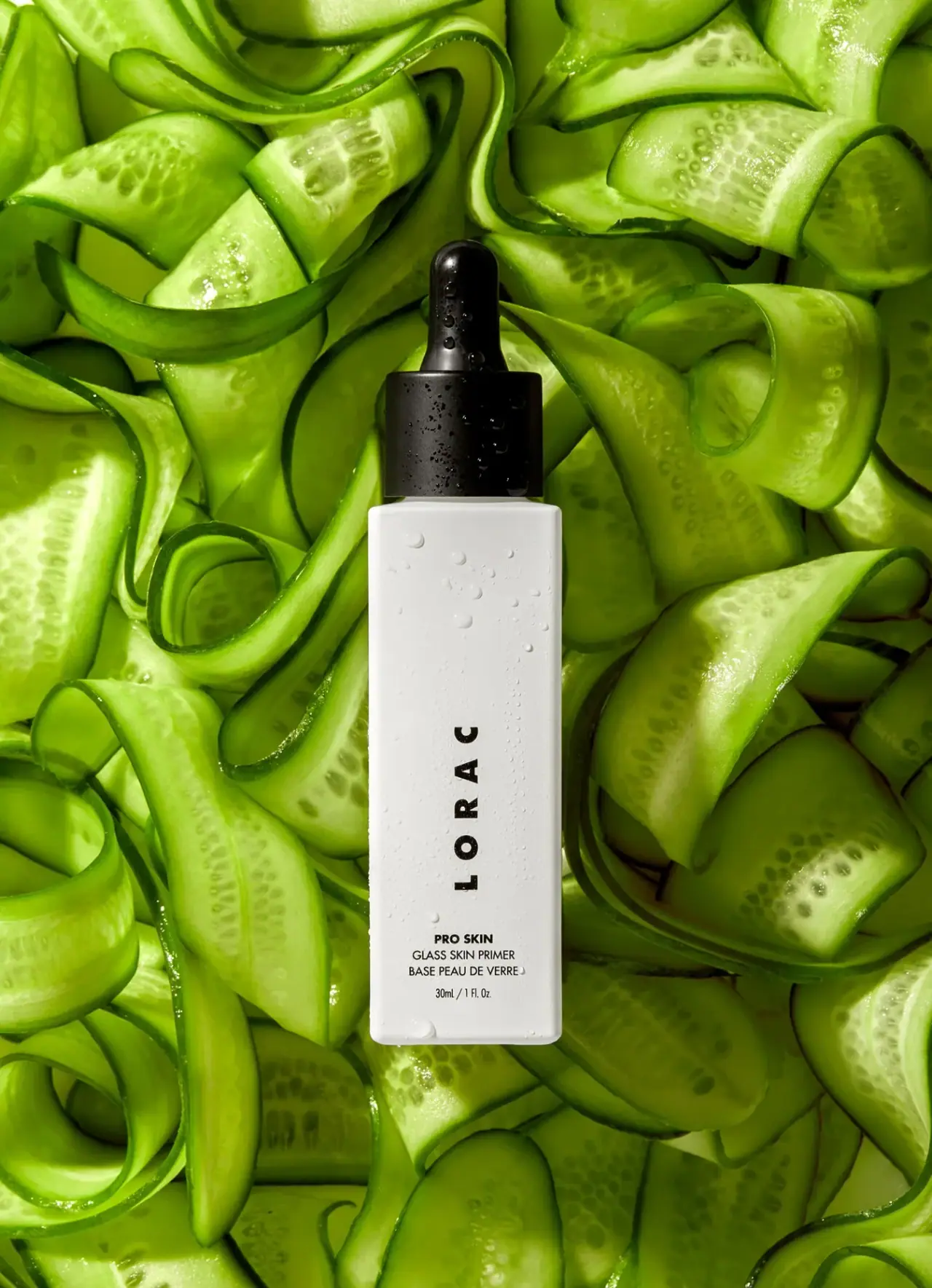
Makeup · Dropper bottle
PRO Skin Glass Skin Primer
LORAC PRO Skin Glass Skin Primer pairs a tall white bottle with a black dropper and a restrained vertical wordmark. The selected cover makes the dispensing closure and product name part of the package’s central visual hierarchy.
The pictured bottle carries a volume marking, but the official product page did not expose matching volume details in the accessible page view.
Colours in this photograph
Sampled from the curated cover, including background and props. Screen colours, not print specifications.
A closer look
Read the full studyDesign observations from the selected packaging.
Closure becomes the silhouette’s anchor
The black dropper creates a dark focal point above the otherwise light bottle. This high contrast gives the package a clear top-to-bottom structure without surrounding decoration.
Rotated wordmark uses the bottle’s height
The widely spaced LORAC word is rotated counterclockwise and reads from bottom to top along the narrow front. It is a turned word rather than individually upright stacked letters, distinct from the smaller horizontal product information below.
More brands to explore
Continue discovering distinctive packaging.