About this packaging
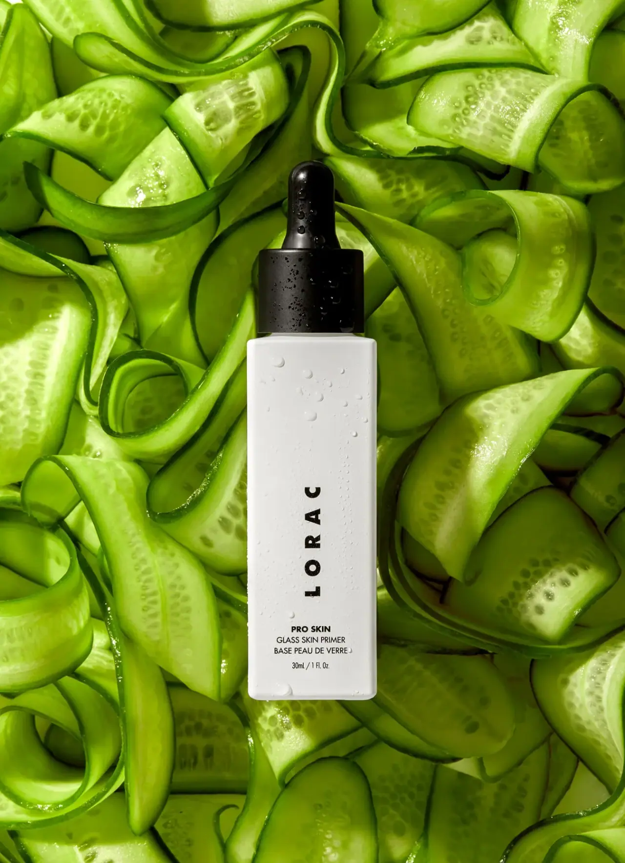
LORAC PRO Skin Glass Skin Primer pairs a tall white bottle with a black dropper and a restrained vertical wordmark. The selected cover makes the dispensing closure and product name part of the package’s central visual hierarchy.
LORAC identifies the product as PRO Skin Glass Skin Primer.[1]
Edition note. The pictured bottle carries a volume marking, but the official product page did not expose matching volume details in the accessible page view.
Pack construction & use
- Dropper bottle
- The selected image shows a tall white rectangular bottle with softly rounded shoulders and a black dropper closure.Observed in the reference photograph
- Front label
- The cover reads 30 mL / 1 fl oz below the primer name. The source page confirms the product identity but does not provide a separately indexed volume specification.Observed in the reference photograph
What makes the design work
Editorial analysis of this packaging reference.
Closure becomes the silhouette’s anchor
The black dropper creates a dark focal point above the otherwise light bottle. This high contrast gives the package a clear top-to-bottom structure without surrounding decoration.
Rotated wordmark uses the bottle’s height
The widely spaced LORAC word is rotated counterclockwise and reads from bottom to top along the narrow front. It is a turned word rather than individually upright stacked letters, distinct from the smaller horizontal product information below.
Minimal color keeps detail legible
Black typography against the white field limits the palette to a simple high-contrast system. Small supporting copy can sit lower on the bottle while the brand remains the dominant read.
Ideas for your next brief
- Use a contrasting closure to create a deliberate visual endpoint on a tall bottle.
- Rotate or stack a wordmark to make effective use of a narrow front panel.
- Keep supporting product copy below a dominant brand mark in a restrained palette.
Sources & further reading
Researched 19 October 2026