Photography: Teri Lyn Fisher — LORAC product photography. Images belong to their respective owners.
LORAC

White rectangular dropper with rotated black maker and open space
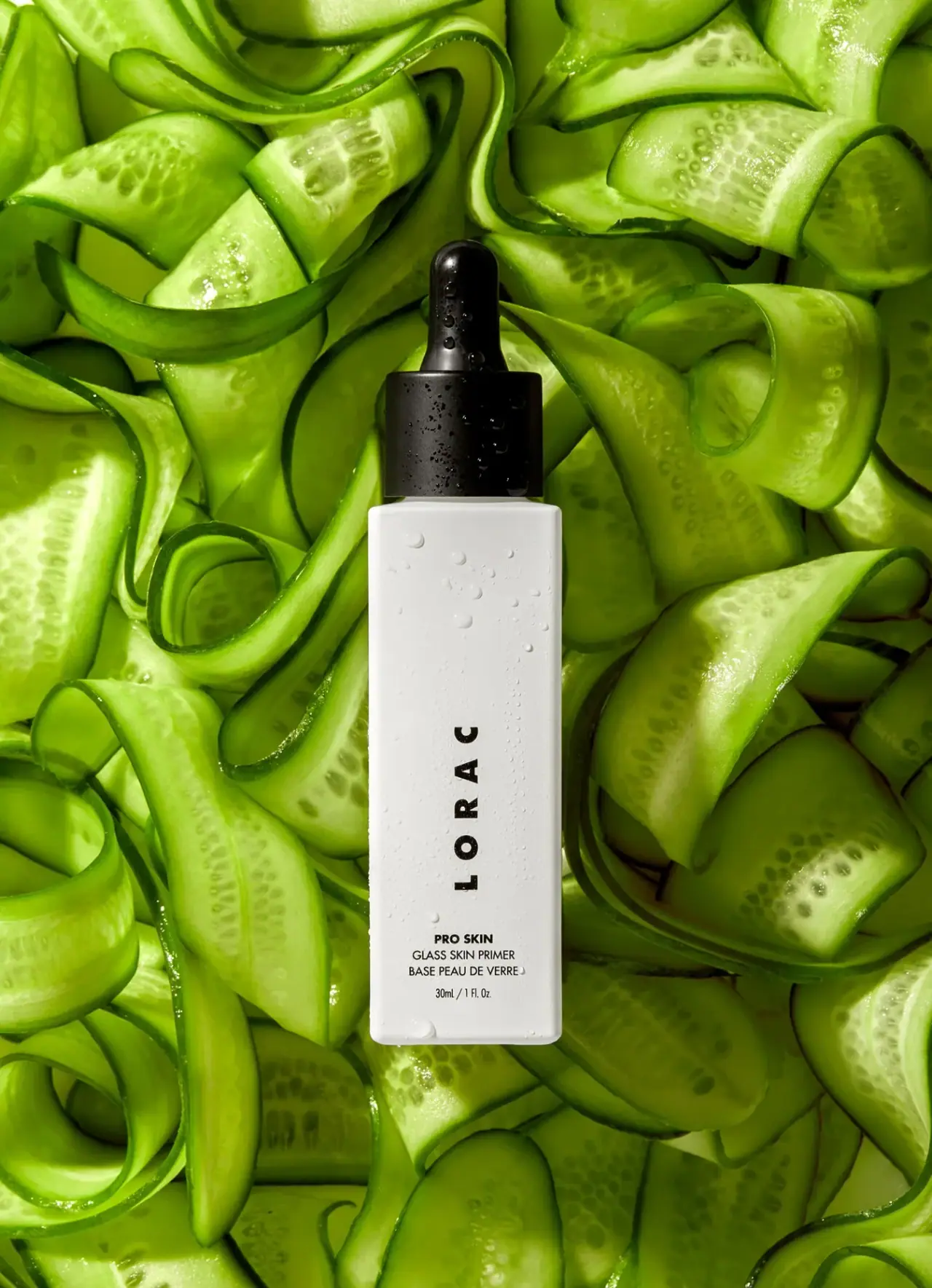
The selected PRO Skin Glass Skin Primer bottle is a tall white rectangle softened at its edges, topped by a broad black collar and rounded dropper bulb. A widely spaced LORAC word rotates upward through the lower middle of the front, while a small horizontal product block remains near the base. Much of the upper body stays blank. Bright cucumber ribbons and scattered droplets belong to Teri Lyn Fisher's campaign setting; they are not green package graphics or a molded surface texture.
- Make-up
- Light pack
- Clinical minimal
- Luxe monochrome
About this study
Selected white rectangular PRO Skin primer bottle in Teri Lyn Fisher's cucumber-ribbon scene, with visible 30ml / 1 Fl. Oz. front. Material and ingredient associations are not inferred from naming or props.
Sources & evidence · Reviewed 2026-10-19Color Palette
Approximate colours interpreted from photography. These are screen references, not official brand colours or print specifications.
Pack body
Soft opaque white
#E9E9E4
Approximate body appearance under the scene lighting, with subtle gray edge shading and reflected green from the surrounding cucumber.
Ink
Black typography
#161713
Large rotated maker and small horizontal information form a single dark print layer.
Accent
Black dropper assembly
#10120F
Collar and bulb create the strongest solid dark area; highlights and droplets do not establish different component colors.
Typography
Suggested visual alternatives, not confirmed brand typefaces. Any scale below is an illustrative estimate.
LORAC is the largest text, using bold uppercase sans forms with conspicuously open spacing. The complete word is rotated counterclockwise, reading from the lower part of the bottle toward the top. It is not composed of individually upright stacked letters. Beneath the maker, PRO SKIN appears as a small bold horizontal line, followed by lighter product and French category wording. The quantity sits separately at the bottom. Large spacing, not a decorative illustration, gives the brand word its presence.
Fonts
Original rotated maker
Montserrat
- Looks like
- Heavy compact geometric sans
- Type
- Geometric sans-serif
- Weight
- Bold, ExtraBold
- Case
- Uppercase
- Tracking
- Wide optical spacing
- Fallback
- Arial, sans-serif
Use for a new short maker, rotated as a complete word. Check the resulting line length rather than reproducing the source's exact letter spacing or proportions.
Product and quantity
Roboto Condensed
- Looks like
- Compact neutral sans
- Type
- Condensed sans-serif
- Weight
- Regular, Bold
- Case
- Uppercase function; mixed-case units
- Tracking
- Natural compact spacing
- Fallback
- Arial Narrow, Arial, sans-serif
Alternative for a small functional block that must fit the narrow front. Use a bolder collection line and lighter category lines, keeping the quantity visually separated.
Structure & Proportions
Visual proportions and finish previews are illustrative. Confirmed construction details and uncertainties are distinguished in the study notes.
Proportions
| Purpose | Value | Preview |
|---|---|---|
| Tall narrow face | The long body accommodates a rotated maker while retaining a substantial blank area above it. | — |
| Broad collar anchor | The black collar approaches the front body's width, creating a strong visual transition from white vessel to the narrower bulb. | — |
| Low information cluster | Product and quantity lines occupy a small lower zone beneath the maker rather than filling the open top half. | — |
| Soft edge treatment | Rounded corners and a slight shoulder soften the rectangular face without turning it into a cylindrical silhouette. | — |
Shapes
| Element | Value | Preview |
|---|---|---|
| Bottle body | Elongated rectangular front with softly rounded corners and a shallow shoulder. | |
| Dropper bulb | Tall rounded black bulb rising from a broad collar. | |
| Maker line | A complete widely spaced word rotated counterclockwise along the bottle axis. | |
| Product block | Small centered horizontal lines grouped near the base. |
Finishes
Soft white surface appearance
Broad front shows gentle shading rather than a verified matte or soft-touch coating. · matte
Black closure highlights
Bulb and collar catch light and carry water droplets; exact material finish is unverified. · gloss
Formats and materials
| Formats | Tall white rectangular dropper-bottle appearance; selected front visibly reads 30ml / 1 Fl. Oz. |
| Materials | The body appears opaque white with a flat broad front and softly rounded edges. The accessible official page does not establish glass, plastic, coating, recycled content or decoration method for this photographed bottle., The black assembly comprises a broad collar and elongated rounded bulb. Exact elastomer, cap resin, pipette material and sealing system are unverified. The words Glass Skin describe the product name and must not be used as evidence that the vessel itself is glass. |
| Closures | The dropper assembly is closed. A wide cylindrical black collar sits above the narrow neck, with a rounded bulb rising centrally from it. The collar is only slightly narrower than the front body in this view, giving the top a substantial dark block. The pipette, threads and any internal wiper or seal are hidden. No dose marking, locking feature or refill mechanism can be established from the selected photograph. |
| Decoration | Widely spaced upward-rotated maker, Small horizontal PRO SKIN line, English and French primer wording, Separated lower quantity line, Large unprinted upper field |
Front Panel
Schematic reading order. The diagram’s zone heights do not represent measured artwork proportions.
The bottle uses the white surface as one continuous field with no visible framed label panel. The large turned maker occupies the lower middle, leaving an unusually open interval between its upper end and the shoulder. The product block remains upright and centered, so it can be read conventionally once the object is recognized. Bold PRO SKIN introduces the category lines, and quantity closes the stack. There are no visible ingredient icons, color bands or decorative borders on this front.
| Zone | Content |
|---|---|
| Upper open field | A large plain white area below the shoulder shows droplets and light rather than additional printed information. |
| Rotated maker | Bold LORAC letters read from bottom to top as a turned word. |
| Collection cue | PRO SKIN appears horizontally in a compact bold line. |
| Bilingual function | Glass Skin Primer and its French category description sit immediately below the collection cue. |
| Net contents | 30ml / 1 Fl. Oz. is visible near the lower edge, independently of the sparse current web description. |
Range System
The accessible official page confirms the product identity and describes an oil-blend serum primer. The selected image supplies the front layout and visible quantity. This single product does not establish a universal LORAC skincare or makeup package system. An original family could repeat the contrast of a turned maker with an upright functional block, but other formats would need their own space and readability decisions.
- Use a stable upright product zone when the maker reads along a different axis.
- Preserve open space only where it supports the specific front proportions.
- Treat a dropper bottle as a format-specific construction rather than assuming all companion primers share it.
Back of Pack & Shelf
The reverse, base and open pipette are not visible. The front's bilingual product wording does not establish the location of full ingredients or application instructions.
- Inspect the reverse before describing ingredient or regulatory hierarchy.
- Confirm pipette and seal construction before documenting dispensing details.
- Do not turn a photographed water droplet into a waterproof-label claim.
On shelf
Interpretively, the black dropper and white rectangular body give a strong silhouette before any small wording is read. The turned maker uses the narrow face efficiently but requires a change in reading direction; the conventional lower product lines compensate. A real shelf test should include a plain background, because the saturated green scene makes the package contrast unusually strong. The broad white upper field may help recognition but should not be mistaken for evidence that no information appears elsewhere on the bottle.
Imagery
Teri Lyn Fisher's portfolio identifies the scene as LORAC on cucumber ribbons. The tightly packed green curls surround the centered bottle with wet highlights and strong shadows, making its white rectangle a clear visual pause. Small droplets appear on the bottle and closure, reinforcing the fresh photographic mood without proving a skincare effect or package water resistance. The accessed official product text does not establish cucumber as a formula ingredient, so the prop remains a visual cue rather than an ingredient assertion.
Guidelines
Editorial principles for an original design brief, not official brand guidelines.
Do
- Distinguish rotated words from stacked letters.
- Keep supporting product information upright and clear.
- Use the observed quantity rather than inventing a web specification.
- Separate green props from the package palette.
- Treat droplets as external photographic texture.
Don't
- Do not infer glass material from the product name.
- Do not describe the maker as reading top to bottom.
- Do not claim cucumber content from the setting alone.
- Do not infer pipette material or dosage marks.
- Do not copy the exact sparse wordmark arrangement.
Sources & evidence
- LORAC — PRO Skin Glass Skin Primerproduct
- Teri Lyn Fisher — Product Photographyphotographer
How this study was built
edition · Sourced fact
Official page confirms the PRO Skin Glass Skin Primer identity; visible photo supplies the 30ml / 1 Fl. Oz. marking.LORAC — PRO Skin Glass Skin Primer · Teri Lyn Fisher — Product Photographystructure · Visual observation
White rectangular body with soft edges supports a broad black collar and rounded dropper bulb.Teri Lyn Fisher — Product Photographytypography · Visual observation
Bold spaced maker is a whole word rotated counterclockwise, reading bottom to top.Teri Lyn Fisher — Product Photographylabel · Visual observation
Large upper blank area contrasts with lower maker and upright collection, category and quantity blocks.Teri Lyn Fisher — Product Photographypalette · Visual observation
White body and black text/closure define the pack; bright green is the external cucumber scene.Teri Lyn Fisher — Product Photographyimagery · Sourced fact
Photographer portfolio explicitly identifies LORAC on cucumber ribbons, matching approved image provenance.Teri Lyn Fisher — Product Photographyrange · Editorial interpretation
Turned maker plus upright functional information is transferable; no universal LORAC packaging rule established.
What remains unverified
- Bottle, collar, bulb and pipette materials unverified.
- Original fonts and measured proportions unknown.
- Reverse, base and open closure unseen.
- Cucumber props do not independently establish formula ingredients; Glass Skin does not establish vessel material.
Give your AI
packaging taste
Give your design or image tool a packaging study: palette, type, structure, front panel and principles for an original brief.
Export this styleFree with an email. PACK.md works in Claude, ChatGPT, Cursor and image tools.
More like this

African Botanics
Technical black label with a low serif signature

bareMinerals
a restrained black compact framing the powder itself

BeautyPWR
Clear square shell, white cream cup, black serif identity

Corpus
sage gloss with whispered gold lettering

Costa Brazil
Pale matching vessels with small, deliberate bilingual labels

Crown Affair
Pale frosted-looking bottle, black pump and small looping emblem

HAKU
Pearly narrow tube with stacked serif identity and clear base

Haus Labs
mirror chrome hardware over frosted shade