About this packaging
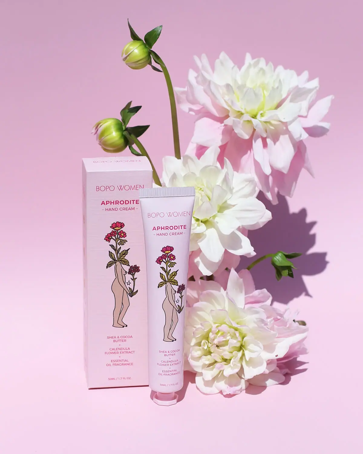
Bopo Women Aphrodite Luxury Hand Cream pairs a pale pink tube with a matching carton illustrated in fine linework. The official listing identifies the product as a 50 mL hand cream and connects the Aphrodite name to a floral fragrance, while the artwork supplies the strongest visual cue on the pack.
Bopo Women describes Aphrodite as a floral, essential-oil-fragranced hand cream.[1]
Pack construction & use
- Tube and carton
- The selected image shows a pink tube with a coordinated carton. A fine-line figure entwined with flowers appears on both.Observed in the reference photograph
- Product size
- The official listing gives the hand cream as 50 mL. The volume is presented low on the tube’s front, beneath the centered product identity and ingredient text visible in the selected image.[1]
What makes the design work
Editorial analysis of this packaging reference.
Illustration connects name and scent world
A fine-line figure surrounded by flowers gives Aphrodite a figurative identity rather than relying on a generic botanical pattern. Repeating it across tube and carton makes the set visually coherent.
A restrained wordmark hierarchy
The smaller Bopo Women mark sits above the more prominent Aphrodite name, which anchors the front panel. Dark rose lettering remains legible against the pale pink field without overpowering the illustration.
Carton and tube work as one presentation
The matching color and artwork make the outer carton feel like an extension of the tube rather than a separate graphic system. This is useful for products where the tube may later be displayed without its box.
Ideas for your next brief
- Repeat a key illustration across tube and carton to preserve recognition after the box is removed.
- Use a product-specific name as the typographic anchor below a smaller parent brand mark.
Sources & further reading
Researched 19 October 2026