About this packaging
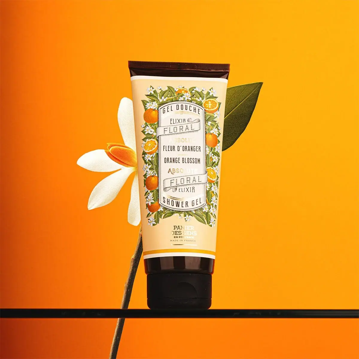
Panier des Sens Orange Blossom Shower Gel uses an illustrated sleeve-like front panel to give a conventional squeeze tube a dense botanical character. Orange fruit, blossoms and a framed bilingual product name connect the scent to its Mediterranean reference.
Panier des Sens lists Orange Blossom Shower Gel in a 200 mL size and describes it as made in France. The photographed front carries French and English names, connecting the same scent and category across two languages.[1]
Pack construction & use
- Container / closure
- The squeeze tube tapers toward a dark cap with a visible flip-top seam and finger recess. A dark crimped edge at the opposite end gives the pale decorated body a border at both ends.Observed in the reference photograph
- Printed panel
- A framed label combines French and English product naming with repeated “floral elixir” wording, surrounded by orange blossom and fruit illustrations.Observed in the reference photograph
What makes the design work
Editorial analysis of this packaging reference.
Illustration as scent shorthand
Orange branches and white blossoms wrap the central label, turning the fragrance into an immediate visual cue. The repeated fruit-and-flower motif reads clearly at shelf distance and remains specific to the Orange Blossom variant.
Framed typography
The narrow, stacked label gives several lines a defined reading area rather than scattering them across the illustrated surface. Different size and weight distinguish the product category, scent, and brand.
Controlled color field
The cream tube and orange background amplify the fruit palette while the dark cap anchors the bottom edge. White blossoms soften the high-saturation scene and echo the light lettering.
Ideas for your next brief
- Build a scent-specific botanical border around a stable central information panel.
- Use a consistent tube and vary the illustration palette to make fragrance variants recognizable.
Sources & further reading
Researched 19 October 2026