Photography: Bopo Women official photography. Images belong to their respective owners.
Bopo Women

a botanical figure on a coordinated blush-pink pair
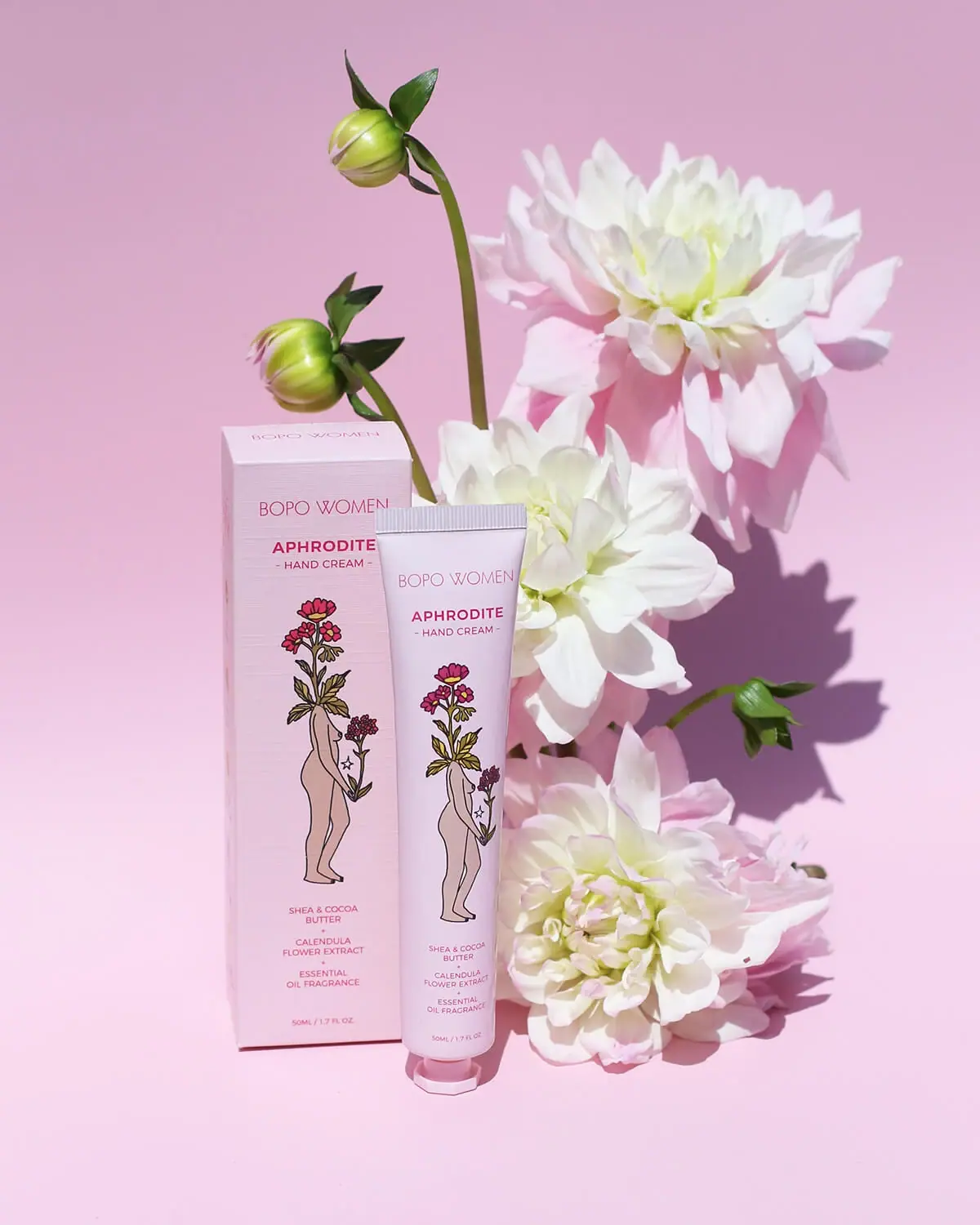
Aphrodite Hand Cream makes its illustration the link between a narrow tube and a taller matching carton. A standing figure with a flowering head occupies the centre of each front, outlined in dark strokes and filled with restrained pink, skin and olive tones. Above it, light brand lettering gives way to a bolder product name; below, short ingredient-oriented lines form a neat vertical sequence. The pink field unifies the two formats without erasing their different proportions. This study addresses this particular Aphrodite presentation rather than every Bopo Women product.
- Body & bath
- Light pack
- Botanical
- Retro illustrated
About this study
Aphrodite 50 mL hand cream and matching carton in the selected official floral photograph. Scent relation to the perfume roller is source-backed, but its packaging is not analysed.
Sources & evidence · Reviewed 2026-10-19Color Palette
Approximate colours interpreted from photography. These are screen references, not official brand colours or print specifications.
Pack body
Pale blush field
#EDD7E4
Approximate tube and carton colour in the selected photograph. It is distinct from the deeper pink scene background; no Pantone or substrate standard is established.
Ink
Dark rose lettering
#A73762
Approximate brand and product text, also related to the flower accents. Lighting and the two substrates may shift the apparent tone.
Near-black outline
#302A2D
Fine dark contour around the figure, leaves and flowers; this creates definition without filling the whole illustration dark.
Accent
Olive botanical fill
#A19457
Approximate leaves within the printed illustration, not the brighter green stems in the photographic set.
Warm figure fill
#D6B2AA
Approximate flat colour inside the drawn body. It is a specific illustration colour rather than a prescribed human skin-tone range.
Typography
Suggested visual alternatives, not confirmed brand typefaces. Any scale below is an illustrative estimate.
BOPO WOMEN is a light uppercase line near the top, spanning much of the available width. APHRODITE follows in a noticeably heavier weight, with HAND CREAM immediately beneath. The product name becomes the main textual anchor even though the brand name is wide. Below the figure, small centred uppercase statements are broken into short blocks. Their repeated alignment gives practical copy a calm rhythm around a more expressive illustration.
Fonts
Light brand alternative
Jost
- Looks like
- Jost Light for a geometric uppercase line
- Type
- Geometric sans serif
- Weight
- Light
- Case
- Uppercase
- Tracking
- Normal to slightly open
- Fallback
- Arial, sans-serif
Develop an independent brand name with a light architectural quality. Keep strokes sufficiently strong for small-format printing and do not imitate the BOPO WOMEN lettering construction.
Product and detail alternative
DM Sans
- Looks like
- DM Sans for clear weight contrast
- Type
- Low-contrast sans serif
- Weight
- Regular and Bold
- Case
- Uppercase
- Tracking
- Normal for details, slightly open for a short product name
- Fallback
- Arial, sans-serif
Use a heavier product-name line and lighter supporting information. Contrast through weight is more useful here than adding a third decorative typeface that competes with the figure.
Structure & Proportions
Visual proportions and finish previews are illustrative. Confirmed construction details and uncertainties are distinguished in the study notes.
Proportions
| Purpose | Value | Preview |
|---|---|---|
| Tube versus carton | The carton is taller and offers a more stable rectangular drawing area; the tube narrows toward its lower closure. The same identity is adapted to those distinct fields. | — |
| Illustration scale | The figure occupies the longest uninterrupted middle section, leaving separate title and detail zones above and below. | — |
| Text blocks | Small lower statements are broken into two-line groups with visible gaps, keeping a narrow width without producing one dense paragraph. | — |
| Cap base | The small closure is visually subordinate to the tube body. No physical dimensions or exact artwork coverage are measured. | — |
Shapes
| Element | Value | Preview |
|---|---|---|
| Tube | Narrow tapering body with flattened sealed-looking upper edge. | |
| Carton | Tall rectangular prism with a clear front face and visible top panel. | |
| Figure | Outlined standing body with flowers and leaves rising where a head would be. | |
| Cap | Small faceted pale closure at the tube base; mechanism unseen. |
Finishes
Subdued pink appearance
Tube and carton; no soft-touch coating is claimed. · matte
Flat illustrated appearance
Figure, foliage and flowers; exact printing method and substrate are unverified. · matte
Formats and materials
| Formats | Selected 50 mL hand-cream tube accompanied by a narrow upright carton. |
| Materials | Tube wall, cap and carton substrate specifications are unverified in the consulted official listing. A sealed-looking upper edge does not establish aluminium, a laminate or a particular plastic. |
| Closures | The tube stands cap-down in the photograph. A small pale faceted cap provides its base, while the opposite end has a ribbed sealed-looking edge. The cap thread, liner, opening size and actual dispensing mechanism are not visible, so a specific closure construction is not asserted. |
| Decoration | Repeated flowering figure on tube and carton., Weight-based uppercase type hierarchy., Short centred ingredient-oriented text blocks below the illustration. |
Front Panel
Schematic reading order. The diagram’s zone heights do not represent measured artwork proportions.
The tube and carton share a centred vertical arrangement: brand, product name and function, illustration, then short lower statements and volume. The artwork becomes a recognisable bridge between the two formats while the copy retains its own clear zones. The figure is not a repeated all-over botanical pattern; it is one specific character-like image.
| Zone | Content |
|---|---|
| Upper brand | Light BOPO WOMEN capitals sit above the product title and repeat on the carton top panel visible in the image. |
| Product identity | Bolder APHRODITE above a smaller HAND CREAM line. The weight change helps the product name hold its own beside the illustration. |
| Illustrated centre | A dark-outlined figure carries flowers and foliage, with small flat colour areas and a star detail. The exact creative authorship is not established. |
| Lower statements | Visible short lines refer to shea and cocoa butter, calendula flower extract and essential-oil fragrance. They are label observations, not independently evaluated efficacy claims. |
| Volume | 50 mL is placed low on the front, separated from the main title. The official listing confirms the size. |
Range System
The official listing links this cream’s floral scent with an Aphrodite perfume roller. That supports a named scent relationship, but no roller artwork or wider colour system was inspected. The transfer lesson is limited to this tube-carton pair: repeat a recognisable illustration while adjusting layout to each physical format.
- Aphrodite tube: the illustration is scaled to a tapering narrow surface.
- Aphrodite carton: the same visual character sits within a taller rectangular panel.
- Aphrodite perfume roller: officially mentioned as a scent relation, without claiming matching packaging here.
- Interpretation: future products could share character or colour cues, but each format needs a separate legibility and cropping check.
Back of Pack & Shelf
The back of the tube and carton are not visible. Side text is only partly exposed and cannot be reliably reconstructed. The website ingredient list does not establish the position or full printed content of the physical reverse panels.
- Inspect the rear and carton sides before mapping ingredients, warnings or manufacturer details.
- Preserve the illustration on the front while reserving a sufficiently readable information area elsewhere in an original concept.
- Verify any certification and environmental statements separately rather than turning decorative stars or flowers into claim marks.
On shelf
Interpretation: the illustrated body could act as a stronger recognition cue than the small ingredient lines, particularly when the carton is removed and only the tube remains. Matching pink fields support continuity, while the dark outline preserves the character against the pastel background. Very fine contours may weaken at small image sizes or on curved surfaces, so an original design needs thumbnail and physical print checks. No shopper-recognition or usability data was consulted.
Imagery
Large pale flowers and green buds rise behind the tube and carton on a pink ground. Direct light creates clear shadows to the right, separating the real petals from the flat printed drawing. This repeats the floral idea at two scales: a small illustrated figure on the package and much larger blossoms in the scene. The real flowers are styling props, not proof of the precise botanical ingredients. The photograph shows how a small hand-cream tube can gain presence without enlarging its branding.
Guidelines
Editorial principles for an original design brief, not official brand guidelines.
Do
- Repeat a distinctive illustration across the primary pack and its carton.
- Adapt artwork scale to the tube taper rather than using one unmodified flat layout.
- Use weight and spacing to distinguish brand, product and supporting copy.
- Keep visible ingredient statements separate from unverified performance claims.
Don't
- Do not infer aluminium or a specific laminate from the sealed tube edge.
- Do not label a pastel surface soft-touch without evidence.
- Do not copy the flowering figure, star detail or BOPO WOMEN mark.
- Do not treat the photographed blossoms as an exact ingredient list.
Sources & evidence
How this study was built
edition · Sourced fact
Official product listing confirms Aphrodite hand cream and 50 mL size.Bopo Women — Aphrodite Luxury Hand Cream, official product and photographystructure · Visual observation
A narrow tube and taller matching carton are visible; materials and closure construction are not inferred.Bopo Women — Aphrodite Luxury Hand Cream, official product and photographytypography · Visual observation
Light brand capitals contrast with a bolder product name and smaller supporting text.Bopo Women — Aphrodite Luxury Hand Cream, official product and photographylabel · Visual observation
A flowering figure with dark outlines and flat coloured areas repeats across both fronts.Bopo Women — Aphrodite Luxury Hand Cream, official product and photographypalette · Visual observation
Blush field, rose type, dark outline, olive leaves and warm figure fill are pack-specific estimates.Bopo Women — Aphrodite Luxury Hand Cream, official product and photographyrange · Sourced fact
The brand links the hand-cream scent to its Aphrodite perfume roller without establishing shared artwork here.Bopo Women — Aphrodite Luxury Hand Cream, official product and photographyimagery · Editorial interpretation
Real floral props amplify the illustrated botanical theme; they are not an exact formulation declaration.
What remains unverified
- Tube, cap and carton specifications, print process and coatings are unverified.
- Original fonts and illustration authorship have not been identified.
- Back, full carton sides and opened closure are unseen.
- Approximate colours and qualitative proportions are not production specifications.
Give your AI
packaging taste
Give your design or image tool a packaging study: palette, type, structure, front panel and principles for an original brief.
Export this styleFree with an email. PACK.md works in Claude, ChatGPT, Cursor and image tools.
More like this

Benamôr
Ornamental lilac medallion suspended above golden botanical oil
Panier des Sens
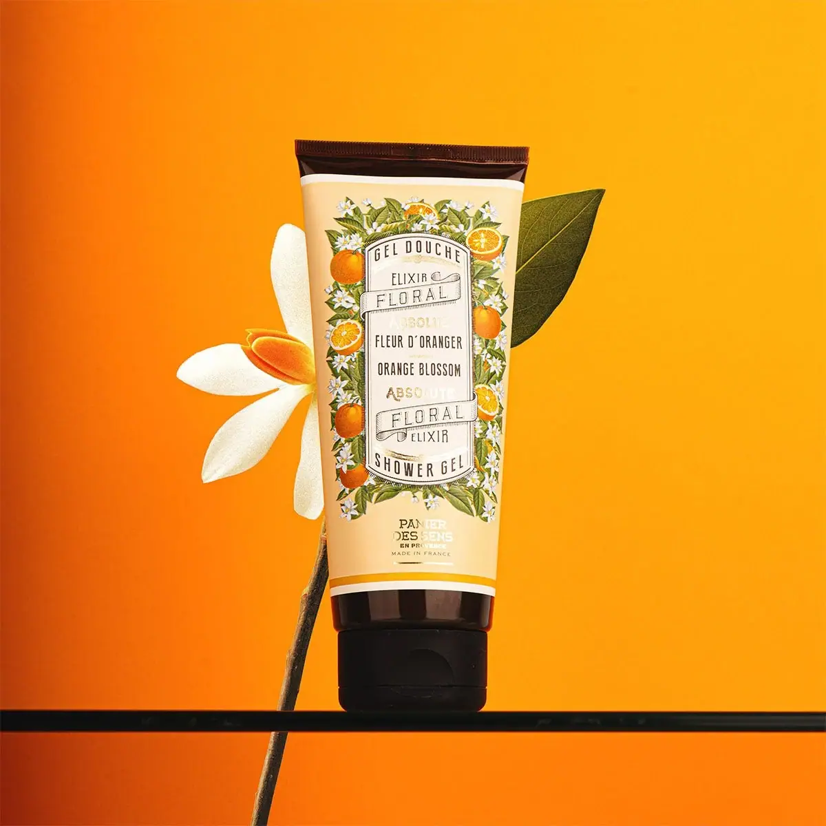
Botanical orange-blossom tube with a framed bilingual cartouche
Good & Well Supply Co.
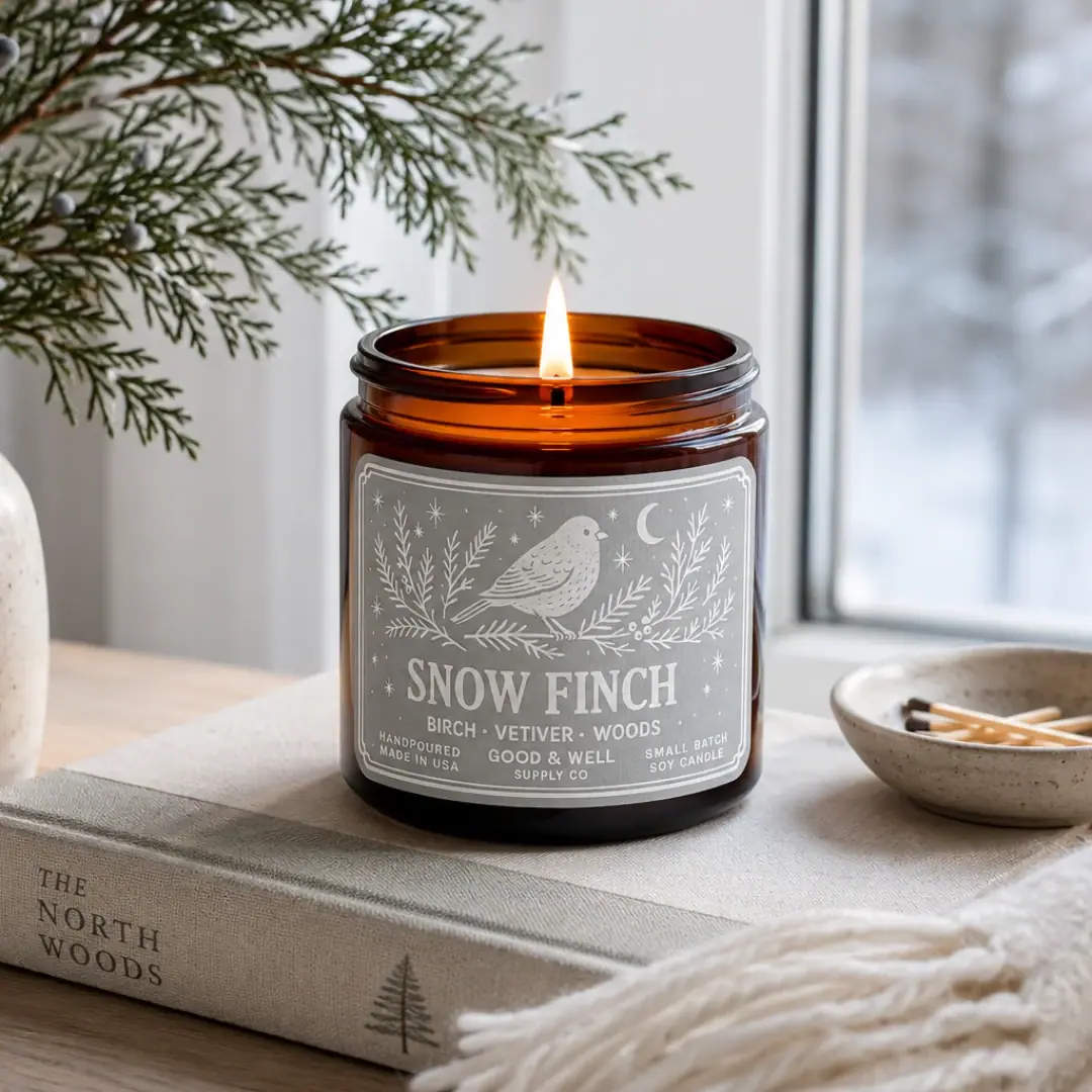
Pale winter bird illustration on a grey amber-jar label
ARRAN
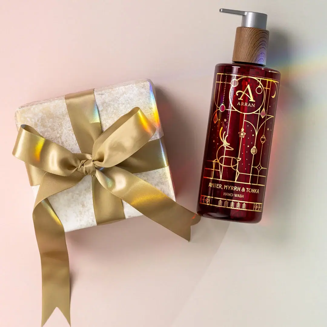
Festive golden linework on garnet with a grain-textured collar
Bathing Culture
Flowing rainbow bands on dark refillable glass

Bomba Curls
tropical foliage gathered around a bold yellow nameplate
Claus Porto
Golden geometric wrapping around a pale floral medallion
Davines
A playful musical box around restrained monochrome haircare minis