About this packaging
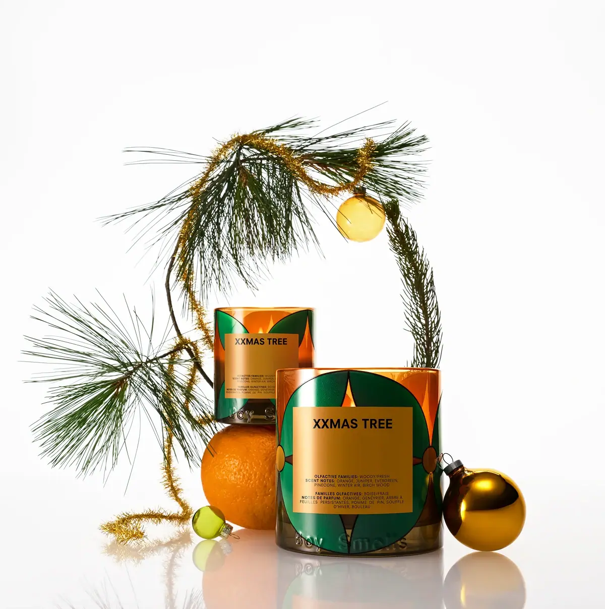
Boy Smells’ XXMAS TREE Magnum candle uses a wide graphic label on a warm-toned vessel. The selected cover places the oversized candle beside a smaller one, making scale and the label system visible together.
Boy Smells describes XXMAS TREE through citrus and juniper top notes, evergreen and pinecone in the middle, and winter air and birch wood at the base.[1]
Pack construction & use
What makes the design work
Editorial analysis of this packaging reference.
A label with its own color field
A dark green label field surrounds a centered amber-colored title block with black XXMAS TREE lettering and small scent notes. The layered shapes echo the vessel’s warm tone while keeping the name in a single high-contrast panel.
Scale communicates the format
Showing the magnum beside a smaller vessel makes the size distinction immediate without a measurement diagram. This is useful when the format itself is part of the product’s value and storage footprint.
Reuse story fits the vessel
The brand’s suggested after-use roles extend the glass vessel beyond the candle. The source frames these as reuse ideas; local recycling acceptance is a separate question.[1]
Ideas for your next brief
- Show a large and standard format together when the scale difference is central to the purchase decision.
- Give a durable vessel a named second use while distinguishing it from claims about local recycling systems.
Sources & further reading
Researched 19 October 2026