About this packaging
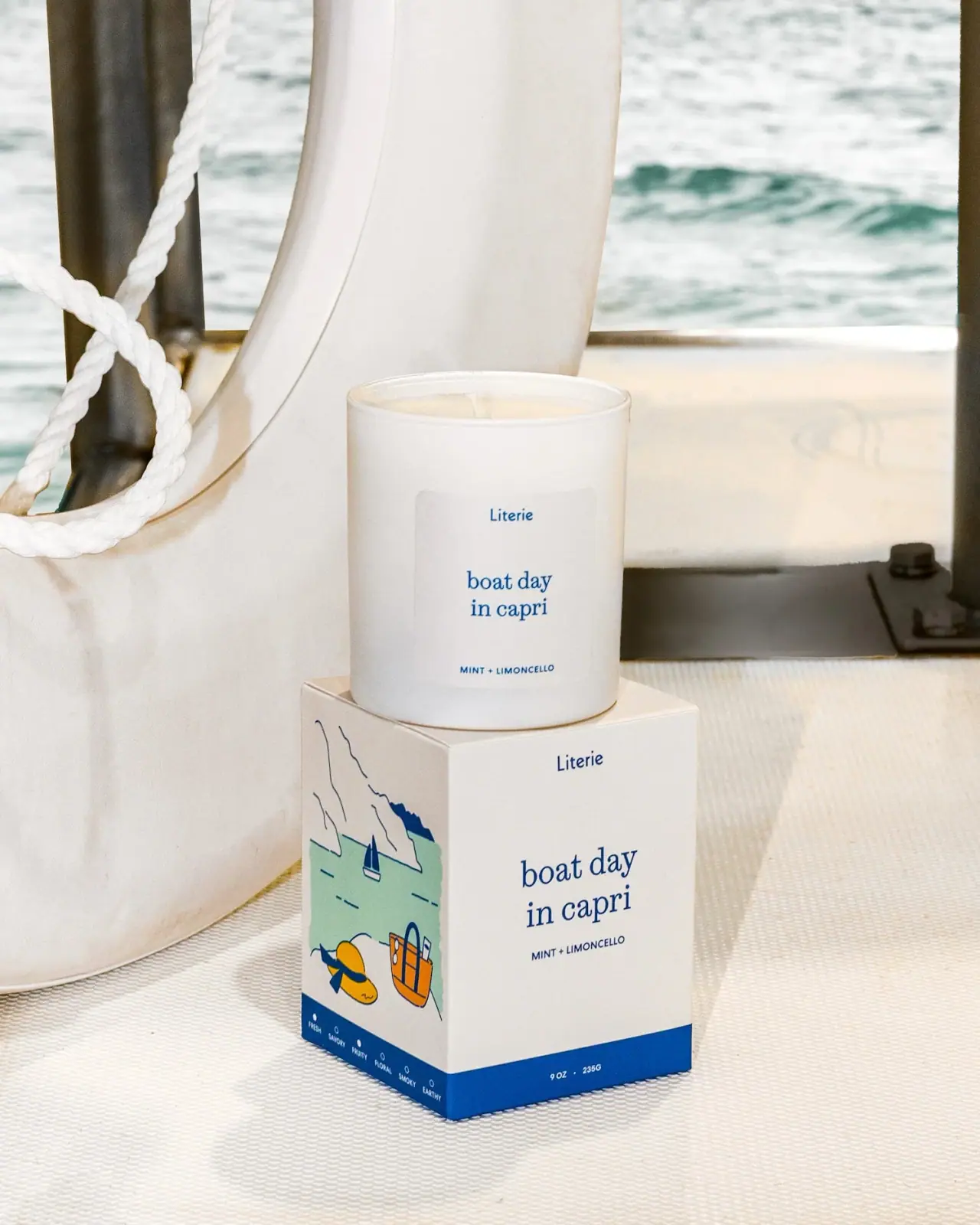
Literie Boat Day in Capri pairs a white cylindrical candle vessel with a matching carton. Blue serif type and a small coastal illustration carry the place-based identity across both pieces.
The selected official photograph identifies Boat Day in Capri and Mint + Limoncello. The carton front's blue base band visibly prints 9 OZ / 235 G; no quantity is legible on the pictured vessel front. Those printed figures are transcribed as shown rather than treated as a verified unit conversion.[1]
Pack construction & use
- Vessel and carton
- The image shows a cylindrical white candle vessel and a square carton with repeated brand and product naming.Observed in the reference photograph
- Printed details
- The carton side carries a coastal illustration and scent-family markers. The vessel repeats the destination name and fragrance pairing; the visible quantity appears on the carton front's lower blue band.Observed in the reference photograph
What makes the design work
Editorial analysis of this packaging reference.
Front and side roles
The carton’s front keeps the product name prominent, while its illustrated side panel adds the Capri scene. This lets the graphic enrich the pack without crowding the main identification face.
Repeatable type roles
The small blue Literie maker mark uses a compact sans-like voice, while the larger destination name is lowercase serif. Repeating these separate roles on vessel and carton makes the set coherent without treating all lettering as one serif family.
Color cue
A narrow blue band at the carton base anchors the illustration and echoes the blue type. The limited palette suits the coastal theme without competing with the name.
Ideas for your next brief
- Use a secondary panel for a detailed illustration when the primary face needs to prioritize product naming.
- Repeat brand, scent typography and one accent color across the vessel and carton to make a set feel intentional.
Sources & further reading
Researched 19 October 2026