


Boy Smells
candy-shell flacons over blush pink glass
Boy Smells splits every perfume flacon horizontally at about 55% of its height: an opaque glossy top in the scent's colour carries the embossed word 'Boy', and a translucent blush-pink glass base (#f6cdbd) carries 'Smells', under a large ball stopper matched to the top. The two words are the whole front, embossed rather than printed, so they read by light and shadow, while the scent name is the only printed element, small at the base as a slanted brush-script logotype or plain bold capitals. Slim travel sprays reduce the system to a coloured sleeve with the name running vertically in black over a pink glass foot, and cartons repeat the split as a duotone halftone portrait over flat pink. Every scent changes only the top colour or its finish (glossy yellow, metallic gold, jade); bottle, pink glass and type never move.
- Candles & home scent
- Perfume
- Light pack
- Colour-coded range
- Bold typographic
- Playful colour
Color Palette
Approximate colours interpreted from photography. These are screen references, not official brand colours or print specifications.
Pack body
Blush Glass
#f6cdbd
Translucent pink lower half of every flacon and the glass foot of travel sprays; carries the embossed second word
Label
Carton Pink
#f3c4b6
Flat pink panel on folding cartons beside the duotone halftone portrait
Ink
Pearl White
#fbf3ee
Scent logotype or capitals printed at the base of the pink glass and type on carton panels
Flacon Black
#1d1b19
Travel-spray actuator caps and the vertical two-word name printed on coloured sleeves
Accent
Script Gold
#b89a3a
Metallic print of the scent logotype and edition word on the gold edition base
Range coding
Citrus Yolk
#f6d32e
Glossy opaque top coating and ball cap on the citrus scent
Brass Gold
#9c8a22
Metallic gold top coating, ball cap and travel sleeve on the gold edition of the citrus scent
Hinoki Jade
#6fa587
Soft green top coating, ball cap and travel sleeve on the woody scent
Mace Tan
#b18d74
Warm tan top coating and duotone carton tone on the vanilla scent
Doll Lilac
#d8bdf2
Lilac plastic body of the body mist and its travel mist
Typography
Suggested visual alternatives, not confirmed brand typefaces. Any scale below is an illustrative estimate.
The two words of the brand name are the loudest element, one per half of the flacon at the same size, embossed so they read as relief in the colour of the surface. The scent name is the only printed line, centred at the base of the pink glass at about a quarter of the wordmark size, sometimes followed by a small edition word. On travel sprays the name runs vertically in black along the sleeve with 'Eau de Parfum' at the foot.
Type scale
Estimated cap size as a share of the panel · Front face of the 100 ml flacon body, shoulder to base, about 90 mm tall (cap excluded)
wordmark-top
13% · Bold · Display
Moss
wordmark-bottom
13% · Bold · Display
Smoke
sleeve-wordmark
7% · Bold · Display
Moss Smoke
scent-logotype
5% · Regular · Script
Fig Rush
scent-name
3.5% · Bold · Label
CEDAR MILK
edition-word
2.5% · SemiBold · Label
GOLD
Fonts
Display
Archivo
- Looks like
- Helvetica Now Display Bold, Neue Haas Grotesk Bold
- Type
- Bold neo-grotesque sans
- Weight
- Bold
- Case
- Title case
- Tracking
- Normal, about 0%
- Fallback
- Helvetica Neue Bold, Arial Bold
The two-word brand name, embossed one word per half of the flacon, printed vertically on travel sleeves and huge across cartons.
Script
Kaushan Script
- Looks like
- Custom bold italic brush logotype
- Type
- Heavy slanted brush script
- Weight
- Regular (heavy stroke)
- Case
- Title case
- Tracking
- Tight
- Fallback
- Brush Script MT, cursive
Scent logotypes that get their own lettering, printed small at the base of the glass with a crossed mark before the name.
Label
Barlow Condensed
- Looks like
- Futura Bold Condensed, Helvetica Neue Bold Condensed
- Type
- Bold condensed grotesque
- Weight
- SemiBold, Bold
- Case
- Uppercase
- Tracking
- Wide, about +6%
- Fallback
- Arial Narrow Bold, sans-serif
Plain scent names (two words in capitals) at the base of the glass, edition words beside a logotype, and the format line on travel sprays.
Body
Inter
- Looks like
- Helvetica Neue Regular
- Type
- Neutral grotesque
- Weight
- Regular, Medium
- Case
- Uppercase
- Tracking
- Wide, about +4%
- Fallback
- Helvetica, Arial
Fragrance type, volume and legal lines on carton bases and back panels.
Structure & Proportions
Proportions
| Purpose | Value | Preview |
|---|---|---|
| Coloured top coating | About 55% of body height, square shoulders to the split line | |
| Pink glass base | About 45% of body height, below the split | |
| Wordmark width | About 60% of flacon width per word | |
| Cap diameter | About 55% of body width, a sphere on a short collar | |
| Scent name width | About 45% of body width, centred at the base | |
| Colours per flacon | Two: scent colour above, blush pink below, plus one print colour for the scent name | — |
| Density | Nearly empty: two embossed words and one small printed line | — |
Shapes
| Element | Value | Preview |
|---|---|---|
| Flacon body | Squat rounded rectangle with soft square shoulders | |
| Stopper | Large sphere on a short collar | |
| Colour split | Straight horizontal line just below mid-height | |
| Travel spray | Slim cylinder with coloured sleeve and pink glass foot | |
| Scent mark | Small crossed roundel before the script name |
Finishes
High-gloss lacquer
Coloured top coating and ball stopper on most scents · gloss
Metallic gold coating
Top half and stopper of the gold edition · metallic
Translucent pink glass
Lower half of every flacon and travel-spray foot · frosted
Blind emboss
Both words of the brand name on the flacon · emboss
Matte print
Folding cartons and travel sleeves · matte
Formats and materials
| Formats | Perfume flacon, Travel spray, Body mist bottle, Folding carton |
| Materials | Glass, Lacquered or metallised top coating, Plastic, Paperboard |
| Closures | Large ball-shaped stoppers colour-matched to the top half of the flacon; slim black or coloured actuator caps on travel sprays |
| Decoration | Embossed wordmark, Two-tone horizontal split, Duotone halftone photo on carton, Vertical wordmark on travel sleeve |
Front Panel
Schematic reading order. The diagram’s zone heights do not represent measured artwork proportions.
No label: the rounded rectangular flacon is split at mid-height between opaque colour above and pink glass below, with the two words of the brand embossed one per half.
| Zone | Content |
|---|---|
| Top half | First word embossed into the opaque coloured coating |
| Bottom half | Second word embossed into the pink glass |
| Base | Scent logotype or capitals printed small in white or gold, edition word beside it |
Range System
The split flacon, the pink glass and the embossed name are fixed; each scent swaps the colour of the top half, the stopper and the travel sleeve, and editions change the finish of that same top.
- Citrus = glossy yellow top and ball cap
- Citrus Gold = metallic gold top, cap and sleeve
- Woody hinoki = jade green top, green travel sleeve
- Vanilla = tan top and tan duotone carton
- Body mist = lilac plastic version
Back of Pack & Shelf
Bottles carry almost nothing behind the front; legal text is printed small on the underside of the glass and on the carton. Cartons put scent notes, ingredients and legal lines on a side panel in small uppercase grotesque on the flat pink ground.
- Scent name with top, heart and base notes listed on the carton side
- Fragrance ingredient list (alcohol, parfum, water, allergens)
- Fragrance type and volume in ml and fl oz
- Barcode on the carton base, no white box
- Caution line and recycling marks in small type
- Batch code and country printed under the glass base
On shelf
On shelf the flacons line up as a row of identical pink bases under changing candy-coloured tops and balls, so the brand reads by silhouette and the scent by colour from across a room.
Imagery
Bottles carry no imagery. Cartons print one portrait photograph as a coarse duotone halftone in the scent colour over the pink panel.
Guidelines
Do
- Split the flacon horizontally at about 55% height: opaque scent colour above, translucent blush pink (#f6cdbd) below.
- Emboss the brand name, one word per half, in a bold grotesque at about 13% of body height; never print it on the bottle.
- Match the ball stopper exactly to the top coating in colour and finish.
- Keep the scent name as the only printed element, centred at the base at a quarter of the wordmark size.
- Give each scent one top colour and change only the finish (gloss, metallic) for editions.
- Carry the scent colour onto the travel sleeve with the name running vertically in Flacon Black (#1d1b19).
Don't
- Don't add a paper label, sticker or frame to the flacon.
- Don't print the brand name in ink on glass; it must read by relief.
- Don't change the pink base colour between scents.
- Don't use more than one print colour on the bottle.
- Don't use photography or pattern on the bottle; keep the halftone portrait on the carton only.
- Don't set the brand name in serif or script.
Give your AI
packaging taste
Give your design or image tool a packaging study: palette, type, structure, front panel and principles for an original brief.
Export this styleFree with an email. PACK.md works in Claude, ChatGPT, Cursor and image tools.
More like this

Behave
struck-through wordmark on sour neon pouches
KraveBeauty
cropped wordmarks on minty skincare bottles
Magic Spoon
saturday cartoon cereal for grown-ups

Partake
one saturated carton per cookie flavour
Starface
star-eyed smiley in neon bubblegum
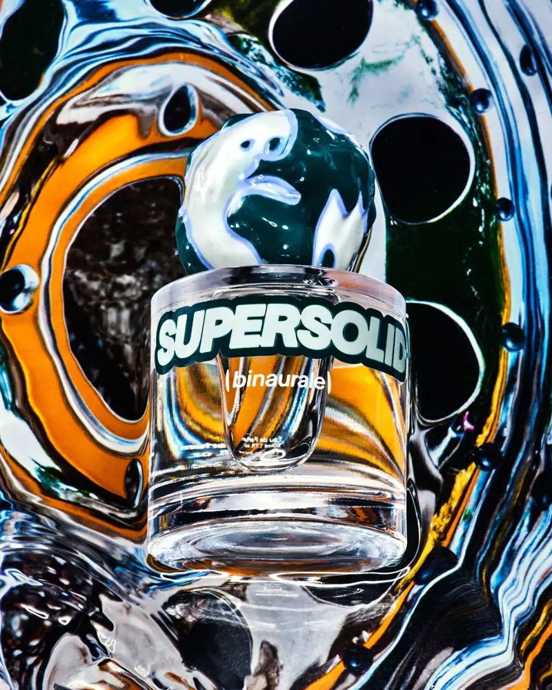
Binaurale
Globular teal cap above slanted pale fragrance lettering
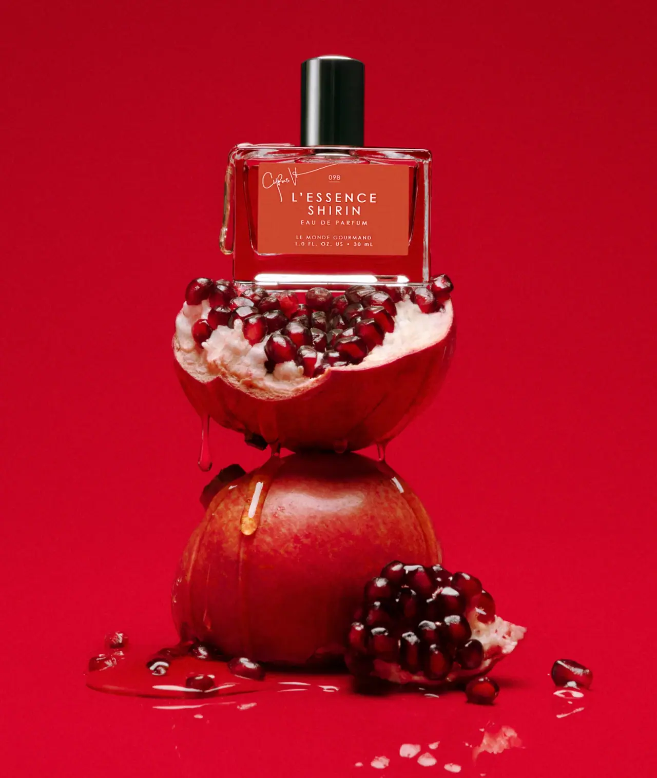
Le Monde Gourmand
white spaced scent naming on red beneath a black cap
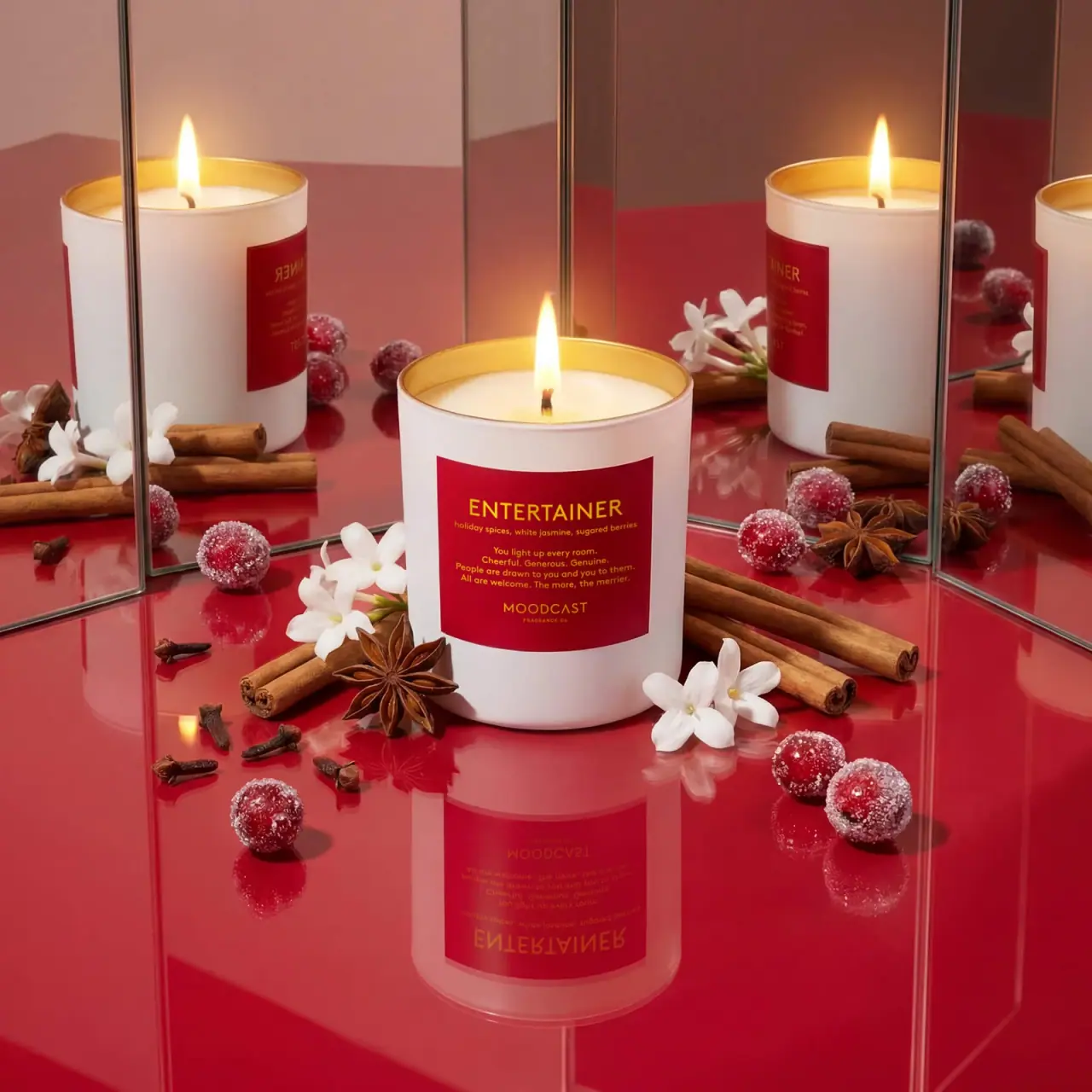
Moodcast
White candle with red personality label and golden inner rim