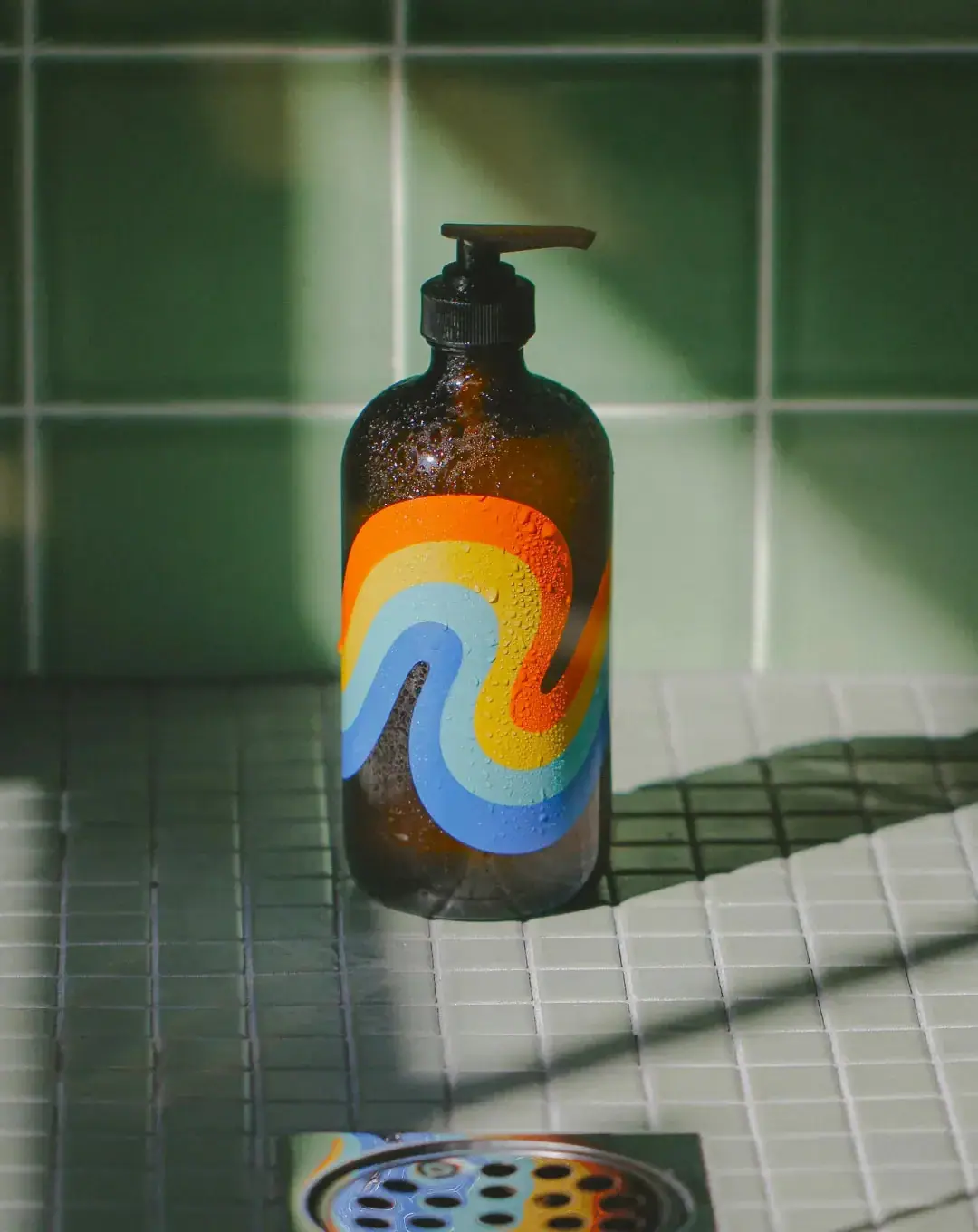
Brightening Body Wash

Photography: byoma.com. All imagery belongs to its respective owner.
What makes the design work
Byoma brand studyVisual observations across the brand’s packaging. Individual formats and editions may vary.
Vertical wordmark
Heavy wide geometric capitals turned 90 degrees and reading bottom to top, about 45% of bottle height, in the pack's single ink.
Spaced sub-brand line
Light capitals tracked at about +40% running parallel to the wordmark, at a third of its cap height ('Blemish' line only).
Product name block
Two short lines of bold caps, left aligned, about 2.6% of pack height.
Reading the label
No separate label: all type is printed directly on the coloured body in one ink, left aligned in a narrow column in the lower half of the pack.
- Upper body
- Wordmark, vertical on tall packs with a spaced sub-brand line beside it
- Middle
- Product name in bold caps, active complex and plus-sign ingredient stack
- Lower
- Thin rule, two-line tagline in bold caps
- Base
- Volume in ml and fl oz
Typography & hierarchy
The wordmark is the largest element, turned 90 degrees on tall bottles and tubes and horizontal on jars and droppers. Under it, the product name in bold caps, the active complex and a plus-sign ingredient stack in regular sentence case, a thin rule, then a two-line bold caps tagline; the volume closes the stack at the base.
Display
Gilroy Black, Neue Plak Wide Black
Heavy wide geometric sans
Uppercase · Black
Headline
Graphik Bold, Neue Haas Unica Bold
Bold neo-grotesque
Uppercase · Bold, Regular
Label
Graphik Light, letterspaced
Light grotesque, very widely spaced
Uppercase · Light
Typeface suggestions based on visual similarity. These are not verified font identifications.
How the range holds together
Colour coding by line and need: one body colour plus one ink colour per family, with an identical type stack across every format.
Shelf presence
The range blocks into clean slabs of sky blue, pink and lemon, and the vertical wordmark gives each tall bottle a readable spine. Online the white-ground renders read as a colour chart.
Related packaging
More curated references in body & bath, matched by format and visual style.