About this packaging
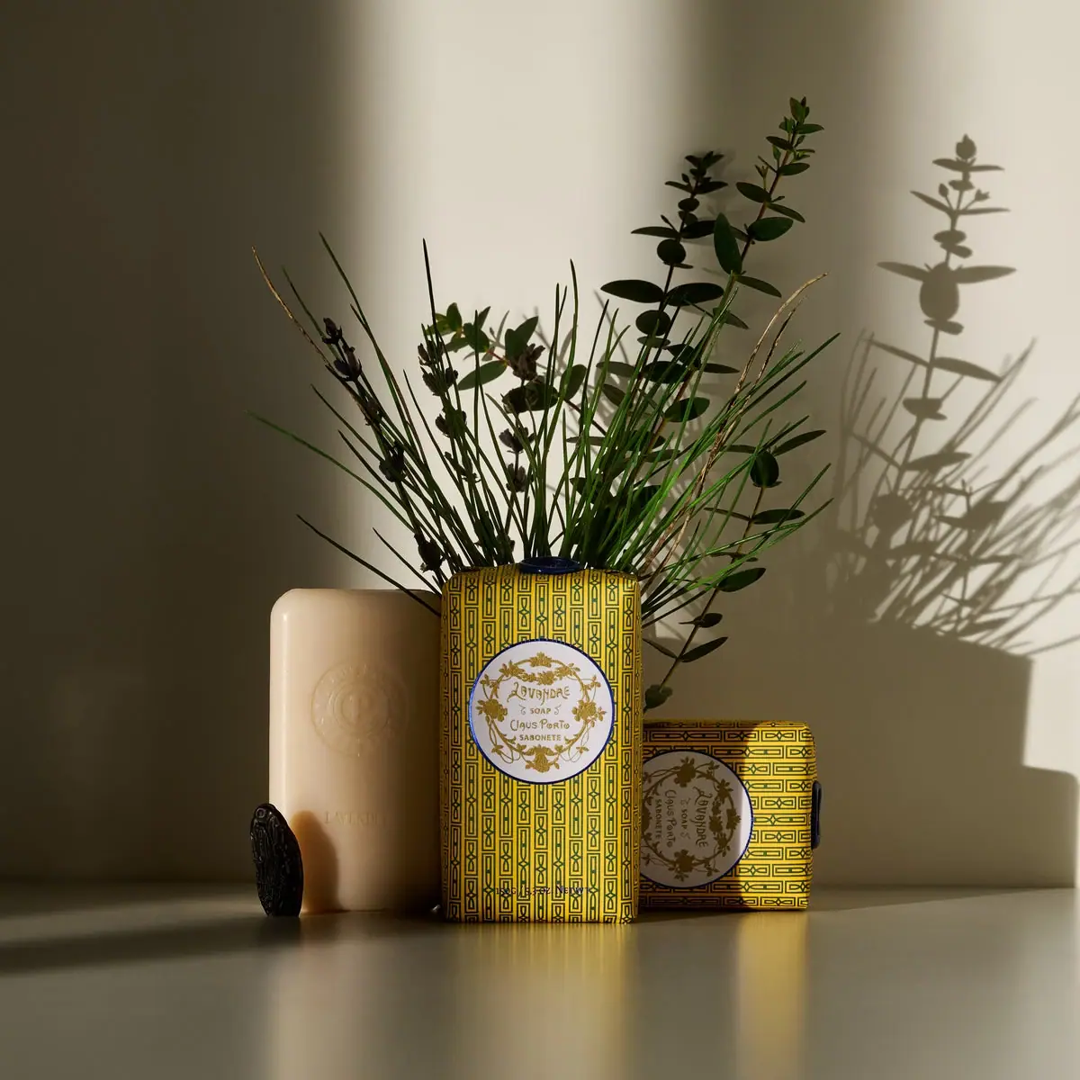
Claus Porto’s Lavandre Lavender Soap pairs a 150 g bar with an ornate patterned wrap and circular scent medallion. The selected image shows the printed presentation alongside an exposed embossed bar.
Claus Porto describes Lavandre’s Classico label as inspired by early twentieth-century house fragrance labels and specifies a manually applied dark blue wax seal.[1]
Pack construction & use
- Wrap and seal
- The brand describes hand-wrapping and a manually applied midnight-blue seal. In the selected photo, dark seal details are visible at the top of the standing pack and the right edge of the sideways pack; their full attachment areas remain partly hidden.[1]
- Soap bar
- An exposed pale rectangular bar sits beside the wrapped examples, showing a circular embossed mark and the Lavandre name.Observed in the reference photograph
What makes the design work
Editorial analysis of this packaging reference.
Pattern as heritage
A dense repeating geometric motif fills the yellow wrapper, then yields to a round white medallion with gold ornament and script. This contrast gives the package both a strong shelf pattern and a quiet center for the scent name.
Label acts like a seal
The circular label sits within the wrapper’s pattern like an inset emblem. Its border and floral detailing echo the decorative surface, connecting the brand’s archival reference to the contemporary product name.
Visible soap reinforces the object
The exposed bar displays an embossed circular mark and lavender name, providing a tactile counterpoint to the printed wrap. Showing both parts helps the paper packaging read as a deliberate presentation rather than a disposable concealment.
Ideas for your next brief
- Pair an all-over pattern with a calm central label to keep ornate packaging readable.
- Let a repeatable embossed mark on the product echo the printed identity on its wrap.
Sources & further reading
Researched 19 October 2026