Photography: Claus Porto official photography. Images belong to their respective owners.
Claus Porto

Golden geometric wrapping around a pale floral medallion
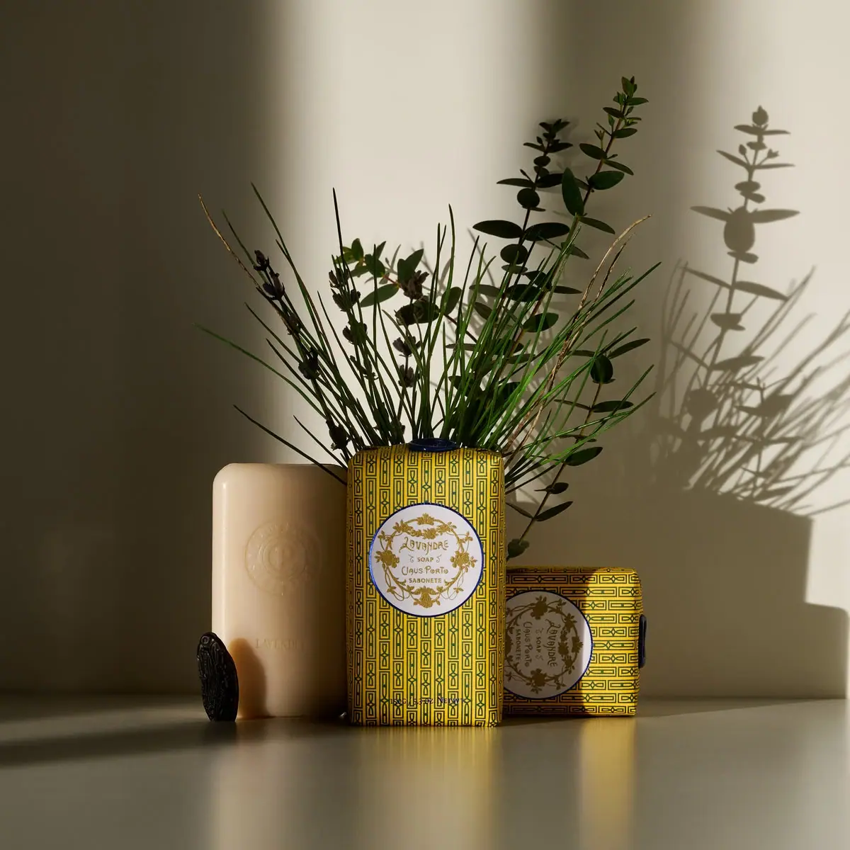
Lavandre balances two kinds of ornament: a tight dark geometric repeat on a yellow wrapper and a more open botanical wreath inside a pale central medallion. The package remains a simple rounded rectangular bar, so the decoration supplies most of its visual richness. In the selected scene, an exposed soap repeats identity through relief rather than ink, and small dark seal elements add a third tactile detail. Claus Porto's current product page connects this Classico design to its early twentieth-century fragrance-label archive. The study covers the photographed Lavandre presentation, not every pattern or format in the wider range.
- Body & bath
- Light pack
- Heritage label
- Maximalist pattern
- Botanical
About this study
Lavandre's approved lifestyle image showing two wrapped examples and one exposed bar, connected to the current 150 g Classico product listing. Other scents and smaller formats are not visually surveyed.
Sources & evidence · Reviewed 2026-10-19Color Palette
Approximate colours interpreted from photography. These are screen references, not official brand colours or print specifications.
Label
Golden yellow ground
#D6B737
Approximate wrapper ground visible between the narrow dark motif lines. Strong side lighting makes the lower and side areas look browner than the directly lit front.
Pale medallion
#E5E5D9
Approximate light central field in the warm photograph. The brand describes the label as light blue and golden; the scene does not provide a calibrated colour reference.
Ink
Deep blue ornament
#182A38
Approximate geometric linework and medallion edge. It gives the dense repeat a crisp structure against the yellow ground.
Antique gold appearance
#9A813C
Approximate lettering and botanical ornament within the medallion. Metallic ink, foil and exact printing method are not verified.
Accent
Midnight seal
#101D2A
Approximate dark seal appearance; the official Lavandre listing specifies midnight blue for the applied wax seal.
Typography
Suggested visual alternatives, not confirmed brand typefaces. Any scale below is an illustrative estimate.
Lavandre sits near the upper centre of the medallion in decorative, irregular-looking lettering. Smaller soap wording, Claus Porto and Sabonete occupy the central vertical stack below. Their narrow space is framed by a wreath rather than a large blank rectangle. The product name leads, but its visual weight shares attention with the surrounding leaves. Small footer text near the bottom of the wrapper remains secondary and should not be transcribed beyond what is legible in the selected image.
Fonts
Decorative scent-name alternative
Berkshire Swash
- Looks like
- Expressive early-display serif direction
- Type
- Decorative display serif
- Weight
- Regular
- Case
- Mixed case for a short original scent name
- Tracking
- Natural spacing with manual optical adjustment
- Fallback
- Georgia, serif
Suggest historical ornament without copying Lavandre's particular lettering. Keep the name short enough to retain generous space inside a new medallion.
Supporting label alternative
Alegreya
- Looks like
- Compact literary serif
- Type
- Text serif
- Weight
- Regular, Medium
- Case
- Mixed case or small uppercase phrases
- Tracking
- Normal to gently open
- Fallback
- Georgia, serif
Provide clearly separated product type and maker lines below the scent name. Let one decorative line lead rather than making every line equally elaborate.
Structure & Proportions
Visual proportions and finish previews are illustrative. Confirmed construction details and uncertainties are distinguished in the study notes.
Proportions
| Purpose | Value | Preview |
|---|---|---|
| Front emphasis | The medallion occupies much of the wrapper's width but only part of its height. Pattern continues above and below, maintaining a strong vertical presence. | — |
| Pattern scale | Many narrow repeats fit across the face. Their density makes the broad pale medallion read as a pause, even though that central area also contains ornament. | — |
| Product relationship | The bare soap has a similar elongated rounded-rectangle profile to the standing wrapped example. This makes the wrap's relationship to the product easy to understand without an opened seam view. | — |
Shapes
| Element | Value | Preview |
|---|---|---|
| Wrapped bar | Elongated rectangle with gently softened corners and folded ends, rather than a rigid square carton. | |
| Identity medallion | Near-circular pale panel with a dark perimeter, appearing slightly altered by perspective on the turned bar. | |
| Geometric repeat | Fine interlocking rectangular paths and small diamond-like details arranged in parallel bands. | |
| Seal element | Dark irregular round outline with a relief face; the exact stamping and application steps are not shown. |
Finishes
Printed wrapper appearance
Yellow patterned surface; no tactile coating or paper grade is verified · matte
Relief soap identity
Circular mark and Lavandre lettering on the exposed bar; this does not imply the wrapper is embossed · emboss
Dark sealed detail
Small dark seal elements visible around the wrapped and unwrapped objects · gloss
Formats and materials
| Formats | Hand-wrapped rectangular soap bar with softened corners, Exposed soap bar shown beside wrapped examples |
| Materials | A thin printed wrapper folds around the bar; precise stock, coating and barrier construction are not specified in the consulted text., The product page identifies a manually applied midnight-blue wax seal; the collection text also uses the term lacquer seal, without specifying its chemistry., The exposed pale soap is the product itself, not a rigid insert or an additional packaging sleeve. |
| Closures | Folded wrapping encloses the soap, with the brand confirming a manually applied seal. Dark seal elements are visible at the top of the standing pack and on the right edge of the sideways pack, although their full attachment areas are partly hidden. A separate dark seal-shaped object stands near the bare soap. The image does not establish the entire folding sequence or whether any additional adhesive is used. |
| Decoration | Continuous geometric repeat arranged in narrow longitudinal bands, Central pale medallion with a dark outline and botanical wreath, Decorative name and supporting text; exact print process is unverified |
Front Panel
Schematic reading order. The diagram’s zone heights do not represent measured artwork proportions.
The outer repeat creates a richly occupied field, while the medallion establishes a separate reading centre. Within that centre, a botanical wreath curves around a short stack of product and maker information. A dark ring prevents the pale field from dissolving into the bright yellow pattern. The two decorative systems differ in rhythm: rectilinear repetition outside, freer branching shapes inside. Their contrast keeps the ornament organised rather than making one uninterrupted texture.
| Zone | Content |
|---|---|
| Outer wrapper | Repeated narrow dark geometric bands over a yellow ground, continuing around the visible package edges. |
| Medallion perimeter | Dark circular outline and gold-coloured botanical branches that define the central identity area. |
| Medallion centre | Lavandre name above smaller product and Claus Porto maker wording, with decorative flourishes between lines. |
| Lower wrapper | Small secondary text near the bottom, visually subordinate to the medallion and not fully transcribed from this image. |
| Bare soap face | Circular relief identity above a smaller Lavandre inscription, showing how the product itself carries a simpler expression of the name. |
Range System
The official collection page locates this treatment within Classico, describing archival imagery and architectural-pattern inspiration. That context supports a heritage approach, but it does not make Lavandre's yellow ground or circular botanical composition universal. The two wrapped objects in the approved image show the same design at different orientations, not two separate fragrances or colour-coded variants.
- Observed: upright and sideways Lavandre bars repeat the same yellow patterned wrap and central emblem.
- Sourced distinction: Classico is a named collection with its own archive-based packaging description, separate from the site's Deco assortment.
- Original-design interpretation: a family could preserve the balance between dense ground and readable centre while developing a different original motif for each scent.
Back of Pack & Shelf
The full reverse, underside and folded seam are not shown. Visible top and side seal details reveal part of the closure presentation but do not expose ingredient-copy, barcode or manufacturer-information placement. Website ingredient text is not evidence of a particular back-panel layout.
- Inspect an opened wrap to establish the real fold order and technical-information zones.
- Do not infer an inner liner, adhesive specification or recycling instruction from the front.
- For original work, keep necessary information readable outside the densest ornamental area.
On shelf
Interpretation: the yellow-and-dark repeat can register from a distance, while the pale circle offers a predictable place to read the scent name up close. The design does not depend on a giant contemporary wordmark. Its challenge is maintaining text clarity within detailed ornament, especially at smaller sizes. The exposed soap in photography reinforces care in the object, but a shelf display would need the wrapped face to communicate on its own.
Imagery
The wrapped and exposed bars stand on a reflective pale surface with long directional shadows. Lavender-like stems and leafy branches rise behind them, casting a large botanical silhouette on the wall. These are scene props rather than an illustrated ingredient list. Strong light makes the yellow wrapper glow while leaving parts of the seal and soap in shadow. The arrangement shows three different kinds of surface at once: printed pattern, dark sealed detail and pale product relief.
Guidelines
Editorial principles for an original design brief, not official brand guidelines.
Do
- Balance a dense repeat with a clearly bounded reading centre.
- Distinguish product relief from wrapper printing.
- Let the motif turn naturally around the bar's edges.
- Keep the scent name readable inside botanical decoration.
- Show closure details accurately when describing hand finishing.
Don't
- Do not call the visible seal absent from the photograph.
- Do not treat the sideways example as a different variant.
- Do not infer foil, paper weight or coating from warm highlights.
- Do not reproduce the archival emblem or exact repeat for a fictional design.
Sources & evidence
How this study was built
edition · Sourced fact
The official listing identifies the 150 g Lavandre product and connects its label to early twentieth-century fragrance artwork.Lavandre Lavender Soap — official product listingstructure · Sourced fact
The brand confirms hand-wrapping and a manually applied midnight-blue seal; exact substrate and seal chemistry are not supplied.Lavandre Lavender Soap — official product listing · Our Collections — Claus Portolabel · Visual observation
A pale botanical medallion interrupts a dense dark geometric repeat on a yellow ground.Lavandre Lavender Soap — official product listingstructure · Visual observation
Dark seal details are visible at the top and side of wrapped examples, with a separate seal-shaped object near the bare bar.Lavandre Lavender Soap — official product listingtypography · Visual observation
Decorative scent lettering leads a compact central stack; the bare bar repeats identity in relief rather than printed pattern.Lavandre Lavender Soap — official product listingrange · Editorial interpretation
Classico provides an archival family context, but two differently oriented examples of Lavandre do not establish a universal palette or layout.Lavandre Lavender Soap — official product listing · Our Collections — Claus Porto
What remains unverified
- Original curated URL was inaccessible; the working official product listing supplies current product context.
- Wrapper substrate, coating, print process, actual typefaces and precise dimensions remain unverified.
- Product copy says wax seal while collection copy says lacquer seal; no specific compound is inferred.
- Strong warm lighting alters colour appearance; the full reverse and seal attachment are unseen.
Give your AI
packaging taste
Give your design or image tool a packaging study: palette, type, structure, front panel and principles for an original brief.
Export this styleFree with an email. PACK.md works in Claude, ChatGPT, Cursor and image tools.
More like this

Benamôr
Ornamental lilac medallion suspended above golden botanical oil

Bomba Curls
tropical foliage gathered around a bold yellow nameplate
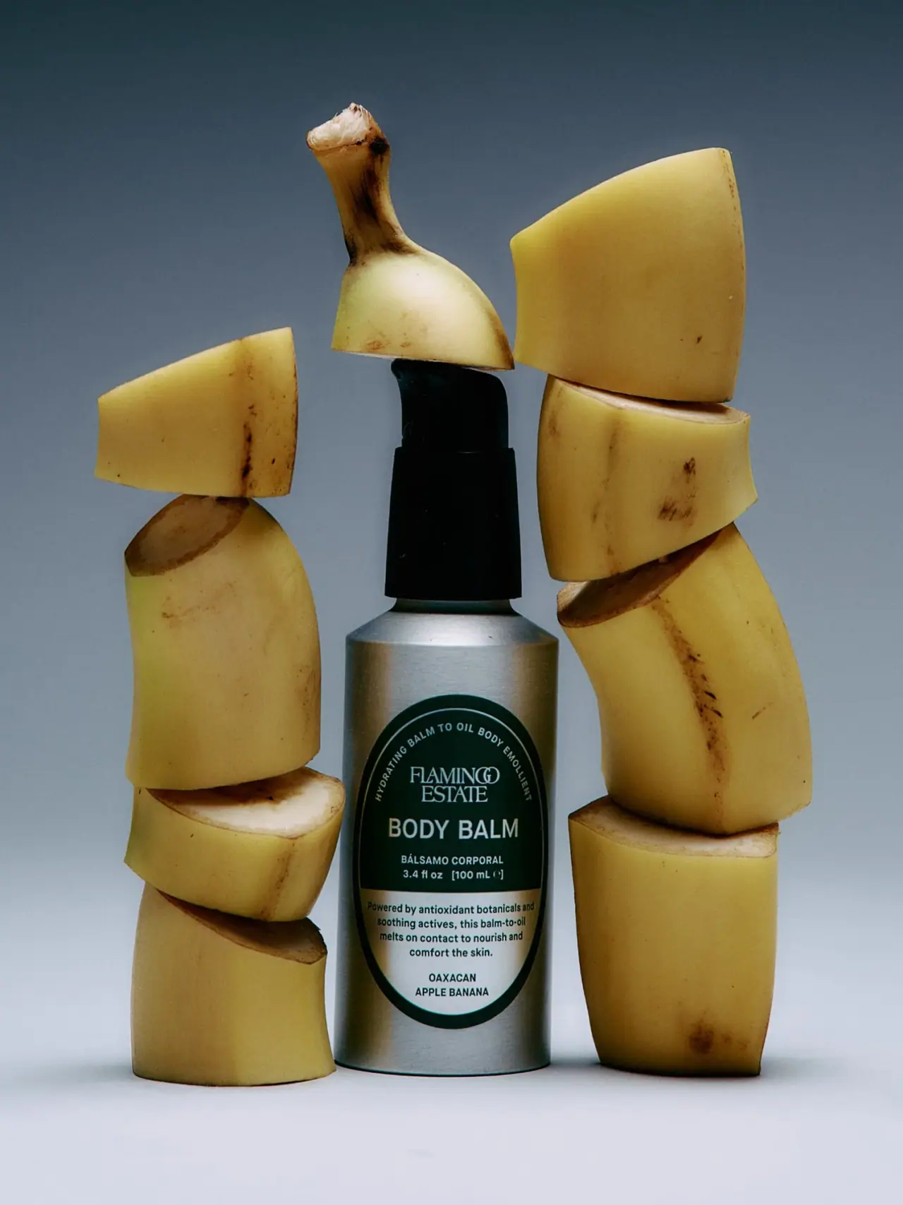
Flamingo Estate
A green oval turns silver utility into botanical character
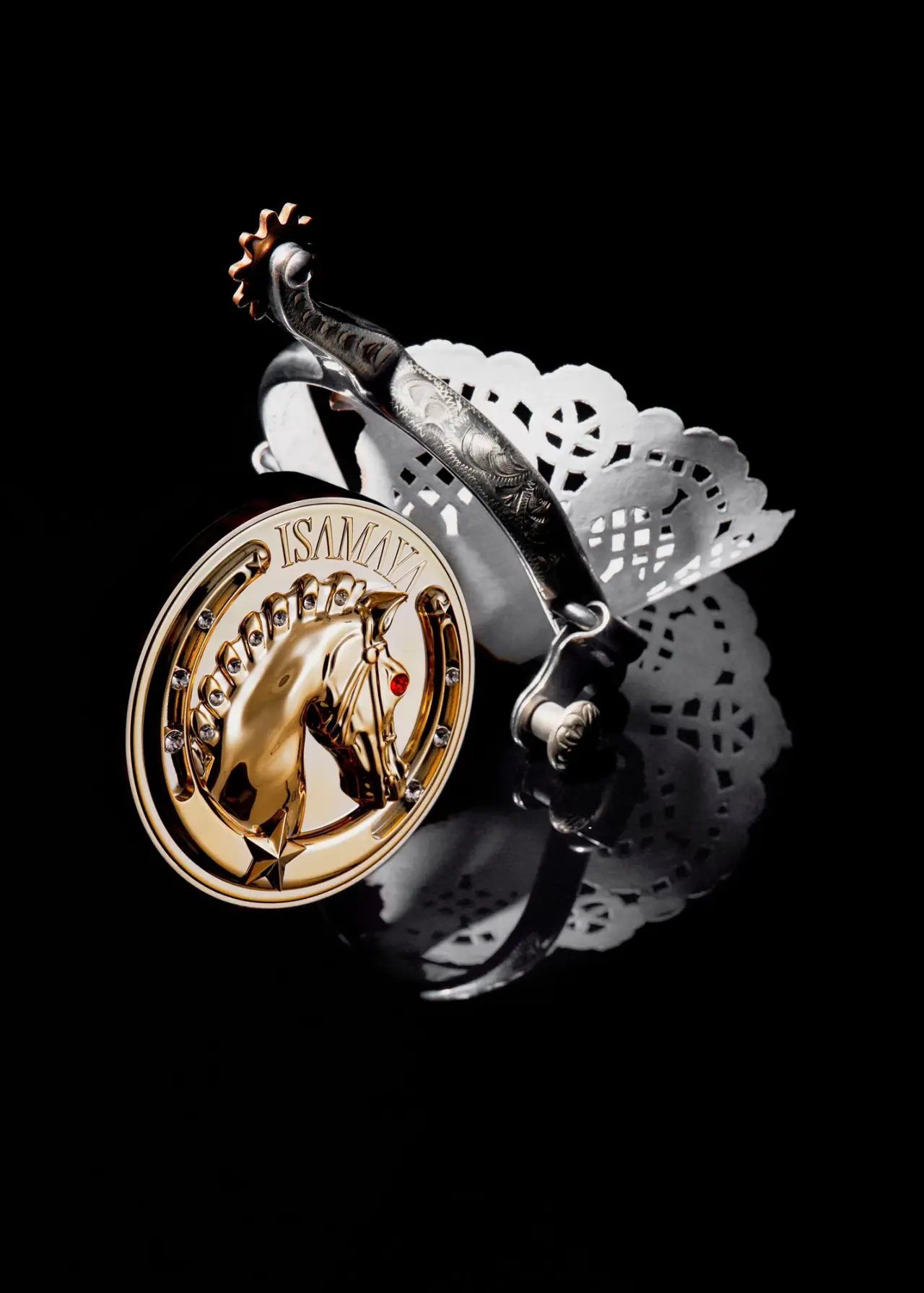
ISAMAYA
Gold horse medallion with crystal-like mane and red eye
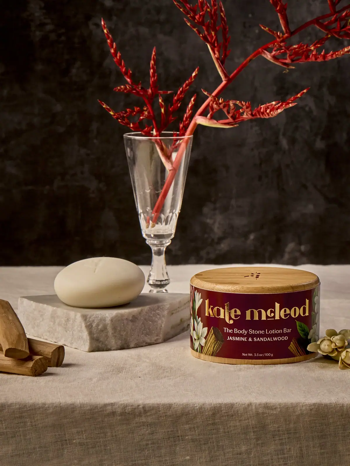
Kate McLeod
A burgundy botanical wrap around a reusable bamboo case
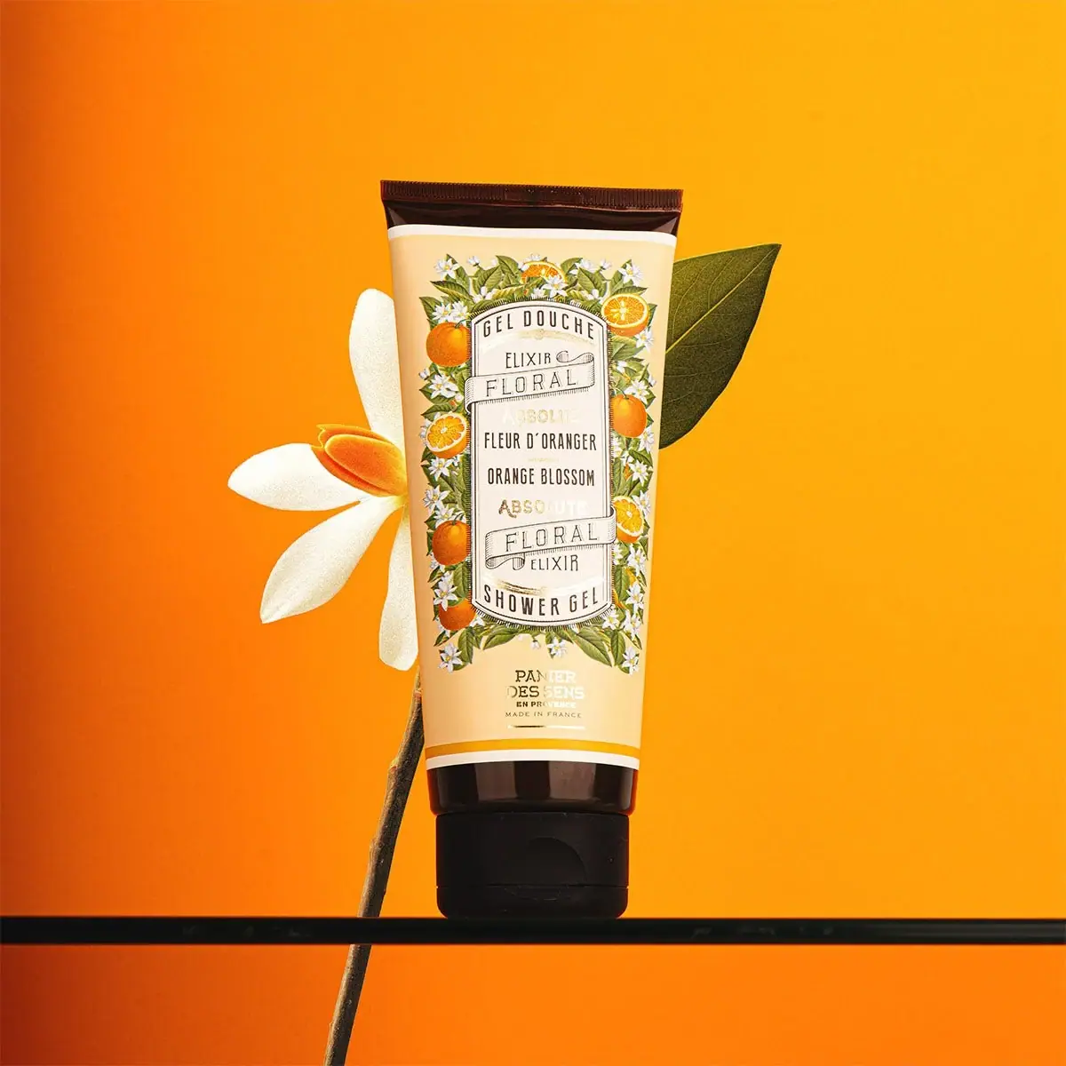
Panier des Sens
Botanical orange-blossom tube with a framed bilingual cartouche
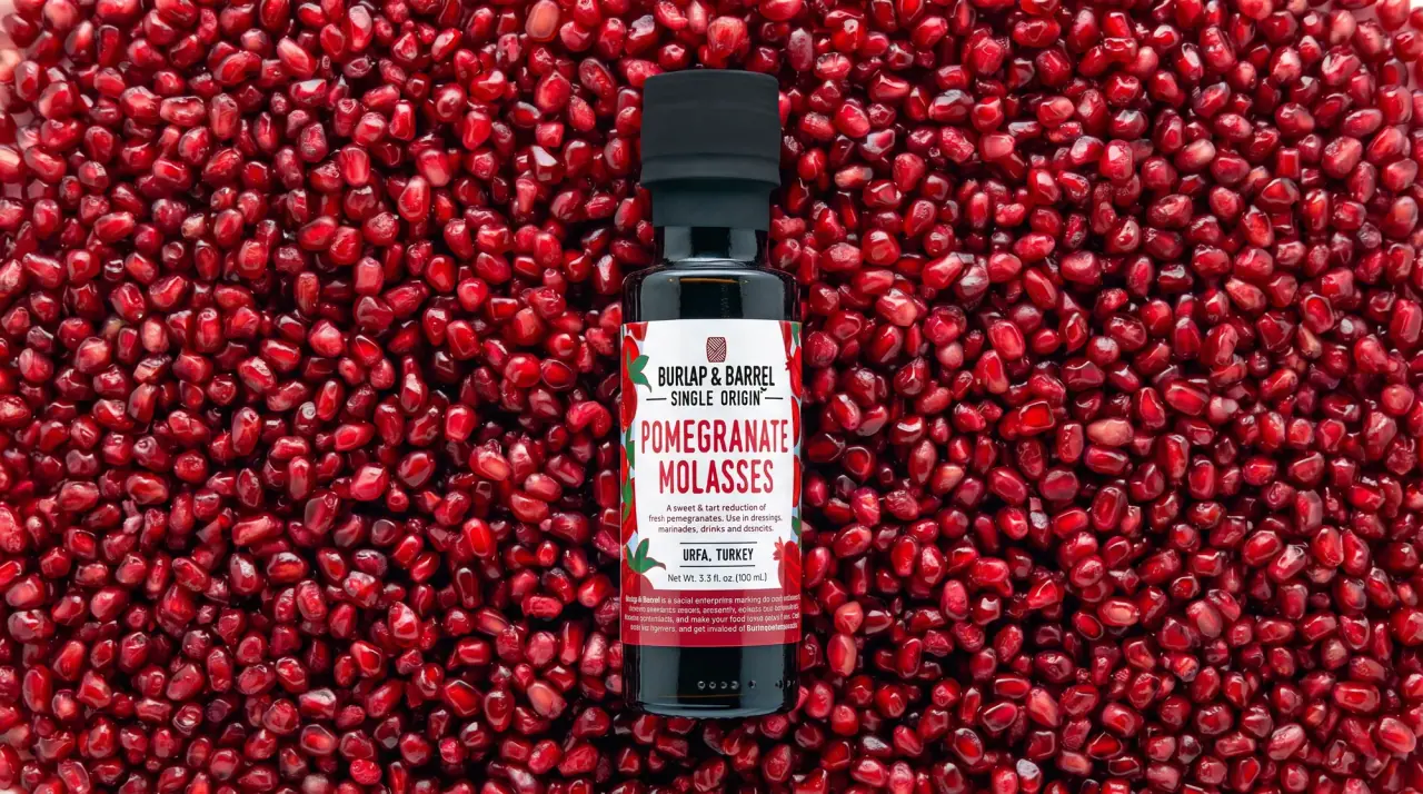
Burlap & Barrel
field-guide labels on clear spice jars
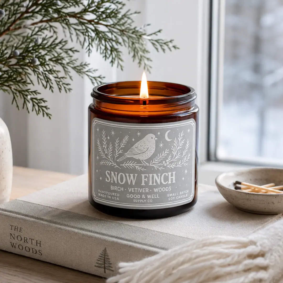
Good & Well Supply Co.
Pale winter bird illustration on a grey amber-jar label