About this packaging
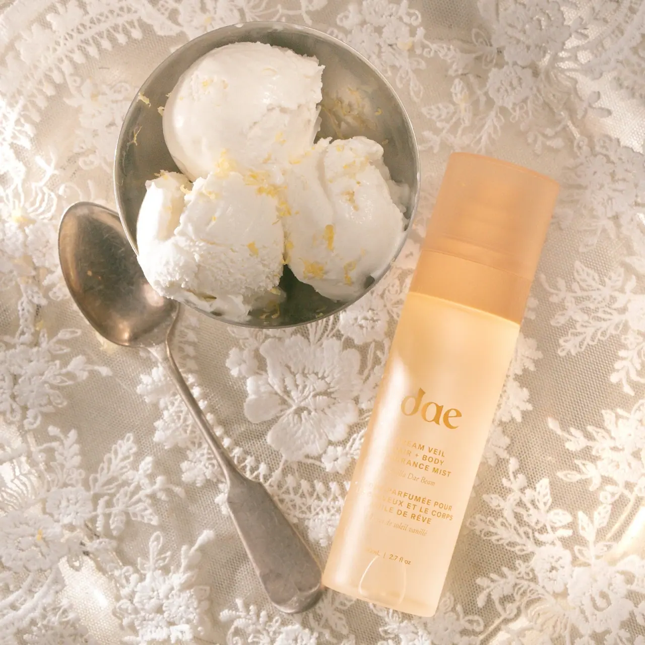
Dae’s Vanilla Dae Beam Dream Veil is an 80 mL hair and body mist in a pale apricot bottle. Soft gold lettering and a broad rounded cap give the tall pack a light, sunlit presence.
Dae describes Vanilla Dae Beam through creamy vanilla, praline, and candied lemon notes and identifies Dream Veil as a hair and body mist.[1]
Pack construction & use
- Bottle
- The selected pack has a tall straight-sided body with softly rounded edges and a broad matching cap. The single view does not establish its precise cross-section or component materials.Observed in the reference photograph
- Front copy
- The lowercase dae wordmark sits above compact English and French product-function blocks, each paired with a smaller scent line. The front presents 80 mL / 2.7 fl oz; these are product descriptions rather than application directions.Observed in the reference photograph
What makes the design work
Editorial analysis of this packaging reference.
Soft contrast suits a light fragrance format
The pale apricot body and warm gold lettering share a narrow tonal range, while the cap is slightly more opaque and lighter. The low-contrast treatment creates a quiet, sunlit appearance that fits the product’s mist format rather than the heavier visual language of an eau de parfum.
A vertical body leaves enough room for bilingual copy
The front face is tall enough to stack the brand, product type, scent name, and French translation without shrinking the typography to a micro-label. The bilingual lines contribute to the package’s visual texture while keeping the main name prominent.
A broad cap continues the silhouette
The matching warm cap approximately continues the body's width. Its soft edges and visible seam keep the tall closed object visually simple; the covered spray mechanism and exact cross-section are not visible.
Ideas for your next brief
- Stack bilingual product copy vertically on a tall format so both names remain legible without a wraparound label dominating the front.
- Use a close tonal palette for a light mist product, then preserve contrast through lettering size and placement.
- Echo the bottle’s softened corners in the cap so a tall spray package has one coherent silhouette.
Sources & further reading
Researched 19 October 2026