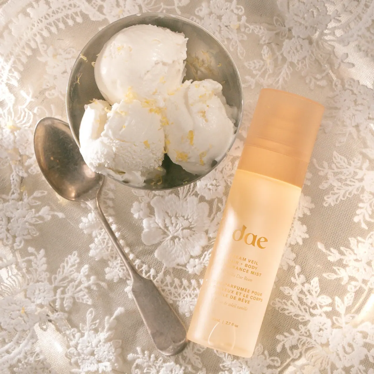
Photography: Dae official photography. Images belong to their respective owners.
Dae

Warm translucent mist with tonal lettering and bilingual rhythm
Dream Veil Vanilla Dae Beam uses a tall pale golden-apricot package and a broad matching cap. A large lowercase serif maker name leads a compact stack of English and French function copy, with smaller italic scent lines between. Warm golden lettering stays close to the body color, giving the object a quiet tonal presence. The selected official photograph places it beside pale dessert scoops, metal tableware and lace, translating the fragrance's gourmand direction into a scene rather than a printed illustration on the bottle.
- Perfume
- Light pack
- Pastel soft-touch
- Bold typographic
About this study
Selected official Vanilla Dae Beam Dream Veil 80 mL mist photograph, with its rounded 2.7 fl oz front display distinguished from the current webpage's 2.73 fl oz listing.
Sources & evidence · Reviewed 2026-10-19Color Palette
Approximate colours interpreted from photography. These are screen references, not official brand colours or print specifications.
Pack body
Pale apricot gold
#EAC38C
Approximate light-transmitting body tone. Cream highlights and deeper edge shadows vary across the vessel, so this is a visual reference rather than a flat production color.
Ink
Muted golden lettering
#B9832B
Maker name and information share a warm ochre-gold appearance. The image does not prove metallic ink, foil or gold content.
Accent
Warm cap amber
#DEA66B
Matching cap appears deeper and warmer than the brightest body areas in the selected image. Its tonality should not be assumed identical under neutral studio light.
Typography
Suggested visual alternatives, not confirmed brand typefaces. Any scale below is an illustrative estimate.
The lowercase dae maker name is the largest text and uses a soft contrast-serif construction. Under it, the English product title and category form a compact uppercase sans block. A smaller inclined serif scent line provides a change of pace before the French function block and its corresponding scent wording. Net contents finish the stack near the base. The large maker name supplies recognition, while the bilingual blocks carry category detail; the elegant scent lines should not be mistaken for practical usage instructions.
Fonts
Original maker and scent voice
Cormorant Garamond
- Looks like
- Soft contrasting serif with italic option
- Type
- Display serif
- Weight
- Regular, Medium
- Case
- Lowercase maker; title-case scent
- Tracking
- Optically balanced maker spacing; natural scent spacing
- Fallback
- Georgia, serif
A proposed serif direction for a new identity and its quieter italic scent line. Use the family as a starting point rather than reproducing the source's distinctive three-letter wordmark.
Bilingual function blocks
DM Sans
- Looks like
- Compact open uppercase sans
- Type
- Geometric sans-serif
- Weight
- Regular, Medium
- Case
- Uppercase function; mixed-case small details where needed
- Tracking
- Moderately open capitals
- Fallback
- Arial, sans-serif
Alternative for English and French information with matched visual weight. Give each translation enough line width and contrast; do not shrink the longer language automatically to force an identical rectangle.
Structure & Proportions
Visual proportions and finish previews are illustrative. Confirmed construction details and uncertainties are distinguished in the study notes.
Proportions
| Purpose | Value | Preview |
|---|---|---|
| Tall continuous outline | Body and cap form a slender straight-sided object with softened edges. The single view does not establish an exact circular, oval or rounded-rectangular cross-section. | — |
| Cap relationship | The cap is substantial enough to read as a complete upper section rather than a tiny nozzle cover; its width closely follows the body. | — |
| Lower information stack | The maker and bilingual blocks concentrate in the lower portion, leaving an open warm field between the cap seam and main identity. | — |
| Type scale contrast | The short maker name is much larger than the functional lines. Scent wording becomes a fine transitional layer rather than another equally bold headline. | — |
Shapes
| Element | Value | Preview |
|---|---|---|
| Closed vessel | Tall narrow form with parallel sides and rounded lower corners in this view. | |
| Broad cap | Matching softened cover with a visible horizontal seam. | |
| Bilingual copy blocks | Compact centered groups with short uppercase lines and quieter italic transitions. | |
| Large maker field | Open lowercase serif lettering without an enclosing badge or border. |
Finishes
Soft translucency
Bottle body allows diffuse internal boundaries and warm light to show through; exact treatment unverified. · frosted
Muted cap surface
Top cover carries broad soft highlights rather than a sharply mirrored finish; coating unknown. · matte
Formats and materials
| Formats | Tall straight-sided hair and body fragrance mist, official 80 mL format; selected front rounds the imperial display to 2.7 fl oz while the current page lists 2.73 fl oz |
| Materials | Body and cap have a softly translucent appearance. The accessed official page does not identify exact resin, glass composition, recycled content or surface treatment., An internal horizontal boundary and highlights are visible through the upper body, but they do not establish a measured fill level or internal construction. No separate opaque paper label is obvious. |
| Closures | The broad warm cap remains in place and approximately continues the width of the bottle. A horizontal seam separates it from the body, with softly rounded outer edges. The product is identified as a mist by the brand, but the spray actuator, neck connection, internal seal and cap attachment are concealed in this image. A refill mechanism is not established. |
| Decoration | Oversized lowercase serif maker name, Compact English uppercase function block, Smaller italic scent name, French function block and translated scent line, Small bottom quantity statement |
Front Panel
Schematic reading order. The diagram’s zone heights do not represent measured artwork proportions.
The front uses a centered vertical stack without a boxed label boundary. A generous blank upper interval gives the maker name room to emerge, then the English and French information follow as two related units. Within each unit the functional sans capitals are visually firmer than the smaller serif scent wording. The subtle palette makes spacing and type texture particularly important: the hierarchy cannot rely on strong color changes to separate languages or distinguish maker from product.
| Zone | Content |
|---|---|
| Maker identity | Large lowercase dae lettering establishes the strongest typographic feature above the smaller information groups. |
| English function | The Dream Veil name and hair/body fragrance-mist category are presented in compact uppercase lines. |
| English scent | Vanilla Dae Beam follows in smaller inclined serif lettering, clearly distinct from the functional capitals. |
| French counterpart | A second uppercase category block and smaller scent line repeat the information rhythm rather than introducing a new benefit badge. |
| Quantity | The small 80 mL and rounded imperial equivalent sit low on the bottle, separated from the language blocks. |
Range System
The product page links this Vanilla Dae Beam mist with a Signature Citrus option, but only the selected vanilla bottle is visually inspected here. No universal hue-to-scent coding or identical construction across the complete Dae range is asserted. Adaptation can borrow the principle of a calm common structure and clearly written scent identity without reproducing this specific color and wordmark combination.
- In an original scent family, preserve the same maker-to-function relationship while allowing scent wording its own small typographic voice.
- Keep bilingual categories parallel in importance even when translations require different line lengths.
- If two variants use similarly pale colors, written scent names must remain legible enough to distinguish them without their campaign props.
Back of Pack & Shelf
Reverse, underside and exposed spray assembly are not shown. The front French block is category information, not evidence of the rear directions layout.
- Inspect an edition-matched back before documenting full directions and ingredients.
- Obtain an uncapped reference before specifying atomizer details.
- Resolve material and finish specifications with the maker before treating a visual frosted effect as production guidance.
On shelf
Interpretively, the broad matching cap and uninterrupted warm body make the pack read as a single calm object. The short large maker name can survive image reduction better than the fine scent text. Golden lettering on apricot has restrained contrast and becomes difficult where glare crosses it, so a new design should be tested in neutral product photography as well as an atmospheric scene. A light tonal treatment is a stylistic choice, not evidence of fragrance concentration or performance.
Imagery
The official still life places the pack diagonally beside a metal bowl of pale scoop-shaped dessert and a spoon on floral lace. Small yellow zest-like fragments reinforce the creamy citrus association; the brand describes vanilla, praline and candied-lemon notes. These props communicate a fragrance impression rather than a formula recipe. Lace adds visual detail outside the plain bottle, while the silver tableware creates cool reflections within the otherwise warm scene. None of those textures is printed on the package.
Guidelines
Editorial principles for an original design brief, not official brand guidelines.
Do
- Separate function, scent and language roles.
- Preserve generous space above a detailed information stack.
- Check tonal lettering against real highlights.
- Describe visible softness separately from manufacturing treatment.
- Keep food props distinct from printed motifs and ingredients.
Don't
- Do not call the French function block usage directions.
- Do not infer gold foil from golden color.
- Do not settle exact vessel cross-section from one view.
- Do not treat campaign dessert props as a formula declaration.
- Do not copy the lowercase maker artwork and complete tonal combination.
Sources & evidence
How this study was built
edition · Sourced fact
Official page confirms 80 mL hair/body mist and vanilla, praline and candied-lemon scent context.Dae — Dream Veil Hair + Body Fragrance Mist, Vanilla Dae Beamstructure · Visual observation
Broad matching cap and tall softened body are shown closed; exact cross-section and mechanism remain uncertain.Dae — Dream Veil Hair + Body Fragrance Mist, Vanilla Dae Beamtypography · Visual observation
Large lowercase serif maker contrasts with uppercase function blocks and small inclined scent lines.Dae — Dream Veil Hair + Body Fragrance Mist, Vanilla Dae Beamlabel · Visual observation
English and French category/scent groups form a centered stack above the quantity.Dae — Dream Veil Hair + Body Fragrance Mist, Vanilla Dae Beampalette · Visual observation
Warm translucent-looking body and cap pair with tonal golden print; no foil confirmed.Dae — Dream Veil Hair + Body Fragrance Mist, Vanilla Dae Beamimagery · Visual observation
Dessert, silver tableware and lace belong to the campaign set rather than on-pack decoration.Dae — Dream Veil Hair + Body Fragrance Mist, Vanilla Dae Beamrange · Editorial interpretation
Bilingual rhythm and explicit scent wording are adaptable principles, not a verified range-wide visual specification.
What remains unverified
- Exact component materials, coating and printing method unknown.
- Precise cross-section and dimensions not established.
- Spray mechanism, reverse and underside not inspected.
- Original fonts and metallic nature of golden lettering unverified.
- Props illustrate scent mood rather than a complete formulation.
Give your AI
packaging taste
Give your design or image tool a packaging study: palette, type, structure, front panel and principles for an original brief.
Export this styleFree with an email. PACK.md works in Claude, ChatGPT, Cursor and image tools.
More like this

Bread Beauty Supply
bubblegum pumps and a fat black wordmark

Fenty Beauty
faceted caps and wide-spaced lilac capitals
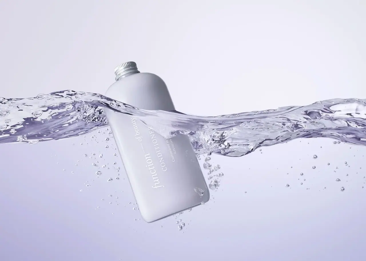
Function of Beauty
Lavender bottle with longitudinal white serif lettering
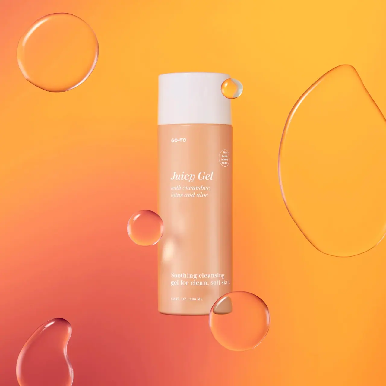
Go-To
Peach cylinder, white cap and airy italic serif copy

Kosas
lavender chrome and candy-pink acrylic
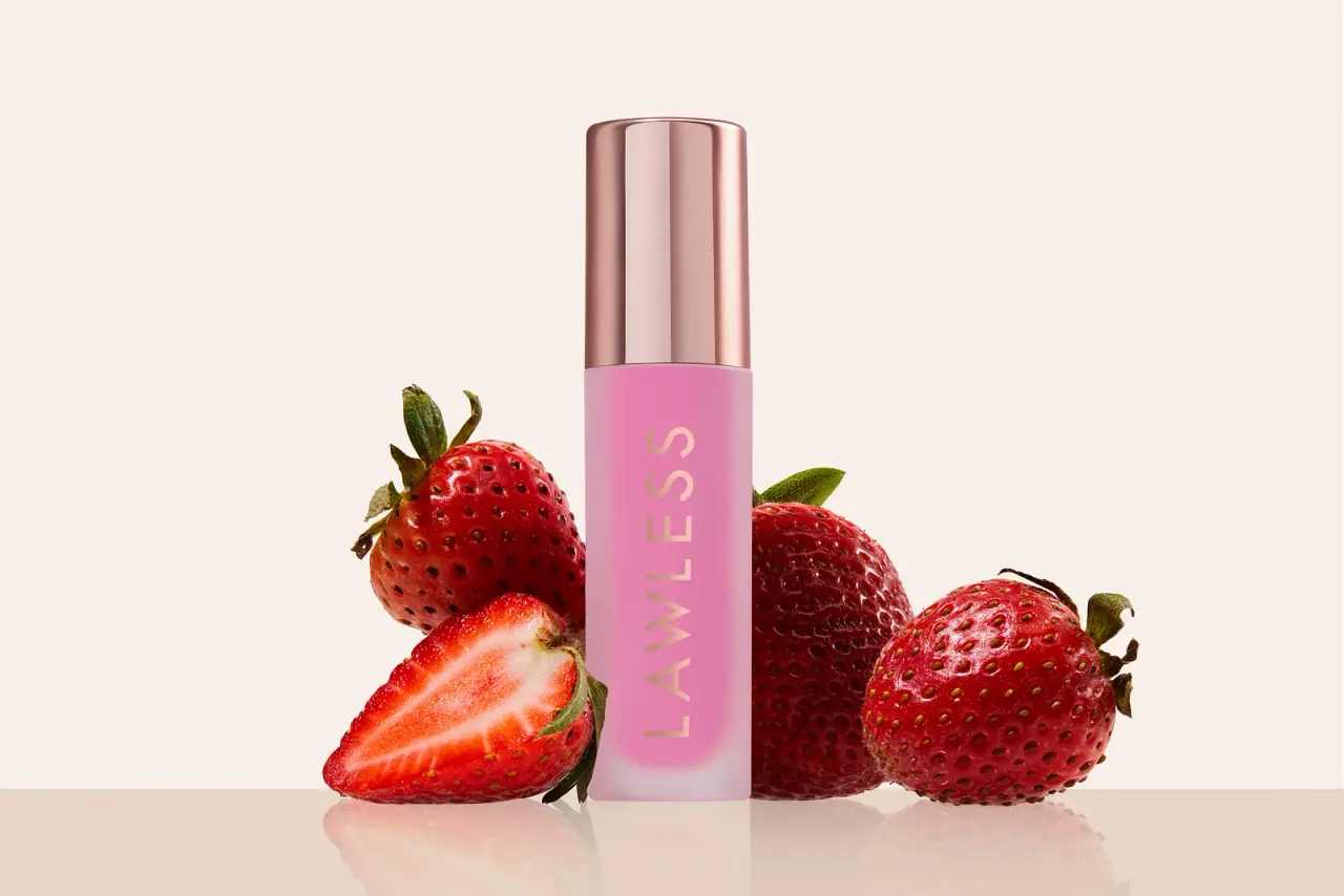
LAWLESS
Pink diffused gloss vial with a reflective rose-toned cap
Odyskin
Mint tube with rotated serif lettering and circular protection badge
Overose
Lavender glossy cylinder with a spare black-and-white scent label