About this packaging
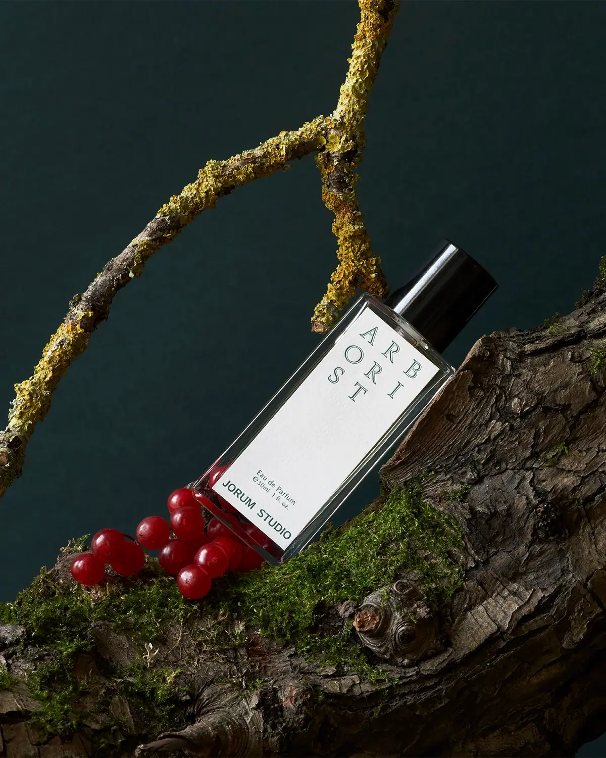
Jorum Studio’s Arborist perfume pairs a tall, clear rectangular bottle with a short black cylindrical cap and a slim white front label. The word Arborist is split into stacked letter groups, using vertical rhythm to make the narrow label readable without expanding its width.
Jorum Studio describes Arborist as a fragrance inspired by Scottish woodlands and lists 30 mL and 50 mL formats. The bottle photographed here is marked 30 mL, accompanied by mossy wood and red berries.[1]
Pack construction & use
- Primary pack
- The straight-sided transparent bottle has a rectangular front, a thick-looking base and a black cylindrical cap. Its white label covers most of the front while leaving a clear border visible.Observed in the reference photograph
- Information placement
- The scent name sits at the top of the label in widely spaced groups of letters. Concentration, 30 mL / 1 fl oz quantity and Jorum Studio branding form a smaller block near the foot.Observed in the reference photograph
What makes the design work
Editorial analysis of this packaging reference.
Blank space separates name from specification
A large empty area between the scent name and small lower text slows the reading rhythm. The bottle can communicate an unusual typographic title without crowding practical product details.
A word is rearranged into a compact field
ARBORIST is divided into three stacked groups in large green-outlined capitals. Smaller concentration, size, and Jorum Studio details cluster near the bottom of the label.
A white label interrupts the woodland scene
The sharp white panel stands apart from the textured bark and dark green setting. Green outlined letters connect the label back to that scene; red berries provide an accent outside the packaging rather than another printed color.
Ideas for your next brief
- When breaking a product name into a typographic grid, preserve clear word order and keep specifications in a separate stable position.
- Use generous blank space to create contrast with a richly textured campaign setting.
Sources & further reading
Researched 19 October 2026